X Close

Digital Education team blog

Home

Ideas and reflections from UCL's Digital Education team

Menu

Archive for the 'Our Views' Category

Moodle Exam guard

By Eliot Hoving, on 19 April 2024

UCL Moodle has been updated with a new feature called Exam guard.

What is it?

Exam guard will prevent users from editing their course from 10 minutes before the start of a Moodle quiz until 10 minutes after the quiz has finished. Exam guard does this by looking at the “open the quiz”/ “close the quiz”  setting when a Moodle quiz is created. The course editing freeze will only apply where the Moodle quiz is open for less than 5 hours as it is designed to target Moodle quizzes being used for controlled condition exams.

A banner will appear at the top of your course when Exam guard is in effect.

Exam guard banner on a course page

Why is this required?

In the past, when users have attempted to edit and save changes to a Moodle course while a quiz is underway, it has caused serious performance issues while Moodle tries to refresh caches and implement the changes. This issue is particularly bad where a large cohort (300+) are taking the quiz, and has caused exams to be disrupted.

What do I need to do?

Exam guard will work automatically and should have no impact on the majority of workflows. Staff can still post to forums, and mark submissions in other assignments. They can also add user overrides for late minute ECs and SORA students to a quiz.

Staff will not be able to edit course settings or create or edit activities in their course while the exam is running.

Staff will no longer be able to manually release a Moodle quiz by making the quiz visible at the exam start time. This workflow is not recommended or required. A better approach is for staff to set the Moodle “open the quiz” setting to the exam start date and time when creating the quiz. Students will see the quiz item on Moodle but aren’t able to access the questions or begin the quiz before the open date and time so there is no risk your exam is released early.

Half the struggle with digital knowledge is knowing what it’s for

By Jim R Tyson, on 10 April 2024

Sometimes I hear an announcement about an update or improvement to some technology or ‘app’ (as the youngsters say) that sounds exciting and eminently worth investigating.  When I start sifting through Google results to find out more, I can spend a day or two sometimes working out what’s going on.  That’s OK, it’s part of my job to do this and then, if what I’ve learned is useful, to find ways to communicate it to other people.

For example, Excel now allows users to create ad hoc and custom functions using lambda().  Now, if you are a computer scientist, mathematician, philosopher or linguist, you will probably have heard of the lambda calculus, an important mathematical invention of the twentieth century that influenced all those disciplines.  It provided a way to formally characterise computation as function application and abstraction (roughly, don’t quote me on this – it was a long time ago).  Now, even students of computer science may sometimes encounter the calculus and end up wondering ‘OK, but what’s it for?’

Well, one way to demonsrate its practical use is by introducing the world of the lambda() function in Excel: it allows you to formally define new Excel functions.  I immediately spotted some  uses  for this.

Descriptive statistics for sub-populations

Excel provides all the most common and useful statistical calculations as basic functions such as count(), average(), var(), stdev() and for some functions there are conditional versions countif(), averageif(),which allow for subsetting your data.  So, it might be that you have two columns of data, the first is some interesting measure (temperature? height? resting bpm?) and the second some characteristic such as ethnicity or gender.

It might be that you want to know what is the average resting heart rate (for example) of the male participants in  your study.  You can do this using averageif(): =averageif(B1:B100, “male”, C1:C100).  Assuming that the sex data are in the range B1:B100 and the resting heart rate data are in C1:100.  In fact, Excel has an averageifs() to help with cases with multiple selection criteria.  So that’s good for data analysts using Excel because it’s a common analytical approach.

However, this only works for averageif(), countif(), maxif(), minif() – there is no conditional var(), stdev(), skew() or kurt().  Well, for variance and standard deviation, we can construct a pivot table to get the subpopulation analysis we want and that’s great.  But occasionally (probably not that often) we want to calculate the skew in resting heart rate for all male participants, and maybe even the kurtosis.  And here, after that long lead in, is where the lambda() function proves it’s worth.  First, lets look at how we would caculate the kurtosis in some measure as a function of gender, using a combination of built-in Excel formulas: Given a data table where column A is the categorical (eg gender) variable and B is the measure of interest:

1 A B
2 1 56
3 1 62
4 1 48
5 1 58
6 1 58
7 1 55
8 1 42
9 1 54
10 1 47
11 2 52
12 2 59
13 2 56
14 2 45
15 2 63
16 2 52
17 2 44

The formula we want is kurt(if(A1:A17=1,B1:B17))

So there are three parameters, the first is the range to which we apply the second (the selection criterion value (here, 1 = male)), the third is the range where the kurt() function will be applied.  I tested this formula and it works fine, it’s just a bit clunky to use compared to the built-in averageif() etc.  So, I decided to reconstruct it using the lambda() function, to produce my own kurtif() function.  In an empty cell, we put the lambda expression:

=LAMBDA(a,n,b, KURT(IF(a = n, b)))

with the three parameters represented (arbitrarily) by a, n and b.  A moments reflection and we see the relation between the lambda expression and our previous Excel formula.  From a practical point of view, the lambda expression tells us where in the calculation to plug in the values a, n and b to get our result.

When you enter this expression in a blank cell and hit return you will see the warning message

#CALC!


which is Excel recognising that the cell contains a lambda expression.  The next step is to name the new function kurtif().  Copy the new lambda expression to the clipboard (highlight and control-c) then from the formula tab on the ribbon select and open the name manager.  In the dialog that this opens press the new button; give kurtif as the name for the new function and then paste the lambda expression from the clipboard then OK and close the name manager dialog.

Now you can carry out the computation as:

=kurtif(A1:17,1,B1:B17)

which is simpler and has the advantage of looking very like averageif() and the other, similar functions.

A missing significance calculation in Excel

Excel has a very simple to use function that will calculate a correlation coefficient (R) from two arrays of data: =correl(Array1,Array2).  It is a minor annoyance that this calculation doesn’t return a p value for R, allowing us to test the null hypothesis that the true correlation between Array1 and Array2 is zero.  So, let’s assume that we have calculated r for two columns of data each and we know that n is just the count of one array, and the result is in cell H1 (for no particular reason).

Now, it’s a fairly simple trick to calculate a t value based on the correlation coefficient.  The formula is

and since we have just calculated r, it is simple to calculate t with the formula (and put the result in H3):

=H1*(sqrt(count(Array1)-1))/sqrt(1*-H1^2)

The last (and for now separate) step is to find the significance for this t score with the two-tailed t distribution function with n-2 degrees of freedom

=t.dist.2t(H3, count(Array1)-2)

And there we have it.  So, it would be useful to have a little helper function we could apply simply,  to calculate  from r.  Here is the lambda function code:

=LAMBDA(r,n,(r*SQRT(n-2))/SQRT(1-(r^2)))

and we can name it and use it as before.  I named mine ‘convertRtoT’ and used it like this with the correlation coefficient in H1 and n = 30:

convertRtoT(H1,30)

So now we know what the lambda() function is for.  The example is perhaps a little obscure, but the principle – that half the struggle with digital knowledge is knowing what it’s for – holds for far more mundane cases: I’ve been learning Power BI, and while there are simple answers – power BI is for visualisation – it’s only after I’ve been through a few hours of tutorials that I’m really understanding what it’s about.

Homework

If you want to check out the example calculations, please go ahead.  I checked them all in Excel (and for the t to r conversion, I checked my result against R), but it’s always possible to make a bluder when copying and pasting.  But finding and fixing errors is good practice.  If you want more practice, then I would suggest creating a function skewif() that works like kurtif(), taking two arrays ( a score and a selection criterion) a gives the skewness for the cases selected by the criterion.  Good luck.

(this blog post was supported by the music of Iannis Xenakis, “Six Chansons No 1, ca sent le musc”)

UCL Moodle theme update – Thursday 14th March

By Eliot Hoving, on 8 March 2024

The Digital Learning Environment team have made a number of changes to the UCL Moodle theme to improve the functionality, speed and accessibility of UCL Moodle for students and staff.

The planned update is scheduled for Thursday 14th March between midnight and 4am. There will be a small outage of 15 minutes during this time. The period is a very low usage period so should have minimal impact on students and staff.

A highlight of the key improvements are outlined below.

Course search

Each course now includes a content search in the course index menu (left hand menu on course pages). Students and staff can search by content name or activity type.


Left hand activity menus

Book, Lesson and Quiz menus no longer show on the right side of page where they can easily be hidden by students and lost. Instead they now appear on the left hand side which should improve the readability of the navigation menu.

Footer search

The search for courses and for UCL Moodle content (known in Moodle terminology as Global search) has been moved to the footer and is now available on every page.

Course breadcrumb improvements

The course breadcrumb will now appear fixed on the top of course pages and includes the course icon for easier navigation.

Additional changes:

  • Course index menu (left hand menu on course pages) set to closed by default to avoid distracting students.
  • Notifications redesign with links to view source of notification, images, and persistence of notifications (i.e. not disappearing once read).
  • Messaging UI improvements.
  • Footer user menu.
  • Course section indentation on large screen to create visual hierarchy.
  • Colour changes to course section toggles, expand / collapse all sections button, to create better emphasis.
  • Back to top on all pages.
  • Large tables (e.g. grading) fill full available screen width.
  • Site admin links (those found most used in survey) moved to user menu.

Feedback or questions?

Please get in touch with the DLE team to provide feedback at digi-ed@ucl.ac.uk.

Starting up Stata with personalised options

By Jim R Tyson, on 4 March 2024

There are often things one can do to personalise and improve ones experience with software that involve some cusotmization, and that may be easy on your own machine, but less easy if your machine is managed by the organisation (in this case UCL).  My Laptop is managed by UCL (although I do have some elevated rights).

In an effort to improve my Stata workflow and output, I have several graphing options that I want to apply to all graphis I produce in Stata.  Typically, I want the Title left justified, in black, to take up the whole width of the graph (rather than the plot region) and to appear top left (at 11 o’clock).  The graph region colour should be white with no axis lines for x or y axes and with no fill-colour or border colour.

To simplify this I put these in a global macro ‘graph_opts‘ and add the macro to the start of any graphing command as $graph_opts . Anyone who knows how lazy and inconsistent I am, will already be guessing that while I may aspire to do this, I more often just hack away at my graphs until they look (more or less) as I want.  This is the worst kind of laziness because a little effort in setting this up would make for less work.

So I decided to investigate – could I automate this?  And I can.  At first, my heart sank slightly when I realised I would have to deal with the system paths on my managed machine, but it turned out to be very straight forward.  You can use sysdir on the stata console to find your stata program files folder.  When you navigate to this folder, use dir *.do to check for the presence of the file sysprofile.do -this means you are in the right directory.  Now, create a new do file called profile.do  Any code you add to this file is executed on Stata start up.  Knowing that I added these lines to my own profile.do (I used the Stata do file editor, but any plain text editor such as Windows Notepad would do as well):

// For -twoway- graphs
global graph_opts ///
  title(, justification(left) color(black) span pos(11)) ///
  graphregion(color(white)) ///
  xscale(noline) xtit(,placement(left) justification(left)) ///
  yscale(noline) ylab(,angle(0) nogrid) ///
  legend(region(lc(none) fc(none)))

// For -graph- graphs
global graph_opts_1 ///
  title(, justification(left) color(black) span pos(11)) ///
  graphregion(color(white)) ///
  yscale(noline) ylab(,angle(0) nogrid) ///
  legend(region(lc(none) fc(none)))

Of course you will want to change these to meet your own preferences – which may mean a deep dive into the Stata documentation.  It is however worth it given the time and effort you will save in hacking at graph code (or [shudder] gph files) to ensure that your graphs are all consistently presented in your reports.

Removal of obsolete Zoom recordings stored in Lecturecast (Echo360) on 11th March 2024

By Silvia Giannitrapani, on 4 March 2024

As per the UCL retention policy, any Zoom-recorded content in Lecturecast will be deleted if it meets the following criteria: 

  • Zoom recordings that have never been shared with a Lecturecast course section 
  • Zoom recordings that have never been viewed.

Staff members impacted by this will be contacted with further details. Should they wish to retain these recordings, they are advised to ensure a copy is stored in their Zoom account, unless they have manually deleted them. Alternatively, a copy of the recording can be downloaded before the 11th March 2024 by following the instruction below.  

 Please note: Teaching events captured or uploaded to Lecturecast (Echo360) will not be affected. 

If you have any questions regarding this matter, please get in touch with the Lecturecast Support Team and we will respond as promptly as possible. 

The Moodle Flexible course format is being phased out from July 19th.

By Eliot Hoving, on 14 February 2024

Why is this change being made?  

The Flexible format plugin has reached end of life and is no longer supported by its maintainer. The plugin has multiple usability and accessibility bugs. The planned upgrade to Moodle 4.4 over the summer will further impact both the function and look of the plugin making the format unusable. 

What do staff need to do? 

Staff using the Flexible format should manually change their course format by the 19th July so they can ensure their course is correctly updated and so they can communicate guidance or notice to students on the course.  

After the 19th July, Flexible format will no longer be available and courses in this format will be automatically converted to the Topics format to ensure that the course continues to function for students and staff. This includes course from the current academic year and those from previous years. 

You can view which course format you are using by going to your course page and clicking settings. 

Course page showing the settings option.


Under Course format you will see the format in use. 

Editing course format menu

Research by the Moodle UX team suggests many staff switched to the Flexible format for its visual appeal and to avoid accessibility issues in the Grid format. Recent updates to the Grid format have significantly improved its accessibility and in this respect it is now preferable to Flexible format.  Staff may be tempted to switch back to the Grid format. However, further research by the Moodle UX team shows that using images for each topic/week is not effective unless you take considerable time to design your images. In most cases, images take up space without providing meaningful information to students, or worse they are confusing to students. Staff can continue to use Grid format, however Moodle UX research shows using the Topics format is a better approach for academic courses. 

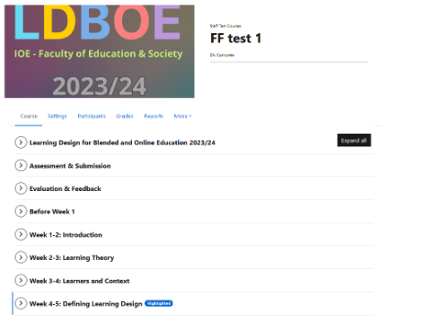
Before (Flexible format) 

Flexible course format


After (Topics format) 

Topics course format

Changing course format will remove any section images, so staff should save these images prior to changing formats if they wish to re-use them.  

Staff can experiment with how their course looks in another course format using the 4-demo environment. 

The recommended steps for staff to complete would be to

  1. Test out new course format in the 4-demo environment.
  2. Save any section images you want to re-use on your live Moodle course (optional).
  3. Notify your students with a Moodle announcement.
  4. Change your course format from Flexible Format to the format of your choice.
  5. Re-add any section images (optional).
  6. Do a quality check.

Courses from previous academic years and snapshot should be left to automatically switch over to Topics.

Questions?  

If you have any questions or concerns, please get in touch with the Digital Education team.