X Close

Digital Education team blog

Home

Ideas and reflections from UCL's Digital Education team

Menu

Archive for the 'Learning spaces' Category

Addressing ten Moodle accessibility concerns for UCL’s disabled users

By Jessica Gramp, on 17 May 2017

UCL staff from Digital Education Advisory and UCL’s Disability Services teams are currently looking at how to improve the accessibility of UCL Moodle for those with disabilities, which will benefit all users. Information from two focus groups, one with students and one with staff, have highlighted a number of concerns, which the Accessible Moodle project aims to address.

The focus groups identified ten areas of concern (listed in order of priority):

  • Clutter – it is difficult to find what you are looking for amongst irrelevant links and content.
  • Emphasis – understanding what is the most important information is not easy.
  • Layout – page elements are not configurable, there is too much visible at once and the blocks are too wide.
  • Navigation and Orientation – pages are long and disorganised, with links to external services not adequately signposted.
  • Usability – some interfaces, especially for assessments, are particularly difficult to use.
  • Awareness – useful features (skip links) and services (Moodle snapshot) remain unknown to those who would benefit from them.
  • Personalisation – there’s a lack of configurable page elements (blocks, fonts, font sizes and colours) or information about how to do this independently with browser plugins and other assistive technologies.
  • Text – there’s a lot of overly long text that is too small, in a difficult to read font with poor contrast and in difficult formats both in Moodle and the resources it contains.
  • Consistency – there’s inconsistencies between some Moodle courses and conversely some courses not being adequately distinguishable from others.
  • Graphics – there’s heavy reliance of written information that could be expressed more simply with icons and images, with appropriate alternative text for those using screen readers.

The learning curve of using new interfaces, problems with assessment, and clunky mobile access were also mentioned by the focus group participants.

These issues will be addressed by a number of initiatives:

  • A new, more accessible UCL Moodle theme for use on desktop and mobile devices.
  • Changes to Moodle configuration.
  • Enhanced Moodle features.
  • Improved training, staff development and support.
  • Proposals to Moodle HQ and iParadigms (who provide Turnitin) to improve interfaces.

Further updates on this project will follow on the Digital Education blog.

2015 Horizon Report – what are the six key trends in E-Learning?

By Clive Young, on 17 February 2015

nmc_itunesu.HR2015-170x170Every year the NMC Horizon Report examines emerging technologies for their potential impact on and use in teaching, learning, and ‘creative inquiry’ within the environment of higher education. The report, downloadable in PDF, is compiled by an international body of experts and provides a useful checklist trends, challenges and technologies in the field and provides a useful benchmark of what is most talked about at the moment.

The key trends identified in the in the short term are

  • Increasing use of blended learning
  • Redesigning learning spaces

Longer term trends are: growing focus on measuring learning, proliferation of open learning resources, advancing cultures of change and innovation and increasing cross-institution collaboration.

Key ‘solvable’ challenges are

  • Blending formal and informal learning
  • Improving digital literacy

More difficult challenges are; personalising learning, teaching complex thinking and the ‘wicked’ ones are competing models of education and the old chestnut, rewarding teaching.

The important developments in educational technology they identify are in the short term are

  • Bring your own device (BYOD)
  • Flipped classroom – same as last year

Longer-term innovations are; makerspaces, wearable technology, adaptive learning technologies and the ‘Internet of Things’.

As usual there are useful commentaries and links throughout. Encouraging that many of these ideas are already being implemented, trialed and discussed here at UCL.


Summer 2014 learning space improvements

By Paul Burt, on 3 October 2014

Early in 2014 I started collaborating with a project team, comprising of UCL Estates and Facilities staff and external consultants, with the aim of improving four of UCL’s most outdated learning spaces. My role was to give specialist educational design input and throughout the process I tried to ensure the principal function of the spaces, learning and teaching, did not get compromised.

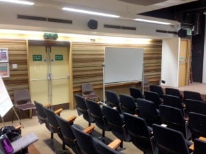
Roberts 309

This 61-seater raked lecture theatre had not been significantly upgraded since probably the 1960’s. Issues particularly noted in this space included the claustrophobically narrow, and not universally accessible, entrance doors and the fact that the lecturer had little choice but to stand and obscure the material they were presenting.

Before photos [click on any photo to enlarge]:
Roberts309_before1

Roberts309_before2

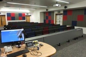
Highlights of the enhancements made

  • One doorway blocked up to create area for teaching station
  • Other doorway made double-width to increase accessibility of room
  • Wheelchair accessible seating positions with moveable study desks
  • Full coverage assistive listening induction loop for use by hearing aid wearers
  • Mains and USB power sockets added to the front two rows of seating
  • Projected image dimensions increased from 2000mm wide to 2750mm
  • Large 3000mm wide column-mounted writing boards deinstalled and reinstalled
  • Improved sight-lines achieved by staggering the seat positions on alternate rows
  • LectureCast system installed
  • Ceiling mounted microphones added to act as fallback pickup for LectureCast (lecture capture)

After photos:
Roberts309_after1

Roberts309_after2

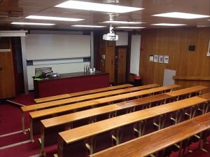
Roberts 508

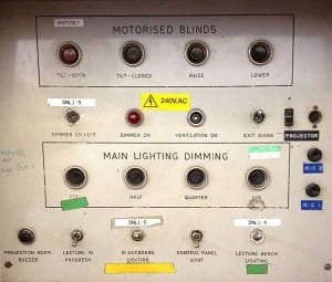
Another raked lecture theatre, capacity 86, which was also a time capsule on the history of lecture theatres.

Before photos:

Roberts508_before1

Roberts508_panel

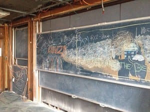
In fact during the renovations a long hidden counter-weighted chalkboard system was uncovered:

Roberts508_old_boards

Highlights of the enhancements made

  • New teaching station and facilities added off-centre
  • Larger projection and writing surfaces added side-by-side
  • Wheelchair accessible seating positions with moveable study desks
  • Full coverage assistive listening induction loop for use by hearing aid wearers
  • Mains and USB power sockets added to the front two rows of seating
  • Improved sight-lines achieved by staggering the seat positions on alternate rows
  • Ceiling mounted microphones added to act as fallback pickup for LectureCast (lecture capture)

After photo:

Roberts508_after1

25 Gordon Street computer room 105

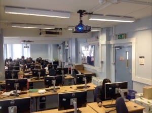
This computer room was uninspiring and a difficult space in which to teach effectively.

Before photo:

GordonStreet105_before1

The main problems were that it was difficult for students to get past those already seated and the length of the room meant the lecturer and the presentation were too distant for students seated at the opposite end.

GordonStreet105_before2

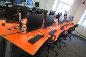
The design decision was made to move the teaching focus of the room to the side and repeat the projection screen three times along the length of the room so that student sight lines are greatly improved.

A novel table design was produced that is very space efficient whilst managing to feel spacious to users.

After photo:

GordonStreet105_after1

Highlights of the enhancements made

  • Circulation and ability to move around room improved
  • Room capacity increased from 33 student computer positions to 45
  • High quality voice reinforcement system so the lecturer can be comfortably heard throughout the space
  • Three large boards which can be used for projection or writing on with a conventional whiteboard pen
  • One of the three projectors has ‘eBeam’ technology which enables use of a special electronic pen, write on one board and it will simultaneously appear on all three
  • Under-utilised network equipment room demolished and replaced with smaller cupboard in corner of room
  • Sleek ‘all-in-one’ computers on fully adjustable desk-mounted arms
  • Two electronically height-adjustable table positions created for wheelchair users
  • Full coverage assistive listening induction loop for use by hearing aid wearers
  • Individual mains sockets added at each seating position for mobile device charging (USB devices can be charged directly off the all-in-one computer)

After photos:

GordonStreet105_after3

GordonStreet105_after2

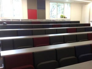
1-19 Torrington Place room B17

This flat-floored lecture theatre had over the years performed a number of different roles including, about ten years ago, being equipped as a virtual reality theatre for built environment visualisation by Bartlett students. The technology for this application was now obsolete and as a general learning and teaching space it was far from ideal as it was depressingly dark with no writing surface and the projected image, despite being a huge screen, was too small for the long viewing distance.

Before photos:

TorringtonPlaceB17_before1

TorringtonPlaceB17_before2

During photo:

TorringtonPlaceB17_during

Highlights of the enhancements made

  • Seating capacity increased from 74 to 92
  • Wheelchair accessible seating positions with moveable study desks
  • Full coverage assistive listening induction loop for use by hearing aid wearers
  • Mains and USB power sockets added to the front two rows of seating
  • Projected image dimensions increased from 2000mm wide to 3400mm wide (now within scope of recommended viewing distances achieved by shortening of the room through creation of a new equipment store and a complex ceiling profile)
  • Large 3500mm wide column-mounted writing boards added (recycled from 25 Gordon Street computer room 105)
  • Improved sight-lines achieved by staggering the seat positions on alternate rows
  • Ceiling mounted microphones added to act as fallback pickup for LectureCast (lecture capture)

After photos:

TorringtonPlaceB17_after1

TorringtonPlaceB17_after2

TorringtonPlaceB17_after3

TorringtonPlaceB17_after4

A note on power sockets

It may at first seem strange that we have opted to fit power sockets to only the front two rows of seating benches in the lecture theatres but there was in fact a sound rationale behind this based on these considerations:

  • Previous surveys have told us that students would like power sockets for charging laptops and other mobile devices whilst in lectures.
  • Fitting power sockets to seating positions is a relatively expensive endeavour as in most spaces it involved cutting a channel into the concrete floor.
  • Year-on-year the battery technology in mobile devices is improving, now it is becoming common for laptops to now have all day batteries – potentially spending significant funds on sockets outlets everywhere could look foolish in a few years.
  • Fitting power sockets to every seating position also does not sit will with UCL’s green ambitions.

So the idea of fitting sockets outlets to only the front two rows was born. By way of an incidental benefit there is the hope that this may help educationally as it will encourage students to sit near the front!

sockets

In many other lecture theatres power sockets are installed beneath the desks. For these refurbishments a low profile desktop-mounted socket was specified as:

  • their presence is more obvious to users
  • they are low enough in profile so that books and notepads can still be places on the desk without issues
  • compared with ‘cubby-box’ mounted sockets there is much less chance of a drink spillage causing problems

Initial feedback from students and staff

This week has been the first use of these refurbished rooms and I have taken the opportunity to be present at the start of a number of the sessions using these spaces. Whilst there have inevitably been some snags with the facilities all of the scheduled teaching has been able to go ahead and the reaction from students and staff has been unanimously positive. On two occasions lecturers who taught in the same space last year have said that they thought they had walked into the wrong room as the transformation has been so extreme.

Reflections on the refurbishments

The design phase of these refurbishments was incredibly tight and what became evident part way through the programme was that the design of the presentation and writing facilities in the rooms needed to dictate many other aspects of the room design. This was particularly evident in 1-19 Torrington Place room B17 where the ceiling profile had to be considerably reworked to permit achieving the required display sizes.

Another victim of the squeezed design phase was that the seating arrangements are near enough direct replacements for what was previously there. A development seen at other universities is what has been christened ‘turn&learn’ seating where seats on alternate rows are able rotate in order to make segments of peer discussion a possibility in the context of a lecture. Another development that is proving popular at a few other UK universities is a design where five or six person benches are constructed around shared table surface.

bench-lecture-theatre

This solution lends itself to integrating problem-based learning activities into a lecture session. Our tight timescales and the architecture of the 2014 refurbishment rooms didn’t lead to opportunities to pilot these kinds of design but the hope is that future refurbishment programmes may offer more scope for innovation.

I would like to thank the hard work of colleagues involved in these projects which has resulted in these remarkable transformations.

Learning and teaching spaces update

By Steve Rowett, on 28 May 2014

It has been a little while since we gave you an update on progress in transforming our learning and teaching spaces, so here’s one now.

We’ve done a lot of work over the last two or three years, from full room refurbishments to ensuring that each centrally bookable teaching space has a PC. It’s great to see that these changes are making a difference. A full room survey by the independent Alexi Marmot Associates rated the equipment and technology in our spaces as 50% four years ago – we now score 80% on the same measure. That’s great progress and thanks to everyone who has been involved.


Easter 2013 and Christmas 2014 programme

To help us deliver more we now undertake smaller work programmes over the Christmas and Easter holidays, with 9 refurbishments already under our belt this year:

  • Chadwick 223 and Bedford Way G11 computer rooms: a full makeover with redecoration, new lighting, furniture and new AV teaching facilities.
  • Gordon House 106: new AV teaching facilities (including its first ever network point!).
  • Foster Court 112/113/114/124 and 14 Taviton 534 and 535: new AV teaching facilities.

The upgrades to the computer rooms are the most impressive. Both rooms were very tired and unattractive before, and now look clean, modern and bright – see an example below. Phil Spencer would be proud of us!


Bedford Way G11 after makeover

Bedford Way G11 after makeover

Thanks to all those in ISD who contributed to these projects and to the many UCL Estates people and external contractors who are involved.

Summer 2014 programme

The summer is always the busiest time for refurbishments, especially those big projects that cannot be fitted into the short timeframe at Easter and Christmas.

Capital projects

This year sees seven major refurbishments led by UCL Estates and funded as UCL capital projects. Roberts 309/508 and 1-19 Torrington Place basement lecture will be stripped back and rebuilt; and Roberts 421 and 422 and 26 Bedford Way G03 will be freshened up with new decoration.

The large computer room in 25 Gordon Square will receive the biggest change, with a full redecoration, new furniture and new all-in-one PCs. E-Learning Environments have been working with UCL Estates on the design of this room, including custom-built furniture which not only enhances the layout for teaching but also increases the capacity of the room.

Summer works

A further 20 or so rooms will receive replacement audio-visual facilities along with associated minor redecoration as part of the ‘summer works’ programme jointly funded by UCL Estates and ISD and managed by Tim Burles in the ISD ITCPD team. A summary of the works planned are given below, but please note these are still subject to change:

  • Archaeology 117 and 501: redecoration and new teaching facilities (small computer room specification: teaching PC and display)
  • Small classrooms in Cruciform and Rockefeller (10 of them): redecoration and new teaching facilities (small classroom specification: wall mounted PC and display)
  • Chadwick B05: New teaching facilities (standard classroom specification)
  • Pearson G23: New teaching facilities (standard classroom specification plus repeater screens)
  • Pearson G26: New teaching facilities (standard classroom specification)
  • 26 Gordon Square B32: New teaching facilities (standard classroom specification plus extra projector to accommodate L shape)
  • Roberts 110: (upgrade of projection/wiring)
  • Rockefeller G02: New teaching facilities (standard classroom specification)
  • Chandler B01, B02, G10 and 118 (standard classroom specification – B01 still under discussion due to need to maintain fire exit access)

Note that a number of these projects are now using the UCL standard classroom specification, albeit occassionally with some modifications such as repeater screens to accommodate awkwardly-shaped rooms. Details of this specification and much more information about our aspirations for learning spaces are available in UCL’s Learning Spaces Guidelines.

Other projects

Some further projects aim to tackle service and technology issues that were raised in the 2013 staff survey:

  • Ensuring that each teaching space has a working phone, clearly labelled with its number, and fixed or attached to a wall or desk.
  • Microphone improvements to reduce the number of silent Lecturecast recordings.
  • A full room audit to update the information on the room bookings website.

It’s a busy programme, and thanks in advance to the many people in ISD who will be involved for their efforts.

A backwards look at the evolution of the classroom

By Paul Burt, on 20 January 2014

I started planning this blog post with the intention of writing about our current strategy for classroom Audio Visual (AV) equipment and teaching facilities. However it soon became clear to me that any discussion about the current state of play for classroom equipment is so intertwined with the recent history of the equipment that it would be helpful to first share some thoughts and observations on what we have gained, and possibly lost, in the name of progress in recent decades.
The equipment installed in UCL classrooms, and in classrooms throughout the country, has seen a marked evolution over the past twenty years mainly as a result of the development of the LCD/DLP data projector in the latter half of the 1990’s. Although video projectors had been around for about twenty years prior to that date they had been prohibitively expensive three-lens behemoths that needed regular re-calibration and were typically too heavy to be moved around. For these reasons video/data projectors only really started to appear in the classroom with advent of LCD/DLP projector technology and the resultant shrinking of both the size and cost of the units.
Data projectors either quickly replaced or at least called into question a number of other technologies that were previously commonplace in the classroom:
  • 35mm slide projectors – these went pretty quickly from most classrooms which was probably somewhat premature as this technology offered an image quality that is only just being achieved by today’s best data projectors. However from a support perspective they were prone to jamming and mechanical failures. It is also a fair observation that for many subjects the convenience offered by the data projector was worth the compromise in image quality. The slide projector’s days became numbered as a result of the data projector’s ability to display images when used in conjunction with a PC or laptop
  • Televisions – often mounted on a trolley and combined with a VHS video recorder, these units were a convenience upgrade from 8mm or 16mm cine film projectors. However in the classroom the television always suffered from a number of drawbacks including the fact that the CRT screen was incredibly heavy (resulting in giant trolley bases) and gave a screen size only adequate for smaller learning spaces. Now video content played back from a dedicated video disc player or from a computer can be displayed via the data projector to the whole class in good quality (even in full HD in some of our classrooms).
  • Overhead projectors – from the perspective of AV teams across the country this was the one technology that refused to die when told to. Prior to the data projector the overhead projector (OHP) was the primary way a lecturer could present pre-prepared materials in the classroom. Typed or printed material, including diagrams and images, could be photocopied onto transparency material that was then projected. Areas of the materials could be highlighted by masking off portions of the light source with a piece of card and annotation could be easily added to the slides with pens of any colour. Blank transparency roll could be used as a writing surface that would be progressed throughout the session and then rewound if recapping or a question on earlier material was raised. The technology was inherently simple and thus relatively reliable (most units even held a spare bulb that could switched into play via a lever). In comparison the saved PowerPoint presentation could be seen as a constrictive and non-agile teaching tool. The requirement for either a computer already in the room (a much more recent milestone for most institutions, UCL included) or for the lecturer to own/carry a laptop and know how to perform the apparent black magic of matching resolutions and setting the display to mirror often proved such a barrier that staff would protest at the removal of OHPs (some still linger in the corners of our classrooms). The natural successor to the OHP is the document camera/visualiser linked to the data projector. On first impressions this technology should fulfil most of the purposes people had for OHPs and offer further benefits such as being able to zoom in on objects and for the display to be captured in a lecture recording. However the usefulness of visualisers has also been overplayed in some institutions where they were also looked upon as the solution for the live display of writing which is where the physical design of the visualiser can let things down a little. I’ll expand on this subject, and the importance of the display of live writing, in a subsequent posting.
One general observation that results from the progress that has been achieved by convergence of all classroom presentation technologies onto the data projector is that now it is critical that this one piece of equipment is working. Luckily the failure of data projector lamps is somewhat more predictable than previous projector technologies meaning that good maintenance should prevent interruption to classes and in the near future there is the promise of ‘lampless’ projectors (with non-replacable LED/laser light sources).
As I say at the start of this post, my intention in looking backwards is to ensure we don’t lose sight of some of the good points, along with the many bad points, of what is now the obsolete.

The spaces of envy

By Steve Rowett, on 11 March 2013

Paul, Vicki and myself had the privilege of welcoming Graham Walton from Loughborough University to UCL following a reciprocal visit last week.

Our two campuses could not be more different.

UCL is landlocked in Bloomsbury, heart of the University of London, in one of the most intense concentrations of college buildings in Europe. Every virtue and vice of the capital is on the doorstep. Loughborough is a low-rise, spacious campus with excellent sports facilities and acres of playing fields.  And a long walk to the town centre.

Yet there was much common ground to enjoy on our tours, not least seeing the ways in which students made spaces their own, confounding our attempts to ‘keep the furniture here’ or ‘make this room silent there’. Lots of thinking about the organic, evolving use of spaces, and plenty of just watching what was happening.

Tours of UCL usually take in three of my favourite spaces on campus.

The UCLU Wolfson Study is a student owned space where anarchy – of the most thoughtful kind – ensures the kind of collective respect of the space and others around, even when they are strangers. The fact that students voted to turn a bar into an alcohol-free study area seems to mark this room as a hard-won achievement; a victory for the student voice that is guarded with a sense of pride.

The second is the BASc (Bachelor of Arts and Sciences) common room, a new type of space at UCL for a new type of programme – and probably a new type of student. These are free-range students, allowed to graze on a diet from across the academic spectrum, and they are experts in negotiation and driving consensus in all that they do. The ever-changing layout of the funky furniture, accessories brought in from home, decorated fish tank with its feeding rota, the self-organising committee posters are the markers they leave in their territory.

The third of my favourites – for today – is the pilot room in the Cruciform Hub. It’s actually very modest in what it does, but its purpose is to try things out, make mistakes and learn from them. And mistakes were certainly made; the benches and seats don’t work well together (unless you have particularly long arms), the exposed group working monitor doesn’t get used due to lack of privacy, and so on. But so much more was got right, and simple observations help us know what to do better when the real Cruciform Hub work starts later this year.

Graham noted that we’d seen about 10 different learning environments in our 90 minutes on the campus, which I reckon is about 5 or 6 more than we had – or at least knew we had – a couple of years ago.  I wish I could take the credit for having written all 10 down in some planning document three years ago, but I didn’t so I can’t. Instead, our students inhabit, colonise, adjust and redefine our spaces to make them their own, and tell us a little more about learning each time they do so.

By the way, if you are a UCL person, feel free to go and look at the Wolfson Study or the Cruciform Hub pilot room.  But as for the BASc common room, you’ll have to make do with just peering in the windows along Malet Place – your card is unlikely to open the door. But see what you think, and if you experience a touch of ‘common room envy’, you won’t be the first.