X Close

Researchers in Museums

Home

Engaging the public with research & collections

Menu

Multispectral Imaging of Leonardo da Vinci Drawings

By Cerys R Jones, on 16 June 2019

In the first year of my PhD, I was asked by Alan Donnithorne, the former head of conservation of prints for the Royal Collection Trust, whether I would be interested in capturing multispectral images of three Leonardo drawings for a book he was writing. Of course I eagerly agreed and in July 2016 Alan brought three beautiful studies by Leonardo to UCL ready for imaging.

The first drawing was the ‘Studies of horses and horses’ heads’ created circa 1481. This is a metalpoint drawing of the portrait of a horse’s head and another in side-profile. To create a metalpoint drawing, a metal-nibbed stylus is used to engrave lines onto paper that has been prepped with glue and ground animal bone, whilst also leaving a deposit of the metal. Although only two horses heads could be seen in visible light, when illuminated in ultraviolet light, two more horses and a dog appeared at the bottom of the page that were invisible to the human eye.

‘Studies of horses and horses’ heads’ illuminated under visible light (left) and after multispectral imaging (right). The two horses and dog at the bottom of the page cannot be seen using the human eye alone. (Image copyright: Queen Elizabeth II, Moral rights: Cerys Jones)

The second drawing was of ‘the anatomy of a bear’s foot’, circa 1488-90. Leonardo initially studied anatomy to inform his paintings;however,this eventually evolved into a plan to write a never-completed treatise on the subject. Martin Clayton, in his 2019 book Leonardo da Vinci: a life in drawing, explained how, at the time, human dissection was illegal and so Leonardo may have been interested in the bear’s foot due to the similarity in the way humans and bears walk. The multispectral imaging of this drawing enabled the different materials (metalpoint, pen and ink, and white heightening) to be separated and show how Leonardo built up his compositions.

The final drawing was a study for ‘the drapery of the Madonna’s arm’ (c. 1510-1515) created for ‘the Madonna and Child with St Anne and a lamb’, a painting currently in the Louvre Museum in Paris. The multispectral imaging revealed the outline of the arm under the drapery,implying that Leonardo first drew a template for the arm and then built the drapery on top of that . The images also enhanced the different materials, including black and red chalk, pen and ink, brush and ink, and white opaque watercolour.

Capturing the multispectral images of the study for ‘the drapery of the Madonna’s arm’. (Image: Cerys Jones)

The full results from this imaging are in Alan’s book Leonardo da Vinci: A Closer Look. This fascinating book investigates many of the Leonardo da Vinci drawings held in the collection at Windsor Library, using a variety of imaging techniques, including multispectral imaging, microscopy, X-Ray fluorescence, and more. He shows Leonardo’s drawings in a way never seen before—including these features invisible to the human eye—to present a detailed view of Leonardo’s musings and thoughtful mind.

The studies for ‘the anatomy of the bear foot’ and ‘the drapery of the Madonna’s arm’ are currently on display in the Queen’s gallery as part of the new exhibition Leonardo da Vinci: a life in drawing to commemorate the 500-year anniversary of Leonardo’s death. This exhibition displays over 200 drawings from Leonardo’s life, spanning a range of topics including anatomy, optics, engineering, botany, cartography and more. I was honoured to be invited to a private view of the exhibition before it was open to the public to celebrate Leonardo’s work and the release of the book. The exhibition is captivating and provides a fascinating insight into Leonardo’s mind, which you can see jumping across subjects on a single piece of paper. I encourage everyone to attend and be inspired by Leonardo’s inquisitive and ingenious mind.

If you’re interested in learning more about my work on the Leonardo drawings, check out my poster!

At the private view of the Leonardo da Vinci: a life in drawing exhibition at the Queens Gallery in Buckingham Palace (Image: Cerys Jones)

Colours of Ancient Egypt – Yellow

By Anna Pokorska, on 20 February 2019

This is the fourth post in the Colours of Ancient Egypt series; here you can read the introduction, here all about the colour blue, and here about the colour red.

Due to its availability in several different forms and shades, yellow was present in many aspects of ancient Egyptian art and decoration, from painting to pottery.

Fragment of a vessel (Petrie Museum, UC25325; Photo: Anna Pokorska).

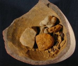
Pottery vessel containing rough pieces of pale and deep yellow pigment (Petrie Museum, UC59746).

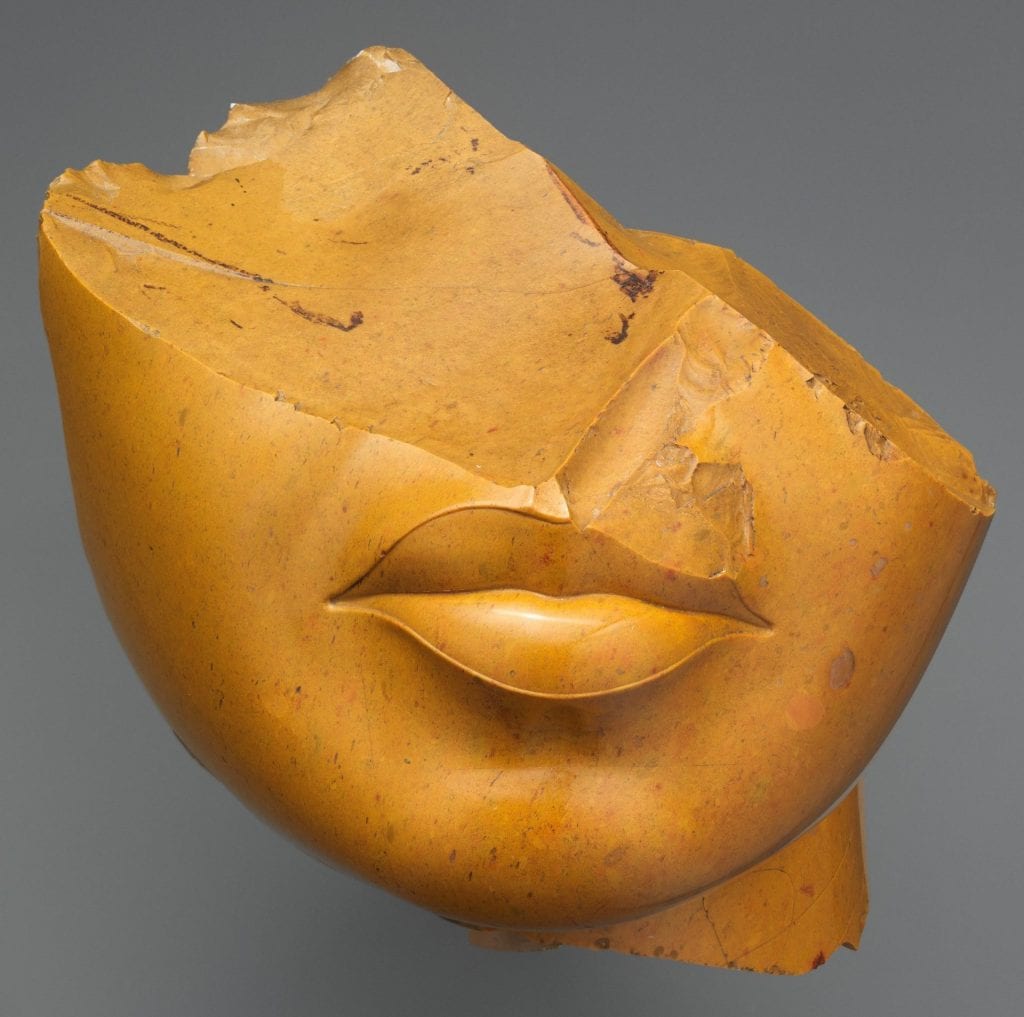
Just as men’s skin was painted red in Egyptian painting, women’s can be distinguished by its yellow colouring, which we can see in a fragment of a statue made out of yellow jasper possibly depicting Queen Nefertiti or Queen Kiya and dated ca.1353–1336 BC.

Fragmentary head of a Queen in yellow jasper, from the 18th Dynasty (Metropolitan Museum of Art, NY).

Yellow was also used to mimic gold in works where the use of the precious metal wasn’t possible. The most prevalent yellow pigments in ancient Egypt were derived from natural ochres and had the same properties as their red equivalents — but they were by no means the only source of the colour.

Painted linen mummy shroud painted with red lead, carbon black, orpiment and Egyptian blue pigments (Petrie Museum, UC38058).

Orpiment was a common yellow pigment with a rich lemon or canary yellow shade. It is an arsenic sulphide and occurs naturally in small deposits as a product of hydrothermal veins, hot spring deposits and volcanic sublimation, although nowadays it can be easily obtained artificially. The arsenic content makes it highly toxic and the sulphur will darken lead-based pigments if used together in a mixture.

Closely related to — although not as widespread as — orpiment is an orange pigment called realgar which can often be found in the same deposits. Despite its toxicity, it was the only orange pigment available until chrome yellows and oranges were introduced in the beginning of the 19th century. An interesting feature of realgar is that prolonged light exposure turns it into a yellow compound called pararealgar without changing its elemental composition.

In addition, Egyptians were able to synthetically produce a highly toxic lead (II) antimonate, also known as Naples yellow. It was often used as an enamel colour from about 1500BC, although it didn’t appear in painting until the Renaissance. As one of the oldest produced artificial pigments it was highly toxic and provided a warm orange shade of yellow. Interestingly, a mineral of the same chemical composition, called bindheimite, exists in nature but wasn’t used to create the pigment. Instead it was made by a calcination of a lead compound (such as lead white) with an antimony compound (e.g. potassium antimonate). A 19th century recipe recommends mixing the ingredients, placing them over a gentle heat and then gradually increasing the temperature. After approx. 5 hrs the calcination is complete, and the resulting product can be ground in water with an ivory spatula (because iron can react with the powder and change its colour). The shade of the pigment could also be manipulated by changing the proportions of the ingredients. Lead antimonate is very stable to light exposure but due to the lead content will turn black on contact with hydrogen sulphide (e.g. in air).

Why were so many dangerous substances used as pigments for so long, especially as harmless clays were so abundant? Although their toxic effects were known, the depth and brilliance of the lead and arsenic compounds made the natural iron oxides appear rather dull and brownish in colour by comparison. In fact, even the pigments that strove to replace them — cadmium, chromium and cobalt yellows which appeared during the 19th century — are all harmful to some extent, and it wasn’t until the development of organic pigments (based on carbon and hydrogen) that we overcame this issue!


Colours of Ancient Egypt – Red

By Anna Pokorska, on 4 December 2018

This is the third post in the Colours of Ancient Egypt series; here you can read the introduction, and here all about the colour blue.

Red was an easy colour to obtain in ancient Egypt as naturally red minerals, or clays, were abundant. In fact, they were already used as pigments for painting in pre-historic times. Of the earth pigments, as they are often called, ochre was used for red colouring. Like others, it is an iron oxide but gets its red shade from a mineral hematite, which can be naturally present in varying quantities. Another way of obtaining the pigment is by heating the more common yellow clay to produce what is called ‘burnt ochre’.

Painted wooden stela showing man Ihefy adoring hawk-headed Horus (Petrie Museum, UC14695).

In ancient Egyptian painting we find the red colour often used to distinguish gender, as men’s skin was often painted red[1]. We can see an example of that in this painted wooden stela from the Petrie Museum.

Less obviously, red ochre was also popular in cosmetics such as rouge and lip colour. In fact, those pigments are still found in beauty products today due to their ready availability, stability and non-toxicity. However, perhaps the most surprising application of these materials is actually medicinal. The Ebers Papyrus, one of the oldest and most important medical texts from ancient Egypt (dated 1550 BC), prescribes ochre clays as a cure for any intestinal or eye problems.

However, minerals were not the only source of red colourants. Ancient Egyptians were also able to tint their textiles using madder or kermes carmine dyes. The former was derived from the root of a madder plant, rubia tinctorum (see below).

Madder plant (Image: Franz Eugen Köhler).

It was one of the most widely used natural red dyes until the development of synthetic equivalents in the 19th and 20th century. In fact, some madder-dyed cloth was even found in Tutankhamun’s tomb. On the other hand, kermes carmine was made from wingless insects found on certain species of European oak trees. Like madder it was used both as a textile dye and a lake, which is a pale pigment obtained by precipitating a dye onto an inert colourless substrate such as chalk. Kermes’ deep crimson shade made it a very popular colourant for centuries.

So far, I’ve mainly talked about pigments and dyes used for decoration, but I would be remiss if I didn’t mention at this point one of my favourite objects in the Petrie collection:

Fragment of a composite statue from Amarna: right ankle and heel, in red jasper (Petrie Museum, UC150; Photo: Anna Pokorska).

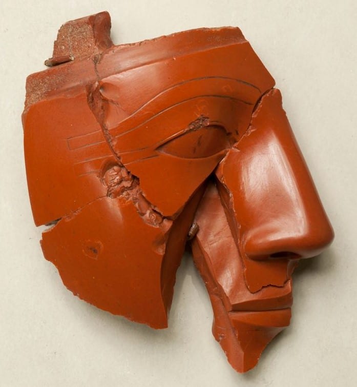
This is a right ankle and heel in red jasper, part of a full-size composite statue from Amarna, dated to the 18th Dynasty. I’ve often stopped in front of it imagining what the statue would have looked like whole. I have to admit that I previously assumed the sculpture to have been entirely made of red jasper, which, in my mind, looked incredible. However, that was not the case; only the exposed flesh would have been carved from red jasper (thus depicting a male figure), while the rest of the statue was likely made from Egyptian alabaster, limestone or wood. The Metropolitan Museum of Art in New York has fragments of a king’s head made of the same material and dated to the same period. In fact, some of the fragments come from the Petrie collection which makes me wonder if they were perhaps part of the same statue.

Fragmentary head of a king in red jasper, from the 18th Dynasty (Metropolitan Museum of Art, NY).

We may never know. But one thing is certain: even though we’ve since been able to create many synthetic red colourants of various shades, natural red pigments used by the ancients remain as popular as ever.


[1] Lorelei Corcoran, Color Symbolism, in ‘The Encyclopedia of Ancient History’, Edited by Roger S. Bagnall, Kai Brodersen, Craige B. Champion, Andrew Erskine, and Sabine R. Huebner, Blackwell Publishing Ltd. (2013), pp. 1673–1674

Colours of Ancient Egypt – Blue

By Anna Pokorska, on 16 October 2018

This is the second in the Colours of Ancient Egypt series; if you want to start at the beginning, click here

The colour blue has already featured in a couple of posts in this blog (e.g. check out Cerys Jones’ post on why the Common Kingfisher looks blue) but it seems impossible to me to discuss colour, especially in Ancient Egypt, and not start with blue. Arguably, blue has the most interesting history of all the colours, which can be attributed to the fact that it is not a colour that appears much in nature – that is, if you exclude large bodies of water and the sky, obviously. Naturally occurring materials which can be made into blue colourants are rare and the process of production is often very time-consuming. In Ancient Egypt, pigments for painting and ceramics were ground from precious minerals such as azurite and lapis lazuli; indigo, a textile dye now famous for its use in colouring jeans, was extracted from plants.


Left: two pieces of azurite (Petrie Museum, UC43790); Right: lapis lazuli (Image: Hannes Grobe)

However, all the above-mentioned colourants presented issues which limited their use. Azurite pigment is unstable in air and would eventually be transformed into its green counterpart, malachite. Lapis lazuli had to be imported from north-east Afghanistan (still the major source of the precious stone) and the extraction process would produce only small amounts of the purest colourant powder called ultramarine. Finally, indigo dyes can fade quickly when exposed to sunlight.

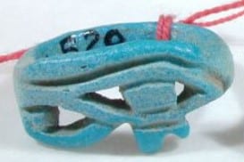
And yet it seems that the Ancient Egyptians attributed important meaning to the colour blue and it was used in many amulets and jewellery pieces such as the blue faience ring, lapis lazuli and gold bracelet or the serpent amulet from the Petrie Museum collection (below).

From left to right: blue faience ring with openwork bezel in form of uadjat eye (Petrie Museum, UC24520); lapis lazuli serpent amulet (UC38655); fragment of bracelet with alternative zig-zag lapis lazuli and gold beads (UC25970).

Therefore, the race to artificially produce a stable blue colourant began rather early. In fact, the earliest evidence of the first-known synthetic pigment, Egyptian blue, has been dated to the pre-dynastic period (ca. 3250 BC)[1]. It was a calcium copper silicate (or cuprorivaite) and – although the exact method of manufacture has been lost since the fall of the Roman Empire – we now know that it was made by heating a mixture of quartz sand, a copper compound, calcium carbonate and a small amount of an alkali such as natron, to temperatures over 800°C.


Fragment of fused Egyptian blue (Petrie Museum, UC25037).

This resulted in a bright blue pigment that proved very stable to the elements and was thus widely used well beyond Egypt. In fact, its presence has recently been discovered on the Parthenon Marbles in the British Museum due to its unusually strong photoluminescence, i.e. when the pigment is illuminated with red light (wavelengths around 630 nm) it emits near infrared radiation (with a max emission at 910 nm).

After its disappearance, artists and artisans had to make do with natural pigments and, being the most stable and brilliant, ultramarine became the coveted colourant once again. In fact, during the Renaissance, it is reputed to have been more expensive than gold and, as a result, often reserved for the pictorial representations of the Madonna and Christ. And so, the search for another replacement was back on. But it wasn’t until the early 1700s that another synthetic blue pigment was discovered, this time accidentally, by a paint maker from Berlin who, while attempting to make a red dye, unintentionally used blood-tainted potash in his recipe. The iron from the blood reacted with the other ingredients creating a distinctly blue compound, iron ferrocyanide, which would later be named Prussian blue. Naturally, other man-made blue pigments and dyes followed, including artificial ultramarine, indigo and phthalocyanine blues.

However, it wasn’t quite the end of the line for Egyptian blue, which was rediscovered and extensively studied in the 19th century by such great people as Sir Humphry Davy. And not only are we now able to reproduce the compound for artistic purposes, scientists are finding more and more surprising applications for its luminescence properties, such as biomedical analysis, telecommunications and (my personal favourite) security and crime detection[2].

References:

[1]  Lorelei H. Corcoran, “The Color Blue as an ‘Animator’ in Ancient Egyptian Art,” in Rachael B.Goldman, (Ed.), Essays in Global Color History, Interpreting the Ancient Spectrum (NJ, Gorgias Press, 2016), pp. 59-82.

[2] Benjamin Errington, Glen Lawson, Simon W. Lewis, Gregory D. Smith, ‘Micronised Egyptian blue pigment: A novel near-infrared luminescent fingerprint dusting powder’, Dyes and Pigments, vol 132, (2016), pp 310-315.

Colours of Ancient Egypt – Introduction

By Anna Pokorska, on 18 August 2018

When viewing exhibitions of objects from ancient Egypt (or any ancient civilisation for that matter) we are used to seeing the beige and grey appearance of bare stone. Indeed, we have come to appreciate the simplicity and purity of ancient sculptures, reliefs and carvings, perpetuated by the numerous plaster casts made and distributed both for research or as works of art in their own right (case in point – the Plaster Court at the Victoria and Albert Museum).

However, this is quite far from the truth. In fact, colour was not only common but of great symbolic importance in Egypt. This is hardly surprising as we use colour to communicate every day even in the modern era (with the most obvious and striking example of the traffic light system, or the wearing of black in many cultures to signal mourning). Although some traditional meanings will have changed over the centuries and varied between cultures, the principle still remains and is widely studied and exploited in a fascinating way in such fields as psychology, marketing and advertising. But I digress…

Let us return to ancient Egypt. To date, many attempts have been made to restore the original colours of artefacts. One such example is the virtual restoration of the Temple of Dendur at the Metropolitan Museum of Art in New York where experts have a created a colour projection to be overlaid on top of the damaged hieroglyphs. An article on the whole project, called Color the Temple, can be read here.

Some people object to these types of intervention, sceptical of how well they recreate and represent the work of the artist, especially if little physical evidence of the original colours in a particular artefact exists. And indeed, we must always be careful when it comes to any type of restoration to take it only for what it is – someone else’s idea of what the object would have originally looked like (often dependent on the restorer’s skill). Although they might still have a way to go, I personally find these virtual restoration techniques intriguing and full of potential. They certainly help my imagination and understanding of the ancient Egyptian civilisation.

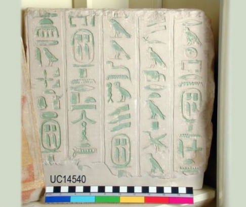
But we can find authentic and undamaged examples of colour even in the Petrie Museum collection. One of the first objects one sees when entering the main exhibition is a limestone wall block fragment from the pyramid of King Pepy I at Saqqara, its beautiful hieroglyphs tinted in green (below).

Wall block fragment from the pyramid of King Pepy I at Saqqara. (Petrie Museum, UC14540)

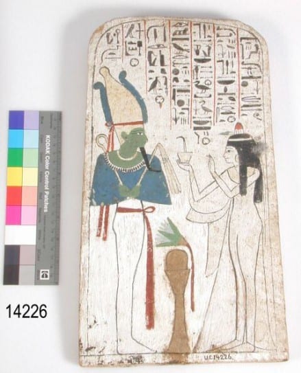
Painted wooden stela of Neskhons, wife of the High Priest of Amun Pinedjem (II) making an offering to Osiris. (Petrie Museum, UC14226)


While on the other side of the display is a painted, rather than carved, wooden stela of Neskhons, wife of the High Priest of Amun Pinedjem (II) making an offering to Osiris (above).

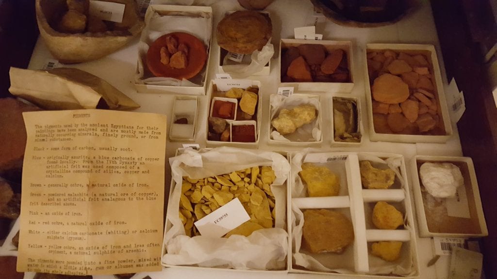
Egyptian artists would have had at their disposal mostly pigments made from grinding common (as well as some not-so-common) minerals and earths. Hidden away in the Petrie Museum storage is a drawer full of exactly those kinds of pigments (below).

Pigment drawer in storage at the Petrie Museum. (Photo: Anna Pokorska)


The yellowed typed note reads:

‘The pigments used by the ancient Egyptians for their paintings have been analysed and are mostly made from naturally occurring minerals, finely ground, or from natural substances.

Black – some form of carbon, usually soot.

Blue – originally azurite, a blue carbonate of copper found locally. From the IVth Dynasty on artificial frit was used composed of a crystalline compound of silica, copper and calcium.

Brown – generally ochre, a natural oxide of iron.

Green – powdered malachite (a natural ore of copper), and an artificial frit analogous to the blue frit described above.

Pink – an oxide of iron.

Red – red ochre, a natural oxide of iron.

White – either calcium carbonate (whiting) or calcium sulphate (gypsum).

Yellow – yellow ochre, an oxide of iron and less often orpiment a natural sulphide of arsenic.

The pigments were pounded in to a fine powder, mixed with water to which a little size, gum or albumen was added to make the whole adhesive.’

Unfortunately (or perhaps fortunately), this subject is too broad and interesting to fit into a single blog post and I’ve decided to explore it further, perhaps expanding beyond Egypt and the ancient times. We shall see where this journey takes me, but I hope you will join me as I investigate individual colours in my future posts.

 You can now read about the colours blue and red.

Of Gastropods and Glass: The Grant Museum’s Blaschka Models of Invertebrates

By Hannah L Wills, on 24 April 2018

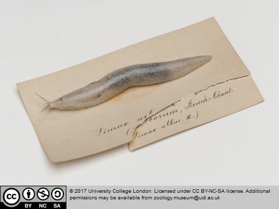
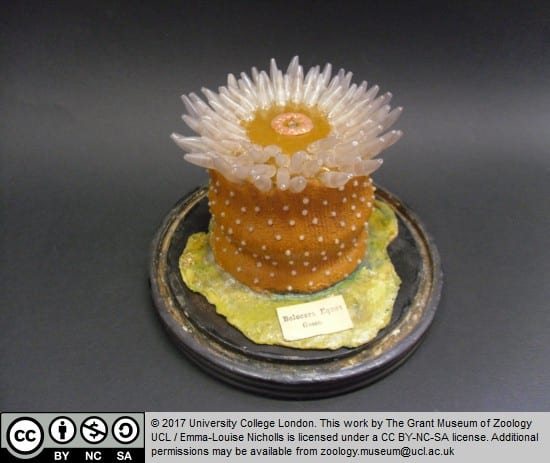
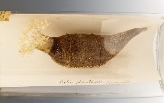
This week it’s time for another of my favourite objects from the UCL museums, today from the collections of the Grant Museum of Zoology. Displayed in a case near the front of the museum is a collection of extraordinary objects. At first glance, these objects appear somewhat otherworldly; their lightly transparent and almost twinkling surfaces captured my attention from my very first visit. They are, of course, the Grant Museum’s collection of glass models of invertebrates, a collection that includes jellyfish, sea anemones, gastropods, and sea cucumbers, produced at the end of the nineteenth century by the Blaschkas, a renowned family of Czech jewellers.

Limax arborum (tree slug). Blaschka glass model of a white slug, (P202). Image credit: Grant Museum.

Actinia equina (beadlet anemone). Blaschka model of a beadlet anemone. Red/orange body with white beadlets. The tentacles are transparent. On a black wooden base, under a glass dome, (C373). Image credit: Grant Museum.


The Blaschka family

The models in the museum’s collection were produced by Leopold and his son Rudolph Blaschka in the late 1800s, and may have been ordered by E. Ray Lankester during his time at UCL as professor of zoology.[i] Leopold Blaschka was born in 1822 in Northern Bohemia (today part of Czechia), in Aicha, a village known for its glasswork and decorative crafts.[ii] The Blaschka family specialised in producing jewellery using a range of materials, including glass, metal, and semi-precious stones. During his career, Leopold developed an interest in natural history, and began producing and selling models of invertebrates in the mid-1860s. The models were created using glass, wire, glue and paint, and occasionally incorporated parts of once-living creatures, including snail shells (see below).[iii] Today, Blaschka invertebrate models can be found in museums all over the world. The Harvard Museum of Natural History also holds a collection of glass flowers created by the Blaschkas, commissioned by the university in 1890.[iv]

Arianta arbustorum (copse snail). Blaschka glass model, (P196). Image credit: Grant Museum.


Why make specimens out of glass?

Passing the collection of models for the first time, a visitor to the Grant Museum could be forgiven for mistaking these models for specimens that were once alive. In light of the museum’s other displays, which feature real animals preserved using a variety of methods, one might wonder why artificial specimens, such as the Blaschka models, should be on display in a museum of natural history. While some creatures, such as mammals, birds, and fish, are easily preserved using methods of taxidermy, flowers and the softer bodies of invertebrates pose specific challenges in terms of their preservation. Putting these specimens into alcohol causes them to lose their shape and colour.[v] By creating models out of glass and other materials, it is possible to depict the vibrant colours and forms of the original specimens, allowing these creatures to be preserved and studied.

Art, Science, and ‘Jokes of Nature’

Former student engager Niall Sreenan has mused on the nature of the Blaschka models as artificial creations that occupy an ambiguous realm between nature and art.[vi] As a historian of science, I am fascinated by this interplay, particularly as it relates to the practice of natural history and the display of specimens. The relationship between art, nature, and science held great significance to the practice of natural history in sixteenth and seventeenth-century Europe. As the historian Paula Findlen has noted, collectors of natural specimens in the Early Modern period were fascinated by the idea that Nature, as a creative force who produced all the objects and creatures in the world, sported or played in her work by producing ‘jokes of nature’.[vii] Such ‘jokes of nature’ incorporated instances where natural objects appeared to ‘mimic’ human artifice, as seen in unusual fossils, geometric crystals, or in stones which appeared to have pictures implanted within them.[viii] ‘Jokes of nature’ were connected to science through the idea that man might match nature using art. Artificial creations and human imitations of natural forms were thought to mimic these jokes in a way that was central to natural philosophers’ understanding of the world.[ix]

Though produced over a century later, the Blaschka glass models call to mind this ambiguous division between human artifice and natural object. As models of difficult-to-preserve specimens, they allow visitors to understand what these creatures look like. On the other hand, they draw attention to human ingenuity and skill in the way they artfully capture the look of organic specimens.

Sea cucumber (female). Blaschka glass model in a cylindrical specimen jar, (S73). Image credit: Grant Museum.


The end of a craft

In 1895, Leopold Blaschka died. When his son retired in 1938 with no apprentices left at the firm, the Blaschka family business closed.[x] The skills used to produce the models died with the Blaschka family, and their work has not been repeated since.[xi] The models in the Grant Museum stand as a remarkable testament to unique craftsmanship and skills now lost.

Though models are no longer produced using the techniques once used by the Blaschka family, the relationship between art and natural history continues to fascinate contemporary artists. Grant Museum Manager Jack Ashby has recently written about the ways in which artists explore and reference the methods of natural history, and the treatment of both living and preserved animal specimens on display.[xii] Exploring the intersection of natural history and art, whether in the creation of model specimens or in the interrogation of the practices of natural history, can prompt us to question the ways in which natural and man-made objects are encountered in museums, and the way we understand an object’s (and our own) relationship with the natural world.


References

[i] ‘Blaschka Glass Model Invertebrates’, UCL Grant Museum, https://www.ucl.ac.uk/culture/grant-museum-zoology/blaschka-glass-models-invertebrates [Accessed 23 April 2018].

[ii] ‘Blaschka Models’, National Museums Scotland, https://www.nms.ac.uk/explore-our-collections/stories/natural-world/blaschka-models/ [Accessed 23 April 2018].

[iii] Ibid.

[iv] Ibid.

[v] ‘Blaschka Models’, National Museums Scotland, https://www.nms.ac.uk/explore-our-collections/stories/natural-world/blaschka-models/ [Accessed 23 April 2018].

[vi] Niall Sreenan, ‘”Strange Creatures” – Reflections – Part One’, 25 June 2015, https://blogs.ucl.ac.uk/researchers-in-museums/2015/06/25/strange-creatures-reflections-part-one/ [Accessed 23 April 2018].

[vii] Paula Findlen, “Jokes of Nature and Jokes of Knowledge: The Playfulness of Scientific Discourse in Early Modern Europe,” Renaissance Quarterly 43, no. 2 (1990): 292-96.

[viii] Ibid., 297-98.

[ix] Ibid.

[x] ‘Blaschka Models’, National Museums Scotland, https://www.nms.ac.uk/explore-our-collections/stories/natural-world/blaschka-models/ [Accessed 23 April 2018].

[xi] ‘Blaschka Glass Model Invertebrates’, UCL Grant Museum, https://www.ucl.ac.uk/culture/grant-museum-zoology/blaschka-glass-models-invertebrates [Accessed 23 April 2018].

[xii] Jack Ashby, ‘When Art Recreates the Workings of Natural History it can Stimulate Curiosity and Emotion’, 19 April 2018, https://natsca.blog/2018/04/19/when-art-recreates-the-workings-of-natural-history-it-can-stimulate-curiosity-and-emotion/ [Accessed 23 April 2018].

A Fine Vintage: Grapes and Wine in Ancient Egypt

By Hannah L Wills, on 20 March 2018

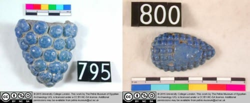
Some of the best conversations I have with visitors in the UCL museums start with the question ‘what’s that?’. A couple of weeks ago, I was asked about an object by a visitor to the Petrie Museum of Egyptian Archaeology, as we stood in front of a case containing an array of small objects. The artefact in question was an oval-shaped sculpture with a point at one end, covered on its surface with a pattern of bubble-like protrusions, made from the pale blue ceramic faience. The case contained a number of similarly shaped objects, and a fired clay mould bearing similar bubble-like impressions.

UC795 and UC800, sculptures found in Amarna, Dynasty 18 (1549 BC – 1292 BC). Image credit: Petrie Museum.

UC1700, fired clay mould used in producing faience sculptures similar to those pictured above. Amarna, Late Dynasty 18. Image credit: Petrie Museum.


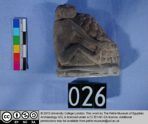
After looking them up on the museum’s online catalogue, we discovered that these small objects were depictions of bunches of grapes, produced using moulds like the one displayed in the case. Grape bunches can be found in a variety of objects in the Petrie Museum, in small sculptures like the ones above, and as part of other artefacts. One of the museum’s faience bead necklaces, likely worn by Tutankhamen’s father and described in a recent blog post, features no less than 83 small bunches of grapes among its beads. Other objects in the museum’s catalogue include fragments of plaster featuring painted designs that incorporate bunches of grapes and vines, from the same location and time period as both the grape sculptures and the bead necklace. My favourite grape-related object is a painted limestone statuette of a monkey, depicted happily devouring an enormous bunch of grapes.

UC1957, reconstructed bead necklace made from faience. The necklace features 83 bunches of grapes, and a variety of other forms, including petals, dates, mandrakes and palm-leaves. Amarna, Late Dynasty 18. Image credit: Petrie Museum.

UC026, painted limestone statuette of a monkey eating a bunch of grapes. Amarna, period of Akhenaten. Image credit: Petrie Museum.


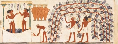
Grape clusters like the sculptures above have been found during excavations at a number of New Kingdom sites in Egypt.[i] It has been suggested that grapes were seen as a symbol of royalty, with painted depictions of the fruits often used to decorate royal thrones and garden shrines.[ii] Grapes and vines, and the process of winemaking, also appear on the walls of New Kingdom tombs.[iii] In ancient Egypt, it was mainly the upper classes and royal families who consumed wine. It was also used as an offering to the gods by pharaohs and priests, as seen in depictions in temples from the New Kingdom period up to Greco-Roman times.[iv] As Anna Garnett, curator of the Petrie Museum, has noted, wine was stored in pottery vessels, known as amphorae (pictured below), and was often labelled with the wine’s location of origin and year of production, just as producers do today.[v]

Detail from facsimile reproduction of a wall mural in the tomb of Nakht at Thebes, ca. 1425–1350 BC, Dynasty 18. This fragment depicts the process of wine making. Norman de Garis Davies (1865–1941), Nakht and Family Fishing and Fowling, Tomb of Nakht, tempera on paper. Image credit: Wikimedia Commons.

UC32931, shard of an amphora featuring the text ‘Year 17, sweet wine of the domain of Sehetep-A[ten]’, Amarna, Late Dynasty 18. Image credit: Petrie Museum.


Maria Rosa Gausch Jané, a leading expert on wine and viticulture in ancient Egypt, has suggested that grapes were seen as a symbol of resurrection, and may also have been thought to play a role in the transfiguration process undertaken by kings as part of the journey into the afterlife.[vi] Supplies of red and white wine have been found in the burial chamber of Tutankhamun, symbolically positioned to aid in the various stages of the king’s transition to the afterlife.[vii]

Grapes had great significance in ancient Egyptian culture, in terms of their cultivation, consumption, and symbolism. Next time you visit the Petrie Museum, see how many references to grapes and wine you can spot!


References

[i] ‘Faience grapes from Amarna’, collections database, Y Ganoflan Eifftaidd / Egypt Centre, Swansea,  http://www.egypt.swan.ac.uk/the-collection-2/the-collection/w344a/ [Accessed 18 Mar 2018].

[ii] Ibid.

[iii] Ibid.

[iv] Maria Rosa Guasch Jané, ‘The Meaning of Wine in Egyptian Tombs: The Three Amphorae from Tutankhamun’s Burial Chamber’, Antiquity 85 (2011): 851-858, p. 855.

[v] Anna E Garnett, ‘Curating the Petrie Museum: Three Object Stories’, 26 Jul 2017, https://blogs.ucl.ac.uk/museums/2017/07/26/curating-the-petrie-museum-three-object-stories/#more-51323 [Accessed 18 Mar 2018].

[vi] Jané, ‘The Meaning of Wine’, pp. 855-856.

[vii] Ibid, p. 857.

Season’s (Philosophical) Feastings

By Hannah L Wills, on 13 December 2017

Christmas is a time for overindulgence, so let’s have some tales of eighteenth-century feasting, with a twist from the history of science.

In my research, I examine the diary of Charles Blagden (1748-1820), physician, natural philosopher, and secretary to London’s Royal Society. One of the things I’ve been most struck by in my work on Blagden’s diary is the ever-presence of food and feasting within the social and scientific worlds of the late eighteenth century. Blagden’s diary reveals a near-daily itinerary of dining engagements where politicians, fellows of the Royal Society, and members of London’s well-to-do gathered to discuss news, politics, and the latest developments in natural knowledge over a range of lavish and often exotic meals. 

Scientific gatherings and feasts

A typical day for Blagden in the year 1795 began with a trip to the London home of Sir Joseph Banks, president of the Royal Society, for breakfast. Though the diary gives little indication of the food on offer, it does reveal that at these gatherings participants discussed news, politics, and natural philosophy, all over breakfast. On some occasions, Blagden and Banks conducted experiments, as revealed in Blagden’s diary entry for 19 February 1795: ‘Breakfasted at Sir Joseph Banks’s. all civil: made some experiments on crystallisation of nitre’.[i] This experiment was one that investigated the properties of a key ingredient in the manufacture of saltpetre (potassium nitrate) used in the manufacture of explosives.

On Thursdays, before the weekly meetings of the Royal Society, Blagden attended the Royal Society Club, a dining club for fellows of the Society held at the Crown and Anchor Inn on the Strand. While meetings of the club were intended to be social, scientific matters were inevitably discussed while members feasted on a variety of foods.[ii] The Royal Society archives contain some of the menus from these meetings, which at a dinner held on 23 October 1783 included ‘A Turtle’, which had for several days before the dinner been allowed to roam at Banks’s London home, ‘Scate’ (the fish skate), ‘Harricot of Mutton’ (a mutton stew), ‘a Hare’, ‘another dish of Turtle’, ‘Potatoes’, ‘Cold Ribs of Lamb’, ‘Breast of Veal’, ‘Haddock’ and finally ‘more of the Turtle’.[iii]

Feasting as research

As well as being a convivial aid to the discussion of natural philosophical topics, eating was also a central part of investigating nature. At gatherings hosted by Banks, visitors indulged in the consumption of various plants and animals, many sourced from exotic locations. One entry in Blagden’s diary reveals a particular gathering during which guests enjoyed several nuts brought by the botanist Richard Molesworth, named in Blagden’s diary as ‘Buticosa’ and ‘Sawena’. Blagden described them as ‘both pleasant to eat; one a sort of buttery nut, the other larger & more like walnut’.[iv]

Such behaviour might seem eccentric and even dangerous to us depending on the kinds of exotic fare on offer. Banks was frequently targeted by contemporary satire with his ‘philosophical’ feasting caricatured in a sketch by the artist Thomas Rowlandson. In ‘The Fish Supper’ (below) we see Banks’s guests, possibly including Blagden, eagerly preparing to devour an alligator specimen, while Banks, on the right-hand side of the image, greedily gnaws on a snake.

Thomas Rowlandson, Sir Joseph Banks about to Eat an Alligator (‘The Fish Supper’), 1788, ink and watercolour on paper (Image credit: © Tate (2014), CC-BY-NC-ND 3.0 Unported)


Festive feasting, with a bang

Experiments combined with dining did on occasion produce dangerous results. For a final festive example, we turn to an anecdote of the earlier eighteenth century. On Christmas Day 1750, Blagden’s contemporary Benjamin Franklin conducted an ill-fated experiment in cooking a turkey. Though today perhaps best known as one of the founding fathers of America, Franklin was also a renowned natural philosopher, famed for his electrical experiments. In April 1749, Franklin wrote a letter detailing an experiment he intended to make where ‘A turkey is to be killed for our dinner by the electrical shock, and roasted by the electrical jack’.[v] Franklin repeated this experiment on Christmas Day the following year with disastrous results, describing it as:

an Experiment in Electricity that I desire never to repeat… I inadvertently took the whole [shock] thro’ my own Arms and Body… the flash was very great and the crack as loud as a Pistol; yet my Senses being instantly gone, I neither Saw the one nor heard the other’.[vi]

Franklin’s turkey cooking is definitely a dining experiment not to be tried at home!


References:

[i] Royal Society Library, Charles Blagden’s Diary Vol 3, entry dated 19 Feb 1795, f. 47r.

[ii] For more information on the dining clubs of the Royal Society, including its membership, see T. E. Allibone, The Royal Society and Its Dining Clubs (Oxford: Pergamon Press, 1976).

[iii] Ibid., 121.

[iv] Royal Society Library, Charles Blagden’s Diary Vol 3, entry dated 17 Oct 1795, f. 70v.

[v] Meredith Man, ‘Ben Franklin on Cooking Turkey… with Electricity’, blog post for the New York Public Library website, published on 24 Nov 2014.

[vi] Ronald Clark, Benjamin Franklin: A Biography (London: Weidenfeld and Nicholson, 1983), 76.

Legacy in Conversation: Scrapbooks, Albums and Diaries in the 18th century

By Hannah L Wills, on 7 March 2017

By Hannah Wills


Hannah’s lunch hour talk, ‘Legacy in Conversation: Scrapbooks, Albums and Diaries in the 18th century’, will take place on Tuesday 14 March, 1-2pm, in the UCL Art Museum


How did people organise their notes and thoughts in the eighteenth century? This question is something that my research aims to get to grips with as I explore the diary and manuscript notebooks of Charles Blagden (1748-1820), an eighteenth-century natural philosopher, and secretary to the major scientific institution, the Royal Society. Whilst working on this strand of my research, which focuses on early modern information storage, retrieval and management, I’ve come across several synergies with the Art Museum’s current exhibition, entitled Legacy: Richard Cooper Jnr and the Artist’s Album.  

Blagden’s diary, vol 4, 3 Apr. 1802, Royal Society. Photo credit: Royal Society

Blagden’s diary, vol 4, 3 Apr. 1802, Royal Society. Photo credit: Royal Society


Legacy presents, for the first time, a number of albums produced by Richard Cooper Jnr, a little known eighteenth-century artist and innovative printmaker. As this exhibition shows, Cooper used his albums as repositories for sketches of artworks produced by other artists, as well as his own ideas and compositions. This use of the artist’s album closely mirrors another form of notebook popular in the eighteenth century, known as the ‘commonplace book’. These notebooks, whose origins can be traced back to the Renaissance, served as a kind of textual scrapbook, as a repository for favourite passages copied from other texts, as well as a note-taker’s own thoughts and anecdotes. Such notebooks enabled individuals to retrieve information, and were often used to help the note-taker pen their own prose compositions, including poems and essays.[i]


Album

One of Richard Cooper Jnr’s albums on display in the exhibition, UCL Art Museum. Photo credit: UCL Art Museum.


Next week, I’ll be giving a lunch hour talk at the Art Museum, exploring some of the connections between the albums of Richard Cooper Jnr and the diaries and commonplace book of Charles Blagden. Described as ‘visual diaries’, I’ll explore how Cooper’s albums are similar to Blagden’s own diary, as devices for storing important ideas, memories and information. Exploring both the text and images found within Blagden’s commonplace book, I’ll take at look at how these notebooks functioned as a kind of textual analogue to the artist’s album, and how albums, diaries and notebooks contribute to notions of ‘legacy’.


[i] Mark Towsey, Reading the Scottish Enlightenment: Books and Their Readers in Provincial Scotland, 1750-1820 (Leiden and Boston: Brill, 2010), 182.

Exploring Perception: Time-based Media at the UCL Art Museum

By Lisa, on 10 February 2014

 ProfileBy Felicity Winkley

Time-Based Media brings together ten multimedia works which depend on technology and can therefore change meaningfully in response to time, including, but not limited to, video, experimental film and audio. All the works in the exhibition are linked in their aim to create a dialogue between viewer and object; to meaningfully provoke an engaging experience. At work under the surface of this engagement is perception, an environmental involvement in which we, the experiencers, receive stimuli to which not only our senses respond, but also our cognitive process. The pieces collected here are not solely visual or static. In this respect they challenge both what we expect to encounter in the rather traditional and certainly serene surroundings of the UCL Art Museum, and moreover what we might expect to experience when we ‘look at art’.

In my research into the perception of landscape, I subscribe to the definition put forward by Allport in his work on the subject some years ago. For him, perception:

‘has something to do with our awareness of the objects or conditions about us. It is dependent to a large extent upon the impressions these objects make upon our senses. It is the way things look to us, or the way they sound, feel, taste, or smell. But perception also involves, to some degree, an understanding awareness, a “meaning” or a “recognition” of these objects’ (1955, 14).

This definition advocates – as do I – the cognitive (as opposed to behaviourist, or gestalt) approach to perception, whereby we understand that the perceptive process is not limited solely to a stimuli-response pattern of observable behaviours, but ‘is influenced by many cultural, experience-based and individual factors that underlie interpretation’ (Campos et al. 2012, 760). It is these factors, mediated by the perceiver’s cognitive and emotional responses, that are so valuable for my personal research into attitudes to landscape preferences, but also to a consideration of how viewers might respond to some of the works curated in Time-based Media.

Take The Printer’s Symphony (2013), a collaborative work by Dana Ariel, Julia McKinlay, Eleanor Morgan and Georgina Tate. A beautiful concertina-fold of card stretches along the length of the case, bringing together prints from the four artists, demonstrating a number of processes, mounted and detailed with added embossings. So far, so good – we as gallery visitors are used to seeing pristine works, safely displayed in cases. However, unusually the object is also accompanied by four minutes of audio, emanating from a hidden speaker, composed of a pastiche of recorded sounds from the print-maker’s studio. At first, our senses are fooled – the everyday noises sound like someone working outside, or upstairs, because memory and therefore knowledge has conditioned us to interpret this as the most likely cause amongst the perceived milieu. On paying closer attention, though, the sound quickly changes and it is soon easy to be drawn in to the soundscape of filing, spraying, rinsing and rolling – an evocative soundtrack of making, which is strangely difficult to connect to the perfect artwork in the case. This is exactly what the artists were hoping to capture – a method of bringing the process of making into the gallery, of bridging the gap between the Slade School of Fine Art and the UCL Art Museum. Thanks to perception, upon listening whilst also observing the work, we can now imagine what the studio environment is like – using the sounds as a trigger to remembered encounters, we can ‘see’ in our mind’s eye how it might appear, or smell the scent of the materials, the feel of a tool-handle in the hand.

In this engagement with The Printer’s Symphony, we can see clearly how memory serves as an essential factor of perception; through memory, we can achieve knowledge, and consequently inform our interpretation of later perceived environments – I remember what workshops are like, and therefore the sounds I encounter in the artwork recall this memory to my mind as I experience it. This type of memory is known as embodied: in which the immersive quality of the experience fully engage the senses to evoke memories beyond those that can be summoned solely by looking at a photograph, for example (Rishbeth and Powell 2013). Viveka Marksio’s work Embodied/Disembodied (v.1) taps into this embodiment, by using computer-generated imagery to take the viewer on a journey through the interior spaces of the Slade School as they are being slowly flooded. The piece aims to ‘recreate the sensations of the body in a threatening and claustrophobic physical space’, and the video is helped to achieve this by the carefully constructed soundtrack which comprises a resonant series of bass notes, with sporadic industrial echoes. Unlike The Printer’s Symphony, whose accompanying audio is ambient in the gallery, Embodied/Disembodied (v.1) (like other works in Time-Based Media) requires the viewer to wear headphones; whilst this is not unusual perhaps, in this instance it is worth noting the effect of the headphones in contributing to the sense of enclosure and threat evoked by the piece. The noise-canceling qualities, along with the sensation of pressure on the head, all add to the perceptive blend of the engagement.

 i am unique and so is everyone else , 2012 video duration: 15 seconds (loop)

Nicolas Feldmeyer
I am unique and so is everyone else , 2012
video duration: 15 seconds (loop)

In I am unique and so is everybody else (2012), Nicholas Feldmeyer achieves a similar effect using solely video. This 15-second looped video collage layers footage of the natural movement of tree branches in the wind with a digital pattern of black dots to create a random movement which is at once hypnotic and contemplative. In contrast to The Printer’s Symphony or Embodied/Disembodied (v.1) the work has no soundtrack, but its immersive simplicity makes it easy for the viewer to call up the sensations that would accompany an encounter with wind in the branches – the sound of it whipping through the trees, the feel of the air on the skin. Again, our perception is informed by memory – we know what this would feel like. And yet visually the beholder is confused by the work; the natural pattern of the branches has been overlaid by a subtle digital intervention, the scene is not quite as it first appeared.

Similarly, Feldmeyer challenges our expectations with My people, humble people (2012), in which small digital ellipses have been overlaid on raindrops as they fall into a puddle. In both pieces, the subtlety of the overlays confuses our perception and encourages close scrutiny – are we looking at the natural phenomena or the digitally imposed details? Where does one stop and the other begin? In terms of our exploration of perception, the effect is pertinent. Although in our daily life perceptual modalities like hearing, touch, smell and taste are extremely important in negotiating our relationship with the outside world, nevertheless, most of the perceptive encounters we have with the environment are conducted visually (Ballesteros 1994). And yet is this the most important? Should we be more cautious in prioritising it over our other senses? Time-Based Media offers the opportunity to question the perceptive process, and encourages us to scrutinise our responses to what we see and how we orientate ourselves to it.
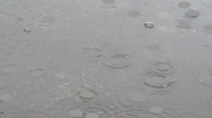
Nicolas Feldmeyer  My people, humble people,  2012 video duration: 1:05 minutes (loop)

Nicolas Feldmeyer
My people, humble people, 2012
video duration: 1:05 minutes (loop)

Time-Based Media is on at the UCL Art Museum until 28 March 2014


Allport, F. H. (1955) Theories of Perception and the Concept of Structure New York: Wiley


Ballesteros, S. (1994) Cognitive Approaches to Human Perception: Introduction, in: Ballesteros, S. (Ed.) Cognitive Approaches to Human Perception New Jersey: Lawrence Erlbaum Associates, Publishers


Campos, M., Velazques, A., Verdinelli, G. B., Priego-Santander, A. G., McCall, M. K. and Boada, M. (2012) Rural People’s Knowledge and Perception of Landscape: A Case Study from the Mexican Pacific Coast Society and Natural Resources: An International Journal 25 (8) pp. 759-774


Rishbeth, C. and Powell, M. (2013) Place Attachment and Memory: Landscapes of Belonging as Experiences Post-Migration Landscape Research 38 (2) pp. 160-178