The first electronic examination utilising the Electronic Bluebook secure software program ran yesterday at UCL Qatar.
The three hour exam was attended by the class of nine students who all chose to complete their exam electronically using the computer, rather than writing their answers by hand. Students were provided with instructions beforehand and attended a short briefing explaining how the system worked and were able to ask questions about the electronic format immediately prior to the start of the exam.

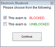
The software was launched in “blocked” mode, meaning no other software could be launched for the duration of the exam, apart from the secure examination system itself. That means students could not access the Internet, any files on the computer or other programs like the Windows calculator.

Staff launched the program (which required Windows Administrator access) and chose the BLOCKED mode and students then entered their candidate numbers, chose their module from the drop down list and selected the number of questions they were answering.
Students were spaced with a spare computer between them and the next candidate where possible. Partitions sat between each desk and staff confirmed in earlier tests that text could not be read by neighbouring students, even when the text was zoomed to the maximum size.
Once the exam questions were handed out, students were permitted to turn over and read the questions, then start the examination software by clicking Start Exam and confirming the number of questions they were to answer.
Students were asked to type around 3,000 words during the exam in answer to 3 questions chosen by each student from a total of 9 questions. The word count for each tab was visible in the left hand column of the software to help students manage the time they spent on each question.
A large electronic countdown timer was displayed on monitors in 3 corners of the room and students were asked to disregard the timer shown in the software, since they were all slightly different depending on when students stopped reading the questions and clicked the [Start Exam] button.
Timings were announced verbally to students with 1 hour remaining, half an hour remaining (at which point students were no longer permitted to leave the room) and these times were also written on a flip chart for students to reference.
The interface of the software is similar to that of a simple text editor like Windows Notepad. Students can cut and paste (but not copy) to move elements of their text around. The software saves each student’s work every minute, both locally and to the exam server on the network. This means in the event of a computer failure the exam can be retrieved either locally or from the server and the student can continue with the exam, with additional time granted to compensate for the disruption.
In the event of a power failure, or another event that prevented the entire cohort from completing the exam electronically, students would have been permitted to continue by hand writing on paper, with special consideration granted to them not being able to reference their work to that point, although attempts would have been made by the staff to print the electronic element of their answers and provide these to the students as quickly as possible to reference and modify by hand.
Students were asked to indicate the question they were about to answer at the top of each tab. Each question was answered on a new tab. Students were provided a notepad and pen for taking handwritten notes during the exam and were also permitted to write on the question sheet. All of these materials remained in the room after the exam. The exam adhered as closely as possible to traditional handwritten examination procedures as per UCL’s e-examination guidance.
One student asked whether they could write notes electronically within the software and were advised that notes should be deleted before submitting, as everything remaining within the exam script would be considered part of their answer and marked accordingly.
During the exam students had some questions about how to begin their exam, how to reference the question they were answering within each tab and how to save and move to the next question, which were all quietly answered by the invigilators. One student was unfamiliar with the UK keyboard layout and needed help locating the quotation marks.
Some of the benefits expected by the staff marking the exam scripts included better legibility of answers, compared to handwritten exams, and less strain on students’ hands given they are no longer used to writing for extended periods. Another expected benefit was the possibility of being able to move text around within each answer.
After the exam, the majority of students reported that they liked being able to type their answers, and that this was faster and more effective than hand-writing. Two students said they would have preferred to handwrite the exam in future, as they felt they were faster at handwriting and could therefore write more in the time and one student was unsure which she preferred. A survey will be used to gather further feedback from these students.
As an observer I noted the noise in the room of tapping keyboards was less distracting than I expected, although there were a small number of students in this case. Some students hand wrote notes and others opted to type directly into the software. I observed many of the students taking advantage of the ability to readily edit their previous writing. Most students appeared to type their answers out directly as they would likely do in a handwritten exam, although I noted one student who appeared to plan the answer in summary form on the computer first and then filled in the details later.
At the end of the exam, students were asked to stop typing and click the FINISH EXAM button and confirm. The system then was expected to send their encrypted responses to the exam server and each screen turn bright green to indicate the exam had been successfully submitted. Although extensive testing was undertaken prior to the exam, there was an, as yet undiagnosed, network failure on the day, which prevented the exam scripts from automatically submitting to the exam server. Despite this issue, the software failed gracefully by providing a descriptive error message (on a blue screen) and explaining the following process. The default web browser was launched automatically upon hitting the [CANCEL] button and loaded a page describing how to locate the encrypted exam script file. The file was then able to be manually selected and uploaded to the examination server. As a precaution, each encrypted exam script was also saved to a USB stick.
The exam scripts were then retrieved by the technical team, then decrypted and printed for marking using the Electronic Bluebook decryption tool.
Overall I was impressed with the simple interface, customer support received and relatively straight forward technical implementation of this secure exam system.
The full size screen, ability to change background colours for visually impaired and dyslexic students (via built-in Windows accessibility tools) and the ability to zoom text to make it larger means it is widely accessible to the majority. However, further tests will need to be carried out to see whether the software is compatible with screen readers and other enabling technologies.
Small improvements that I would like to see implemented in future versions include an option to turn off the system’s timer; having the number of questions pre-populate for each exam (with the option to override the number perhaps); the ability to allow particular, pre-defined programs to run (e.g. the Windows calculator, or Excel); and having a drop down option on each question tab, so a student can select which question they are answering i.e. tab 1 answering question 7.
Overall I think this tool is intuitive, accessible and simple enough to be used effectively by students to complete essay style examinations electronically and I was especially impressed by the graceful way it failed when it encountered network connectivity issues.
 The UCL E-Learning Baseline is now available as a printable colour booklet. This can be downloaded from the UCL E-Learning Baseline wiki page: http://bit.ly/UCLELearningBaseline
 Close
Close


