Rub a balloon or a plastic rod, charging it up with static electricity, and it can suddenly pick up little pieces of paper. It’s a common classroom demonstration in high school science classes, an everyday example of electrostatic attraction. But it’s never explained fully in class – pupils are told about plastics gaining or losing electrons and becoming charged, but why (and how) this charge is actually created is never explained.
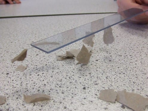
Static electricity picking up scraps of paper. Photo: Tess Watson (CC BY)
The reason for this is as simple as it is surprising: nobody actually knows.
***
Much of what we are taught in school science lessons is wrong. Electrons are not billiard balls spinning around an atomic nucleus – even if that’s a useful metaphor. Newton’s laws do not govern the motion of objects – though in most cases, they are so close as makes no difference. Copernicus did not claim, let alone prove, that the Earth orbits the Sun, though his model of the cosmos was an important innovation in the history of astronomy.
In all these cases, the classroom version is a reasonable approximation, a simplification which still helps children learn about science, without getting bogged down in unnecessary complexity.
But in the case of plastic being charged up with static electricity, scientists genuinely don’t fully understand what’s going on.
***

Katherine Holt
Katherine Holt is a researcher in UCL Chemistry who has worked on electrostatic charging, and is hoping to answer some of these questions. Initially interested in the way that charge can build up on the surfaces of nanodiamonds (microscopic diamonds formed in the soot created by explosives), she has come to work on the question of how static electricity forms on the surfaces of plastics.
For many years, this was the preserve of physicists, who looked at the big picture of how charge behaves on the surface of a whole object. But with the improvement in tools such as magnetic force microscopes, the field has in recent years opened up to chemists, who are interested in small-scale properties of materials, such as bonds between atoms, breaking and joining of atoms in molecules, the microscopic structure of surfaces and the behaviour of individual ions and electrons.
This change of emphasis, Holt says, has brought about a growing conviction that even the most superficial explanation given in school (“electrons are transferred to or from the plastic when it is rubbed”) is wrong. It is increasingly clear that the charging process is actually linked to imperceptible damage to the surface. Bonds between atoms on the plastic’s surface are being broken by the rubbing and this – not the exchange of electrons between surfaces – is leading to the charge being created.

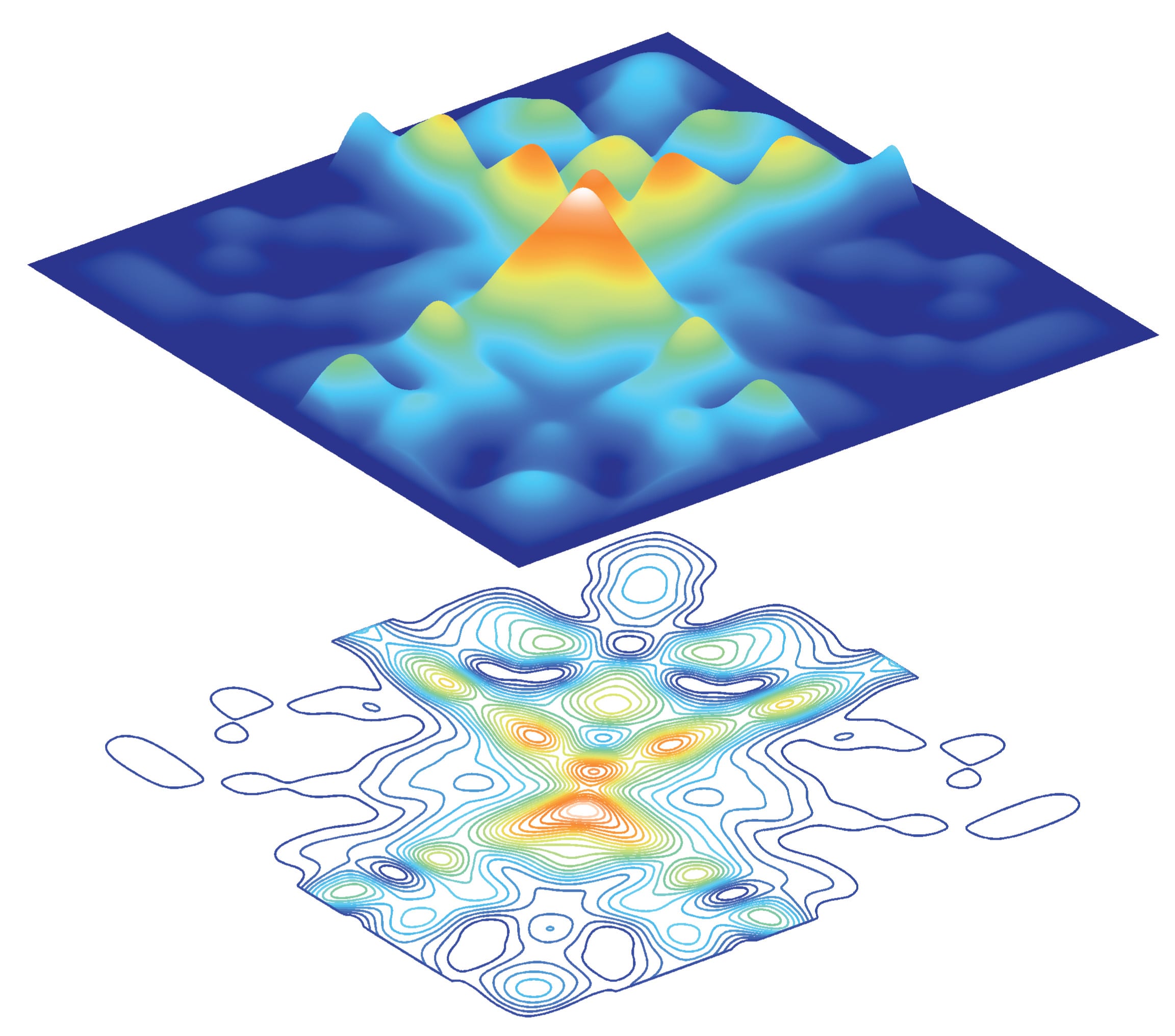
Tunneling electron microscope image of two polystyrene beads rubbing together and then separating that clearly shows that material is transfered from one surface to another as they do so and that the surfaces become ‘scarred’ and damaged. Credit: Katherine Holt (UCL Chemistry)
But identifying microscopic damage on the surface and linking that to the creation of static electricity isn’t the same as figuring out what is actually going on.
***
When you break bonds between atoms in molecules, shattered fragments of those molecules (either individual atoms or groups of atoms) are formed. These highly reactive particles are known as free radicals.
And indeed, Holt says, you can find free radicals on the surface of charged plastic rods. What’s more, in the same location as these radicals, surface imaging techniques reveal the presence of electric charge.
But even this still doesn’t solve the mystery of precisely how electrostatic charging works: radicals are electrically neutral, so some other particle – presumably ions or electrons – must be carrying the charge.
There is more that isn’t known.
For instance, whether a plastic will become positively or negatively charged is easily predicted, there is even a table (the triboelectric series) which sets out which combinations of common polymers will charge each other positively or negatively when rubbed against each other. But the triboelectric series is based on experimental data – there is no underlying theory explaining what is actually going on, and Holt says, there may never be one: there could be a diverse range of different phenomena all contributing to the different electrostatic properties of the different plastics.
***
Working in a field which is experimentally well understood, but lacking in theoretical explanation, is not an entirely comfortable area for scientists. For engineers, however, who are interested in practical applications and less worried about theory, this is far more usual territory.
Holt says that, despite being a chemist, she’s now finding it easier to talk to engineers about her work in this area than she does with colleagues in closely aligned fields of chemistry. Engineers are interested in electrostatic charging for prosaic reasons – preventing powders from clumping together in factories, for example – and have an extensive practical understanding of it. But they don’t care in what’s happening on a molecular level.
Which, when the underlying science is as intractable as this, seems like quite a tempting thing to do.
Related links
 Close
Close


