 Close
Close

MAPS Summer Research Internship – Visualising COVID-19 inequalities in the UK
By Peter Marron, on 8 January 2024
Last year, undergraduate students at UCL took part in the Mathematical & Physical Sciences Undergraduate Research Internship scheme. As part of their project of visualising COVID-19 inequalities in the UK, they’ve written blog posts on their experience and findings. You can read the blog post written by Arts and Science student, Rose Bourges below:
The aim of this MAPS Summer Research Internship was to visualize in a simple and clear way social inequalities during the covid-19 pandemic in the UK. In this blogpost, I will describe in more detail the steps and methodology undertaken in this research project, as well as the results.
Why were you interested in this research internship?
On a personal level, this project deeply interested me for two main reasons. First, it matched perfectly with my desire to work in epidemiological research. I chose to pursue my studies in UCL’s Bachelor of Arts and Sciences, and to take a range of modules in Biomedical Sciences, Coding and Population Health, which reflect my goal to study the link between social and health inequalities. This research internship was the opportunity to apply this knowledge and to discover the world of research. Secondly, a module in ‘Coding for Bioscience Research’ in 2nd year had perfectly equipped me with the tools for this data analysis and visualisation research internship. In this class, I had to simulate the impact of covid-19 outbreaks on the number of deaths, according to certain parameters such as lockdowns and vaccination rates. I really enjoyed the logical aspect of coding and my familiarity with the covid-19 data encouraged me to apply to this internship.
Which social inequality did you decide to focus on?
This project focuses more specifically on the impact of income on education during school closures. It was clear after my first meeting with Dr Lehmann that due to the limited amount of time, it would be preferable to focus on one type of social inequality. I started looking at the available literature and decided that I wanted to focus on education, and more specifically on learning inequalities. There are two main reasons for this choice. First, during the covid lockdowns, I had personally witnessed how online classes had influenced my capacity to learn. My neuroscience classes also taught me about the neural basis of learning, and the importance of repetition over time. Undeniably, the lockdown was creating a pause in our school years. I was really intrigued to understand how social inequalities such as income could impact this covid learning gap, as evidence showed that the quality of learning differed greatly from one social background to another. Secondly, the fact that data was publicly available on the topic also led me to focus on learning inequalities during the first wave of the covid-19 lockdown.
Was there any previous research available?
Looking at the research that had already been done on social inequalities during covid-19 was the first step of this research internship, to be aware of the conclusions that had already been formulated and of any gaps in the literature.
One major publication was the Marmot Review. In 2010, the Marmot Review exposed the principle of social gradient of health, explaining the graded relationship between social inequalities and health inequalities. The latest version published in 2020 showed how the Covid-19 pandemic had revealed and amplified existing social inequalities, such as ethnicity, gender, and income. The latter particularly influenced the quality and quantity of learning students had during school closures.
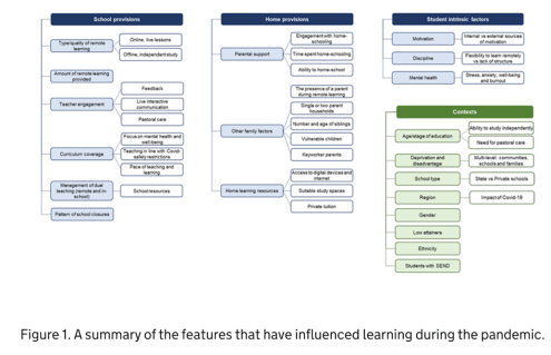
Most of the previous research available on learning inequalities comes from official sources. The UK government acknowledges that while learning had decreased overall for everyone during the pandemic, it was not spread out evenly. A brief from the Parliament, shown below, outlines all the possible factors for this phenomenon, which are regrouped in different categories – school provisions, home provisions, student intrinsic factors – all of this according to the context, such as the parent’s income. For example, students in state schools, which generally come from lower income families, are less likely to receive teaching hours. At home, they probably don’t have the adequate laptop to work on. On top of that, their parents are more likely to be key workers, meaning that they are less at home, and have less time to help their child with schoolwork. Finally, the child has more chances of spending his lockdown with a lack of private space, which can affect his mental health and his ability to work and learn. Consequently, Kelly et al estimated that in April 2020, children from higher income families spent an extra hour and a half on schoolwork. Agostinelli et al (2022) also showed in the United States how school closures could ‘increase socio-economic segregation’, when schools should be acting as a social equaliser. Along with the lack of technology and support from parents, they estimated that this triple impact of closing schools led children’s grades to decrease by four points in lower income families, while children in higher income families did not see any change in their grades.
In the UK, most of the official statistics base themselves on research from the Institute for Social & Economic Research. Using the Understanding Society Covid-19 dataset, it explores the links between home learning and socio-economic status. More importantly, it explains how social class, ethnicity, the level of the parents’ education and the impact it has on children’s learning are all intertwined.
With this research in mind and knowing that the average level of income varies widely from one region to another in the UK, I started thinking that I could build interactive maps comparing income with learning provisions during school closures.
Which data did you use?
Based on these previous findings, the next step was to find the data. This was the most time-consuming process, and I encountered many challenges. As a student, I often did not have the required licences to access some datasets, as many of the data was confidential. I learned to remain open-minded during the whole process and acknowledge that I would probably have to adjust the visualisations according to the available data. Lastly, a lot of time was spent reading user guides to understand how the data was formatted, and to decide which variables to keep in very large datasets.
All my data comes from the Understanding Society dataset, the data which has been used from the Institute for Social & Economic Research. Thus, it is an official and credible source. Thanks to unique PIDPs (person identifiers), I was able to merge together data on income, education and geographical location, which was its main advantage. Most of the questionnaires were tailored directly to school closures in the UK during covid-19. However, the data lacks objectivity and in geographical precision.
More information on the data, and on the code used to create the maps, can be found in the annex.
What are the final visualisations?
Now that I have outlined some details in the code, I will present the final maps which compare income with the number of weekly hours spent on schoolwork, on online and offline lessons, of help received on homework, and with the number of technological devices per child.
All of these results present an average across each of the regions.
Average income per child per month

This first map shows the average level of income in each region, per child. In other words, the household earning was divided by the number of children. This allows us to consider families with a single parent or many children, the assumption here being that the income “allocated” to each child would be different. The classical North/South divide is present here. The Southeast and London have the highest incomes, which are of £2300 to £2400 per month, while Yorkshire & Humber has the lowest average income of £1800.
This map can be seen as the “independent variable”, which will be used to compare to the “dependent variables”.
Number of weekly hours spent on schoolwork
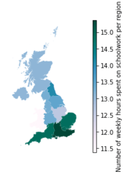

Interactive version available on GitHub
This map represents how many hours per week each student spent on schoolwork, during the first school closures in April 2020. This was subjectively measured by the parents, and it can designate personal work time as well as online lessons, permitting us to get a general overview.
Although there is not an exact linear relationship between income and the time spent on schoolwork, there are some notable differences across regions. At first view, the North/South income divide is striking here. In the South East, one of the regions with the highest income (£2300 per child per month), the average time spent on schoolwork was 15 hours per week. In comparison, in Yorkshire & the Humber, one of the regions with the lowest income (below £1800 per child per month), the time spent on schoolwork was on average 13.5 hours per week.
Number of weekly hours of offline and online lessons


These maps measure more precisely the time spent on schoolwork by comparing the weekly hours of online and offline lessons. An offline lesson is work that will be given by the school, done asynchronously. The assumption here is that a student will be more engaged in his schoolwork if he has more contact hours with the teachers and the rest of his class, rather than when the student is working on their own.
Concerning the number of offline lessons, the North/South divide is once again very present here, as the richer regions of the South had an average of 12.5 hours of offline learning per week, while the poorer regions of the North oscillated between 10 and 11.5 hours a week of offline learning.
Meanwhile, the number of online lessons do not show such a clear difference between the Northern and Southern regions. However, the richest region (London) had around 5.5 hours of online learning each week, while the poorest region (Yorkshire & Humber) had one of the lowest numbers of teaching hours, which was 3.5 hours a week.
In general, the fact that the maximum number of hours of online teaching was of 5.5 hours a week, cumulated with a maximum of 12.5 hours of offline teaching per week, is worrying when compared to the usual timetables, that contain around 25 to 30 hours for a high school student, with additional work at home. Although some children might be more concentrated during online lessons as there is not the usual distraction of other classmates, this difference remains concerning for the appearance of a learning gap for all children.
Number of technological devices per child
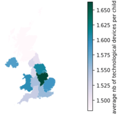
Next, this map shows how many technological devices each child had access to in the household. Once again, I divided the number of technological devices in the household by the number of children, assuming that a child will be less productive in his work if he must share a computer with his siblings. This is especially important during school closures and lockdowns, where all the teaching is taking place online. A child will be very disadvantaged if he cannot have access to the learning material.
The results are rather surprising as it is not the regions with the highest incomes that had the highest number of technological devices per child, and it’s even an opposite trend that can be observed. Therefore, there are no key takeaways concerning social inequalities in this map.
Number of weekly hours of help on schoolwork
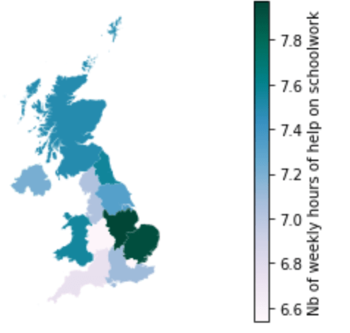
Finally, this last map displays how many hours per week a child in each household received in schoolwork from his parents or his siblings. This can be especially important to motivate children and to ensure their comprehension of the learning material. The assumption here is that households earning less money are more likely to have parents that are key workers, and who are therefore less at home.
The results here are surprising when compared to the other maps, as the North/South trend is almost reversed. As such, London is the region where children received the less schoolwork help, around 6.6 hours per week, while the East of England had around 8 hours of help per week. Therefore, our assumption above has not been verified.
Are there any limitations to these maps?
These maps have some clear limitations which are important to acknowledge to analyse the results correctly.
First, there is an obvious lack of objective data concerning educational attainment. For example, the time spent on schoolwork does not necessarily represent the quality of the learning. While some households might only count productive working time, others might factor in the breaks as well. Regarding “offline” work, some might interpret this only as assignments to hand in while others may think this also includes personal work. Overall, having access to objective data would have increased the reliability of this research.
Secondly, it must be noted that the different regions/countries across the UK might have implemented different policies concerning school closures. The maps often display Wales and Scotland in purple, especially regarding time spent on schoolwork, although these are not the poorest regions. Lockdowns were implemented in different ways across the United Kingdom and these maps could also be reflecting this diversity.
Furthermore, these maps do not reflect social inequalities within one region. For example, London has very different incomes according to the boroughs, and this is not shown on the maps due to the lack of specific geographical data. Across the regions, some data about social variables such as age and gender are also missing. A student preparing his A-levels should be spending considerably more time on his work than someone entering elementary school, and the maps do not show how school closures have impacted the different age groups. This is also the case for gender. Previous research has shown that women’s mental health had been more affected by lockdowns, and that they were expected to do more housework than usual. This may have also been the case for older female students, therefore impacting their schoolwork.
Finally, ethnic groups have been hit very differently by the covid-19 lockdowns. Some research indicates that a considerable learning gap has appeared in children from Pakistani and Bangladeshi backgrounds. Overall, social inequalities have risen in BAME backgrounds during covid-19, which is not shown in the maps. This was partly because the maps were representing numerical data rather than categorical data. It can be noted however that ethnicity and income are closely correlated.
Could your findings lead to further research?
This research was very time-limited, with few sources of data. Therefore, I will be indicating some possible guidelines for further research. The first possibility could be to cover the limitations outlined above concerning other social categories, such as ethnicity, rather than just focusing on income. Moreover, the next guidelines for further research described below focus more on measuring the actual learning gap.
Although these results are only representative of a short period of time, which is the start of the first lockdown, some available statistics could allow us to model the long-term impact. The UK government (gov.uk, 2020) estimates that 1 hour of teaching time per week leads to 0.1SD of test scores. This means that over the weeks, as the gap increases between the number of teaching hours between lower and higher income backgrounds, so do the grades. Some projections in the UK estimate that the educational attainment gap, which had been gradually closing since 2011, could widen again between 11% and 75%. If time had permitted, the time spent on schoolwork could therefore have been linked to educational attainment, with worse and best-case scenarios.
In the long run, this could affect a student’s potential to get into university, and thus possibly affect their income as well. In the United States, Agonistelli et al (2022) predicted that school closures could decrease the future income of children from lower income families by 25%. To realise this calculation in the UK, we would however need exact data on the number of teaching hours and not the amount of time spent on schoolwork.
Another possibility would be to compare the effects of remote learning according to income across subjects. For example, many studies focusing on OECD countries have shown that after the summer, children from lower income families start school again in September with a ‘learning loss’, especially in reading. While ‘literacy teaching also takes place at home’ (Marcotte, 2007), mathematics depends mostly on the amount of teaching time. This means that during school closures, reading skills could mostly be affected by the socio-economic background of the child, while mathematical skills could depend more on the quantity of teaching provided by the school.
Finally, school closures in different socio-economic backgrounds also had an indirect impact on educational attainment not only through teaching related measures but also child poverty and mental wellbeing. Many stopped receiving free school meals, and children in lower income families also lived in more precarious situations, affecting their mental well-being and therefore school achievement. In fact, the UK government has summarised all the features possibly influencing learning during the pandemic. If all the available data existed, it could be relevant to create interactive visualisations with some of these variables as well
Conclusion
In conclusion, these maps enable us to show in a simple and clear way social inequalities during school closures in the UK. Overall, regions with lower household income also witness less time spent on schoolwork, and less delivery of online and offline lessons, creating a learning gap between children from lower and higher income backgrounds. While the results have not been dealt with in a statistical way, this visual aid helps us convey the correct message and push towards further research.
Annex
Data description
It is the UK’s Household Longitudinal study, which began in 2009 and explores through waves a representative sample of the UK population, organized in themes. Thanks to unique PIDPs (person identifiers), I was able to merge together data on income, education and geographical location, which was its main advantage. Here are the two datasets used:
- UKHLS Covid-19 Web Survey data, April 2020 (ca_indresp_w): this dataset contained information on household income as well as questionnaires on home schooling during school closures.
- UKLHS Waves 1-18 data (k_indresp): this dataset contained information on the geographical location of the respondents, divided in the Governmental Office Region.
These datasets contain several limitations. First, the geographical data is not very precise, but without any licence I could not access any data more specific than the UK’s twelve regions. Secondly, most of the data is subjective. All the official data on educational attainment did not exist after the start of the covid-19 pandemic. Therefore, I had to rely on web and telephone surveys completed by parents, answering questions such as the amount of time spent on schoolwork and the number of technological devices in the household. However, these questionnaires were also an advantage because they were tailored specifically to covid-19 school closures. Therefore, it contained questions on online lessons for example, which would not have existed in the usual education questionnaires.
Data visualisation in Python – Methodology
- Merging datasets
- Putting in the same dataframe the data on income and education with the data containing Governmental Office Region thanks to the PIDPs
- Cleaning data
- Getting rid of missing values
- Selecting only columns I’m interested in to get a smaller and more comprehensible dataset
- Using the pivot function to have a single row per child in each household instead of columns
- Adding new columns
- Performing calculations to have “income per month per child” rather than “income per household over x amount of time”
- Performing calculations to have weekly amount of time spent on work (instead of daily), for more visually significant results
- Summary statistics
- Comparing the means and distributions of all the variables, to detect potential outliers
- Visualized this with the seaborn library
- Static data visualisations
- Importing the new dataset containing the tiles for the map
- Merging this new dataset with the previous one
- Calculating the mean of each variable for each region
- Creating one static map for the income per month per child
- Creating several static maps for all the schoolwork variables
- Interactive data visualisation
- Using the folium library and importing the British grid map
- Converting the data to GeoJSON format
- Calculating the centroid of each point
Written by: Rose Bourges, Arts and Science BASc
Chemistry of the dark arts – Happy Halloween!
By Peter Marron, on 30 October 2023
Welcome to our Chemistry of the dark arts… Watch these chilling experiments conducted by UCL Chemistry staff, and have a spooky Halloween! Narrated by UCL Science & Technology Studies student Andrea Lekare.
Creative producers: Claire Gacki (also camera person), Hannah Shalloe (also video contributor) and Helena Wong. Thank you to Professor Andrea Sella for his inspiration, Cesar Reyes for the thin films and Luka Nunar for the video equipment.
Student Instagram Takeover: Mullard Space Science Laboratory Summer Event
By Peter Marron, on 22 July 2023
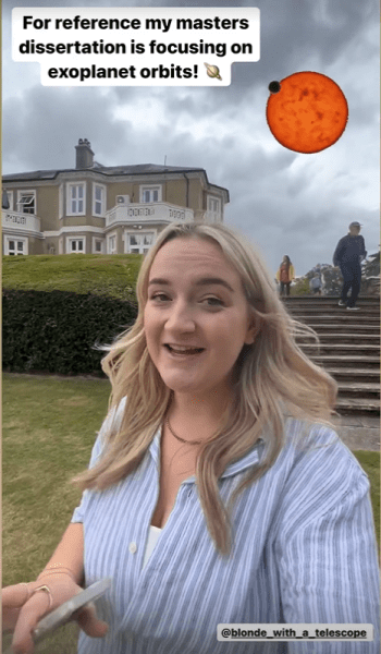
Join UCL Space & Climate Physics student, Eleanor (@blond_with_a_telescope) as she shows you around the activities going on at our Mullard Space Science Laboratory Summer Event!
Open Days 2023 Instagram Takeover
By Peter Marron, on 1 July 2023

Join UCL Natural Sciences student, Alexa, in our Open Days social media takeover. Alexa answers questions around her programme and shows us some of the best bits going on in the Faculty of Mathematical & Physical Sciences, during this week’s UCL Open Days.
Student Vlog: UCL Mathematics Department Tour
By Peter Marron, on 14 April 2023
Undergraduate Mathematics student Teren takes us on a tour of the Maths department and shares her tips on some of the best places to study and hang out at our Bloomsbury campus.
Formula For A Healthy Lifestyle
By Peter Marron, on 9 February 2023
For most students, university is the first time you’ll live on your own and be constantly surrounded by people, ideas and events. As tempting as it is to join every society, make a million friends and excel academically, it’s normal to get overwhelmed by new responsibilities and neglect your health. Luckily, I have some advice on how you can balance a healthy lifestyle so you can get the most out of university whilst not burning out!
From my experience, the formula for a healthy lifestyle is:
Healthy = 35% mental + 30% physical + 30% academic + 5% professional
This is easier said than done, it took me months before I had any control over my life so don’t worry if you feel disorganised at the beginning. To help ease the chaos, below are a few tips on how you can personally maintain each element in the formula.
Mental (35%):
For me, there are two factors that manage mental health- stress relief and social life. Tips that help stress relief are:
Find a mindfulness technique that works for you
Meditation and yoga might seem pretentious but having an outlet to let out your thoughts and feelings is imperative! Personally, journaling after a tough day helps decongest my head and untangle my thoughts but for others, it’s drawing or going on long walks.
Call family, friends and loved ones!
Tips for socialising are:
- Make the first move: As cliche as it sounds, people at university won’t talk to you unless you approach them first. Remember: everyone is in the same boat as you so don’t be shy (and don’t forget to get their socials to stay in contact)!
Physical (30%):
It’s easy to sacrifice a few hours of sleep and a workout to get a practice sheet submitted. I’m guilty of midnight instant noodles and all-nighters, but you’ll start feeling fatigue and low moods if you routinely not care for your body. My biggest tips on maintaining physical health are:
Find an exercise that you enjoy
Regularly moving your body is easy if you do something you find fun. UCL has a myriad of sports societies that you can join from football and rowing to ultimate frisbee and Aikido. I took up Krav Maga, which was both stress relief and socialising!
Set a sleeping deadline
After a certain time, it’s more productive to sleep than to churn out low quality work. Set a strict time where you’ll stop studying and go to bed to get the rest you need.
Eat at least one fruit and one vegetable a day
This sounds patronising but it’s difficult to eat nutritiously when you’re super busy. Your immunity system will thank you for eating at least one fruit or vegetable with each meal.
Academic (30%):
MAPS degrees are exam-focused so it’s essential to make sure you’re learning effectively throughout the year. My tips are:
Develop a study routine
Dedicating specific times of the week to studying ensures productivity. The best structure for me was setting a module per day (eg. Analysis on Monday, Algebra on Tuesday etc.) but figure out what’s best for you.
Establish a note taking method
How content is taught at university is different from secondary school so it’s important to organise how you’ll absorb and make future resources from lectures, lecture notes and tutorials. This will make revising easier!
Professional (5%):
This is something you don’t need to focus on when you start university but if you’re interested in starting your professional development, my biggest tip would be:
Take advantage of UCL’s opportunities!
UCL has so many opportunities to develop your career- from MAPS-specific career newsletters, volunteering roles and profession-focused societies such as Business Society, you can start developing employable skills, gaining experience and deciding what you want to pursue.
Overall, when life gets tough, don’t feel pressured to keep up your perfect routine. Everyone’s healthy lifestyle is unique to them and constantly changing depending on deadlines, personal obligations, finances and other factors. At the end of the day, the goal is to just do your best at university. I hope my tips offer some guidance on how to survive first year and I wish you the best on your university journey!
Written by: Teren Lee, UCL Mathematics
If you like Maths at A Level, then you’ll love studying it at UCL because…”
By Peter Marron, on 9 February 2023

An A-Level to University guide on all things Maths
Have you looked at maths degree modules and had no idea what any of it means? Compared to A Levels, university modules can sound terrifyingly vague. What in the world will you study in Methods? But fear not, this guide will break down how the A Level Maths topics you enjoy link to the modules you can study at UCL, so you can tailor your UCL degree to what you like learning. Taking a look at the mandatory modules I studied in first year:
If you like… well all of A Level Maths, you’d enjoy Mathematical Methods!
Mathematical Methods (or the shortened name ‘Methods’) is a continuation of almost all your favourite A Level Maths and Further Maths topics like vectors, polar coordinates, integration, differentiation and more! By balancing new ideas with revision of familiar concepts, UCL structures this course to make studying undergraduate maths friendly and never monotonous.
If you like sequences, series and proofs, you’d enjoy Analysis!
Analysis 1 and 2 dissect the reasoning behind classic maths topics such as calculus and functions. Building on A Level proof types like contradiction and induction, new notation is introduced to prove fundamental ideas around limits and differentiation. These concepts are standard in any undergraduate maths degree but UCL’s well-structured, supportive framework means that you’ll understand the reasoning every step of the way. This module is a favourite amongst most students as it uses clever reasoning to provide dimension to ideas you already know, making the content feel relatable. So if you’ve always asked why in class (why is the limit of 1/x = 0 as x tends to infinity? Why are we able to differentiate this curve?) and love the certainty of maths, Analysis at UCL is perfect for you!
If you like matrices, functions and set theory, you’d enjoy Algebra!
If Analysis focuses on the fine print, Algebra’s about the big picture. Algebra 1 and 2
discusses what links mathematical objects (such as matrices and vectors) together – what can we say about the way these groups behave? The first year centres around the underlying complexity of different linear equations like functions and matrices. This unlocks greater depth to the ‘simple’ A Level topics you know to create cohesion between Algebra and other mandatory modules. Algebra 1 and 2 are the modules I enjoy the most because its straightforward concepts are easy to conceptualise. This makes the ideas grounded and logical, enabling them to feel accessible and engaging.
UCL’s mandatory modules build a strong mathematical base which allows you to confidently explore any area you choose, inviting you to shape your own education so you study what you’re interested in. This personalisation is provided through the wide range of UCL maths degree programmes and modules you can pick. So, looking at the modules on offer:
If you like modelling, differential equations and conservation of energy, choose Applied Maths!
This mandatory module for Mathematics BSc students provides a great foundation on how maths is utilised in real life. Using ideas like second order differential equations and conservation of energy, this module applies pure maths concepts to build different population and oscillation models.
If you prefer statistics, why not pursue Mathematics and Statistical Science BSc?
This combined-studies degree allows you to take three Statistics modules in First Year:
- Introduction to Probability and Statistics
- Introduction to Practical Statistics
- Further Probability and Statistics
With an emphasis on probability, distribution and coding in R, these modules incorporate data from a range of fields such as astronomy, medicine and finance to show theory in action!
And if you prefer less maths-focused topics, check out the other degree programmes you can take at UCL:
- Mathematics with Mathematical Physics BSc
- Mathematics with Economics BSc
- Mathematics with Modern Languages BSc
- Mathematics with Management Studies BSc
- Mathematics and Physics BSc
With the cohesive structure and the flexibility to individualise, UCL is the perfect place for you to study maths depending on what you enjoyed at A Levels!
You can visit our module information page for more details on the syllabi of each module.
You can find more details on different degree programme structuresere. on the UCL Mathematics website.
Written by: Teren Lee, UCL Mathematics
Student Vlog: UCL Science and Technology Studies students’ Christmas wishes
By Peter Marron, on 21 December 2022
To mark the beginning of the festive season, UCL STS students talk about their Christmas wishes – the issues they’d like to solve (using science and technology). What is your Christmas wish?
How has technology shaped Christmas?
By Peter Marron, on 20 December 2022

Christmas, a beloved tradition for many families around the world, which has held a special place in the hearts of Christian families since the 9th Century, has now become a universal tradition, allowing different cultures to adopt the holiday and shape it as per their wishes. However, with the advent of the industrial revolution and its associated technologies, it has evolved into an increasingly non-denominational event with a decidedly commercial nature, thanks to advances in manufacturing, shipping logistics, and marketing, all brought by technological change.
The mass production of consumer goods has forever changed the tradition of gift-giving on Christmas (and other holidays or festive occasions such as birthdays, anniversaries, Bat Mitzvahs, etc.).
Gone are the hand-crafted trinkets and ornaments of the past – the modern Christmas relies on a steady flow of commodities from manufacturer to consumer, making products that were once expensive and rare cheaper and more widely available than ever before. For instance, in the past, there was a practice among the wealthy to give citrus fruits on the holidays. It was a symbol of status – citrus fruits are out of season in the winter, and must be imported to a rainy, cool place like Britain. It was a sign that the giver of such a gift had the means to afford such a luxury. However, when considered in our modern context, this practice seems quaint. In fact, it is quite easy to picture a child’s face, full of disappointment while receiving a citrus fruit when all they really wanted was a PlayStation.
Furthermore, the wide availability of these commodities is facilitated by the vast, somewhat reliable network of modern shipping and logistics. Planes, trains, trucks, and powered boats have made access to merchandise much quicker and less expensive. These advances in manufacturing and distribution enabled by technology have led to cheaper, more plentiful consumer goods, and modern Christmas is changed because of it. In some sense, it is a positive change – revolutions in these sectors have made it easier and cheaper to bring joy to a loved one, awarding it with inclusivity. However, the other side of the coin is the negative effects these technologies bring – the rapid increase of pollution and global warming due to the methods in which mass production of goods is executed, amongst other undesirable effects.
The current state of Christmas is inextricable from the technology it is built upon – it would look foreign to us without the mass production of consumer goods, the vehicles and manpower used to distribute them, and the platforms on which they are sold to us. Even the inability to track Santa Claus’ journey across the globe seems rather antiquated. This demonstrates the inevitable social shaping of technology and how technology has reshaped Christmas (along with perhaps every other tradition known to the human being).
Written by: Andréa Lekare, UCL Science & Technology Studies
Student Blog: All I want for Christmas is µ (mu) – Christmas Gifts for Any Mathematician!
By Peter Marron, on 19 December 2022
Are you stuck trying to find a gift for the mathematicians in your life? As much as we love t-shirts with cheesy mathematical puns, it’s great to get something more intellectually satisfying for any mathematician you know this holiday season. Whether you’re passionate about numbers or know someone who loves solving problems, here are some of my favourite gifts that will make any prospective mathematician happy!
1) Maths Books
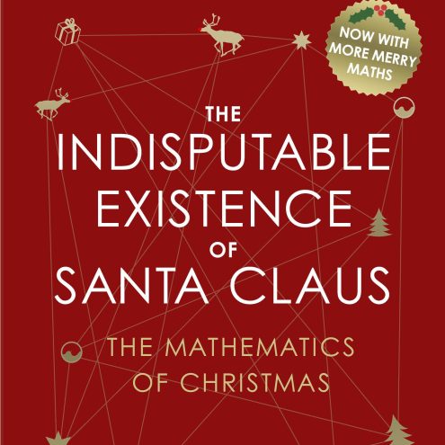
The Indisputable Existence of Santa Claus: The Mathematics of Christmas
These are great presents for anyone who wants to build their mathematical knowledge and venture into new areas of mathematics. Ever wanted to know how to use game theory to figure out who you should buy Christmas gifts for? Well, ‘The Indisputable Existence of Santa Claus’ written by UCL’s very own Dr Hannah Fry and Dr Thomas Oleron-Evans solves that exact question as well as all other mathematical Christmas conundrums (including the metabolic rate of Santa Claus!).
If these popular science topics pique your interest, definitely check out the rest of Dr Hannah Fry’s novels such as ‘The Mathematics of Love’ which finds patterns in romance and ‘Hello World: How to be Human in the Age of the Machine’ which tackles the good, bad and ugly of algorithms. If novels are too long for your liking, why not gift issues of Chalkdust magazine, a bi-annual magazine tackling all things mathematical? Founded by UCL Alumni Rafael Prieto Curie and published in UCL, each issue uses different areas of maths to solve real life problems so there’ll be something interesting for anyone who’s mathematically curious. Click here to check out some of their articles and order a copy!
2) Puzzles
Mathematicians are driven by a love of solving problems so gifting any sort of puzzle will definitely be fun. From chess sets and sudoku books, to mathematical board games like Decrypto and mechanical puzzles, the possibilities are endless. I’d particularly recommend puzzle books by Raymond Smullyman as they blend recreational maths problems with different fields of logic and set theory, the perfect brain teaser for on-the-go or a relaxed afternoon.
3) Klein Bottles
Klein bottles are key shapes in topology since the neck of the bottle twists into itself such that there’s no outside or inside to the shape. This topological surface isn’t actually possible to make in three dimensions, but 3D approximations are fun gifts as bottle openers, water bottles, lamps and decorative places!
4) Maths Pun utensils
No mathematician can deny the fun of mathematical puns, especially when they are in a practical application. Think ‘proof is in the pudding’ pudding bowls where mathematical proofs are written at the bottom, or a π pie plate. This will definitely put a smile on their face.
I hope this short list gave you some inspiration for the types of presents you can get to develop someone’s passion for maths. Regardless of what you give, what we value most is time with loved ones and a well-deserved break so I have no doubt that anything mathematical will be appreciated.
Happy Holidays!
Written by: Teren Lee, UCL Mathematics
