X Close

Anthropology of Smartphones and Smart Ageing Blog

Home

Anthropology of Smartphones and Smart Ageing

Menu

“Iconographies for Retirement” – By Pauline Garvey

By paulinegarvey, on 31 October 2019

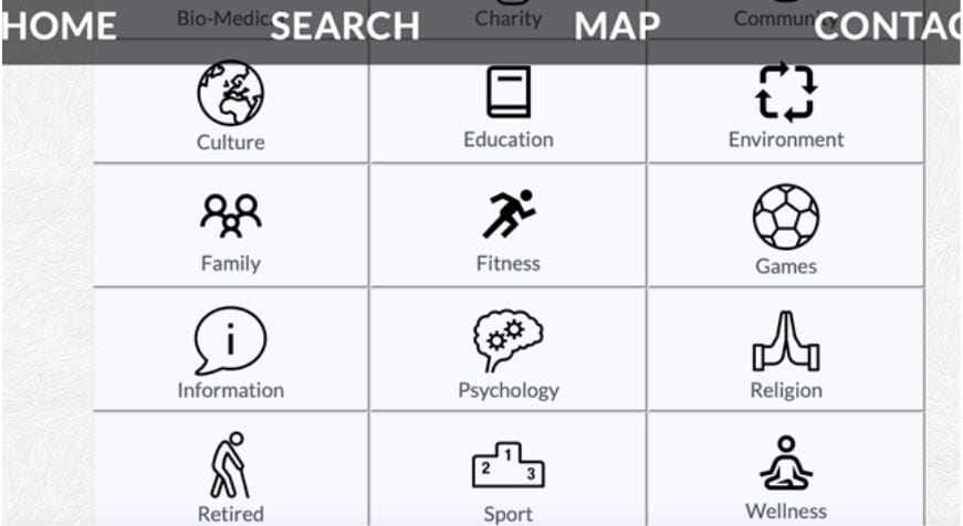
As part of the ASSA project, we are developing mHealth (mobile health) initiatives in order to address the needs of our populations. In our two field sites in Dublin we are engaged in developing social prescribing sites that can be accessed online, on smartphones, and as hard copies for those who are not comfortable with digital media.


Figure 1: One Dublin-based social prescribing site that we are developing.

Social prescribing is based on the recognition that a person’s health is improved by the degree she or he is embedded in social networks and cultural activities (see my blog December 2018). In many cases it involves a GP or counsellor writing a ‘prescription’ for a patient to attend a social activity that will embed a person in their community and enhance their health in mental, emotional and physical ways. In one pilot study, the Irish Health Service Executive described social prescribing as a service that:

“…helps to link you with sources of support and social activities within your community. Social Prescribing is for you if you feel that you need some support to mind your health and wellbeing, you feel isolated, stressed, anxious or depressed, you simply feel you need the service.”

This approach to health has been subject to quite a bit of media attention in Ireland this year and has been subject to several pilot studies nationally and internationally.[i] As part of this rising tide, there is now an annual international conference dedicated to social prescribing which is being developed in diverse countries from UK to the United States, Canada, the Netherlands, Singapore, and Finland.

The question for our team is firstly how can we develop a social prescribing site that enhances the lives of our research respondents? Secondly, how can an anthropological approach make a positive contribution to social prescribing more generally? Our approach is very much coloured by our methodology of anthropological ethnography and participant observation. This means that our insights emerge as the result of immersive participation in our field sites, building on the 16-month ethnographic fieldwork already completed. In developing a social prescribing website, we plan on continuing to work with our research respondents to understand how they use and engage with initiatives such as these.

The first issue emerged early when our informants expressed doubt about the iconography used to denote retirement.

Figure 2: One of the icons that our respondents objected to

For the people we work with, this icon seemed to capture an ageist expectation of what retirement should be rather than their actual experience of it. For example, one of my respondents jogged the 30 km home on the day he retired. Although this man’s level of fitness is not what I would describe as ‘average’, his perspective on remaining active is more in keeping with our respondents than the icon above (see figure 2).

As a result, we set about working with students from computer science in Maynooth University to create something more appropriate. As we work on developing iconography that better encapsulates the experience of our respondents, we realise that this is an ongoing iterative process that we will constantly revise as we launch our websites and work with our respondents in the years to come (see figure 1). Two alternative icons we are currently considering with respondents can be seen below.


Figure 3: Alternative retirement icons that we are currently considering with our research respondents.


References:

[i] https://www.irishtimes.com/life-and-style/health-family/what-is-social-prescribing-and-how-it-can-benefit-your-health-1.3840354


The less you know, the more you learn: on teaching smartphone usage to old adults in Santiago

By Alfonso Otaegui, on 26 February 2019

Walking by. Photo by Alfonso Otaegui

Within the frame of the Anthropology of Smartphones and Smart Ageing research project, I have been teaching workshops on smartphone usage for older people at a cultural center for almost a year. Teaching has not only been a very rewarding task, but it has also been a learning experience for me, as I had never taught elderly students before. I have been doing participant observation on how the students interact with their phones not only for the sake of the research project but also to become a better teacher. This opportunity of being in close contact with them for several months, on a weekly basis, when they interact with their phones, has allowed me to spot the main difficulties they face when learning to use this nowadays ubiquitous device.

The enthusiasm and effort of the students are admirable. I had argued a while ago that the experiences of using the phone are as diverse as the people who use it. Some common points can be found however when it comes to the obstacles along the learning curve, which I was able to spot after several months of teaching. One of the main obstacles is, as expected, the stigma of old age, as if ‘technology’ –a word that seems to encompass the totality of this brave new world– were beyond their capabilities: ‘All this is natural for you, the young people, but not for us’ said one student. Soon enough, when the students learn to perform some simple tasks with the phone, their self-confidence grows and allows them to keep learning, even if the stigma is still there, in the back of their minds.

The stigma of old age is not, however, the main obstacle I have encountered when teaching. The most difficult one is, by far, what I name, for lack of a better term, ‘anxiety’. ‘Anxiety’ is a general term to cover several behaviors I observed while they were instructed to do simple procedures. They have in common the underlying feeling of ‘overwhelment’: information or time is handled in a way that the user experience becomes overwhelming and therefore, frustrating.

The clearest example of ‘anxiety’ is getting distracted by too many options, and then blocked to finish the instructed operation. Something that might seem as straightforward as sharing a picture from the Gallery app, has many distracting alternatives along the way if you pay attention to every detail of every screen (most of the students have Android devices). Having opened the app, selected the album and selected the picture, then a series of –too many– possibilities appear, such as a heart, three dots in vertical, three circles intersecting, a square with an arrow, a square with a smiling face and an arrow, a paint pallet, three dots forming a V (the share button), or a trash bin. Even if the students are asked to focus on the share button, some of them may have already tapped on the trash button to delete the image, some others try one or button or another, while most of them ask about what every single button does and do not continue with the task they were learning. Most of the questions they asked me in individual consultations on operations they want to perform could be paraphrased like this: ‘then, I got here, and I don’t know which of all these is the next step’.

So, what can be done from the teacher’s perspective to help them overcome this obstacle? To put it simply, the best solution I have found so far is to deconstruct the garden of forking paths of mobile UI into a single highway. According to a survey and field studies by Leung et al. (2012), old adults prefer manuals for learning how to use mobile devices, as they usually contain step-by-step instructions. That is, in fact, what I ended up doing after a couple of months. With every operation I teach, I organize the web of options into a single line, and then write it down on the whiteboard (we have no screens or projectors at the cultural center), broken down into manageable steps, one after the other. The students copy every step –I usually tweak the instructions for each student, according to the specific UI of their phone–, building their own personal manual. This handwritten reference constitutes fundamental support for the old adult and in a way, it becomes the Ariadne’s thread they need to navigate through the labyrinth of everchanging contextual menus. Ironically, the student needs to ignore options in order to advance. Sometimes, the less you know, the more you learn.


References

Leung, R., Tang, C., Haddad, S., McGrenere, J., Graf, P., and Ingriany, V. 2012. How older adults learn to use mobile devices: Survey and field investigations. ACM Trans. Access. Comput. 4, 3, Article 11 (December 2012), 33 pages. DOI = 10.1145/2399193.2399195 http://doi.acm.org/10.1145/2399193.2399195