 Close
Close

Countdown to touchdown
By Oli Usher, on 10 November 2014

Comet C-G, seen by Rosetta’s NAVCAM on 6 November 2014. Philae’s landing site is towards the top of the image. Credit: ESA/Rosetta/NAVCAM – CC BY-SA IGO 3.0
After a decade of travelling around the Solar System, the Rosetta probe is now at its destination: Comet 67-P/Churyumov-Gerasimenko (or Comet C-G to its friends).
The Rosetta mission is made up of two parts which have spent the last decade bolted together: the orbiter, and the lander, known as Philae.
Just after 9am GMT on Wednesday, Philae will separate from the mother ship and begin its descent to the comet’s surface. Around seven hours later, if all goes well, it will touch down on C-G’s rough surface.
This will be the first ever landing on a comet.
The gravitational force between two objects is directly proportional to their masses and the distance between them. Philae, at around 100kg, weighs much the same as a (large) human being, but the comet has a tiny fraction of the Earth’s mass. The pull between them is therefore minuscule – of the order of the gravitational force experienced by an object weighing just one gram on Earth.
Even though Philae will only be approaching Comet C-G at walking pace, the low gravity means it will need to attach itself to the surface with a harpoon to avoid bouncing back into space.
Because of this, the manoeuvre has been compared to a ‘docking’ rather than a ‘landing’.
UCL’s Prof Andrew Coates is a member of the Rosetta Plasma Consortium, which will be monitoring the plasma environment of the comet during Philae’s descent and landing. (He was also closely involved with the design and construction of Rosetta’s scientific payload.) He will be at mission control in Darmstadt on Wednesday as the lander begins its descent.
“The Rosetta orbiter and lander provide unique perspectives on how comets interact with the solar wind and on charged dust from the surface. The historic landing attempt will be a huge opportunity for coordinated observations,” says Prof Coates.
- Bona fide members of the press can interview Prof Coates on landing day for comment. Please contact UCL Media Relations.

Comet seen over Rosetta’s solar array, 14 October 2014, when the comet was around 16km away. Credit: ESA/Rosetta/Philae/CIVA (All rights reserved)
Links
High resolution images
The Hubble Space Telescope’s successor: UCL’s contribution
By Oli Usher, on 3 November 2014
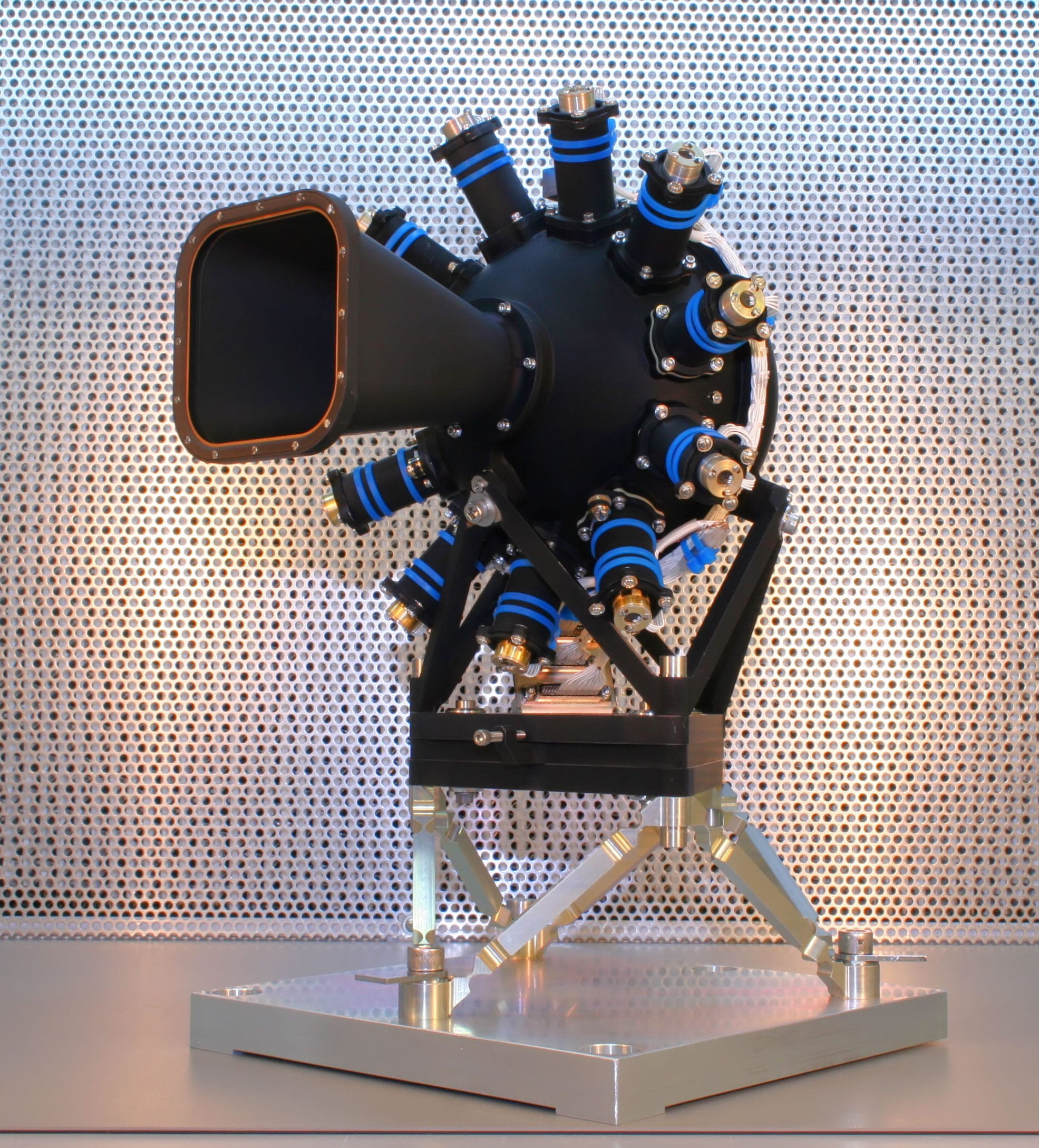
JWST NIRSpec calibration assembly. Photo credit: UCL MSSL
The James Webb Space Telescope (JWST), currently under construction by NASA and ESA, will be the successor to the wildly successful Hubble Space Telescope. Unlike Hubble, which specialises primarily in observing the same light our eyes see (with limited ultraviolet and infrared capabilities), JWST is specially designed to observe in the infrared.
These wavelengths are interesting to scientists as they allow them to peer through thick dust clouds which scatter visible light, revealing areas of star birth and planetary systems forming. They also reveal the distant past of the cosmos, which has been redshifted out of the visible spectrum thanks to its extreme distance. Infrared observations are extremely challenging to do from the ground as most wavelengths of infrared are absorbed by the atmosphere.
(Hubble’s capabilities in visible light will be largely replaced by a new generation of ground-based observatories, such as the European Extremely Large Telescope.)
A vast project like JWST involves numerous institutions around the world – and among their number is UCL. UCL’s Mullard Space Science Laboratory is providing part of the NIRSpec (Near Infra-Red Spectrograph) instrument, which in turn is part of the European contribution to the telescope project. JWST will also be launched from a European Ariane rocket in 2018.
NIRSpec will break down the light into its component wavelengths, allowing for precise measurements of the motion and chemical makeup of stars and galaxies.
The Calibration Assembly, pictured here, built by UCL, ensures accurate observations by periodically testing the accuracy of the instrument’s colour measurements.
Links
High resolution images
Visualising political polarisation
By Oli Usher, on 29 October 2014
Network diagrams are visualisations of the links between different things. Points mark out the things (for instance, children in a class) and lines are the connections between them (for instance, whether they are friends). For small sets of data, these are an arresting way of immediately understanding relationships between things.
For instance in this (imaginary) diagram, even the quickest of glances shows that Maryam has many friends and Peter has very few:

While they work well for small datasets, like a class with a few tens of children, these diagrams quickly become unreadable as you add more points.
But what if there were a way to avoid showing every point, while still somehow conveying the overall message? Many of the individual data points will be very similar or even identical (for instance Peter, Sarah and Philippe in the diagram above). If you could somehow average these out and come up with a handful of idealised versions of the children in the class, you could drastically reduce the clutter – and in the case of particularly complex ones, simplify a chart and make it readable.
This is something UCL statisticians Patrick Wolfe and Sofia Olhede have worked on in a new paper, published recently in the Proceedings of the National Academy of Sciences. The thrust of the paper is highly technical and not for the faint-hearted:

But one example of how their technique simplifies the presentation of data is much more comprehensible.
A decade ago, a statistical study of over 1200 political blogs in the run-up to the 2004 US election went viral thanks to a startling visualisation of the hyperlink between blogs:

Network diagram of US political blogs in 2004 (Credit: Lada Adamic, all rights reserved)
Blogs supporting President Bush’s Republican Party (red dots) overwhelmingly linked to other Republican blogs (red lines). On the left, blogs supporting the Democrats and their candidate John Kerry (blue dots) showed a similar pattern of mutual linking (blue lines).
Hyperlinks crossing the political divide – in orange – were relatively few and far between.
The chart starkly displays the lack of communication of a polarised political discourse. But if you’re looking for any finer detail, it is a mess. There are over a thousand dots and several thousand lines. The detail is impossible to see.
Olhede and Wolfe’s analysis condense down 1224 blogs into just 17 buckets of 72 blogs each, clustered together based on similar linking behaviour.
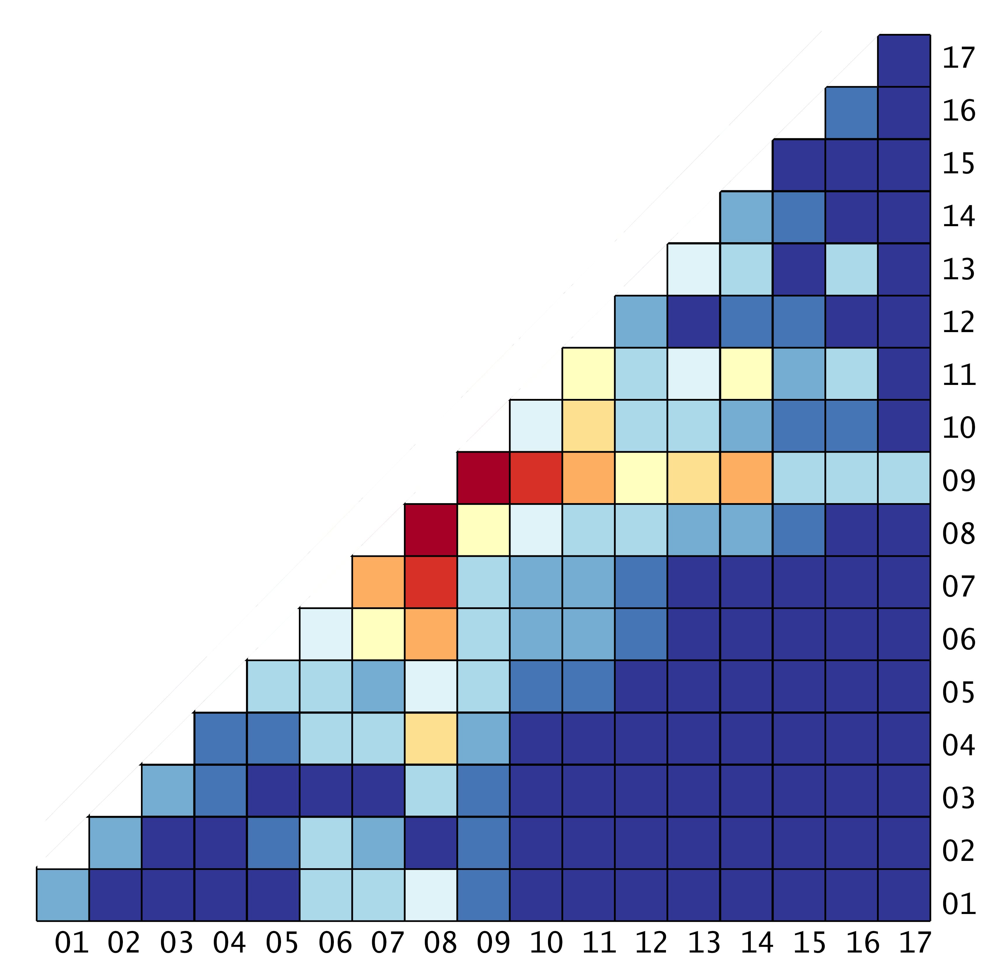
This diagram looks complicated at first sight, but it is in fact quite simple.
Each line and each column represents one of the 17 buckets of blogs, with lines and columns 1 to 8 representing the eight buckets of liberal blogs, while 9 through 17 are the nine buckets of conservative blogs.
Match up the co-ordinates, and the colour of the square shows how often these blogs link to each other, with dark blue being no links and bright red being extremely frequent linking.
So for instance, to see how frequently the blogs in the sixth bucket link to those of the eighth, you just need to look at the sixth block in the eighth column. (The square is orange, representing frequent linking between them – as indeed you might expect of two liberal blogs.)
This simplified diagram, called a ‘network histogram’, reveals the same dramatic segregation of the blogosphere as the network diagram does – notice the sea of blue in the bottom right part of the diagram, where you might expect to see links between Republican and Democratic blogs – in a chart with just 153 points of data, rather than several thousand.
It also shows other features such as relative popularity within each political grouping (which is virtually impossible to see in any detail in the original visualisation) as well as how much blogs within each of the 17 bins link to themselves (i.e. the blogs most similar to them). Perhaps surprisingly, many of them don’t – with the most isolated blogs not linking to blogs similar to themselves, but just linking to the most popular, most mainstream ones on their side of the political spectrum.
The network histogram also reveals the nature and frequency of the (rare) links across the political divide – for instance, the most popular cross-partisan linking occurs between bucket 9 of conservative blogs and bucket 8 of liberal blogs – though even this is only frequent enough to show up in pale yellow.
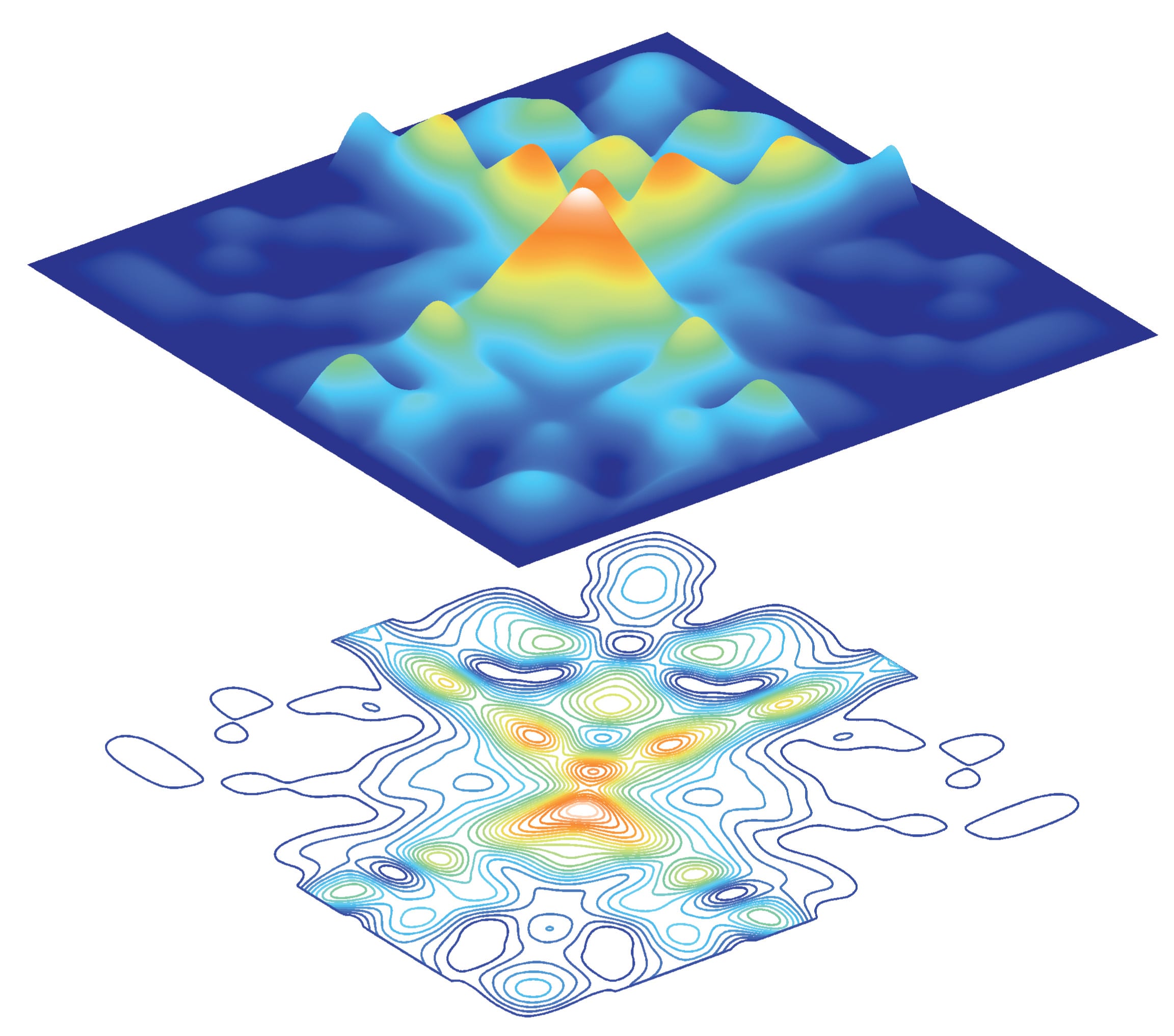
Make the histogram a square (by mirroring it), and the data can be represented in different ways – for instance, with different heights representing varying intensities of linking (top) or map-like contours (bottom).
Links
- Paper in PNAS (pdf)
- High resolution pictures of various visualisations of the network histogram are available on Flickr
- UCL Statistical Science
- Sofia Olhede
- Patrick Wolfe
Simplifying complex data
By Oli Usher, on 27 October 2014
One challenge in science is how to represent vast datasets in a way that the human eye and brain can understand. UCL statisticians Sofia Olhede and Patrick Wolfe have worked on methods of simplifying data on relationships between things in a way which captures all the important features, but is not so unwieldy that the patterns are lost.

The top pair of images on this page show data on how frequently blogs supporting different parties link to each other – showing frequent linking between fellow US Republican Party blogs and US Democratic Party blogs (top and bottom quadrants of the picture) but very little crossing the political divide (left and right quadrants). Peaks (in red and yellow) show groups of blogs that link to each other frequently, blue areas show combinations of blogs that rarely never link to each other. The lower image is a 2D map of exactly the same data.
The next image shows a mathematical approximation of the shape of the distribution of linking in that data – showing how the underlying pattern of blogs linking to each other is actually rather simple.

A detailed article on the science behind these images – and what they tell us – will be published here on the UCL Science blog on Wednesday.
Picture credits: Patrick Wolfe, Sofia Olhede (UCL Statistical Science).
Data from Adamic and Glance
Links
High resolution images
Yesterday’s solar eclipse, seen from space
By Oli Usher, on 24 October 2014
Yesterday saw a partial eclipse of the Sun, visible in parts of eastern Russia and North America. In space, however, a more impressive eclipse (with virtually the entire solar disc obscured) was visible to the Japanese Aerospace Exploration Agency‘s Hinode spacecraft.
Hinode (‘Sunrise’) was built in part by UCL’s Mullard Space Science Lab, and is the latest chapter in a long history of close relations between UCL and Japan.
This video shows the view captured from the spacecraft’s X-ray telescope, which captures the extremely hot gases in the solar atmosphere. (Note that while X-rays may let us see through a few centimetres of flesh, they don’t let us see through several thousand kilometres of Moon.)
Video credit: Shimojo/JAXA/ISAS
Representing resource use at UCL… using chemistry glassware and electronics
By uccafau, on 20 October 2014

Elements
How do you represent the complexities of the resource use of a university using just what you can find in a chemistry lab – and some collective ingenuity?
That’s what Andrea Sella, Joanna Marshall-Cook and I set out to do over the course of last week with the help of Rae Harbird and Stephen Hailes.
The result, Elements, is on show in UCL’s North Cloisters for Degrees of Change, a week long endeavour by UCL’s Sustainability team to explore the environmental consequences of all the world-class teaching, research, collecting, exhibiting, making, inventing and outreach that goes on at the university.
During the research for the installation I learned some interesting statistics. For instance, a typical chemistry fume cupboard uses 10,000kWh of electricity per year (£1,000), and our heating comes from a series of underground pipes.
The installation is a visual metaphor for how the university’s heating and water systems work. We often don’t think about the consequences of running a tap, or pouring a bucket down a drain, flushing a toilet, taking a shower. Chemical glassware in all its varied and complex forms provides a perfect toolbox to explore the convoluted system of flows in resource infrastructure. Elements incorporates soxhlets – a type of chemical glassware normally used for extracting liquid from a solid, such as producing essential oils – which act as reservoirs within the system as a whole, just as we act as reservoirs for water either within ourselves or by our actions.
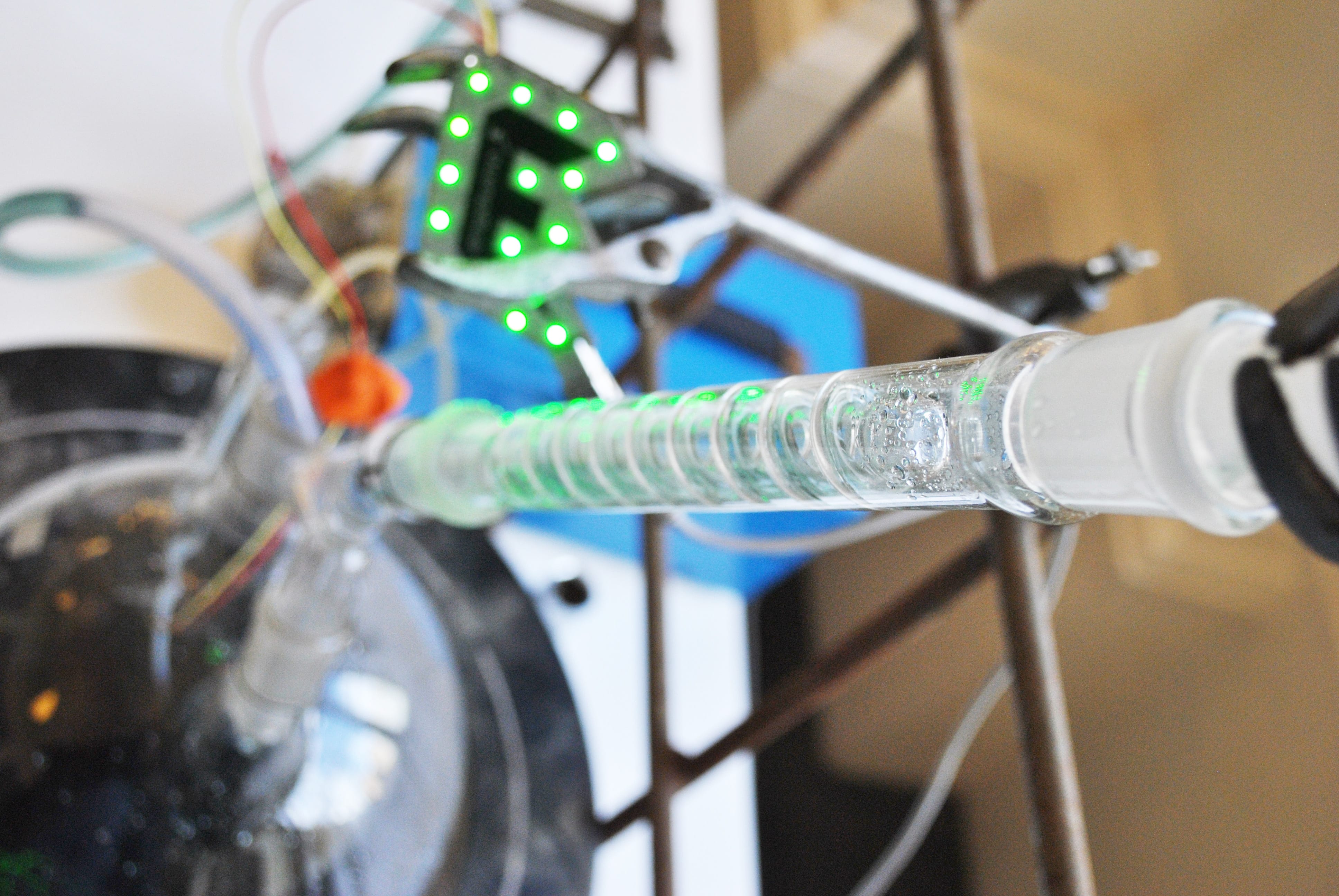
Lots of crazy glassware and – lit up in green and looking suspiciously like UCL Engineering’s logo – an EngDuino computer, monitoring the water level in the system
The crazy glassware installation also has a 5L round bottomed flask and an electric pump – after all, it takes power to heat and move all the university’s water. The flask is like the water infrastructure external to UCL – and is monitored by an EngDuino and sensor, programmed by Rae and Stephen, that alerts us when the water levels are low.

A sensor detects the water level and reports back to the Engduino if the level is too low
At a time of increasing water scarcity and climate change due to our energy use, it’s important to realise that our actions on a personal scale have a real affect that ripples through the infrastructure that helps us live as well as we do.
- Kat Austen is writer in residence at UCL Mathematical & Physical Sciences
- Elements is on show in the North Cloisters from 10am to 4pm until Friday 24 October
Marvellous maps
By Oli Usher, on 20 October 2014
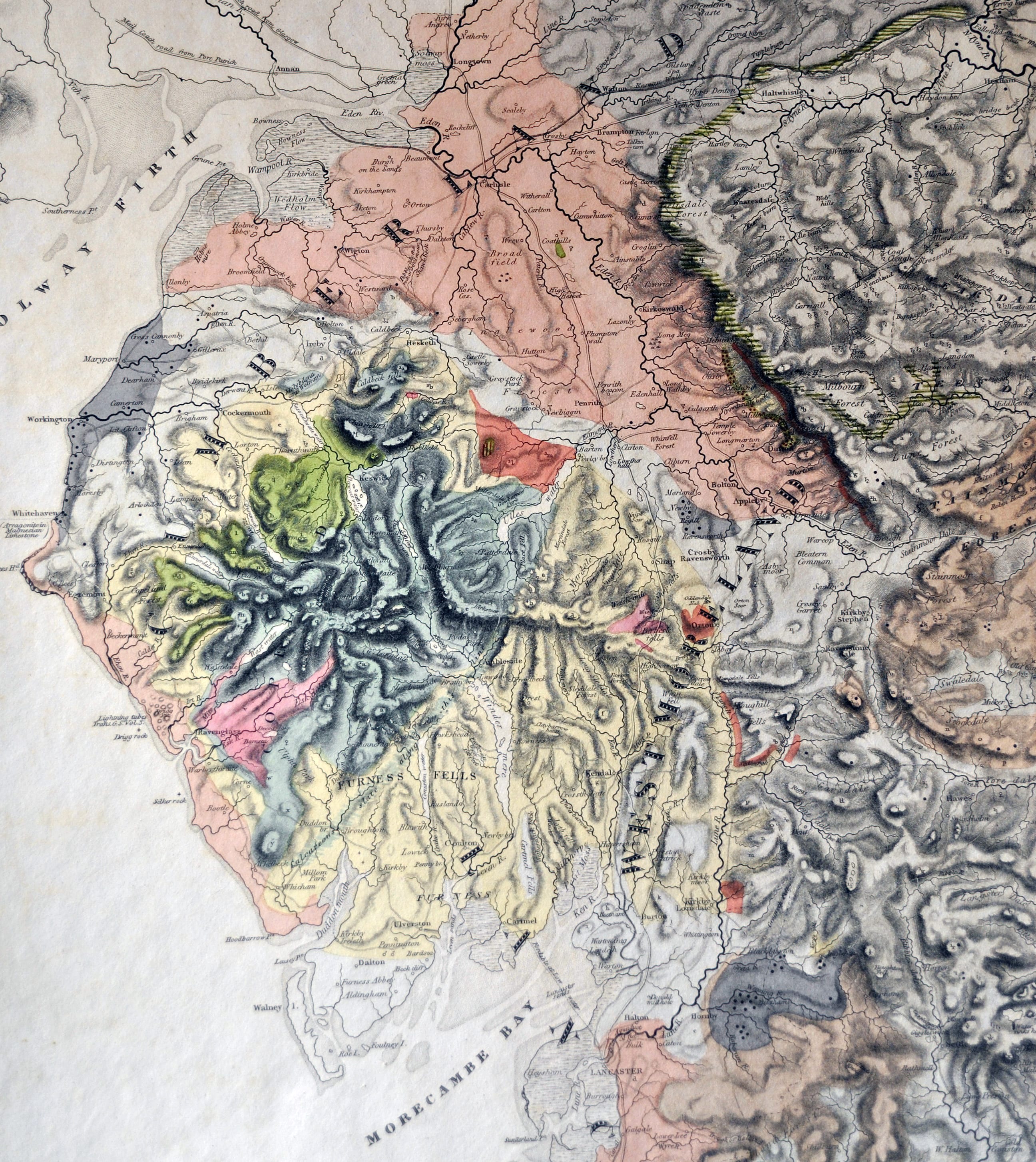
Part of George Greenough’s 1819 geological map of England & Wales, showing modern-day Cumbria (then Cumberland and Westmoreland)
This picture shows part of George Bellas Greenough’s 1819 geological map of England and Wales – the first to comprehensively map what lies beneath England’s countryside. This page shows the counties of Cumberland and Westmoreland (modern Cumbria).
Greenough was a pioneering geologist of the 19th century who left his collections to UCL when he died in 1855. (His name is commemorated in UCL’s Earth Sciences student society, the Greenough Society.)
Some of Greenough’s maps, along with other historic items from UCL’s Geology Collections, were publicly displayed on Friday as part of Earth Sciences week.
Links
High resolution images
Space Shuttle commander visits UCL Academy
By Oli Usher, on 13 October 2014

NASA Administrator Charlie Bolden (right) with UCL Academy principal Geraldine Davies (left)
Last week saw Charlie Bolden – a former Space Shuttle pilot who now heads up NASA – visit UCL Academy. In this week’s Picture of the Week, he can be seen visiting the school’s facilities with the principal, Geraldine Davies.
UCL Academy is a non-denominational state school in Swiss Cottage, around two miles north of UCL’s central London campus. The school, which is sponsored by UCL, educates local children and charges no fees, and has extensive input into its teaching from UCL academics and students. It opened in 2012, and recently sent its first student to UCL – to study chemistry.
Bolden gave an inspirational talk to students, and was mobbed by students as he toured the school afterwards.
UCL space scientist Lucie Green, who arranged the visit (and is one of the school’s governors), said: “UCL has a long history of working with NASA that began shortly after its formation in 1958. Today, we have an extended family that includes the UCL Academy and it’s wonderful to see the Academy being the focus for an inspirational visit by Charles Bolden. This is a very positive example of the value-added that comes from having such a broad community where we can work together for the benefit of the students.”
The event is covered in a post on the UCL Events blog, which begins:
Charlie Bolden was born in the deep south of the US, during the days of segregation and institutionalised racism. Despite this inauspicious start in life, he went on to a high-flying military career, commanded the Space Shuttle, spent 28 days in orbit and, in 2009, was made head of NASA by President Obama. He is the first African American to hold the position…
Links
High resolution images
UCL’s first Nobel Prize
By Oli Usher, on 7 October 2014
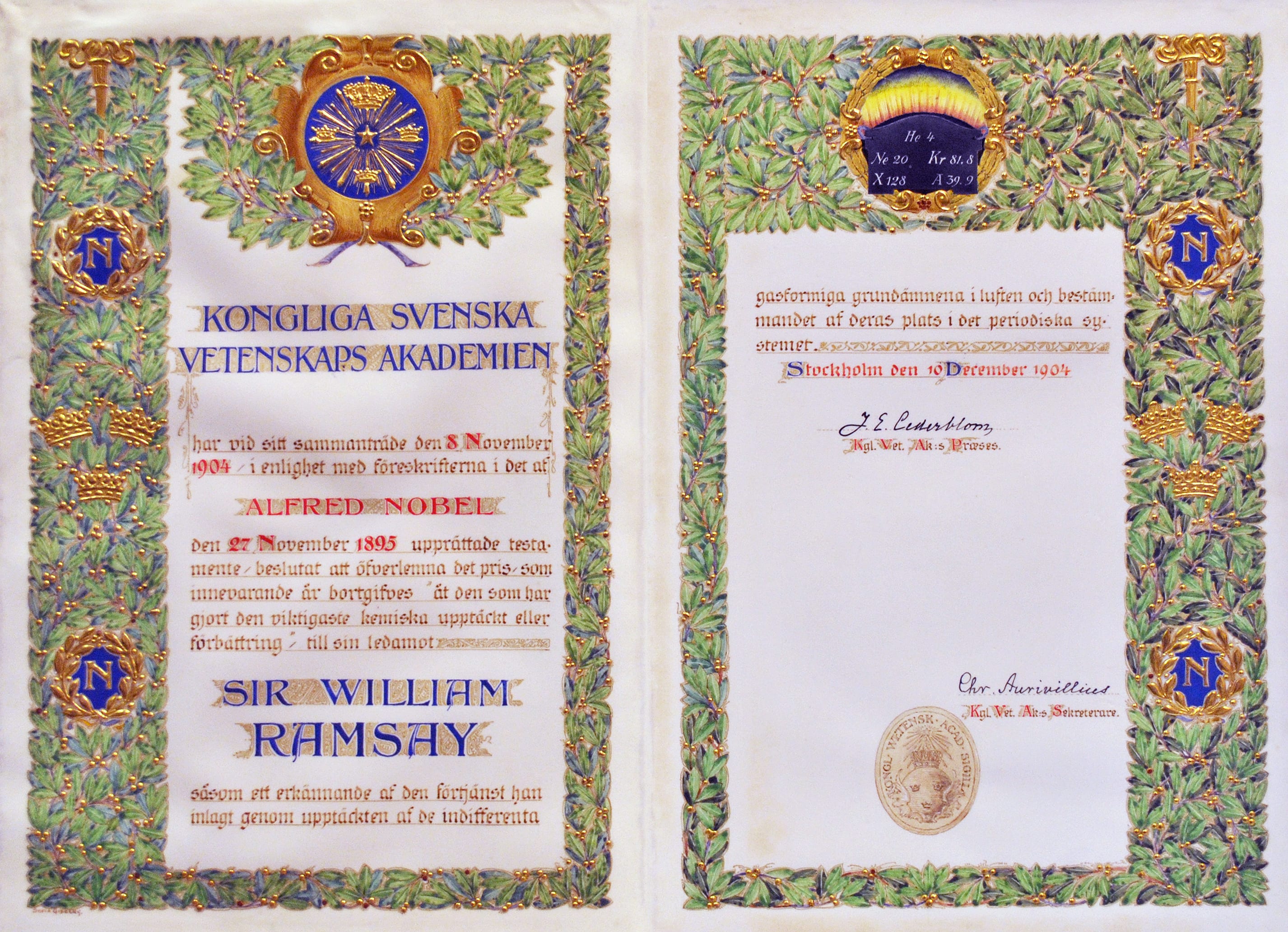
William Ramsay’s Nobel Prize certificate. Photo: public domain
This week is Nobel Prize week. Prof John O’Keefe (UCL Cell & Developmental Biology) has just been announced as the winner of the 2014 Physiology or Medicine Nobel Prize for his work on positioning systems in the brain.
He joins a long list of Nobel laureates affiliated to UCL.
The very first of these was Sir William Ramsay, who won the 1904 Nobel Prize in Chemistry. Ramsay is seen as one of the fathers of chemistry at UCL, and he is responsible for the discovery of the noble gases. He also supervised two students who also went on to win Nobel Prizes themselves: Jaroslav Heyrovský and Otto Hahn.
Ramsay’s Nobel Prize certificate, pictured above, is held in UCL’s collections, along with his medal and some of the apparatus he used to carry out his research.
Links
High resolution image
Mapping the Apollo landing sites
By Oli Usher, on 29 September 2014
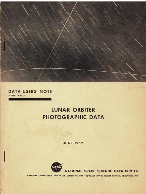 Apollo 11, which touched down in the Sea of Tranquility on 20 July 1969 was the first manned landing on the Moon. But prior to the human spaceflight project, NASA explored the Moon with robotic probes. One key element of this endeavour was the Lunar Orbiter programme, which included five spacecraft that mapped almost the entire lunar surface in 1966 and 1967. This was in part in order to identify landing sites for Apollo, but the missions also had broader scientific goals.
Shortly before the first manned landing, NASA published a catalogue of all their data from the Lunar Orbiter programme, entitled Lunar Orbiter Photographic Data. This features maps of the entire Moon, with the locations, sizes and shapes of all Lunar Orbiter photos marked on them, along with extensive technical information.
Today, missions like this work entirely online, but in those pre-internet days, the data had to exist in hard copy.
A copy of this book exists in UCL’s planetary science archives, the NASA Regional Planetary Imaging Facility. Among its pages is the mapping of the area Apollo 11 landed in, the Sea of Tranquility (Mare Tranquilitas here). This is located towards the right of this sheet, where the imaging (marked in red) is densest.

Links
High resolution images
