X Close

The Pigment Timeline Project

Home

Menu

A Colour A Day: Week 31

By Ruth Siddall, on 25 October 2020

A Colour A Day: Week 31. 19th -25th October

Jo Volley writes…

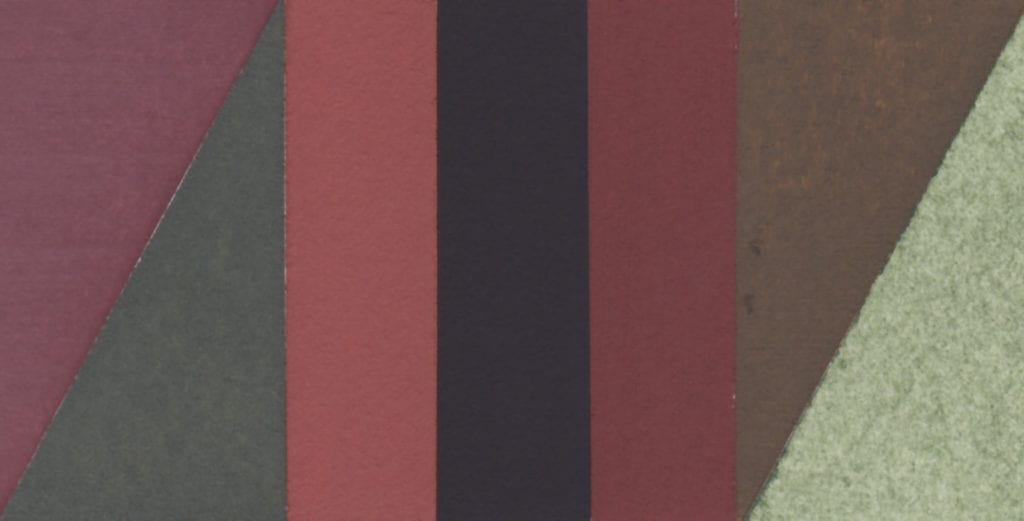
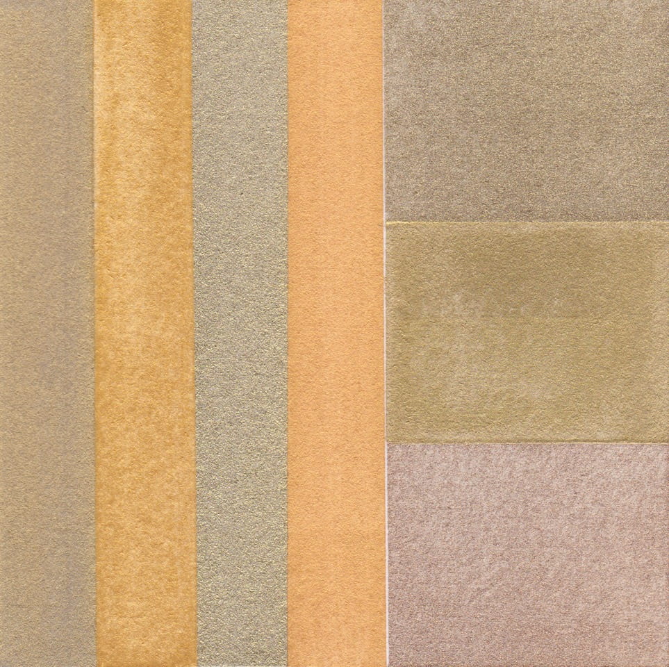
This week’s colours are manufactured by Ruth Siddall who says of them. ‘Procion MX Dyes – The difference between a dye and a pigment is that a dye is soluble in water and a pigment is insoluble. I am experimenting at the moment to try and find as many ways of making the colourful, organic compounds in dyes into insoluble pigments. These are a series of pigments I made by dyeing a starch with modern Procion MX dyes. I used potato starch as a substrate. I have seen modern dyes such as rhodamine being used in this way, so I thought I’d give it a go. If I’m honest, I’m disappointed with the pale colours produced – quite the opposite of the dyes which were intensely coloured! Chemically, Procion MX dyes are dichlorotriazines, which means they contain a ring-shaped molecule with three nitrogen ions so the formula is C3H3N3 (most ring molecules just have six carbons). In addition there are two chlorine ions attached to this ring and it is these that bond to -OH groups in fibres to produce strong dyes on cloth. Starch has -OH groups, so I had hoped it would work the same way here. There is some colour but it’s not as intense as I had hoped for.’

Each pigment is bound in gum Arabic on W&N watercolour paper. They were like no other pigment I have used before – it was rather like trying to paint with clouds – amorphous – the colour just slipping away. According to the American Meteorological Society, amorphous clouds ‘are without any apparent structure at all, as may occur in a whiteout in a thick cloud or fog over a snow surface when one loses any sense of direction – up, down and sideways’

Procion red MX-G
Procion yellow MX-4G
Procion blue MX-2R
Procion yellow MX-3K
Procion turquoise MX-G
Procion composite grey
Procion red – MX-5B


A Colour A Day: Week 30

By Ruth Siddall, on 18 October 2020

A Colour A Day: Week 30. 12th-18th October.

Jo Volley writes…

In October 2015, whilst on research leave, I travelled around Provence visiting pigment quarries, mines and factories to look at pigment manufacturing methods and processes. In this marvellous red landscape, I have never felt such a strong emotional relationship between the landscape and painting.  The trip was also something of a pilgrimage to visit the bibliotheque in Aix en Provence to view a remarkable manuscript made by the C17 Dutch artist A. Boogert who in 1692 completed an educational manual of how to mix every colour available to him. Each pigment is bound in gum Arabic and applied to paper with instruction as to their properties, proportions and potential. It is an extraordinary document of the pigments available at that time and of an artist’s dedication to learning. It was a humbling experience to hold in one’s hands this rare and beautiful manuscript, and to feel a connection with Boogert’s endeavours. The timeless and common manufacture of binding colour and making paint. The sheer pleasure of it… and its desire to communicate. It has also been the inspiration for this project.

Each red earth is bound in gum Arabic on W&N watercolour paper.

Collected: Sentier des Ocres, Roussillon.
Purchased: Sentier des Ocres, Roussillon.
Collected: Les Mines des Bruoux, Gargas.
Collected: Mathieu Ocre Usine, Roussillon.
Purchased: Les Mines des Bruoux, Gargas.
Purchased: Mathieu Ocre Usine, Roussillon.


A Colour A Day: Week 29

By Ruth Siddall, on 11 October 2020

A Colour A Day: Week 29. 5th -11th October

Jo Volley writes…

In the early 1800’s the mineralogist Abraham Werner published the Nomenclature of Colours to identify minerals by key characteristics. It was later amended by Patrick Syme, C19 Scottish flower painter, having been introduced to it by Robert Jameson who had studied for a year under Werner before becoming a professor of Natural History at Edinburgh University. Jameson had matched Werner’s descriptions with the actual minerals, Syme then used these as his starting point for the colour names, descriptions and actual colour charts introducing references to animals and vegetables. Darwin took a copy on the HMS Beagle voyage (1831-1836) and its terminology, ‘lent both precision and lyricism to Darwin’s writings, whether he was detailing the changeable ‘hyacinth red and chestnut brown’ of the cuttlefish, ‘the primrose yellow’ of species of sea hare, or the ‘light auricular purple’ and provided his naturalist contemporaries with clear point of reference, and enabled all his readers to clearly envision the creatures and settings of lands that most, in a pre-photography age, would never see.’

Extracts from Publisher’s notes Werner’s Nomenclature of Colours, Natural History Museum


A Colour A Day: Week 28

By Ruth Siddall, on 4 October 2020

A Colour A Day; 28th  September – 4th October

Jo Volley writes…

This week’s colours are seven Russian earth pigments gifted by Ruth Siddall who says of them. ‘These seven pigments are supplied by Moscow-based company Colibri Premium Pigments. Many of the earth and mineral pigments they supply are sourced in Russia. This is a selection of their ochres, which include iron ochres (red and yellow ochre) and aluminium-rich earths known as bauxite (deposits much overlooked as ochres). Siderite is iron carbonate. Also included here are two very ‘Russian’ pigments made from minerals mainly known only from deposits in Russia. Shungite is a black, carbon-rich earth pigment. It is found in very ancient, 2 billion year old rocks in Russian Karelia, in the region of Lake Onega. It is named after the town of Shunga. It formed as biogenic deposits, probably from algae preserved in anoxic conditions and then subsequently metamorphosed. Volkonskoite is a green-coloured, chrome-bearing smectite clay mineral. It is sourced from the Okhansk region of the Urals. Tuff is a volcanic ash deposit, in this case coloured purple by iron oxides.

Ruth suggests listening to Sibelius’s Karelian Suite whilst viewing the colours.

All pigments are bound in gum Arabic on W&N watercolour paper and read from left to right:

Tuff Purple
Siderite
Mumia Bauxite
Shungite
Sankirnaya Ochre
Volkonskoite

A Colour A Day: Week 27

By Ruth Siddall, on 27 September 2020

A Colour A Day: Week 27; 21st-27th September

Jo Volley writes…

This week’s colours are inspired by Anni Albers’ 1926 wall hanging Black White Yellow exhibited at the Tate show in 2018. In her book, On Weaving, she states; ‘Continuing in our attitude of attentive passiveness, we will also be guided in our choice of color, though here only in part. For our response to color is spontaneous, passionate, and personal, and only in some respects subject to reasoning. We may choose a color hue – that is, its character as red or blue, for instance – quite autocratically. However, in regard to color value – that is, its degree of lightness or darkness – and also in regard to color intensity – that is, its vividness – we can be led by considerations other than exclusively by our feeling. As an example: our museum walls will demand light and have a color attitude that is non-aggressive, no matter what the color hue and whether there is over-all color or a play of colors.

First column top to bottom:
Davy’s Grey – W&N Watercolour
Turner’s Yellow – Liquitex Soft Body Acrylic
Gris Lichen – Lefranc Bourgeois Designers gouache
Primary Yellow – W&N Designers gouache
Davy’s Grey – W&N Watercolour
Turner’s Yellow – Liquitex Soft Body Acrylic

Second column top to bottom:
Velvet Black – Lefranc Bourgeois Designers gouache
White
Velvet Black – Lefranc Bourgeois Designers gouache

Third column top to bottom:
Primary Yellow – W&N Designers gouache
Gris Lichen – Lefranc Bourgeois Designers gouache
Turner’s Yellow – Liquitex Soft Body Acrylic
Davy’s Grey – W&N Watercolour
Primary Yellow – W&N Designers gouache
Gris Lichen – Lefranc Bourgeois Designers gouache

Fourth column top to bottom:
White
Velvet Black – Lefranc Bourgeois Designers gouache
White

Fifth column top to bottom:
Spectrum Yellow – W&N Designers gouache


A Colour A Day: Week 26

By Ruth Siddall, on 20 September 2020

A Colour A Day: Week 26. 14th-20th September

Jo Volley writes…

This weeks colours are 7 lake pigments manufactured by Ruth Siddall.


ON THE CHARACTER OF A RED CALLED LAC
CHAPTER XLIII

A colour known as lac is red, and it is an artificial colour. And I have various receipts for it; but I advise you, for the sake of your works, to get the colour ready made for your money. But take care to recognise the good kind, because there are several types of it. Some lake is made from the shearings of cloth and it is very attractive to the eye. Beware of this type, for it always retains some fatness in it, because of the alum, and does not last at all, either with temperas or without temperas, and quickly loses its colour. Take care to avoid this; but get the lac which is made from gum, and it is dry, lean, granular, and looks almost black, and contains a sanguine colour. This kind cannot be other than good and perfect. Take this, and work it upon your slab; grind it with clear water. And it is good on panel; and it is also used on the wall with a tempera; but the air is its undoing. There are those who grind it with urine; but it becomes unpleasant, for it promptly goes bad.

Cennino Cennini, Il Libro dell’Arte


All pigments are bound in gum Arabic on W&N watercolour paper and read from left to right:

Iris green lake – ‘Lily green’
Logwood lake
Logwood ‘chalk’ lake
Cutch #1
Cutch #2
Butterfly Pea Flower lake
Lac lake – Kerria lacca

A Colour A Day: Week 25

By Ruth Siddall, on 13 September 2020

A Colour A Day: Week 25. 7th-13th September

Jo Volley writes…

A method for making shell gold

Grind either skewings or leaf gold with a small amount of clear honey into a paste using a muller and slab. Work the muller slowly in a figure of eight until you have the mixture spread out thinly on the slab, gather up and begin grinding again. Continue this process for approx. 15 minutes or until you have broken down the gold into fine particles. Place the mixture into a glass and fill with hot water to flush out the honey.

When the gold has settled to the bottom of the glass decant the water.
Repeat approx. 5 or 6 times until all the honey is removed. De-ionised or distilled water is recommended for the last 2 stages. Allow the gold pigment to dry. Bind with gum Arabic and store the gold paint in a shell.

All pigments are bound in gum Arabic on W&N watercolour paper.

First column left to right: Four gold pigments gifted by the artist, Lisa Milroy, collected on her travels in China.

Second column top to bottom:
Schmincke pale gold
Jo Volley’s shell gold
Schmincke rich pale gold

A Colour A Day: Week 22

By Ruth Siddall, on 23 August 2020

A Colour A Day Week 22. 17th-23rd August

Jo Volley writes…In JL Carr’s novel A Month in the Country the protagonist Tom Birkin returning from the First World War is redeployed as a wall painting conservator. He spends the summer uncovering a large medieval wall painting in a country church and along with it rediscovers a sense of faith in the future. As the painting’s image is revealed and through the unknown artist’s use and choice of colours, Tom begins to appreciate and understand the man.

‘I was working up the 3 brothers (see Luke 16), blissfully heedless of the judgement to come…The second magnate’s cloak was a splendid garment – red outside and green lining. A very good red, the best in fact, no expense spared, sinoper haematite that is, not to be confused with what some fatheads call sinoper which, as often as not, is red earth, the stuff they used to bring in by the shipload from Pontus Euxinus (and don’t ask me where that was). That’s the red which darkens almost as soon as you turn your back on it: it survives and that’s all that can be said for it. In fact, on damp walls, it’s all that does survive. Well, back to this chap’s cloak. It was resin-based and that doesn’t ooze out, by the gallon; they found a scallop-shell with caked deposit amongst the rubble in the Gifford Chantry at Boyton.’

‘Mr Birkin…Mr Birkin…is it an oil painting or a water colour or what is it for goodness sake?’ ’It’s all sorts of things, Mrs Keach. Item – blew bysse at 4s 4d. the pound, item – one sack of verdigris at 12d. a pound, item – red ochre, 3 pounds a penny, item – 3 pecks of wheat flour…. I suppose you could lump it all as tempera. And let’s not forget the wall itself – down in the sinful south, plastered with chalk bound with parish offerings of skimmed milk; up here, slaked limestone putty damped just enough to stiffen. That’s about what it is. …Spaynishe white,  Baghdad indigo, Cornish malachite…

But for me, the exciting thing was more than this. Here I was, face to face with a nameless painter reaching from the dark to show me what he could do, saying to me as clear as my words, ‘If any part of me survives from time’s corruption, let it be this. For this was the sort of man I was.’

Each pigment is bound in gum Arabic on W&N watercolour paper and reads from left to right:

Malachite
Verdigris
Chalk
Haematite
Red ochre
Chalk
Indigo
Blue bice

A Colour A Day: Week 21

By Ruth Siddall, on 16 August 2020

A Colour A Day Week 21. 10th-16th August

Jo Volley writes….

Extracts from Matisse on Art Jack D Flam 1973. On the occasion of an exhibition at the Gallery Maeght, December 1949 the title of which was Black is a Colour. Henri Matisse’s remarks were recorded by M. Maeght.

Before, when I didn’t know what to put down, I put down black. Black is a force: I depend on black to simplify the construction. Now I have given up all blacks*The use of black as a colour in the same way as the other colours – yellow, blue or red – is not a new thing. The Orientals made use of black as a colour, notably the Japanese in their prints. Closer to us, I recall a painting by Manet in which the velvet jacket of a young man with a straw hat is painted in a blunt and lucid black. In the portrait of Zacharie Astruc by Manet, a new velvet jacket is also expressed by a blunt luminous black. Doesn’t my painting of the Marocains use a grand black which is as luminous as the other colours in the painting? Like all evolution, that of black in painting has been made in jumps. But since the Impressionists it seems to have made continuous progress, taking a more and more important part in colour orchestration, comparable to that of the double-bass as a solo instrument. 

*Matisse does not mean he has given up the use of black, but that he no longer used it merely for linear construction as in his earlier works. Actually, at this time Matisse was making a use of black as a colour instead of an element of linear construction.

From left to right

  1. Jet – W&N Designers gouache
  2. Perylene – W&N Designers gouache
  3. Lamp – W&N Designers gouache
  4. Blue Black – W&N Calligraphy ink
  5. Mars – W&N Designers gouache
  6. Ivory – W&N Designers gouache
  7. Noir Intense – Lefranc Bourgeois Linel gouache

A Colour A Day: Week 15

By Ruth Siddall, on 5 July 2020

A Colour A Day: Week, 15. 29th June – 5th July

Jo Volley writes…….

In spring 2017, Nisar Hossain, Dean of the Fine Art Faculty, University of Dhaka, Bangladesh, Artist and specialist on Contemporary Painting and Folk Painting of Bangladesh, led a contemporary installation  workshop at the Slade based on traditional Folk Art of Bangladesh.  He also gave  a public lecture at the Whitechapel Gallery The heritage of ritualistic folk painting and the traditional painter communities of Bangladesh as part of the Inspire exchange project between the Slade School of Fine Art and the University of Dhaka Faculty of Fine Art, Bangladesh funded by the British Council.

Links to various workshops throughout the Inspire project

Here are 7 of the colours Nisar generously donated to the Material Research Project pigment library, written in Bangla, as he gave me. Each are bound in gum Arabic on W&N watercolour paper and read from left to right.

  1. Hāra pathar
  2. Haritāl
  3. Sindura
  4. Bhusha kali
  5. Hingula
  6. Elamati
  7. Nīl