X Close

The Pigment Timeline Project

Home

Menu

Archive for the '#MaterialsResearchProject' Category

A Colour A Day: Week 51

By Ruth Siddall, on 14 March 2021

A Colour A Day: Week 51. 8th – 14th March
Jo Volley writes…
This weeks colours include a text from Shaan Bevan on making her own colours.
Making my own colour from raw material allows me to examine the properties behind the colour, often beyond the physical. Collecting colour links me to place, ecology, and the process of augmentation. A scientific exploration allows me to understand the natural process behind colour and the innate physical properties that result in its behaviour. Historical research opens up complicated political and social realities that are often buried in my initial perception of the material. All of this investigation deepens my practice and allows me to uncover the poetry contained in the material I’m working with.
Shaan is an artist currently studying on the Graduate Painting programme at the Slade School of Fine Art, UCL.
All pigments are bound in gum Arabic on W&N watercolour painting and read from the top:
Newman’s Dragons Blood
         Bistre – Ashphaltum
         Alizarin Green
Shaan Bevan’s Creosote – Atramentum
         Brown  Madder

A Colour A Day: Week 50

By Ruth Siddall, on 7 March 2021

A Colour A Day: Week 50 1st – 7th March
Jo Volley writes…

This weeks colours include Peter Newell Price’s Black Carbon Fibre who says of it;

‘Carbon fibre was first used in1860 by Sir Joseph Swan as a filament in the development of the first primitive incandescent light bulb, from which Thomas Edison further developed the first long lasting electric incandescent light bulbs. High performance structural carbon fibre used today was invented in the USA in 1958 by Roger Bacon. Its commercial manufacture took many years to develop and uses polyacrylonitrile as its raw material, which is white in colour. It is stretched, oxidised and finally carbonised in high temperature furnaces, in an inert atmosphere, that vaporise half of its materiality. The end product, carbon fibre, is almost pure carbon and black.

My own use of Carbon fibre came about almost by accident. I’d been using some in a totally practical way to strengthen some laminated fibre glass joints when a section of the woven carbon fibre cloth unravelled and linear lines of the warp and weft from the cloth fell to the floor. What immediately interested me was that the scattered black lines were like a drawing and not just because they were linear, but because they were the same element as one of its allotropes graphite, the material of a humble pencil. I liked the idea that a drawing in carbon fibre extended the pencil line, yet it had the tensile strength to liberate the line off the paper.

I experimented with ways of using carbon fibre, making three dimensional drawings, which lead to using it in a milled form to mix with epoxy to make fillers and trying it with mediums, to see if it would work as a pigment to make a black paint. The fibres are extremely fine, about 7 micrometers in diameter and reflective, so I’ve found that as a paint it has a subtle velvety appearance, which slightly tones down its blackness. Used as a water colour the black tone remains consistent with no secondary tone bleeding from the denser black.

Carbon and what we call black has a tightly fused relationship. Black is technically not a colour, as black absorbs all light from the visible spectrum and reflects none of the light back into our sight. So it is carbon in its various forms and shades which has formed the physical interpretations of what we know as black. I like to see black and carbon as one and the same and If black is the absence of light then carbon, like Joseph Swans light bulb has made it shine.’

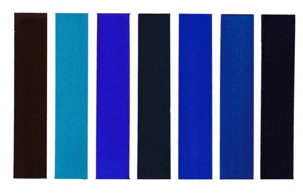
Image: Peter Newell Price Untitled A3

First column top to bottom:

Indian Purple in gum Arabic
Jo Volley’s Iron solution (2019)
Field’s Purple in gum Arabic

Middle column:

Peter Newell Price’s Black Carbon Fibre (2018) in gum Arabic

Third column top to bottom:

Anthracite
Perrindo Violet in gum Arabic
David Dobson’s Synthetic Vivianite (2017) in gum Arabic


A Colour A Day: Week 49

By Ruth Siddall, on 28 February 2021

A Colour A Day: Week 49. 22nd – 28th February

Jo Volley writes…

This weeks colours are mainly produced by Ruth Siddall who says of them;

These slates and shales represent the Palaeozoic stratigraphy of north west England and Wales. The coal-black, black shale from Britannia Quarry in the Pennines and was collected during a field trip to the South Pennine Coalfied with Onya McCausland. The slates from Penrhyn (Cambrian Slate) and Blaenau Ffestiniog and the red shale from the shores of the Menai Straits were all collected in North Wales over the past year. I would like to dedicate this set of pigments to my late mother, Anne Siddall (8th June 1940-22nd November 2020) who grew up in Lancashire, the daughter of parents from North Wales and with ancestors who worked in the slate quarries of the region. The Plas Brereton red ochre slate outcrops close to her final home in Caernarfon.

All colours are bound in gum Arabic on Winsor & Newton watercolour paper and read from left to right.

Cambrian Heather Slate
Cambrian Sage Slate
Blaenau Grey Slate
Blaenau Ochre Slate
Plas Brereton Red
Britannia Black
Cote d’Azure Violet from Kremer Pigments


A Colour A Day: Week 48

By Ruth Siddall, on 21 February 2021

A Colour A Day; Week 48. 15-21 February

Jo Volley writes…

This week are colours are seven earths generously gifted to me by their makers and accompany George Szirtes’ wonderful poem Soil.

Soil takes place in England on a train journey. I was taking a ride I think from London up to Yorkshire and I looked out at the soil, the earth and I thought I recognise that colour – where does that colour come from? And what does it mean to me? It seemed to be saying something, it seemed to be saying something and it brought to my mind the subject of belonging – to the soil, or to that soil.’ George Szirtes

Soil

What colour would you call that? That brown
which is not precisely the colour of excrement
or suede?
The depth has you hooked. Has it a scent
of its own, a peculiar adhesiveness? Is it weighed,
borne down
by its own weight? It creeps under you skin
Like a landscape that’s a mood, or a thought
in mid-birth,
and suddenly a dull music has begun. You’re caught
by your heels in that grudging lyrical earth,
a violin
scraped and scratched, and there is nowhere to go
but home, which is nowhere to be found
and yet
is here, unlost, solid, the very ground
on which you stand
but cannot visit
or know.

From The Budapest File (Bloodaxe, 2000) George Szirtes 2000; used by permission of the owner. Click to listen to George reading Soil.

Colours read from top to bottom on W&N watercolour paper:

Christine Chua’s Singapore Ochre
Chalybeate – Cohen’s Fields Fountain JV/2020
Gail Lamarche’s Arizona Red
Penelope Kupfer’s Waterfall Red – Brazil 2019/20
Penelope Kupfer’s Roadside Red – Brazil 2019/20
Hampstead Heath no.6 JV/2020
Onya McCausland’s Six Bells Burnt Ochre (oil paint)

Chalybeate Fountain, Cohen’s Fields, Hampstead Heath

A Colour A Day: Week 47

By Ruth Siddall, on 14 February 2021

A Colour A Day: Week 47 8th – 14th February
Jo Volley writes…

This week’s colours accompany this beautiful poem by artist and poet Sharon Morris.

The purpose of blue

But it’s the colours I miss, don’t you see?
the lapis sky and fair cerulean blue
of ocean, the precise shivering hue
of your laugh on a bright day, so clear.

Whatever the light, lavender appears
to shave blue from grey, the way I knew you.
I’m dead-heading the daisy – though it’s futile –
sweeping leaves and weeding ‘volunteers’.

My eyes close – the way whales slip from view
between the waves – I have to let you go.
I still wear that specific shade of turquoise –

you looking out at the Pacific Ocean –
the way blue sky screens emptiness, its purpose
forgetting or holding on. Is this beauty?

The purpose of blue is from a set of sonnets, some of which were published in the anthology Tying the Song, Enitharmon Press, 2000. Sharon is also a Professor of Fine Art, Slade Deputy Director (Academic) and Head of the PhD Programme.

Colours read from left to right on W&N watercolour paper.
Methyl Violet pigment bound in gum Arabic
Cerulean Blue pigment bound in gum Arabic
Dumont’s Blue W&N watercolour
Vivianite pigment bound in gum Arabic
Oregon Blue (Yin mIn Blue), Derivan, Matisse Range*
Monastral Blue pigment bound in gum Arabic
Bronze Blue pigment bound in gum Arabic

*I first became aware of Yin MIn Blue in the summer of 2016 and wrote to the manufacturers requesting a sample for the Slade Material Research Project Pigment Collection but without luck. I then discovered a paint manufacturer in Australia, Derivan, were advertising it in their Matisse range as Oregon Blue and wrote a similar email asking for a donation. This is response from Steven Patterson, Derivan’s Chief Executive Officer that summer.
‘Thank you for your email – I would be happy to send you a sample of the paint we have made with the pigment, however we do not have any dry pigment left!!! we have used it all!!! – yet if you are happy with the paint please let me know the best address to send it to.’
I accepted his kind offer and very excited to receive a few weeks later two tubes plus some lovely colours from their Natural Pigments of Australia range which have been featured in previous weeks A Colour A Day.
A conversation in the Housman bar over the newly acquired blue with Ruth Siddall and David Dobson got David thinking about inventing his own new blue – more on that another time. At a later date Steven Patterson very generously sent a sample of the pigment, now part of the collection, and featured in an exhibition in the Material Museum during Colour & Poetry: A Symposium 2019.

A Colour A Day: Week 46

By Ruth Siddall, on 7 February 2021

A Colour A Day: Week 46. 1st – 7th February 2021

Jo Volley writes …

This week we celebrate seven orange pigments with an accompanying text written by Ed Winters.

Orange is both a direct and indirect reference to the secondary colour. It is direct in that it names the colour. It is indirect in that it refers to the citrus fruit which, when ripe, exemplifies the colour. It is a secondary colour in that it can be ‘divided by’ red and yellow, the two primary colours between which it sits on the colour wheel. It is the complementary colour of the third primary colour, blue. It is as warm as blue is cool.Thus, we can begin to build up descriptive relations between orange and the system of colours into which its place is uniquely specified in advanceIf that sounds queer, it is because colour is, first and foremost, apprehended in and through perception. To talk of a colour geometry is to posit a system which is conceived a priori. If no-one had ever seen orange, say because there just happened to be no orange surfaces in the world, we would nevertheless feel that there is somewhere in colour space awaiting its arrival; a gap, so to speak. Given our conception of complementary colours we would be puzzled by the gap that is left in partnering blue with its complementary. (We would have to think of orange even if we had never seen it. And that is a very odd thought). It is a bright colour with a tonal value between the lighter colour yellow and the darker colour red. It thus reflects more light than its complementary blue (the so called “problem of inverted qualia”)Wittgenstein, in noticing such features of colours, undermines the thought that what you see as orange could be what I see as blue. Hence Wittgenstein looks to these other features of colour properties to begin to identify colours without recourse to indirect descriptions.

Dr Edward Winters is a writer and artist. He is an elected member of the Association Internationale des Critiques d’Art; and an elected member of the council of the Royal Institute of Philosophy. He writes widely on art and aesthetics.

All pigments are bound in gum Arabic on W&N watercolour paper and read:

First rectangle clockwise from top:

Orange Vermilion

Chrome Orange

Alizarin Orange

Monolite Orange

Second rectangle clockwise from top:

Lead Tin Orange

Lead Tin Orange

Iragazine Orange

End rectangle:

Mineral Orange


A Colour A Day: Week 45

By Ruth Siddall, on 31 January 2021

A Colour A Day: Week 45. 25 – 31 January

Jo Volley writes…

This week we have seven beautiful copper based pigments manufactured by Ruth Siddall who says of them:

‘Of this set of seven pigments, four are derived from natural mineral samples and three are synthetic. Two are made by reacting metallic copper with vinegar plus or minus salt to produce verdigris (copper acetate) and atacamite (copper hydroxy chloride). The final synthetic pigment is a precipitate of copper carbonate formed by mixing copper sulphate solution with sodium carbonate solution. The natural minerals were bought from reputable mineral dealers and were sourced from copper mines in the Katanga region of the Democratic Republic of Congo.

All pigments bound in gum Arabic on W&N watercolour paper and read from left to right:

Copper Carbonate
Malachite & Azurite
Malachite
Verdigris
Synthetic Atacamite
Azurite
Malachite & Chrysocolla


A Colour A Day: Week 44

By Ruth Siddall, on 24 January 2021

A Colour A Day: Week 44.  18th-24th January

Jo Volley writes…

This week’s colours were manufactured at Joshibi University of Art & Design,  Japan and donated to the Slade some 20 years ago, where they are now housed as part of the Slade Material Research Project Pigment Collection. 

At that time the Joshibi department were conducting a study on materials used in traditional Japanese painting adding to their understanding and knowledge outside of Japan.  Along with 14 pigment sachets of colours and glues, there are 5 very beautiful sample boards of 45 pigments including an explanation sheet to their origins and production. 

Here are my favourite seven pigments.

Each pigment is bound in animal skin glue on Winsor & Newton watercolour paper.

Top row from left to right:

Stones from Fuji River   

Sand (heat-treated) from the Sahara

Stones heat-treated) from Fuji River   

Middle row: Japanese glass beer bottles

Bottom row from left to right:

Soil from Joshibi

Mussel Shells

Sand from Mount Fuji


A Colour A Day: Week 42

By Ruth Siddall, on 10 January 2021

A Colour A Day: Week 42. 4-10 January

Jo Volley writes…

This week we have more earth pigments collected and manufactured by Ruth Siddall who says of them;

These are a series of British earth colours derived from some of the geological formations of southeast England. Ashdown Orange, Galley Hill Gold, Galley Hill Red and Road Works Red are all from the Cretaceous Wealden facies and all were collected in and around Bexhill in East Sussex. These strata expose terrestrial deposits which include fossil soils (palaeosols) as well as ochre-stained sandstones. The Road Works Red was procured from some kindly municipal workmen who were digging up the road outside St Mary Magdalene’s Church in Bexhill. River Ching and Walton-on-the-Naze clays are both derived primarily from the London Clay deposits of the London Basin. The River Ching flows through Higham’s Park in NE London, once a landscape garden laid out by Humphry Repton in the 1790s. The lake in the park is Repton’s construction, and the banks of the Ching which flows alongside the lake, are largely ‘made ground’ which mixes the London Clay with the overlying Ice Age Woodford Gravels. Here in NE London, the London Clay is dark grey and the clays from the Woodford Gravels is pale brown. At Walton-on-the-Naze, London Clay underlies a spectacular sequence of Ice Age strata. Again largely of continental origin, red beds dominate the sequence here. The red ochre from Stone Point, extracted from a thin horizon of red sandstones is possibly very recent in age and certainly Holocene. The pigments derived from these geological strata required a lot of processing, including washing, levigating, grinding and sieving to extract a suitable pigment.

All pigments are bound in gum Arabic on W&N watercolour paper and read from left to right:

Walton-on-the-Naze London Clay
Ashdown Orange
Galley Hill Red
Galley Hill Gold
Road Works Red
Stone Point Red Ochre
River Ching Ochre

A Colour A Day: Week 41

By Ruth Siddall, on 3 January 2021

A Colour A Day: Week 41. 28th December- 3rd January

Jo Volley writes...

This weeks colours are seven beautiful Japanese pigments, gifted to me some years ago, but unfortunately their pigment identity is unknown to me. As with all the colours I make from pigments they are bound in my preferred choice of medium, gum Arabic, which is the hardened sap of certain varieties of the acacia tree which grow exclusively in the Sahel. It has a long, complex and sometimes a very brutal history and apart from its value to the artist it has been used in foods, medicine and cosmetics for centuries.

My favourite new fact about gum Arabic can be found in Dorrit Van Dalen’s wonderful book, Gum Arabic. The Golden Tears of the Acacia Trees, Chapter IX: Intangible Tears, where she explains its chemistry.

‘Gum Arabic is a complex polysaccharide composed of four sugars – galactose, arbinose, rhamnose and glucuronic acid, plus calcium, magnesium and potassium salts. These constituents are linked to each other in myriad ways, with a ramification of elements within the molecule. This is why gum Arabic dissolves so well and produces solutions of very low viscosity: the many ramifications allow it to hold much water. Solutions of gum Arabic in water become viscous only at concentrations of 30 per cent gum or higher.

Around the turn of the century it was discovered that the molecules of gum from Acacia senegal and Acacia seyal has another permanent element that had not been noticed before or that had been seen as an impurity. Chemists found that a protein that makes up just 2 or 3 per cent of the molecule explains the property which makes especially hashab, gum from Acacia senegal, so valuable: its emulsifying capacity.

In 2019, Peter Williams, professor of Polymer and Colloid Chemistry at Glyndwr University, explained to me the significance of the find. the protein that distinguishes gum Arabic from other gums is hydrophobic: it tries to get away from water, but close to oil if there is any around. The carbohydrate part of the protein, however, is hydrophilic and uses its ramifications to stay in water as much as it can. Now imagine a glass of water with some gum Arabic dissolved in it. Add some oil (Coca-Cola-flavoured, for instance) and see what happens: each molecule of gum wants to wrap one arm around a molecule of oil, and another round a molecule of water. Like couples on a dance floor, the new combinations will fill the glass evenly. So the protein component give the gum molecule amphiphilic characteristics: it likes to be near water and oil.’

Kordofan gum Arabic

All colours are bound in gum Arabic on W&N watercolour paper and read from left to right as a rainbow and dedicated to our Key Workers.