X Close

The Pigment Timeline Project

Home

Menu

Archive for the '#blue' Category

A Colour A Day: Week 47

By Ruth Siddall, on 14 February 2021

A Colour A Day: Week 47 8th – 14th February
Jo Volley writes…

This week’s colours accompany this beautiful poem by artist and poet Sharon Morris.

The purpose of blue

But it’s the colours I miss, don’t you see?
the lapis sky and fair cerulean blue
of ocean, the precise shivering hue
of your laugh on a bright day, so clear.

Whatever the light, lavender appears
to shave blue from grey, the way I knew you.
I’m dead-heading the daisy – though it’s futile –
sweeping leaves and weeding ‘volunteers’.

My eyes close – the way whales slip from view
between the waves – I have to let you go.
I still wear that specific shade of turquoise –

you looking out at the Pacific Ocean –
the way blue sky screens emptiness, its purpose
forgetting or holding on. Is this beauty?

The purpose of blue is from a set of sonnets, some of which were published in the anthology Tying the Song, Enitharmon Press, 2000. Sharon is also a Professor of Fine Art, Slade Deputy Director (Academic) and Head of the PhD Programme.

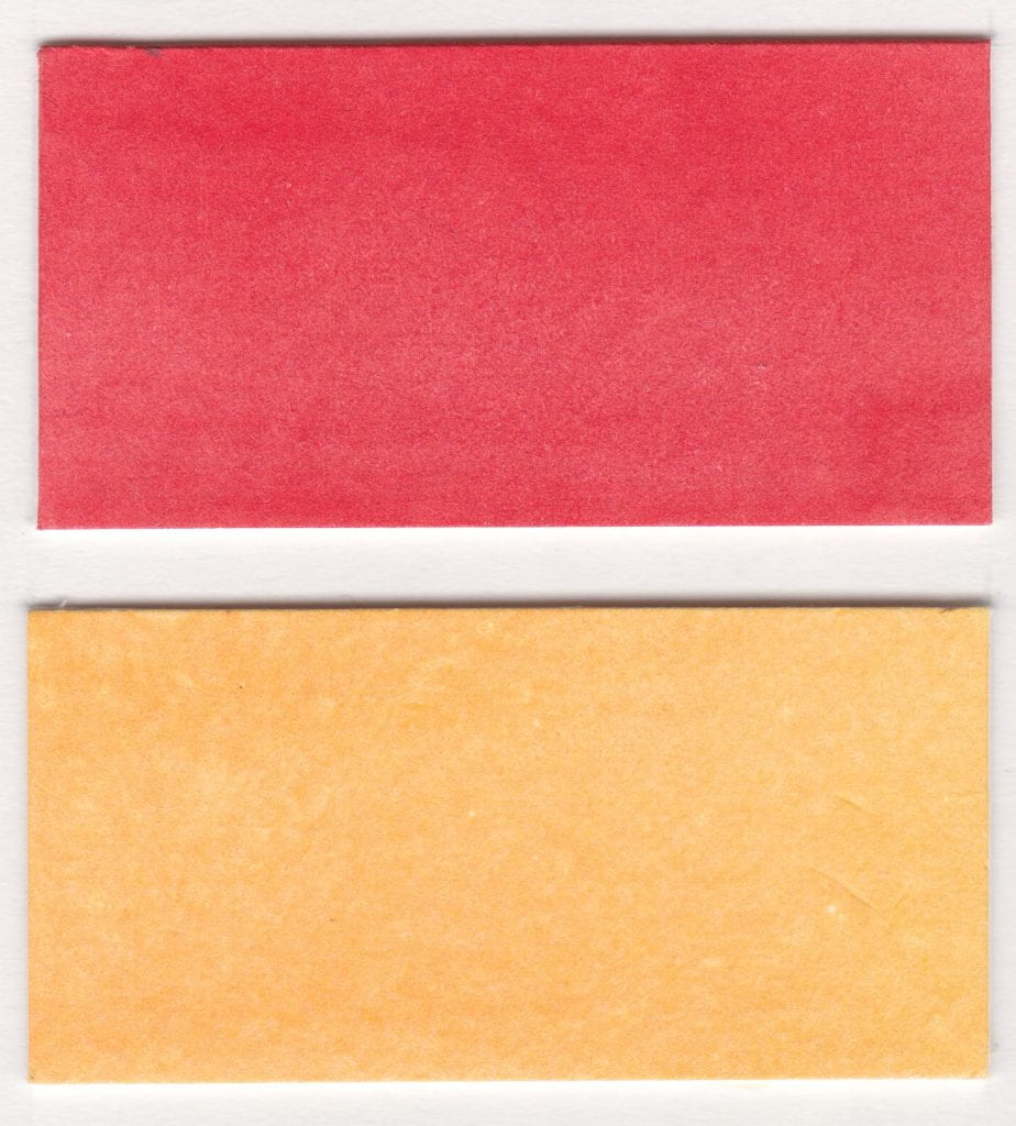
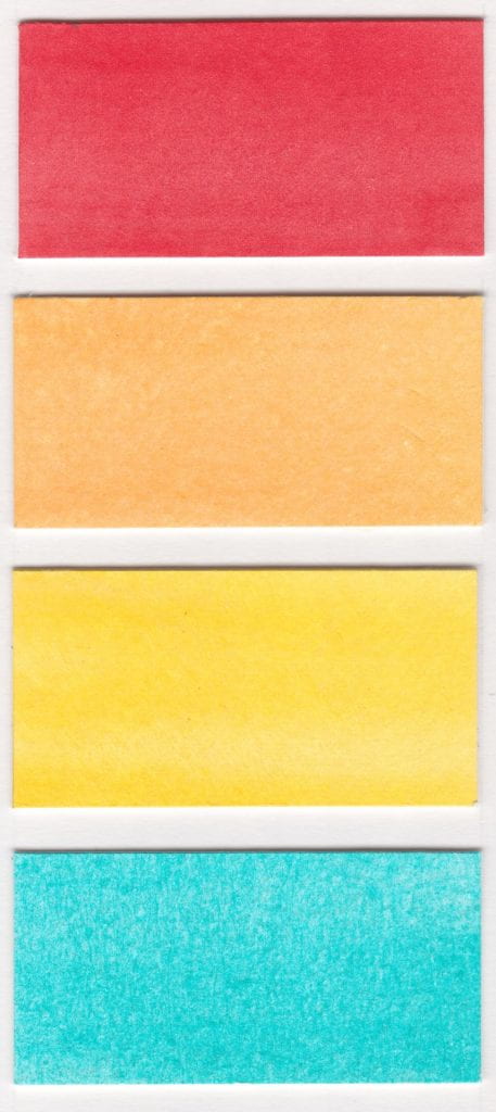
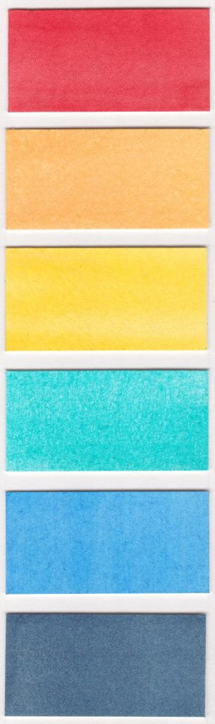
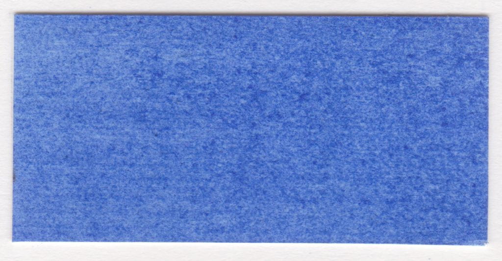
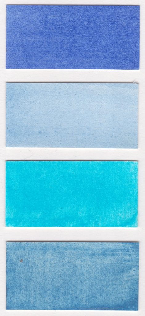
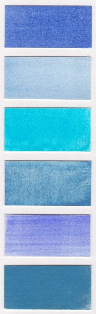
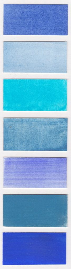
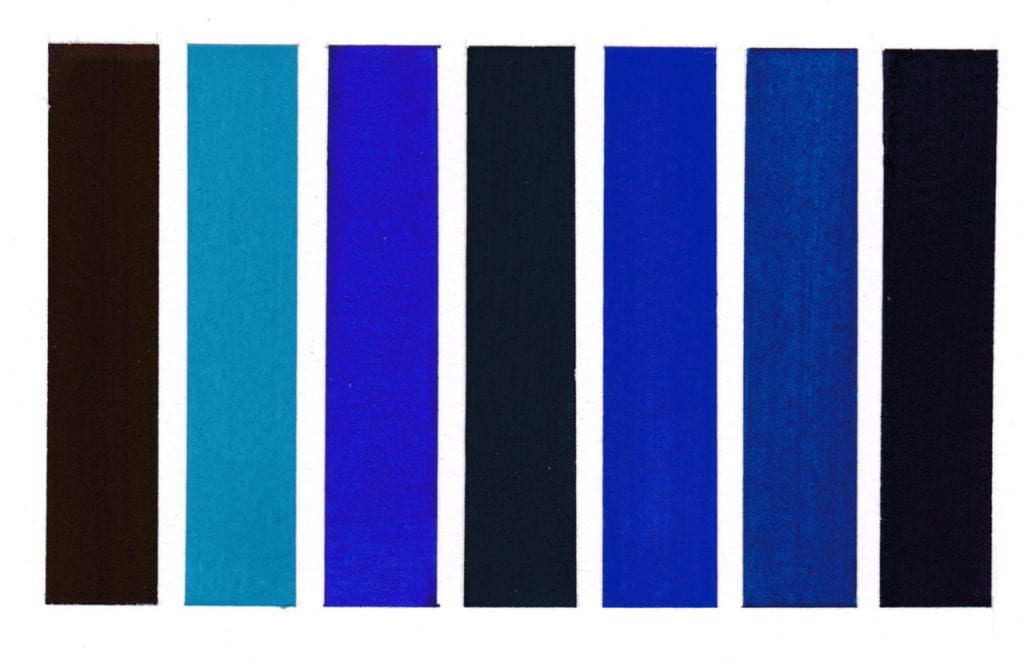
Colours read from left to right on W&N watercolour paper.
Methyl Violet pigment bound in gum Arabic
Cerulean Blue pigment bound in gum Arabic
Dumont’s Blue W&N watercolour
Vivianite pigment bound in gum Arabic
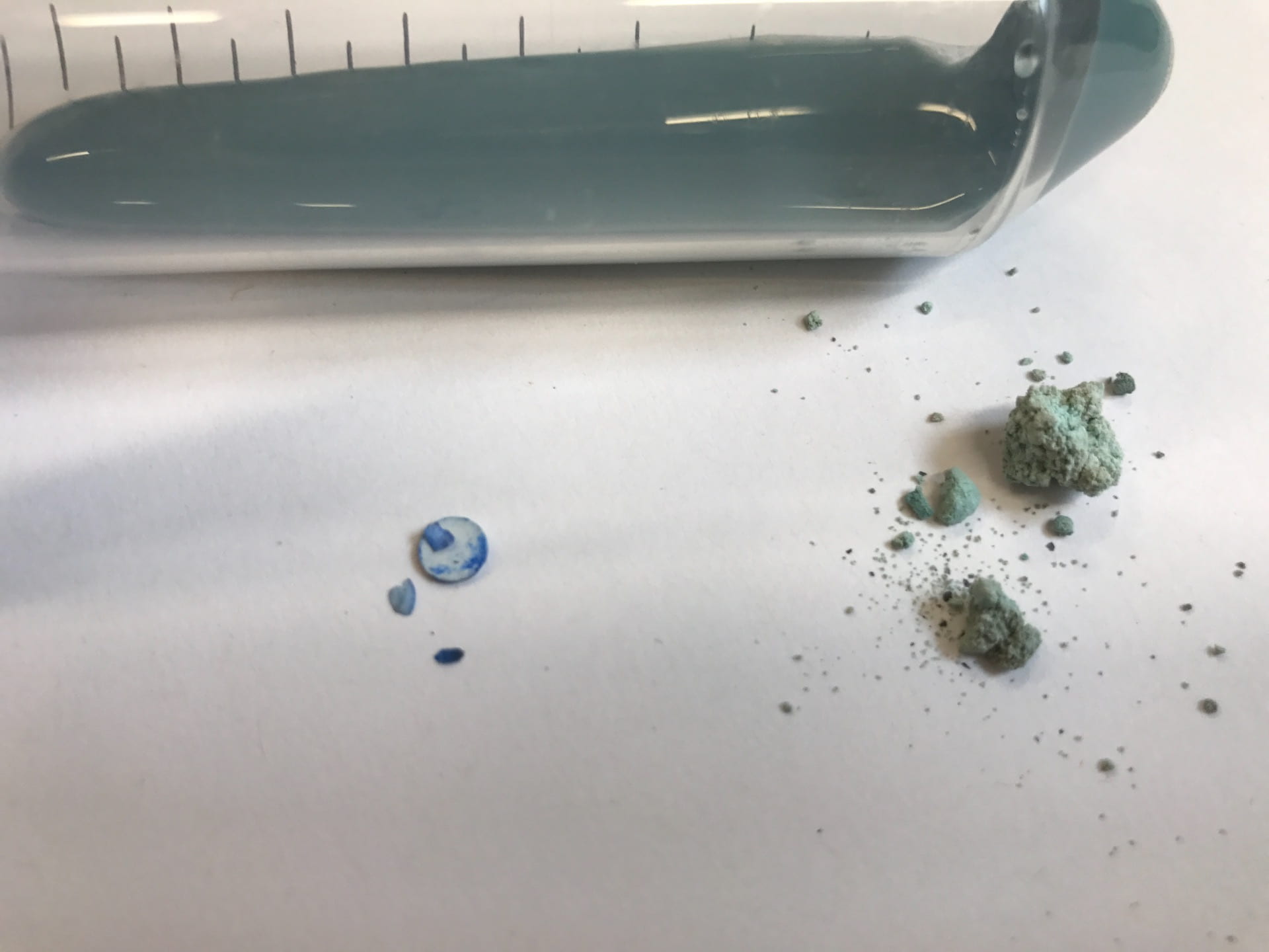
Oregon Blue (Yin mIn Blue), Derivan, Matisse Range*
Monastral Blue pigment bound in gum Arabic
Bronze Blue pigment bound in gum Arabic

*I first became aware of Yin MIn Blue in the summer of 2016 and wrote to the manufacturers requesting a sample for the Slade Material Research Project Pigment Collection but without luck. I then discovered a paint manufacturer in Australia, Derivan, were advertising it in their Matisse range as Oregon Blue and wrote a similar email asking for a donation. This is response from Steven Patterson, Derivan’s Chief Executive Officer that summer.
‘Thank you for your email – I would be happy to send you a sample of the paint we have made with the pigment, however we do not have any dry pigment left!!! we have used it all!!! – yet if you are happy with the paint please let me know the best address to send it to.’
I accepted his kind offer and very excited to receive a few weeks later two tubes plus some lovely colours from their Natural Pigments of Australia range which have been featured in previous weeks A Colour A Day.
A conversation in the Housman bar over the newly acquired blue with Ruth Siddall and David Dobson got David thinking about inventing his own new blue – more on that another time. At a later date Steven Patterson very generously sent a sample of the pigment, now part of the collection, and featured in an exhibition in the Material Museum during Colour & Poetry: A Symposium 2019.

A Colour A Day: Week 45

By Ruth Siddall, on 31 January 2021

A Colour A Day: Week 45. 25 – 31 January

Jo Volley writes…

This week we have seven beautiful copper based pigments manufactured by Ruth Siddall who says of them:

‘Of this set of seven pigments, four are derived from natural mineral samples and three are synthetic. Two are made by reacting metallic copper with vinegar plus or minus salt to produce verdigris (copper acetate) and atacamite (copper hydroxy chloride). The final synthetic pigment is a precipitate of copper carbonate formed by mixing copper sulphate solution with sodium carbonate solution. The natural minerals were bought from reputable mineral dealers and were sourced from copper mines in the Katanga region of the Democratic Republic of Congo.

All pigments bound in gum Arabic on W&N watercolour paper and read from left to right:

Copper Carbonate
Malachite & Azurite
Malachite
Verdigris
Synthetic Atacamite
Azurite
Malachite & Chrysocolla


A Colour A Day: Week 34

By Ruth Siddall, on 15 November 2020

A Colour A Day: Week 34. 9th-15th November

Jo Volley writes…

This week’s colours are named after or made for artists and very much inspired by Caroline de Lannoy’s Colour Tale which I first saw at the Tate in 2000 and again last year at the Colour & Poetry: A Symposium performed by the Slade Colour Choristers. Caroline de Lannoy says of the work.

‘Much of my interest has been in the way in which language impinges on our perception, both in its everyday contexts and in works of art. The world has millions of colours. Why do we only name a few? The human eye can see about a thousand levels of light – dark, a hundred levels of yellow-blue, a hundred levels of red-green. This means that the human eye can distinguish about ten million different colours. But human language categorizes these into a small set of words. Throughout the years I have collected 1153 colour names. These colour names, are both abstract and referential. Some colour terms are metaphorical extensions of what are originally object names; some derive from the world of nature, some come from paint materials and others from my own interpretation. ‘Colour Tale’ deals with the relationships between communication and perception, between the spoken words and the visual. It illustrates the ambiguous implications for perceptual research of findings dealing with linguistic and visual classification. Carefully measured and adjusted the written elements or declarative statements comment on aspects of communication, vision, and any specific sites. The colour names are composed as a body of theoretical discourse, and as a ‘visual’ poem, to create a mental image or a fantasy picture, and to develop thinking spaces. Free for the imagination the colours become as intangible as ghosts in the air. The passage of the words sparks off continually the ability to remember fundamental experiences and it invites the audience to take part, by assigning images to the words, thus translating the auditory impressions into visual ones. The rich structure of association around these words call up images and stimulate the emotion and the imagination of the hearers, conveying different ideas to different persons – for a word is a signifier and has many possible signified. This is a prime case of audience participation. The listener is free to make his-or her individual interpretation, to construct his-or her own fantasy picture, and to ‘see’ his-or her personal colour perception since the subject matter is out of sight.’

Please listen to Colour Tale performed here by Eddie Izzard

Colours read from left to right:

van Dyck brown – Lefranc & Bourgeois gouache
Veronese green – Lefranc & Bourgeois gouache
Titan red – mixture
Klein blue
Stuart Semple orange
Prout’s brown ink – Roberson
Corot green – Lefranc & Bourgeois gouache


A Colour A Day: Week 22

By Ruth Siddall, on 23 August 2020

A Colour A Day Week 22. 17th-23rd August

Jo Volley writes…In JL Carr’s novel A Month in the Country the protagonist Tom Birkin returning from the First World War is redeployed as a wall painting conservator. He spends the summer uncovering a large medieval wall painting in a country church and along with it rediscovers a sense of faith in the future. As the painting’s image is revealed and through the unknown artist’s use and choice of colours, Tom begins to appreciate and understand the man.

‘I was working up the 3 brothers (see Luke 16), blissfully heedless of the judgement to come…The second magnate’s cloak was a splendid garment – red outside and green lining. A very good red, the best in fact, no expense spared, sinoper haematite that is, not to be confused with what some fatheads call sinoper which, as often as not, is red earth, the stuff they used to bring in by the shipload from Pontus Euxinus (and don’t ask me where that was). That’s the red which darkens almost as soon as you turn your back on it: it survives and that’s all that can be said for it. In fact, on damp walls, it’s all that does survive. Well, back to this chap’s cloak. It was resin-based and that doesn’t ooze out, by the gallon; they found a scallop-shell with caked deposit amongst the rubble in the Gifford Chantry at Boyton.’

‘Mr Birkin…Mr Birkin…is it an oil painting or a water colour or what is it for goodness sake?’ ’It’s all sorts of things, Mrs Keach. Item – blew bysse at 4s 4d. the pound, item – one sack of verdigris at 12d. a pound, item – red ochre, 3 pounds a penny, item – 3 pecks of wheat flour…. I suppose you could lump it all as tempera. And let’s not forget the wall itself – down in the sinful south, plastered with chalk bound with parish offerings of skimmed milk; up here, slaked limestone putty damped just enough to stiffen. That’s about what it is. …Spaynishe white,  Baghdad indigo, Cornish malachite…

But for me, the exciting thing was more than this. Here I was, face to face with a nameless painter reaching from the dark to show me what he could do, saying to me as clear as my words, ‘If any part of me survives from time’s corruption, let it be this. For this was the sort of man I was.’

Each pigment is bound in gum Arabic on W&N watercolour paper and reads from left to right:

Malachite
Verdigris
Chalk
Haematite
Red ochre
Chalk
Indigo
Blue bice

A Colour A Day: Week 7

By Ruth Siddall, on 10 May 2020

A COLOUR A DAY – Week ;  4th – 10th  May

Jo Volley writes……

This week’s colours are a homage to our key workers and are from Winsor & Newton’s Professional watercolour range.

The rainbow mirrors human aims and actions. Think,  and more clearly wilt though grasp it, seeing Life is but light in many-hued reflection; Goethe Reflection,Thinking, Mirrors

  1. Cadmium Red
  2. Cadmium Orange
  3. Cadmium Yellow
  4. Cobalt Turquoise
  5. Winsor Blue
  6. Indigo
  7. Dioxazine Violet


A Colour A Day: Week 5

By Ruth Siddall, on 26 April 2020

Jo Volley writes….

A COLOUR A DAY – Week 5 –-20th  -26th  April  are 7 historic blues bound in gum arabic.

‘We love to contemplate blue, not because it advances to us, but because it draws us after it.’ Goethe

  1. Genuine Ultramarine blue
  2. Ultramarine Ash
  3. Ploss Blue
  4. Egyptian Blue
  5. Han Blue
  6. Azurite
  7. Smalt

Earth Blue – a guest blog by Professor David Dobson

By Ruth Siddall, on 7 May 2019

Professor David Dobson was UCL Slade School Scientist in Residence for 2017-2018. Intrigued my the media coverage that the development of the new YIn Mn Blue pigment made in 2017, David was moved to make his own blue and think more about blue minerals in the Earth. David has recently been interviewed in Science Magazine by Kai Kupferschmidt.

David writes …

We live on the blue planet. Blue is so common in our everyday experience that we don’t even notice it. The sky is blue due to light scattering and water absorbs short wavelengths of the visible spectrum making it a pale blue.  But blue minerals are rare; so much so that in medieval and renaissance time blue pigments were reserved for God and the saints.  Most mineral colouration comes from small amounts of transition metal impurities in the mineral structure.  This class of element can exist in several different electrical charge states and the hopping of electrons from one transition metal ion to another causes absorption of light in the visible spectrum and hence colour.

Iron, with allowed charges of 2+ or 3+, is the most common transition metal and so most minerals display the colours associated with electron hopping between 2+ and 3+ iron – red or brown when 3+ dominates and green when 2+ dominates. But deep in the Earth’s interior, at pressures of 180 to 230 thousand atmospheres the most common mineral, ringwoodite, is a rich royal blue. Once again, water is responsible, at least in part. In this case water is incorporated into ringwoodite as protons (H+ ions) and it substitutes for the main cations, Mg2+ or Si4+. In order for a stable substitution in a crystal lattice the charges must balance – you can’t replace one silicon (Si4+) ion for just one proton because the crystal would be left with an excess negative charge which would blow it apart.  Instead the proton is accompanied by an iron ion to make a [Fe3+H+] substitution on the silicon site.  This pushes the iron into a much smaller site than it usually occupies, surrounded by only 4 oxygen (O2-) ions rather than the usual 6 oxygens.  This in turn changes the energy of charge transfer electron hopping transitions between iron 2+ and 3+ ions, making ringwoodite blue rather than brown. This [Fe3+H+] substitution is such a good fit in the silicon site that, if all the ringwoodite in the Earth had as much water as possible in its structure (and that is a BIG if), there could be as much as 4 time the entire volume of the oceans locked up as structurally bound water in the Earth’s mantle and Earth’s interior would be as blue as its exterior.

Here in UCL Earth Sciences we are attempting to develop synthetic structures which mimic the unusual ferric iron structure of ringwoodite but which are stable at atmospheric pressure.  So far we have shown that we can make blue pigments from iron-bearing oxides and are now investigating how much Fe3+ the structures can take before they become unstable.  That will determine just how blue we can make them. The prospects are bright…blue.

Ringwoodite synthesised at 20 GPa and containing 10% iron


David’s new blue, with about 0.3% iron


Three blues created by Fe2+-Fe3+ charge transfer: vivianite (in the centrifuge vial), (on the left) my Fe-bearing zinc germanate with Fe from 0 to 0.3% and (on the right) a Fe-dopes zinc silicate.