Close
Close

A Colour A Day: Week 42
By Ruth Siddall, on 10 January 2021
A Colour A Day: Week 42. 4-10 January
Jo Volley writes…
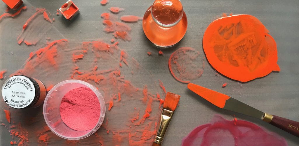
This week we have more earth pigments collected and manufactured by Ruth Siddall who says of them;
‘These are a series of British earth colours derived from some of the geological formations of southeast England. Ashdown Orange, Galley Hill Gold, Galley Hill Red and Road Works Red are all from the Cretaceous Wealden facies and all were collected in and around Bexhill in East Sussex. These strata expose terrestrial deposits which include fossil soils (palaeosols) as well as ochre-stained sandstones. The Road Works Red was procured from some kindly municipal workmen who were digging up the road outside St Mary Magdalene’s Church in Bexhill. River Ching and Walton-on-the-Naze clays are both derived primarily from the London Clay deposits of the London Basin. The River Ching flows through Higham’s Park in NE London, once a landscape garden laid out by Humphry Repton in the 1790s. The lake in the park is Repton’s construction, and the banks of the Ching which flows alongside the lake, are largely ‘made ground’ which mixes the London Clay with the overlying Ice Age Woodford Gravels. Here in NE London, the London Clay is dark grey and the clays from the Woodford Gravels is pale brown. At Walton-on-the-Naze, London Clay underlies a spectacular sequence of Ice Age strata. Again largely of continental origin, red beds dominate the sequence here. The red ochre from Stone Point, extracted from a thin horizon of red sandstones is possibly very recent in age and certainly Holocene. The pigments derived from these geological strata required a lot of processing, including washing, levigating, grinding and sieving to extract a suitable pigment.‘

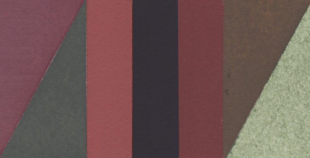
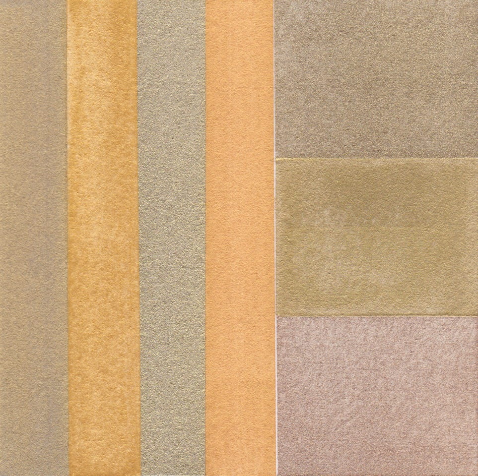
All pigments are bound in gum Arabic on W&N watercolour paper and read from left to right:
Walton-on-the-Naze London Clay
Ashdown Orange
Galley Hill Red
Galley Hill Gold
Road Works Red
Stone Point Red Ochre
River Ching Ochre