X Close

The Pigment Timeline Project

Home

Menu

Archive for the '#WinsorandNewton' Category

A Colour A Day: Week 47

By Ruth Siddall, on 14 February 2021

A Colour A Day: Week 47 8th – 14th February
Jo Volley writes…

This week’s colours accompany this beautiful poem by artist and poet Sharon Morris.

The purpose of blue

But it’s the colours I miss, don’t you see?
the lapis sky and fair cerulean blue
of ocean, the precise shivering hue
of your laugh on a bright day, so clear.

Whatever the light, lavender appears
to shave blue from grey, the way I knew you.
I’m dead-heading the daisy – though it’s futile –
sweeping leaves and weeding ‘volunteers’.

My eyes close – the way whales slip from view
between the waves – I have to let you go.
I still wear that specific shade of turquoise –

you looking out at the Pacific Ocean –
the way blue sky screens emptiness, its purpose
forgetting or holding on. Is this beauty?

The purpose of blue is from a set of sonnets, some of which were published in the anthology Tying the Song, Enitharmon Press, 2000. Sharon is also a Professor of Fine Art, Slade Deputy Director (Academic) and Head of the PhD Programme.

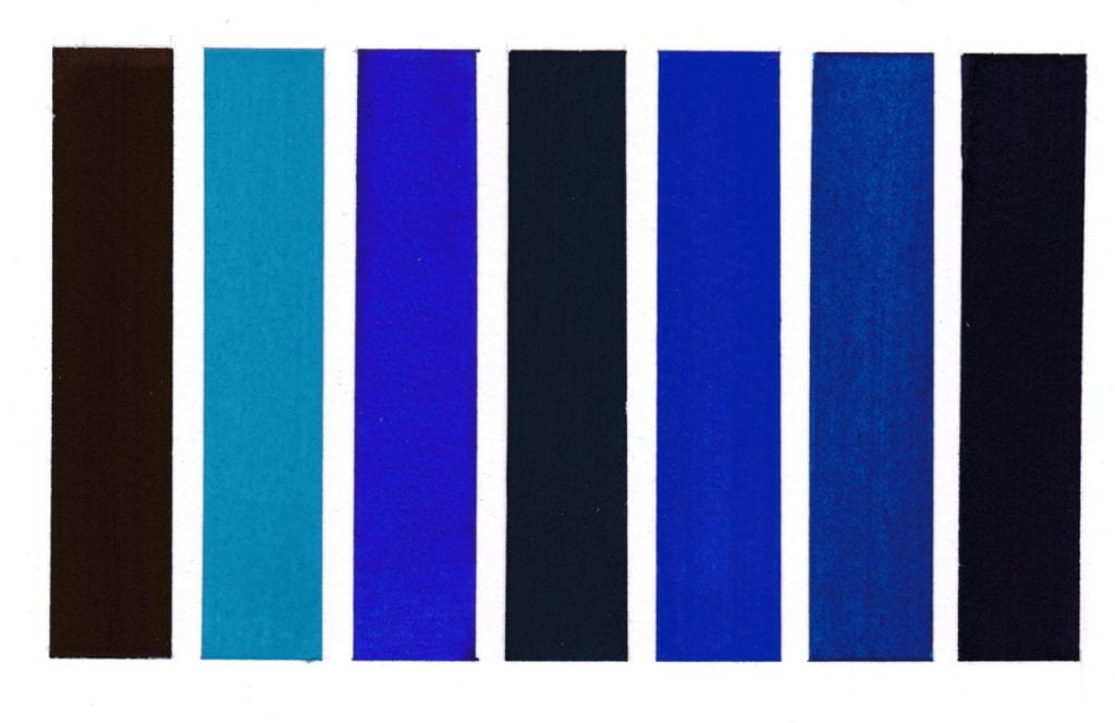
Colours read from left to right on W&N watercolour paper.
Methyl Violet pigment bound in gum Arabic
Cerulean Blue pigment bound in gum Arabic
Dumont’s Blue W&N watercolour
Vivianite pigment bound in gum Arabic
Oregon Blue (Yin mIn Blue), Derivan, Matisse Range*
Monastral Blue pigment bound in gum Arabic
Bronze Blue pigment bound in gum Arabic
*I first became aware of Yin MIn Blue in the summer of 2016 and wrote to the manufacturers requesting a sample for the Slade Material Research Project Pigment Collection but without luck. I then discovered a paint manufacturer in Australia, Derivan, were advertising it in their Matisse range as Oregon Blue and wrote a similar email asking for a donation. This is response from Steven Patterson, Derivan’s Chief Executive Officer that summer.
‘Thank you for your email – I would be happy to send you a sample of the paint we have made with the pigment, however we do not have any dry pigment left!!! we have used it all!!! – yet if you are happy with the paint please let me know the best address to send it to.’
I accepted his kind offer and very excited to receive a few weeks later two tubes plus some lovely colours from their Natural Pigments of Australia range which have been featured in previous weeks A Colour A Day.
A conversation in the Housman bar over the newly acquired blue with Ruth Siddall and David Dobson got David thinking about inventing his own new blue – more on that another time. At a later date Steven Patterson very generously sent a sample of the pigment, now part of the collection, and featured in an exhibition in the Material Museum during Colour & Poetry: A Symposium 2019.

A Colour A Day: Week 46

By Ruth Siddall, on 7 February 2021

A Colour A Day: Week 46. 1st – 7th February 2021

Jo Volley writes …

This week we celebrate seven orange pigments with an accompanying text written by Ed Winters.

Orange is both a direct and indirect reference to the secondary colour. It is direct in that it names the colour. It is indirect in that it refers to the citrus fruit which, when ripe, exemplifies the colour. It is a secondary colour in that it can be ‘divided by’ red and yellow, the two primary colours between which it sits on the colour wheel. It is the complementary colour of the third primary colour, blue. It is as warm as blue is cool.Thus, we can begin to build up descriptive relations between orange and the system of colours into which its place is uniquely specified in advanceIf that sounds queer, it is because colour is, first and foremost, apprehended in and through perception. To talk of a colour geometry is to posit a system which is conceived a priori. If no-one had ever seen orange, say because there just happened to be no orange surfaces in the world, we would nevertheless feel that there is somewhere in colour space awaiting its arrival; a gap, so to speak. Given our conception of complementary colours we would be puzzled by the gap that is left in partnering blue with its complementary. (We would have to think of orange even if we had never seen it. And that is a very odd thought). It is a bright colour with a tonal value between the lighter colour yellow and the darker colour red. It thus reflects more light than its complementary blue (the so called “problem of inverted qualia”)Wittgenstein, in noticing such features of colours, undermines the thought that what you see as orange could be what I see as blue. Hence Wittgenstein looks to these other features of colour properties to begin to identify colours without recourse to indirect descriptions.

Dr Edward Winters is a writer and artist. He is an elected member of the Association Internationale des Critiques d’Art; and an elected member of the council of the Royal Institute of Philosophy. He writes widely on art and aesthetics.

All pigments are bound in gum Arabic on W&N watercolour paper and read:

First rectangle clockwise from top:

Orange Vermilion

Chrome Orange

Alizarin Orange

Monolite Orange

Second rectangle clockwise from top:

Lead Tin Orange

Lead Tin Orange

Iragazine Orange

End rectangle:

Mineral Orange


A Colour A Day: Week 44

By Ruth Siddall, on 24 January 2021

A Colour A Day: Week 44.  18th-24th January

Jo Volley writes…

This week’s colours were manufactured at Joshibi University of Art & Design,  Japan and donated to the Slade some 20 years ago, where they are now housed as part of the Slade Material Research Project Pigment Collection. 

At that time the Joshibi department were conducting a study on materials used in traditional Japanese painting adding to their understanding and knowledge outside of Japan.  Along with 14 pigment sachets of colours and glues, there are 5 very beautiful sample boards of 45 pigments including an explanation sheet to their origins and production. 

Here are my favourite seven pigments.

Each pigment is bound in animal skin glue on Winsor & Newton watercolour paper.

Top row from left to right:

Stones from Fuji River   

Sand (heat-treated) from the Sahara

Stones heat-treated) from Fuji River   

Middle row: Japanese glass beer bottles

Bottom row from left to right:

Soil from Joshibi

Mussel Shells

Sand from Mount Fuji


A Colour A Day: Week 43

By Ruth Siddall, on 17 January 2021

A Colour A Day: Week 43. 11th -17th January

Jo Volley writes…

This week we have seven colours new to the Winsor & Newton Winton oil range, accompanied with notes by Stephanie Nebbia, artist and Colart Global Fine Art Collective manager.

Dioxane Blue – PV23, PB29. Strong transparent violet, dark almost black in mass tone with a beautiful bluish Ultramarine hint in the undertone. The range from the deep violet to the blue leanings makes it very versatile.

Phthalo Yellow Green – PY74, PG7. Bright opaque green with a strong Cadmium yellow like temperature with an added Phthalo depth of hue. Possesses many qualities of a Cadmium green bright/mid green.

Azo Brown – PY74, PV23. Golden tinge to this warm brown which although not organic has the madder like quality of madder brown which comes from the gentle charring of madder lake. Has the advantage of being lightfast with the same versatility.

Phthalo Deep Green – PG7, PR177. Dark almost black mass tone with a cool red shade in the undertone, reminiscent as a dark version of the historic Alizarin green lake and the toxic Cinnabar greens with the same transparency. Has the same potential and versatile offered by Hooker’s green – also a combination of pigments – with a strong tinting strength.

Azo Yellow Green – PY74, PG7, PR101, PY42. Warm Indian yellow tone with a Phthalo green tinge and although not an earth colour contributes to this family with a brownish ochre warmth making an excellent and versatile earth yellow. Reminiscent of haematite and goethite ochres which I find very evocative.

Quinacridone Deep Pink – PB29, PV19. A deep dark crimson mass tone reminiscent of the historic Alizarin rose with a blue/violet temperature undertone.

Dark Verdigris – PY74, PB29. Deep green with an Ultramarine tint similar to copper corrosion derived greens but stable and unlike early versions does not blacken. A colour used frequently by Watteau where he mixed genuine Ultramarine with actual copper Verdigris as well as featuring in Flemish School painting and early Italian oil painting.

Colours read from left to right:

Dioxane Blue
Phthalo Yellow Green
Azo Brown
Phthalo Deep Green
Azo Yellow Green
Quinacridone Deep Pink
Dark Verdigris

A Colour A Day: Week 42

By Ruth Siddall, on 10 January 2021

A Colour A Day: Week 42. 4-10 January

Jo Volley writes…

This week we have more earth pigments collected and manufactured by Ruth Siddall who says of them;

These are a series of British earth colours derived from some of the geological formations of southeast England. Ashdown Orange, Galley Hill Gold, Galley Hill Red and Road Works Red are all from the Cretaceous Wealden facies and all were collected in and around Bexhill in East Sussex. These strata expose terrestrial deposits which include fossil soils (palaeosols) as well as ochre-stained sandstones. The Road Works Red was procured from some kindly municipal workmen who were digging up the road outside St Mary Magdalene’s Church in Bexhill. River Ching and Walton-on-the-Naze clays are both derived primarily from the London Clay deposits of the London Basin. The River Ching flows through Higham’s Park in NE London, once a landscape garden laid out by Humphry Repton in the 1790s. The lake in the park is Repton’s construction, and the banks of the Ching which flows alongside the lake, are largely ‘made ground’ which mixes the London Clay with the overlying Ice Age Woodford Gravels. Here in NE London, the London Clay is dark grey and the clays from the Woodford Gravels is pale brown. At Walton-on-the-Naze, London Clay underlies a spectacular sequence of Ice Age strata. Again largely of continental origin, red beds dominate the sequence here. The red ochre from Stone Point, extracted from a thin horizon of red sandstones is possibly very recent in age and certainly Holocene. The pigments derived from these geological strata required a lot of processing, including washing, levigating, grinding and sieving to extract a suitable pigment.

All pigments are bound in gum Arabic on W&N watercolour paper and read from left to right:

Walton-on-the-Naze London Clay
Ashdown Orange
Galley Hill Red
Galley Hill Gold
Road Works Red
Stone Point Red Ochre
River Ching Ochre

A Colour A Day: Week 39

By Ruth Siddall, on 20 December 2020

A Colour A Day: Week 39. 14th-20th December

Jo Volley writes…

I’m only happy when I’m trying to create something new’: words by Henry Levison inventor of Liquitex acrylics paint. Levison was a colour chemist who ran Permanent Pigments, Cincinnati, Ohio, which had been milling colours from 1933. Acrylics were first developed as a solvent-based artists’ colour in the early part of the C20 and by 1955 Levison had perfected a commercially viable water-based acrylic. The Permanent Pigments went on to be called Liquitex.

Henry Levison inventor of Liquitex.

Colours are from the Liquitex Soft Body Acrylic range on W&N watercolour paper and read from left to right:

Quinacridone Burnt Orange
Quinacridone Blue Violet
Indanthrene Blue
Parchment
Bronze Yellow
Prism Violet
Muted Violet

A Colour A Day: Week 38

By Ruth Siddall, on 13 December 2020

A Colour A Day: Week 38. 7th-13th December

Jo Volley writes…

This week’s colours are accompanied by ‘Cobalt: Pigment of Hope and Destruction’ by Robert Mead as a response to the colours.

Cobalt shares an entwined history with both painting and technology. The mineral is capable of producing a range of different colours – perhaps the most commonly known is Cobalt Blue. This is a cobalt aluminate pigment and was first discovered in 1775 – with further modern production achieved in 1777, where the moistening of aluminium compounds with a cobalt solution turned blue and strongly calcined. A variety of other colours can be produced through cobalt; a range of violets can be created through a variety of different compounds – such as cobalt magnesium arsenate – and cobalt phosphate octahydrate. Cobalt Green has been made by multiple processes including the direct mixture of cobalt blue with ‘chromic’ yellow or a combination of cobalt and zinc or iron oxide. Cobalt Yellow is a potassium cobalt nitrate, first synthesised in 1831 – through the reaction between potassium nitrite and cobalt salts, creating a crystalline mass. Using cobalt, we are able to produce range of wonderful and unique colours. However, as a mineral its demand has increased alongside the development of new technologies – as a key component of batteries in laptops, phones and increasingly electric cars. The main source of cobalt extraction is in The Democratic Republic of Congo, whose history of colonisation by Belgium from 1869-1908 through to its independence in the 1960s is entwined with the desire for its available supply of minerals such as diamonds, copper and uranium. Now major western companies such as Apple, Dell and Microsoft have bought into the mining industry there, as cobalt suppliers for their lithium batteries, this high demand has led to quarries operating with dangerous conditions and often using child labour. Furthermore, both the pigment and the mineral itself hold highly toxic particles and when consumed or inhaled and can cause major health risk – increased through poor mining conditions. Further increasing the demand for cobalt is the development of electric cars. As we attempt to offset the climate crisis by moving to using electric vehicles, companies such as BMW and Tesla have also invested heavily in cobalt mining to acquire the material for powering them. In this case, cobalt is at the centre of paradox between hope for moving away from fossil fuels and towards clean electric energy and the negative consequences its acquisition results in. Without sustainable mining methods, its production is tainted by this problematic discord. In reflecting on cobalt’s significance for our future, it seems prescient that it was the key ingredient in what was considered the doomsday weapon of the Cold War – the Cobalt Bomb (or C-Bomb), theoretically capable of wiping out all human life on the planet and featuring in films such as Beneath the Planet of the Apes and Dr Strangelove. The use of cobalt would allow a much higher level of fallout to be released from detonation, many times greater than the level of residual radiation still present in the strata of the Earth from the era of nuclear testing. When we look at the alluring colours it can produce we can also consider that cobalt pigments are entwined with both our colonial and technological history and humanities attempts at both healing and destruction.

Robert Mead is a painter and PhD researcher at the Slade School of Fine Art. The aim of his research is to make paintings that form emotive connections between the viewer and our environment which draw them into wider hidden discourses. Robert says of his work; ‘Moving through the strata of my paintings digs up histories and ghosts that we may not wish to confront but are bound to our past’.

Each pigment is bound in gum Arabic on W&N watercolour paper and read from left to right:

Cobalt Violet Dark
Cobalt Green
Cobalt Violet Brilliant
Cobalt Yellow Pale
Cobalt Green Bluish
Cobalt Violet
Cobalt Titanate Green

A Colour A Day: Week 36

By Ruth Siddall, on 29 November 2020

A Colour A Day: Week 36. 23rd – 29th November

Jo Volley writes ….

‘Colour has been used chiefly in the past to as a means to display form – form being thought of as its obvious master.

The freedom of abstract thought has come, and shows us a future lying ahead of colour as one of the three great abstract arts.

Mathematics – music – colour. To those artist whose inspiration comes in the form of shape and shape relationships, colour may continue to be the means of expressing those shapes, unless it be that they find that light and shades a more suitable means for their purpose.

But to those artist whose inspiration comes in the form of colour alone, without reference to object or object sense, it is no longer necessary to set about seeking some form into which the colour maybe tagged to give it being.’

Extract from Winifred Nicholson Unknown Colour first published 1937, click here to continue reading,

Assorted Kremer pigments bound in gum Arabic on W&N watercolour paper and read from left to right.

Chrysocolla
Han purple
Celadonite
Realgar
Cavansite
Sodalite
Red Jasper

A Colour A Day: Week 27

By Ruth Siddall, on 27 September 2020

A Colour A Day: Week 27; 21st-27th September

Jo Volley writes…

This week’s colours are inspired by Anni Albers’ 1926 wall hanging Black White Yellow exhibited at the Tate show in 2018. In her book, On Weaving, she states; ‘Continuing in our attitude of attentive passiveness, we will also be guided in our choice of color, though here only in part. For our response to color is spontaneous, passionate, and personal, and only in some respects subject to reasoning. We may choose a color hue – that is, its character as red or blue, for instance – quite autocratically. However, in regard to color value – that is, its degree of lightness or darkness – and also in regard to color intensity – that is, its vividness – we can be led by considerations other than exclusively by our feeling. As an example: our museum walls will demand light and have a color attitude that is non-aggressive, no matter what the color hue and whether there is over-all color or a play of colors.

First column top to bottom:
Davy’s Grey – W&N Watercolour
Turner’s Yellow – Liquitex Soft Body Acrylic
Gris Lichen – Lefranc Bourgeois Designers gouache
Primary Yellow – W&N Designers gouache
Davy’s Grey – W&N Watercolour
Turner’s Yellow – Liquitex Soft Body Acrylic

Second column top to bottom:
Velvet Black – Lefranc Bourgeois Designers gouache
White
Velvet Black – Lefranc Bourgeois Designers gouache

Third column top to bottom:
Primary Yellow – W&N Designers gouache
Gris Lichen – Lefranc Bourgeois Designers gouache
Turner’s Yellow – Liquitex Soft Body Acrylic
Davy’s Grey – W&N Watercolour
Primary Yellow – W&N Designers gouache
Gris Lichen – Lefranc Bourgeois Designers gouache

Fourth column top to bottom:
White
Velvet Black – Lefranc Bourgeois Designers gouache
White

Fifth column top to bottom:
Spectrum Yellow – W&N Designers gouache


A Colour A Day: Week 26

By Ruth Siddall, on 20 September 2020

A Colour A Day: Week 26. 14th-20th September

Jo Volley writes…

This weeks colours are 7 lake pigments manufactured by Ruth Siddall.


ON THE CHARACTER OF A RED CALLED LAC
CHAPTER XLIII

A colour known as lac is red, and it is an artificial colour. And I have various receipts for it; but I advise you, for the sake of your works, to get the colour ready made for your money. But take care to recognise the good kind, because there are several types of it. Some lake is made from the shearings of cloth and it is very attractive to the eye. Beware of this type, for it always retains some fatness in it, because of the alum, and does not last at all, either with temperas or without temperas, and quickly loses its colour. Take care to avoid this; but get the lac which is made from gum, and it is dry, lean, granular, and looks almost black, and contains a sanguine colour. This kind cannot be other than good and perfect. Take this, and work it upon your slab; grind it with clear water. And it is good on panel; and it is also used on the wall with a tempera; but the air is its undoing. There are those who grind it with urine; but it becomes unpleasant, for it promptly goes bad.

Cennino Cennini, Il Libro dell’Arte


All pigments are bound in gum Arabic on W&N watercolour paper and read from left to right:

Iris green lake – ‘Lily green’
Logwood lake
Logwood ‘chalk’ lake
Cutch #1
Cutch #2
Butterfly Pea Flower lake
Lac lake – Kerria lacca