X Close

The Pigment Timeline Project

Home

Menu

Archive for the '#MaterialsResearchProject' Category

A Colour A Day: Week 40

By Ruth Siddall, on 27 December 2020

A Colour A Day: Week 40. 21st-27th December

Jo Volley writes…

This weeks colours are accompanied by Marge Piercy’s poem Colors passing through us.

Purple as tulips in May, mauve
into lush velvet, purple
as the stain blackberries leave
on the lips, on the hands,
the purple of ripe grapes
sunlit and warm as flesh.

Every day I will give you a color,
like a new flower in a bud vase
on your desk. Every day
I will paint you, as women
color each other with henna
on hands and on feet.

Red as henna, as cinnamon,
as coals after the fire is banked,
the cardinal in the feeder,
the roses tumbling on the arbor
their weight bending the wood
the red of the syrup I make from petals.

Orange as the perfumed fruit
hanging their globes on the glossy tree,
orange as pumpkins in the field,
orange as butterflyweed and the monarchs
who come to eat it, orange as my
cat running lithe through the high grass.

Yellow as a goat’s wise and wicked eyes,
yellow as a hill of daffodils,
yellow as dandelions by the highway,
yellow as butter and egg yolks,
yellow as a school bus stopping you,
yellow as a slicker in a downpour.

Here is my bouquet, here is a sing
song of all the things you make
me think of, here is oblique
praise for the height and depth
of you and the width too.
Here is my box of new crayons at your feet.

Green as mint jelly, green
as a frog on a lily pad twanging,
the green of cos lettuce upright
about to bolt into opulent towers,
green as Grand Chartreuse in a clear
glass, green as wine bottles.

Blue as cornflowers, delphiniums,
bachelors’ buttons. Blue as Roquefort,
blue as Saga. Blue as still water.
Blue as the eyes of a Siamese cat.
Blue as shadows on new snow, as a spring
azure sipping from a puddle on the blacktop.

Cobalt as the midnight sky
when day has gone without a trace
and we lie in each other’s arms
eyes shut and fingers open
and all the colors of the world
pass through our bodies like strings of fire.

Colours are from the Liquitex Soft Body Acrylic range on W&N watercolour paper and read from left to right:

Bright Aqua Green
Vivid Orange
Scarlet
Naphthol Crimson
Yellow Orange Azo
Permanent Light Green
Permanent Dark Green

A Colour A Day: Week 39

By Ruth Siddall, on 20 December 2020

A Colour A Day: Week 39. 14th-20th December

Jo Volley writes…

I’m only happy when I’m trying to create something new’: words by Henry Levison inventor of Liquitex acrylics paint. Levison was a colour chemist who ran Permanent Pigments, Cincinnati, Ohio, which had been milling colours from 1933. Acrylics were first developed as a solvent-based artists’ colour in the early part of the C20 and by 1955 Levison had perfected a commercially viable water-based acrylic. The Permanent Pigments went on to be called Liquitex.

Henry Levison inventor of Liquitex.

Colours are from the Liquitex Soft Body Acrylic range on W&N watercolour paper and read from left to right:

Quinacridone Burnt Orange
Quinacridone Blue Violet
Indanthrene Blue
Parchment
Bronze Yellow
Prism Violet
Muted Violet

A Colour A Day: Week 38

By Ruth Siddall, on 13 December 2020

A Colour A Day: Week 38. 7th-13th December

Jo Volley writes…

This week’s colours are accompanied by ‘Cobalt: Pigment of Hope and Destruction’ by Robert Mead as a response to the colours.

Cobalt shares an entwined history with both painting and technology. The mineral is capable of producing a range of different colours – perhaps the most commonly known is Cobalt Blue. This is a cobalt aluminate pigment and was first discovered in 1775 – with further modern production achieved in 1777, where the moistening of aluminium compounds with a cobalt solution turned blue and strongly calcined. A variety of other colours can be produced through cobalt; a range of violets can be created through a variety of different compounds – such as cobalt magnesium arsenate – and cobalt phosphate octahydrate. Cobalt Green has been made by multiple processes including the direct mixture of cobalt blue with ‘chromic’ yellow or a combination of cobalt and zinc or iron oxide. Cobalt Yellow is a potassium cobalt nitrate, first synthesised in 1831 – through the reaction between potassium nitrite and cobalt salts, creating a crystalline mass. Using cobalt, we are able to produce range of wonderful and unique colours. However, as a mineral its demand has increased alongside the development of new technologies – as a key component of batteries in laptops, phones and increasingly electric cars. The main source of cobalt extraction is in The Democratic Republic of Congo, whose history of colonisation by Belgium from 1869-1908 through to its independence in the 1960s is entwined with the desire for its available supply of minerals such as diamonds, copper and uranium. Now major western companies such as Apple, Dell and Microsoft have bought into the mining industry there, as cobalt suppliers for their lithium batteries, this high demand has led to quarries operating with dangerous conditions and often using child labour. Furthermore, both the pigment and the mineral itself hold highly toxic particles and when consumed or inhaled and can cause major health risk – increased through poor mining conditions. Further increasing the demand for cobalt is the development of electric cars. As we attempt to offset the climate crisis by moving to using electric vehicles, companies such as BMW and Tesla have also invested heavily in cobalt mining to acquire the material for powering them. In this case, cobalt is at the centre of paradox between hope for moving away from fossil fuels and towards clean electric energy and the negative consequences its acquisition results in. Without sustainable mining methods, its production is tainted by this problematic discord. In reflecting on cobalt’s significance for our future, it seems prescient that it was the key ingredient in what was considered the doomsday weapon of the Cold War – the Cobalt Bomb (or C-Bomb), theoretically capable of wiping out all human life on the planet and featuring in films such as Beneath the Planet of the Apes and Dr Strangelove. The use of cobalt would allow a much higher level of fallout to be released from detonation, many times greater than the level of residual radiation still present in the strata of the Earth from the era of nuclear testing. When we look at the alluring colours it can produce we can also consider that cobalt pigments are entwined with both our colonial and technological history and humanities attempts at both healing and destruction.

Robert Mead is a painter and PhD researcher at the Slade School of Fine Art. The aim of his research is to make paintings that form emotive connections between the viewer and our environment which draw them into wider hidden discourses. Robert says of his work; ‘Moving through the strata of my paintings digs up histories and ghosts that we may not wish to confront but are bound to our past’.

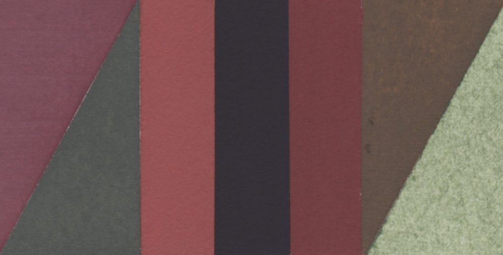
Each pigment is bound in gum Arabic on W&N watercolour paper and read from left to right:

Cobalt Violet Dark
Cobalt Green
Cobalt Violet Brilliant
Cobalt Yellow Pale
Cobalt Green Bluish
Cobalt Violet
Cobalt Titanate Green

A Colour A Day: Week 35

By Ruth Siddall, on 22 November 2020

A Colour A Day: Week 35. 16th – 22nd November

Jo Volley writes …

‘We had a remarkable sunset one day last November. I was walking in a meadow, the source of a small brook, when the sun at last, just before setting, after a cold gray day, reached a clear stratum in the horizon, and the softest, brightest morning sunlight fell on the dry grass and on the stems of the trees in the opposite horizon and on the leaves of the shrub oaks on the hillside, while our shadows stretched long over the meadow east-ward, as if we were the only motes in its beam. It was such a light as we could not have imagined a moment before, and the air also was so warm and serene that nothing was wanting to make a paradise of that meadow. When we reflected that this was not a solitary phenomenon, never to happen again, but that it would happen forever and ever, an infinite number of evenings, and cheer and reassure the latest child that walked there, it was more glorious still.’

Extract from ‘Walking’ by Henry David Thoreau, 1862
(for J.S)

Pigments manufactured by Ruth Siddall, bound in gum Arabic on W&N watercolour paper, and read from left to right:

Weld & Calcium Carbonate Lake
Annatto Lake
Safflower Carthamidin Lake
Eosin Lake #1 & Annatto Lake 50:50 mix
Eosin Chalk Lake
Geranium Lake
Eosin Lake #1

A Colour A Day: Week 34

By Ruth Siddall, on 15 November 2020

A Colour A Day: Week 34. 9th-15th November

Jo Volley writes…

This week’s colours are named after or made for artists and very much inspired by Caroline de Lannoy’s Colour Tale which I first saw at the Tate in 2000 and again last year at the Colour & Poetry: A Symposium performed by the Slade Colour Choristers. Caroline de Lannoy says of the work.

‘Much of my interest has been in the way in which language impinges on our perception, both in its everyday contexts and in works of art. The world has millions of colours. Why do we only name a few? The human eye can see about a thousand levels of light – dark, a hundred levels of yellow-blue, a hundred levels of red-green. This means that the human eye can distinguish about ten million different colours. But human language categorizes these into a small set of words. Throughout the years I have collected 1153 colour names. These colour names, are both abstract and referential. Some colour terms are metaphorical extensions of what are originally object names; some derive from the world of nature, some come from paint materials and others from my own interpretation. ‘Colour Tale’ deals with the relationships between communication and perception, between the spoken words and the visual. It illustrates the ambiguous implications for perceptual research of findings dealing with linguistic and visual classification. Carefully measured and adjusted the written elements or declarative statements comment on aspects of communication, vision, and any specific sites. The colour names are composed as a body of theoretical discourse, and as a ‘visual’ poem, to create a mental image or a fantasy picture, and to develop thinking spaces. Free for the imagination the colours become as intangible as ghosts in the air. The passage of the words sparks off continually the ability to remember fundamental experiences and it invites the audience to take part, by assigning images to the words, thus translating the auditory impressions into visual ones. The rich structure of association around these words call up images and stimulate the emotion and the imagination of the hearers, conveying different ideas to different persons – for a word is a signifier and has many possible signified. This is a prime case of audience participation. The listener is free to make his-or her individual interpretation, to construct his-or her own fantasy picture, and to ‘see’ his-or her personal colour perception since the subject matter is out of sight.’

Please listen to Colour Tale performed here by Eddie Izzard

Colours read from left to right:

van Dyck brown – Lefranc & Bourgeois gouache
Veronese green – Lefranc & Bourgeois gouache
Titan red – mixture
Klein blue
Stuart Semple orange
Prout’s brown ink – Roberson
Corot green – Lefranc & Bourgeois gouache


A Colour A Day: Week 33

By Ruth Siddall, on 8 November 2020

A Colour A Day: Week 33. 2nd-8th November

Jo Volley writes… This week we have more food colourants accompanied by the first stanza of John Keats’ (1795-1821) poem To Autumn.

Season of mists and mellow fruitfulness,
  Close bosom-friend of the maturing sun;
Conspiring with him how to load and bless
  With fruit the vines that round the thatch-eves run;
To bend with apples the moss’d cottage-trees,
  And fill all fruit with ripeness to the core;
To swell the gourd, and plump the hazel shells
  With a sweet kernel; to set budding more,
And still more, later flowers for the bees,
  Until they think warm days will never cease,
For summer has o’er-brimm’d their clammy cells.

Colours read from top to bottom:
Blueberry
Rosemary
Forget-me-not
Blackcurrant
Lavender
Passion fruit
Grape


A Colour A Day: Week 31

By Ruth Siddall, on 25 October 2020

A Colour A Day: Week 31. 19th -25th October

Jo Volley writes…

This week’s colours are manufactured by Ruth Siddall who says of them. ‘Procion MX Dyes – The difference between a dye and a pigment is that a dye is soluble in water and a pigment is insoluble. I am experimenting at the moment to try and find as many ways of making the colourful, organic compounds in dyes into insoluble pigments. These are a series of pigments I made by dyeing a starch with modern Procion MX dyes. I used potato starch as a substrate. I have seen modern dyes such as rhodamine being used in this way, so I thought I’d give it a go. If I’m honest, I’m disappointed with the pale colours produced – quite the opposite of the dyes which were intensely coloured! Chemically, Procion MX dyes are dichlorotriazines, which means they contain a ring-shaped molecule with three nitrogen ions so the formula is C3H3N3 (most ring molecules just have six carbons). In addition there are two chlorine ions attached to this ring and it is these that bond to -OH groups in fibres to produce strong dyes on cloth. Starch has -OH groups, so I had hoped it would work the same way here. There is some colour but it’s not as intense as I had hoped for.’

Each pigment is bound in gum Arabic on W&N watercolour paper. They were like no other pigment I have used before – it was rather like trying to paint with clouds – amorphous – the colour just slipping away. According to the American Meteorological Society, amorphous clouds ‘are without any apparent structure at all, as may occur in a whiteout in a thick cloud or fog over a snow surface when one loses any sense of direction – up, down and sideways’

Procion red MX-G
Procion yellow MX-4G
Procion blue MX-2R
Procion yellow MX-3K
Procion turquoise MX-G
Procion composite grey
Procion red – MX-5B


Recipes and Talks

By Ruth Siddall, on 20 October 2020

 Here are some link to resources and that people might find useful. 

Ruth Siddall’s Recipes

Slade School Pigment Farm Talks 

Over the Spring we had a series of lockdown talks to celebrate the Pigment Farm Project; the talks were about dyes, lake pigments and plants in art generally and come from Emma Richardson, Ruth Siddall, Nicholas Laessing, Andreea Ionascu and Lea Collet. You can watch the recordings of the talks here.

Slade Methods Room Recipes

Lots of pdfs with recipes and methods for making a range of artists materials and other constructions.


A Colour A Day: Week 29

By Ruth Siddall, on 11 October 2020

A Colour A Day: Week 29. 5th -11th October

Jo Volley writes…

In the early 1800’s the mineralogist Abraham Werner published the Nomenclature of Colours to identify minerals by key characteristics. It was later amended by Patrick Syme, C19 Scottish flower painter, having been introduced to it by Robert Jameson who had studied for a year under Werner before becoming a professor of Natural History at Edinburgh University. Jameson had matched Werner’s descriptions with the actual minerals, Syme then used these as his starting point for the colour names, descriptions and actual colour charts introducing references to animals and vegetables. Darwin took a copy on the HMS Beagle voyage (1831-1836) and its terminology, ‘lent both precision and lyricism to Darwin’s writings, whether he was detailing the changeable ‘hyacinth red and chestnut brown’ of the cuttlefish, ‘the primrose yellow’ of species of sea hare, or the ‘light auricular purple’ and provided his naturalist contemporaries with clear point of reference, and enabled all his readers to clearly envision the creatures and settings of lands that most, in a pre-photography age, would never see.’

Extracts from Publisher’s notes Werner’s Nomenclature of Colours, Natural History Museum


A Colour A Day: Week 28

By Ruth Siddall, on 4 October 2020

A Colour A Day; 28th  September – 4th October

Jo Volley writes…

This week’s colours are seven Russian earth pigments gifted by Ruth Siddall who says of them. ‘These seven pigments are supplied by Moscow-based company Colibri Premium Pigments. Many of the earth and mineral pigments they supply are sourced in Russia. This is a selection of their ochres, which include iron ochres (red and yellow ochre) and aluminium-rich earths known as bauxite (deposits much overlooked as ochres). Siderite is iron carbonate. Also included here are two very ‘Russian’ pigments made from minerals mainly known only from deposits in Russia. Shungite is a black, carbon-rich earth pigment. It is found in very ancient, 2 billion year old rocks in Russian Karelia, in the region of Lake Onega. It is named after the town of Shunga. It formed as biogenic deposits, probably from algae preserved in anoxic conditions and then subsequently metamorphosed. Volkonskoite is a green-coloured, chrome-bearing smectite clay mineral. It is sourced from the Okhansk region of the Urals. Tuff is a volcanic ash deposit, in this case coloured purple by iron oxides.

Ruth suggests listening to Sibelius’s Karelian Suite whilst viewing the colours.

All pigments are bound in gum Arabic on W&N watercolour paper and read from left to right:

Tuff Purple
Siderite
Mumia Bauxite
Shungite
Sankirnaya Ochre
Volkonskoite