X Close

The Pigment Timeline Project

Home

Menu

Archive for the '#ArtistsPigments' Category

A Colour A Day: Week 43

By Ruth Siddall, on 17 January 2021

A Colour A Day: Week 43. 11th -17th January

Jo Volley writes…

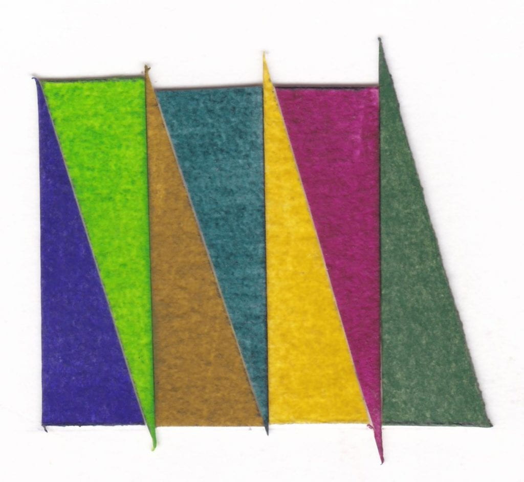
This week we have seven colours new to the Winsor & Newton Winton oil range, accompanied with notes by Stephanie Nebbia, artist and Colart Global Fine Art Collective manager.

Dioxane Blue – PV23, PB29. Strong transparent violet, dark almost black in mass tone with a beautiful bluish Ultramarine hint in the undertone. The range from the deep violet to the blue leanings makes it very versatile.

Phthalo Yellow Green – PY74, PG7. Bright opaque green with a strong Cadmium yellow like temperature with an added Phthalo depth of hue. Possesses many qualities of a Cadmium green bright/mid green.

Azo Brown – PY74, PV23. Golden tinge to this warm brown which although not organic has the madder like quality of madder brown which comes from the gentle charring of madder lake. Has the advantage of being lightfast with the same versatility.

Phthalo Deep Green – PG7, PR177. Dark almost black mass tone with a cool red shade in the undertone, reminiscent as a dark version of the historic Alizarin green lake and the toxic Cinnabar greens with the same transparency. Has the same potential and versatile offered by Hooker’s green – also a combination of pigments – with a strong tinting strength.

Azo Yellow Green – PY74, PG7, PR101, PY42. Warm Indian yellow tone with a Phthalo green tinge and although not an earth colour contributes to this family with a brownish ochre warmth making an excellent and versatile earth yellow. Reminiscent of haematite and goethite ochres which I find very evocative.

Quinacridone Deep Pink – PB29, PV19. A deep dark crimson mass tone reminiscent of the historic Alizarin rose with a blue/violet temperature undertone.

Dark Verdigris – PY74, PB29. Deep green with an Ultramarine tint similar to copper corrosion derived greens but stable and unlike early versions does not blacken. A colour used frequently by Watteau where he mixed genuine Ultramarine with actual copper Verdigris as well as featuring in Flemish School painting and early Italian oil painting.

Colours read from left to right:

Dioxane Blue
Phthalo Yellow Green
Azo Brown
Phthalo Deep Green
Azo Yellow Green
Quinacridone Deep Pink
Dark Verdigris
A Colour A Day: Week 42

By Ruth Siddall, on 10 January 2021

A Colour A Day: Week 42. 4-10 January

Jo Volley writes…

This week we have more earth pigments collected and manufactured by Ruth Siddall who says of them;

These are a series of British earth colours derived from some of the geological formations of southeast England. Ashdown Orange, Galley Hill Gold, Galley Hill Red and Road Works Red are all from the Cretaceous Wealden facies and all were collected in and around Bexhill in East Sussex. These strata expose terrestrial deposits which include fossil soils (palaeosols) as well as ochre-stained sandstones. The Road Works Red was procured from some kindly municipal workmen who were digging up the road outside St Mary Magdalene’s Church in Bexhill. River Ching and Walton-on-the-Naze clays are both derived primarily from the London Clay deposits of the London Basin. The River Ching flows through Higham’s Park in NE London, once a landscape garden laid out by Humphry Repton in the 1790s. The lake in the park is Repton’s construction, and the banks of the Ching which flows alongside the lake, are largely ‘made ground’ which mixes the London Clay with the overlying Ice Age Woodford Gravels. Here in NE London, the London Clay is dark grey and the clays from the Woodford Gravels is pale brown. At Walton-on-the-Naze, London Clay underlies a spectacular sequence of Ice Age strata. Again largely of continental origin, red beds dominate the sequence here. The red ochre from Stone Point, extracted from a thin horizon of red sandstones is possibly very recent in age and certainly Holocene. The pigments derived from these geological strata required a lot of processing, including washing, levigating, grinding and sieving to extract a suitable pigment.

All pigments are bound in gum Arabic on W&N watercolour paper and read from left to right:

Walton-on-the-Naze London Clay
Ashdown Orange
Galley Hill Red
Galley Hill Gold
Road Works Red
Stone Point Red Ochre
River Ching Ochre

A Colour A Day: Week 41

By Ruth Siddall, on 3 January 2021

A Colour A Day: Week 41. 28th December- 3rd January

Jo Volley writes...

This weeks colours are seven beautiful Japanese pigments, gifted to me some years ago, but unfortunately their pigment identity is unknown to me. As with all the colours I make from pigments they are bound in my preferred choice of medium, gum Arabic, which is the hardened sap of certain varieties of the acacia tree which grow exclusively in the Sahel. It has a long, complex and sometimes a very brutal history and apart from its value to the artist it has been used in foods, medicine and cosmetics for centuries.

My favourite new fact about gum Arabic can be found in Dorrit Van Dalen’s wonderful book, Gum Arabic. The Golden Tears of the Acacia Trees, Chapter IX: Intangible Tears, where she explains its chemistry.

‘Gum Arabic is a complex polysaccharide composed of four sugars – galactose, arbinose, rhamnose and glucuronic acid, plus calcium, magnesium and potassium salts. These constituents are linked to each other in myriad ways, with a ramification of elements within the molecule. This is why gum Arabic dissolves so well and produces solutions of very low viscosity: the many ramifications allow it to hold much water. Solutions of gum Arabic in water become viscous only at concentrations of 30 per cent gum or higher.

Around the turn of the century it was discovered that the molecules of gum from Acacia senegal and Acacia seyal has another permanent element that had not been noticed before or that had been seen as an impurity. Chemists found that a protein that makes up just 2 or 3 per cent of the molecule explains the property which makes especially hashab, gum from Acacia senegal, so valuable: its emulsifying capacity.

In 2019, Peter Williams, professor of Polymer and Colloid Chemistry at Glyndwr University, explained to me the significance of the find. the protein that distinguishes gum Arabic from other gums is hydrophobic: it tries to get away from water, but close to oil if there is any around. The carbohydrate part of the protein, however, is hydrophilic and uses its ramifications to stay in water as much as it can. Now imagine a glass of water with some gum Arabic dissolved in it. Add some oil (Coca-Cola-flavoured, for instance) and see what happens: each molecule of gum wants to wrap one arm around a molecule of oil, and another round a molecule of water. Like couples on a dance floor, the new combinations will fill the glass evenly. So the protein component give the gum molecule amphiphilic characteristics: it likes to be near water and oil.’

Kordofan gum Arabic

All colours are bound in gum Arabic on W&N watercolour paper and read from left to right as a rainbow and dedicated to our Key Workers.

A Colour A Day: Week 40

By Ruth Siddall, on 27 December 2020

A Colour A Day: Week 40. 21st-27th December

Jo Volley writes…

This weeks colours are accompanied by Marge Piercy’s poem Colors passing through us.

Purple as tulips in May, mauve
into lush velvet, purple
as the stain blackberries leave
on the lips, on the hands,
the purple of ripe grapes
sunlit and warm as flesh.

Every day I will give you a color,
like a new flower in a bud vase
on your desk. Every day
I will paint you, as women
color each other with henna
on hands and on feet.

Red as henna, as cinnamon,
as coals after the fire is banked,
the cardinal in the feeder,
the roses tumbling on the arbor
their weight bending the wood
the red of the syrup I make from petals.

Orange as the perfumed fruit
hanging their globes on the glossy tree,
orange as pumpkins in the field,
orange as butterflyweed and the monarchs
who come to eat it, orange as my
cat running lithe through the high grass.

Yellow as a goat’s wise and wicked eyes,
yellow as a hill of daffodils,
yellow as dandelions by the highway,
yellow as butter and egg yolks,
yellow as a school bus stopping you,
yellow as a slicker in a downpour.

Here is my bouquet, here is a sing
song of all the things you make
me think of, here is oblique
praise for the height and depth
of you and the width too.
Here is my box of new crayons at your feet.

Green as mint jelly, green
as a frog on a lily pad twanging,
the green of cos lettuce upright
about to bolt into opulent towers,
green as Grand Chartreuse in a clear
glass, green as wine bottles.

Blue as cornflowers, delphiniums,
bachelors’ buttons. Blue as Roquefort,
blue as Saga. Blue as still water.
Blue as the eyes of a Siamese cat.
Blue as shadows on new snow, as a spring
azure sipping from a puddle on the blacktop.

Cobalt as the midnight sky
when day has gone without a trace
and we lie in each other’s arms
eyes shut and fingers open
and all the colors of the world
pass through our bodies like strings of fire.

Colours are from the Liquitex Soft Body Acrylic range on W&N watercolour paper and read from left to right:

Bright Aqua Green
Vivid Orange
Scarlet
Naphthol Crimson
Yellow Orange Azo
Permanent Light Green
Permanent Dark Green

A Colour A Day: Week 39

By Ruth Siddall, on 20 December 2020

A Colour A Day: Week 39. 14th-20th December

Jo Volley writes…

I’m only happy when I’m trying to create something new’: words by Henry Levison inventor of Liquitex acrylics paint. Levison was a colour chemist who ran Permanent Pigments, Cincinnati, Ohio, which had been milling colours from 1933. Acrylics were first developed as a solvent-based artists’ colour in the early part of the C20 and by 1955 Levison had perfected a commercially viable water-based acrylic. The Permanent Pigments went on to be called Liquitex.

Henry Levison inventor of Liquitex.

Colours are from the Liquitex Soft Body Acrylic range on W&N watercolour paper and read from left to right:

Quinacridone Burnt Orange
Quinacridone Blue Violet
Indanthrene Blue
Parchment
Bronze Yellow
Prism Violet
Muted Violet

A Colour A Day: Week 38

By Ruth Siddall, on 13 December 2020

A Colour A Day: Week 38. 7th-13th December

Jo Volley writes…

This week’s colours are accompanied by ‘Cobalt: Pigment of Hope and Destruction’ by Robert Mead as a response to the colours.

Cobalt shares an entwined history with both painting and technology. The mineral is capable of producing a range of different colours – perhaps the most commonly known is Cobalt Blue. This is a cobalt aluminate pigment and was first discovered in 1775 – with further modern production achieved in 1777, where the moistening of aluminium compounds with a cobalt solution turned blue and strongly calcined. A variety of other colours can be produced through cobalt; a range of violets can be created through a variety of different compounds – such as cobalt magnesium arsenate – and cobalt phosphate octahydrate. Cobalt Green has been made by multiple processes including the direct mixture of cobalt blue with ‘chromic’ yellow or a combination of cobalt and zinc or iron oxide. Cobalt Yellow is a potassium cobalt nitrate, first synthesised in 1831 – through the reaction between potassium nitrite and cobalt salts, creating a crystalline mass. Using cobalt, we are able to produce range of wonderful and unique colours. However, as a mineral its demand has increased alongside the development of new technologies – as a key component of batteries in laptops, phones and increasingly electric cars. The main source of cobalt extraction is in The Democratic Republic of Congo, whose history of colonisation by Belgium from 1869-1908 through to its independence in the 1960s is entwined with the desire for its available supply of minerals such as diamonds, copper and uranium. Now major western companies such as Apple, Dell and Microsoft have bought into the mining industry there, as cobalt suppliers for their lithium batteries, this high demand has led to quarries operating with dangerous conditions and often using child labour. Furthermore, both the pigment and the mineral itself hold highly toxic particles and when consumed or inhaled and can cause major health risk – increased through poor mining conditions. Further increasing the demand for cobalt is the development of electric cars. As we attempt to offset the climate crisis by moving to using electric vehicles, companies such as BMW and Tesla have also invested heavily in cobalt mining to acquire the material for powering them. In this case, cobalt is at the centre of paradox between hope for moving away from fossil fuels and towards clean electric energy and the negative consequences its acquisition results in. Without sustainable mining methods, its production is tainted by this problematic discord. In reflecting on cobalt’s significance for our future, it seems prescient that it was the key ingredient in what was considered the doomsday weapon of the Cold War – the Cobalt Bomb (or C-Bomb), theoretically capable of wiping out all human life on the planet and featuring in films such as Beneath the Planet of the Apes and Dr Strangelove. The use of cobalt would allow a much higher level of fallout to be released from detonation, many times greater than the level of residual radiation still present in the strata of the Earth from the era of nuclear testing. When we look at the alluring colours it can produce we can also consider that cobalt pigments are entwined with both our colonial and technological history and humanities attempts at both healing and destruction.

Robert Mead is a painter and PhD researcher at the Slade School of Fine Art. The aim of his research is to make paintings that form emotive connections between the viewer and our environment which draw them into wider hidden discourses. Robert says of his work; ‘Moving through the strata of my paintings digs up histories and ghosts that we may not wish to confront but are bound to our past’.

Each pigment is bound in gum Arabic on W&N watercolour paper and read from left to right:

Cobalt Violet Dark
Cobalt Green
Cobalt Violet Brilliant
Cobalt Yellow Pale
Cobalt Green Bluish
Cobalt Violet
Cobalt Titanate Green

A Colour A Day: Week 37

By Ruth Siddall, on 6 December 2020

A Colour A Day: Week 37. 30th November – 6th December
Jo Volley writes…
This week we have 7 more colours gifted by Steven Patterson, Chief Executive Officer, Derivan, Australian artist materials manufacturer, from their Matisse range of acrylics.


Answer to an Inquiry.

My formats are square, but the grids never are absolutely
square; they are rectangles, a little bit off square, making a
sort of contradiction, a dissonance, though I didn’t set out to do
it that way. When I cover the square surface with rectangles, it
lightens the weight of the square, destroys its power.

Agnes Martin, Writings 1992


Colours are painted out onto W&N watercolour paper and read from left to right:

Australian Red Voilet
Transparent Red Oxide
Deep Rose Madder
Mars Violet
Transparent Venetian Red
Lori Red – Light
Permanent Maroon

A Colour A Day: Week 36

By Ruth Siddall, on 29 November 2020

A Colour A Day: Week 36. 23rd – 29th November

Jo Volley writes ….

‘Colour has been used chiefly in the past to as a means to display form – form being thought of as its obvious master.

The freedom of abstract thought has come, and shows us a future lying ahead of colour as one of the three great abstract arts.

Mathematics – music – colour. To those artist whose inspiration comes in the form of shape and shape relationships, colour may continue to be the means of expressing those shapes, unless it be that they find that light and shades a more suitable means for their purpose.

But to those artist whose inspiration comes in the form of colour alone, without reference to object or object sense, it is no longer necessary to set about seeking some form into which the colour maybe tagged to give it being.’

Extract from Winifred Nicholson Unknown Colour first published 1937, click here to continue reading,

Assorted Kremer pigments bound in gum Arabic on W&N watercolour paper and read from left to right.

Chrysocolla
Han purple
Celadonite
Realgar
Cavansite
Sodalite
Red Jasper

A Colour A Day: Week 35

By Ruth Siddall, on 22 November 2020

A Colour A Day: Week 35. 16th – 22nd November

Jo Volley writes …

‘We had a remarkable sunset one day last November. I was walking in a meadow, the source of a small brook, when the sun at last, just before setting, after a cold gray day, reached a clear stratum in the horizon, and the softest, brightest morning sunlight fell on the dry grass and on the stems of the trees in the opposite horizon and on the leaves of the shrub oaks on the hillside, while our shadows stretched long over the meadow east-ward, as if we were the only motes in its beam. It was such a light as we could not have imagined a moment before, and the air also was so warm and serene that nothing was wanting to make a paradise of that meadow. When we reflected that this was not a solitary phenomenon, never to happen again, but that it would happen forever and ever, an infinite number of evenings, and cheer and reassure the latest child that walked there, it was more glorious still.’

Extract from ‘Walking’ by Henry David Thoreau, 1862
(for J.S)

Pigments manufactured by Ruth Siddall, bound in gum Arabic on W&N watercolour paper, and read from left to right:

Weld & Calcium Carbonate Lake
Annatto Lake
Safflower Carthamidin Lake
Eosin Lake #1 & Annatto Lake 50:50 mix
Eosin Chalk Lake
Geranium Lake
Eosin Lake #1

A Colour A Day: Week 34

By Ruth Siddall, on 15 November 2020

A Colour A Day: Week 34. 9th-15th November

Jo Volley writes…

This week’s colours are named after or made for artists and very much inspired by Caroline de Lannoy’s Colour Tale which I first saw at the Tate in 2000 and again last year at the Colour & Poetry: A Symposium performed by the Slade Colour Choristers. Caroline de Lannoy says of the work.

‘Much of my interest has been in the way in which language impinges on our perception, both in its everyday contexts and in works of art. The world has millions of colours. Why do we only name a few? The human eye can see about a thousand levels of light – dark, a hundred levels of yellow-blue, a hundred levels of red-green. This means that the human eye can distinguish about ten million different colours. But human language categorizes these into a small set of words. Throughout the years I have collected 1153 colour names. These colour names, are both abstract and referential. Some colour terms are metaphorical extensions of what are originally object names; some derive from the world of nature, some come from paint materials and others from my own interpretation. ‘Colour Tale’ deals with the relationships between communication and perception, between the spoken words and the visual. It illustrates the ambiguous implications for perceptual research of findings dealing with linguistic and visual classification. Carefully measured and adjusted the written elements or declarative statements comment on aspects of communication, vision, and any specific sites. The colour names are composed as a body of theoretical discourse, and as a ‘visual’ poem, to create a mental image or a fantasy picture, and to develop thinking spaces. Free for the imagination the colours become as intangible as ghosts in the air. The passage of the words sparks off continually the ability to remember fundamental experiences and it invites the audience to take part, by assigning images to the words, thus translating the auditory impressions into visual ones. The rich structure of association around these words call up images and stimulate the emotion and the imagination of the hearers, conveying different ideas to different persons – for a word is a signifier and has many possible signified. This is a prime case of audience participation. The listener is free to make his-or her individual interpretation, to construct his-or her own fantasy picture, and to ‘see’ his-or her personal colour perception since the subject matter is out of sight.’

Please listen to Colour Tale performed here by Eddie Izzard

Colours read from left to right:

van Dyck brown – Lefranc & Bourgeois gouache
Veronese green – Lefranc & Bourgeois gouache
Titan red – mixture
Klein blue
Stuart Semple orange
Prout’s brown ink – Roberson
Corot green – Lefranc & Bourgeois gouache