Simplifying complex data
By Oli Usher, on 27 October 2014
One challenge in science is how to represent vast datasets in a way that the human eye and brain can understand. UCL statisticians Sofia Olhede and Patrick Wolfe have worked on methods of simplifying data on relationships between things in a way which captures all the important features, but is not so unwieldy that the patterns are lost.
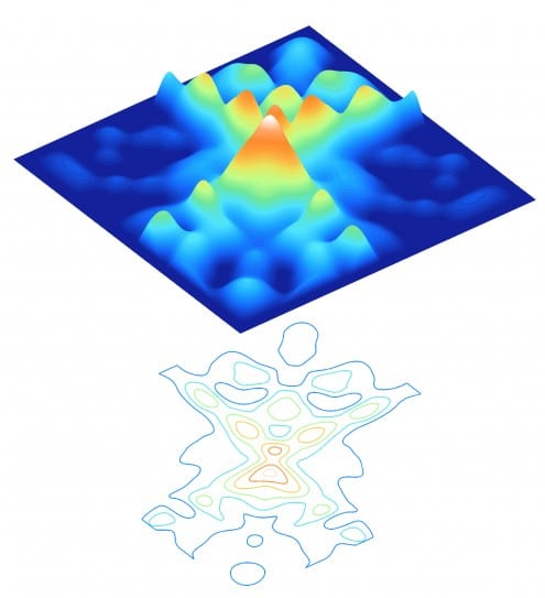
The top pair of images on this page show data on how frequently blogs supporting different parties link to each other – showing frequent linking between fellow US Republican Party blogs and US Democratic Party blogs (top and bottom quadrants of the picture) but very little crossing the political divide (left and right quadrants). Peaks (in red and yellow) show groups of blogs that link to each other frequently, blue areas show combinations of blogs that rarely never link to each other. The lower image is a 2D map of exactly the same data.
The next image shows a mathematical approximation of the shape of the distribution of linking in that data – showing how the underlying pattern of blogs linking to each other is actually rather simple.
A detailed article on the science behind these images – and what they tell us – will be published here on the UCL Science blog on Wednesday.
Picture credits: Patrick Wolfe, Sofia Olhede (UCL Statistical Science).
Data from Adamic and Glance
 Close
Close


