X Close

The Pigment Timeline Project

Home

Menu

Archive for the '#PigmentTimelineProject' Category

Morland’s Blue; UCL Arena Centre

By Ruth Siddall, on 19 March 2017

Senior teaching fellow in UCL’s Arena Centre for Research-based Education, Nick Grindle, started academic life as a Art Historian. Nick has been with The Arena Centre (formerly CALT) since 2011 and has responsibility for educational development within UCL’s Social and Historical Sciences and Arts and Humanities Faculties. However, UCL being the wonderful place it is, Nick still has opportunities to teach and conduct research within UCL Art History, the department where he studied for both his undergraduate and PhD degrees. One of his main interests is in the 18th Century English painter, George Morland and he has recently curated an exhibition of this artist’s works at the Stanley and Audrey Burton Gallery, at the University of Leeds. In our Pigment Timeline Questionnaire, Nick responded on behalf of CALT, stating his general interest in colour theory and pigments and mentioned an especial interest in the palettes of 18th Century British painters. Initially I was concerned that we may be returning to the murkier ends of the spectrum for this blog, envisioning browns and dull greens. But Nick has contributed some more cheerful colour via the subject of his research, Morland.

George Morland (1763-1804) spent most of his short life in Fitzrovia and Camden. He was apprenticed to his father, who gave him ‘a very complete colour box’ (Collins, 1806). From the late 1780s he was a popular society painter and got rich quick as a consequence. He fuelled a fast lifestyle with colossal debts, and died in poverty aged forty-one. Nevertheless as a painter, his output was prolific, with a specialism in genres scenes of both high London society and rural labour.

I met with Nick to talk about Morland’s painting techniques, palette and subjects. Nick tells me that there were a number of contemporary biographies of Morland, which alluded to his rapid painting technique and dealings with colourmen. One of his biographers discussed his use of colour as follows:

‘Morland was always particularly careful to use the best oils and most durable colours; concerning the chemical properties of which he possessed a considerable degree of practical knowledge, chiefly derived from his father, who had studied the subject with great attention, and made many experiments. Morland’s skill in these matters is best evinced by the high state of preservation in which even his earliest paintings still remain, for they have experienced no change but the addition of that mellowness, which no art can emulate, and time alone can give. He maintained that every possible effect might be produced with four or five colours, and that the ochres were sufficiently brilliant for the strongest lights; he however occasionally employed Naples yellow. In rich parts he used the umbers and Vandyke brown, never asphaltum, and copies are sometimes detected from this circumstance; for the presence of that substance may easily be discovered by passing a wet finger over it, since the moisture will lie evenly upon the other parts, while it recedes from the greasy surface of the asphaltum rising in ridges like net-work.

‘His principles were few and obvious, though for the most part just, such as that a portion of pure red should be introduced somewhere in a picture; accordingly we never see a landscape of his without a red cloak, coat, or cap; and this is uniformly accompanied by a blue jacket, or petticoat: he also remarked that there should always be a touch of vermillion in the lips, though they should not be painted entirely with it.
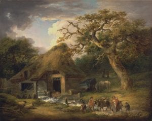
George_Morland_-_The_Old_Water_Mill_-_Google_Art_Project

George Morland, The Old Water Mill, 1790, oil on canvas, 100 x 125 cm, Yale Centre for British Art, Paul Mellon Collection.

‘Of his mode of procedure, in general his method in painting trees will serve as an example. He used to lay in the branches, in a broad style, with simple cool tints of ochre and blue, or black; and after the dead colour was dry, to glaze them with yellow lake, or brown pink, and to touch in the lights with ochre, or Naples yellow, pure or tinged with blue, and sometimes mixed with yellow lake. He occasionally used the softener, but always touched upon his painting afterward: sometimes he would varnish the picture, and drag, or otherwise work upon it while tackey [sic].

‘Among other subjects connected with art, at present in a very imperfect state, from the want of accurate experiments, is that of the properties of colours with respect to durability. Thus artists often waste their time in making fruitless enquiries of each other, and in collecting accounts which agree in nothing but their uncertainty, and each is at last reduced to find out by hasty and imperfect trials, during his own short life, the best mode of transmitting his works to posterity. (Dawe, 219-221).

Indeed, Nick told me that during his research, he has visited many a British provincial museum to see Morland’s paintings in storage. All have been in very good condition with little evidence for previous restoration or lining the canvas. This is rare indeed for paintings of this period.

Looking through images of Morland’s paintings in public collections via the Art UK website and also in the collections of Tate and the Yale Centre for British Art we get a sense of his palette, and we see just how well Dawe has described Morland’s use of colour. The outdoor settings of many of his paintings dictate a range of greens, yellows and drab browns, and there is often a splash of colour in the foreground or in the clothing of staffage; a woman with a blue parasol or shawl, a man with red breeches, a blue cart outside a barn.
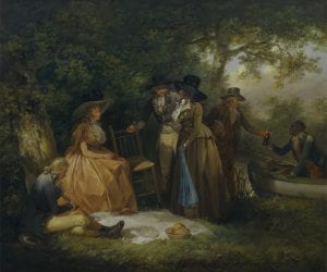
Anglers

George Morland, The Angler’s Repast, 1789, oil on canvas, 63 x 76 cm. Yale Centre for British Art, Paul Mellon Collection.

A late work by Morland ‘The Artist in his Studio and His Man Gibbs’ is in the Nottingham Castle Museum and Art Gallery and can give us some clues to his painting practice (below). This self portrait was created towards the end of Morland’s life, c. 1802, when the artist had clearly fallen on hard times, indeed he had recently been released from debtors’ prison. His dingy, dark studio is clearly also his living space too, occupied by Morland and his man, Gibbs. Gibbs is listlessly cooking sausages over an open fire much to the interest of two expectant dogs. Preparatory studies of the same dogs – and maybe Gibbs too – appear on the wall above the fireplace. Crumpled boots and household items litter the scene. Morland has his easel set up by the only window and looks glumly out at us, while his near-complete painting shows the ideal of an English country cottage on a bright, sunny, Summer’s day. A recurrent theme, if the other paintings stacked behind him are anything to go by. We also see his painting materials on the stool beside him and the palette in his hand. Not many colours there, maybe seven? These are likely to be black and white, and a few others: evidence supporting Morland’s claim ‘that every possible effect might be produced with four or five colours’? Probably, but hard to tell for sure.
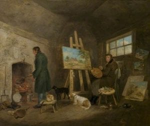
Morland, George, 1763-1804; The Artist in His Studio and His Man Gibbs

George Morland, The Artist in his studio and his man Gibbs, c. 1802, oil on canvas, 63.5 x 72 cm, Nottingham Castle Museum and Art Gallery, NCM1904-55.

Apart from the blue sky on the unfinished painting, the blue of Gibbs’s blue stockings and coat and the red of the fire stand out. Those two colours again.

Blue Pigments have always been relatively hard to come by, a point made evident by the fact that Dawe is able to name numerous pigments for yellow and brown, but not for blue. Few natural minerals suitable as use for blue pigments exist, these are mainly lazurite (ultramarine), vivianite, azurite and its synthetic equivalent, blue verditer and the dye indigo. Smalt – a cobalt-doped glass – was widely available but know to be fugitive, and so unlikely to have been employed by the meticulous Morland. Prussian Blue became commercially available from the second decade of the 18th Century but the stable Cobalt Blue did not appear until 1775. The latter could have been used by Morland but like many other blue pigments, it would have been expensive.

Could Morland’s blue be Prussian Blue? My gut feeling, from its slightly dull colour in the paintings, is that this is his pigment used for scarfs, caps and breeches. Cobalt blue and ultramarine are stronger, much brighter blues (though a preparation of cobalt blue, mixed with white could have been used for Morland’s skies). However we will have to wait for the opportunity to analyse the pigments of Morland’s paintings to be sure what was on his palette.

Prussian Blue on an organic substrate viewed under the microscope; plane-polarised light x 400.

Prussian Blue is a hydrated iron(III) hexacyanoferrate(II) complex. It is a synthetic pigment of extremely fine particle size and intense colour. It is relatively easily synthesised using readily available ingredients; dried blood (a source of iron), and alkali (i.e. potassium carbonate), iron sulphate hydrate, alum and hydrochloric acid. After heating the blood and alkali together, a red compound is formed which is then dissolved in water and filtered. The filtrate is then mixed with the alum and the iron salt and finally washed in hydrochloric acid, leaving a blue precipitate that is then ground to for the pigment (Samain et al., 2013). This process was first discovered in Berlin in 1704, earning it the early trade name of Berlin Blue.


References and further reading

Collins, W., 1806, Memoirs of that Celebrated, Original and Eccentric Genius the late George Morland, London: C. Stower.

Dawe, G., 1807, The Life of George Morland, London: Vernor & Co.

Grindle, N., ed., 2015, George Morland: Art, Traffic and Society in Late Eighteenth Century England., The Stanley & Audrey Burton Gallery., 99 pp.

Grindle, N. M., 2015, ‘The gipsey-race my pity rarely move?’ Representing the Gypsy in George Morland’s Morning, or the Benevolent Sportsman., in: Dethloff, D., Murdoch, T. & Sloan, K. (Eds.), Burning Bright: Essays in Honour of David Bindman, 105-114. http://discovery.ucl.ac.uk/1470833/7/9781910634349_updated.pdf

Samain, L., Grandjean, F., Long, G. L., Martinetto, P., Bordet, P., Sanyova, J. & Strivay, D., 2013, Synthesis and fading of eighteenth-century Prussian blue pigments: a combined study by spectroscopic and diffractive techniques using laboratory and synchrotron radiation sources., Journal of Synchrotron Radiation., 20, 460-473.

‘The Artist in his Studio and His Man Gibbs’, George Morland, Art UK https://artuk.org/discover/artworks/the-artist-in-his-studio-and-his-man-gibbs-46834/search/actor:morland-george-17631804/page/6

George Morland: https://en.wikipedia.org/wiki/George_Morland


Vivianite: Office of the Vice-Provost for Education and Student Affairs

By Ruth Siddall, on 31 January 2017

The colour and pigment I (Ruth Siddall) have chosen to represent my department, the Office of the Vice-Provost for Education and Student Affairs (that’s right guys, I’m taking you all down with me) in the Pigment Timeline Project is vivianite. The reason is simply that it is a rather beautiful pigment, it looks good under the microscope and I just like its colour, a shade of greyish blue. It is also an unexpected earth pigment, being blue and therefore standing out from the usual gamut of yellows, browns, reds and blacks that we associate with the word ‘ochre’. Another reason is that it is the first pigment to appear in The Pigment Compendium’s Optical Microscopy volume.

Vivianite is not a well-known pigment, and it is a true fact that lack of knowledge of the existence of a pigment directly correlates to the likelihood of its identification on a painted object. I feel that the more we know about and recognise this mineral pigment, the more it will be identified.

Vivianite is a mineral forming in the natural geological environment. Chemically, it is an iron phosphate hydrate (Fe2+3(PO4)2· 8HO); when unexposed to oxygen it is colourless, but oxidation produces a blue or green colouration as the Fe2+ ions convert to Fe3+. Dig into a peat bog, and the bright blue can form before your eyes.

Vivianite was first discovered by John Henry Vivian a Cornish politician, mine owner and mineralogist at the Wheal Kind Mine near St Agnes. Vivian did not name the mineral himself, but it was named after him by Abraham Gottlob Werner 1817. It can form beautiful, bladed, gem quality crystals, but in terms of its use as a pigment, I am more interested in the earthy, friable forms; ‘blue earth’ or ‘blue ochre’.

IMG_0251

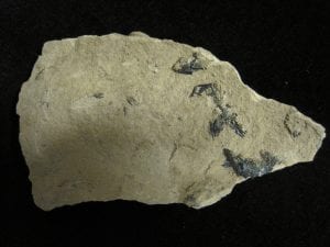
Vivianite crystals on London Clay from West Leigh, Hampshire

To act as a good pigment, a mineral needs to be soft enough to grind to a fine powder, and to be able to retain its colour when finely ground. This is, by far, not a universal property; many minerals which are strongly coloured in hand specimen, lose their colour completely when finely ground. Naturally occurring, blue minerals are not common and so, when encountered in peat bogs and similar environments, vivianite would have attracted the eye with its striking paint-making potential.

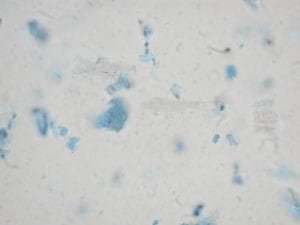
Vivianite is very easy to recognise using polarising light microscopy. It has intense blue-to-colourless pleochroism as the microscope stage is rotated. Compare the two images below, both the same field of view, from the Pigment Compendium reference collection.

OLYMPUS DIGITAL CAMERA

This sample, P1353 was donated to us by Rowena Hill. It comes from the Southern Highlands of Papua New Guinea, where Rowena was studying the use of the pigment in ethnographic contexts. It was collected in 1986.

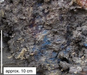
Geologically, vivianite forms in damp, anoxic environments in the presence of phosphate and the absence of sulphur. My only geological sample , a gift of colleague, Peter Hay is from the London Clay, collected from West Leigh Landfill Site near Havant in Hampshire (see photo above). Dark blue bladed crystals have grown on the surface. Apart from an association with dead bodies (more later), this mineral is most commonly encountered in peat bogs, though this is something I have never personally observed. Indeed the only field photo I have seen of vivianite in situ in sediments is in Dill & Techmer’s 2009 paper on ‘ferricretes’ in Bavaria. If anyone out there has field photographs of vivianite in the geological environment, I would love to see them! It should also be noted that vivianite commonly turns up as a corrosion product in archaeological finds, particularly on iron artefacts (see for example, Scott & Eggert, 2007).

vivianiteindirt

Vivianite forming in clays and silts in Bavaria, from Dill & Techmer (2009).

Dead bodies are a good source of phosphate in the form of bone – chemically calcium hydroxyl apatite, Ca5(PO4)3(OH) – and spectacular blooms of vivianite have been noted on human remains, famously it was found in the body of Ötzi, the Tyrolean ice man (see Pabst & Hofer, 1998). It has become an unintentional habit of this blog to stray into the more macabre associations of pigments and their derivation and uses, and so I feel I should introduce readers to ‘Brienzi, the blue vivianite man of Switzerland’. Brienzi (not his real name) was drowned in the Brienzersee in Switzerland, probably in the 18th Century AD. The remains of his corpse was exposed by a landslide and discovered in 1996 (Thali et al, 2011). Preserved fat was seen to be coated in vivianite. Click here for images. Or not. The mineral has also been found on more recent remains of US airmen who went missing in action during the Vietnam War (Mann et al., 1998), demonstrating that it forms geologically rapidly.

Records of vivianite’s occurrence on works of art are not abundant. Known examples include tentative identifications on works by Vermeer and several other examples which are listed in Scott & Eggert (2007) and also in the Pigment Compendium (Eastaugh et al., 2004). Use is more or less restricted to 17th and 18th Century western painting , with a few occurrences in in post-Roman and Medieval art and ethnographic use in New Zealand (Hamilton, 1896), Papua New Guinea (Hill, 2001) and particularly in art of the Pacific Northwest of North America.

I visited Alaska in 2008 to attend a conference and whilst there went to see the amazing exhibition ‘Yuungnaqpiallerput / The Way We Genuinely Live’ (Fienup-Riordan, 2007), which showcased artefacts, experiences and memories demonstrating the adaptability of the local Yup’ik people to their environment. The Yup’ik used red and yellow ochres and chalks as pigments but also used vivianite to paint masks and other artefacts. An interview with local man Paul John recalled kayaking out to collect pigments from Nelson Island with his grandfather and others, where vivianite was exposed high up, in cliff sections. His grandfather’s rifle was an essential tool in the procurement of this particular pigment; “Since it’s hard to reach, they sometimes shot at the mountainside to get it.”

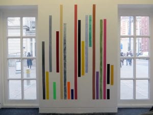
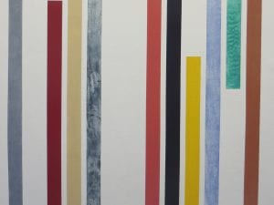
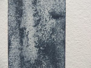
Vivianite pigment is available to buy from artists’ colourmen today. My colleague and fellow Pigment Timeliner Jo Volley is, at the time of writing, installing an artwork in UCL’s Front Lodge. Called ‘Sampler II’, it contains stripes of pure pigment including mineral vivianite.

IMG_2704

IMG_2708

IMG_2697

Jo Volley , 2017, ‘Sampler II’

References and further reading

Dill, H. & Techmer, A., 2009, The geogene and anthropogenetic impact on the formation of per descensum vivianite–goethite–siderite mineralization in Mesozoic and Cenozoic siliciclastic sediments in SE Germany., Sedimentary Geology 217, 95–111.

Eastaugh, N., Walsh, V., Chaplin, T., & Siddall, R., 2008, Pigment Compendium: A Dictionary and Optical Microscopy of Historic Pigments. (1st ed.). London: Butterworth-Heinemann., 958 pp.

Fienup-Riordan, A., 2007, Yuungnaqpiallerput / The Way We Genuinely Live: Masterworks of Yup’ik Science and Survival., University of Washington Press., 360 pp. & Yup’ik Science: working with bone, stone and ivory; http://www.yupikscience.org/10wintervillage/10-3.html

Hamilton, A., 1896, Maori Art, Harmer Johnson, London.

Hill, R., 2001, Traditional paint from Papua New Guinea: context materials and techniques, and their implications for conservation., The Conservator, 25, 49-61.

Hrala, J., 2016, This strange mineral grows on dead bodies and turns them blue., http://www.sciencealert.com/vivianite-the-blue-mineral-that-eerily-turns-buried-bodies-blue

Mann, R. W., Feather, M. E., Tumosa, C. S., Holland, T. D. & Schneider, K. N., 1998, A blue encrustation found on skeletal remains of Americans missing in action in Vietnam., Forensic Science International, 97, 79-86.

Mindat; Vivianite: http://www.mindat.org/min-4194.html

National Gallery, London: Vermeer’s palette; https://www.nationalgallery.org.uk/paintings/research/meaning-of-making/vermeer-and-technique/vermeers-palette

Pabst, M., and Hofer, F., ‘Deposits of different origin in the lungs of the 5,300-year-old Tyrolean Iceman’, American Journal of Physical Anthropology 107 (1998) 1–12.

Scott, D. A & Eggert, G., 2007, The vicissitudes of vivianite as pigment and corrosion product, Studies in Conservation, 52, 3-13.

Thali, M. J., Lux, B., Lösch, S., Rösing, F. W., Hürlimann, J., Feer, P., Dirnhofer, R., Königsdorfer, U. & Zollinger, U., 2011, ‘‘Brienzi’’ – The blue Vivianite man of Switzerland: Time since death estimation of an adipocere body., Forensic Science International 211, 34–40.

Volley, J., 2017, “Sampler II”

Lamp Black: Digital Humanities

By Ruth Siddall, on 26 August 2016

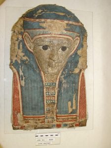
We are all familiar with the colourful coffins and mummy cases associated with Ancient Egypt. These artefacts can tell us much about the life and death of the person but unintentionally, they have even more to reveal about life in Ancient Egypt. Coffins were made in large numbers in specialist workshops. Some were expensive and intended for the elite of society and were made from fine materials by the finest craftspeople. Others were for the less well-off and often recycled material from other coffins and items of waste. Most coffins were made of painted wood, but many funerary masks and mummy cases were made from a composite material known as cartonnage. We can think of this as something akin to papier mâché, but made from layers of papyrus or linen, glued together with animal skin glue and a paste know as whiting, made from pulverised chalk mixed with glue.

CUC45851AF2 CUC45847AF1

Above: Cartonnage masks UC45851 & UC45847 from UCL’s Petrie Museum, made from layering and moulding papyri and whiting and then painted.

We often think of writing in Ancient Egypt being all about scribes employing masons to cut intricate hieroglyphs for monumental inscriptions on obelisks or temple pylons, however a huge amount of letters, lists, legal documents and so on were written in ink on papyrus, and these are less likely to have been preserved in the archaeological record. However some of these documents were recycled and used to make cartonnage and so were, by serendipity preserved. By reading them we could discover a wealth of detail about everyday life in Ancient Egypt … but we would have to destroy the mummy case first! We need a method of being able to read these invisible texts which is non-destructive.

With modern imaging technology and processing it is looking like there is another way. I spoke to Dr Kathryn Piquette of UCL Centre for Digital Humanities; a cross-faculty research centre in the UCL Department of Information Studies. Kathryn, an Egyptologist who has a PhD in the development of writing and art, is perfectly placed to be one of the collaborators working on the project Deep Imaging Mummy Cases. This has been set up as a consortium between research institutions in the US and in Europe under the direction of Prof. Melissa Terras and Prof. Adam Gibson at UCL.

Kathryn’s work is all about trying to detect the ink hidden in layers of cartonnage as a first step towards evaluating the potential of multispectral imaging to visualise ink on papyri within cartonnage

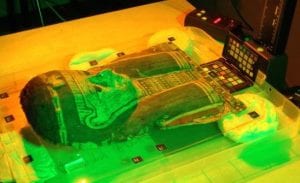
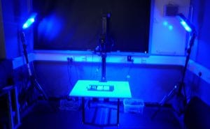
Multispectral imaging uses light waves at wavelengths outside human vision, primarily in the infra red (IR) and ultraviolet (UV) spectrum, used in both reflectance and excitation mode. Whether you can see the ink or not depends on the light source and pigment used. Light can be filtered before it hits the camera’s sensor. A series or ‘stack’ of images are produced using different wavelengths and types of filters. The image stack can be analysed and tweaked using processing software to enhance the contrast of the writing inks against the papyrus. Different inks produce different levels of contrast.

imaging cartonnage UVimaging

Above: imaging cartonnage under different light sources

Carbon-based ink such as lamp black absorbs IR radiation. Therefore it is very obvious when viewed using IR light and has a good contrast with the papyrus substrate. Lamp black was the main type of ink ingredient used for writing on papyrus in Ancient Egypt. Red inks made from ochre or the arsenic sulphide mineral realgar were also used, and iron gall inks were introduced into Egypt from the northern Mediterranean during the Ptolemaic period (305 BC – 30 BC).

Kathryn is testing the power of multispectral imaging on papyrus using surrogates for cartonnage which she calls ‘phantoms’. These are made of layers of modern papyrus affixed together. Marks in ink are made on the surface, one layer, two layers and three layers down. The aim of the phantoms is to find out how deeply the wavelengths from different light sources penetrate the papyrus. Can the subsurface marks be revealed?

She is testing this method using replica lamp black ink, red iron oxide ink, iron gall ink and modern Winsor & Newton India Ink. Our very own Jo Volley, PI of The Pigment Timeline Project assisted Kathryn in making the iron gall ink from oak galls.

Kathryn tells me that these phantoms were surprisingly difficult and fiddly to make because papyrus sheets have the tendency to curl. To create a flat surface, with no air pockets between the layers of papyrus, she had alternate the direction of the sheets so facing fibres ran in opposite direction and then stitch the layers together using linen thread.

phantoms2-5_b

Above: Kathryn’s ‘phantoms’ for testing the imaging of different inks.

This is a pilot project. So far Kathryn has discovered that presence carbon ink can be observed down to the third layer but actual legibility may not be feasible beyond the second layer; iron gall and red ochre inks are less easy to detect. Other members of the team have tested the efficacy of Optical Coherence Tomography (OCT) and various X-ray techniques final assessment of results now underway.

It is hoped that a follow-on a project will enable further refinement of non-destructive techniques and development of protocols for imaging papyri in cartonnage as well as documentation of their internal structure.. These techniques are unlikely to become affordable and routine in the near future, but there is lots of scope to learn more about pigments and their properties under different light sources and to further refine this technique to enable us to access this hidden wealth of ancient writing.

Lamp Black is a form of carbon black. It is essentially soot and is composed of finely particulate amorphous carbon. The pigment is cheap and easy to make; all you need is a flame and a fuel source and a surface for the soot to accumulate on. This pigment must have been recognised from the earliest dates of human cognition. It has been recognised in paintings of all periods and all regions and was also widely used as a cosmetic and as a tattooing ink. Lamp Black has been the main ink used for writing and calligraphy in many cultures (although iron gall inks and sepia have also been used from the Roman Periods onwards). Nevertheless, Lamp Black was the main constituent of India Ink (but note that modern India Inks are made with a mixture of organic dyes).

carbonblack

Above: Aggregates of lamp black particles made by Ruth Siddall from a soya wax candle flame and observed under plane polarised light at x 1000 magnification.

The best lamp blacks are made from burning tree resins, pitch or tar, or burning the wood of resinous trees such as pine. Burned gum from Kauri pines was used to make tattooing inks by the New Zealand Maori. Pine resin or pine logs were used in China and Li Qiaoping describes a variety of complex kilns constructed for lamp black manufacture, whereby the chimneys were fitted with a vessel for collecting the soot, which was then removed and collected using a feather duster.

PeachamThe universally accepted method of removing the lamp black from the surface seems to be by scraping it off with a feather. In addition to Li Qiaoping’s descriptions, Jacobean gentleman Henry Peacham wrote in his treatise ‘The Gentleman’s Exercise’ (1612; left) ‘The making of ordinary Lamp blacke. Take a torch or linke, and hold it under the bottome of a latten basen, and as it groweth to be furd and blacke within, strike it with a feather into some shell or other, and grinde it with gumme water.”
M. Watin writing at the end of the 18th Century suggests burning pitch in a closed shed with sheepskins hung from the rafters. The soot collects in the fleece and can then be shaken out. This sounds like a dirty job, but would have produced soot on an industrial scale. It should also be noted, that if you have access to a shed, you are well set to begin the manufacture of a wide range of pigments … lead white, verdigris, vermillion … but I digress.

To make ink, as we have learned from Peacham, the soot needs to be mixed with water and a gum so that it sticks to the writing surface. Such gums would have been gum Arabic (used as the medium in watercolour paints) as well as gum mastic, gum tragacanth and shellac; the latter a resin secreted by insects, the lac bug (Kerria lacca).

Some blacks are blacker than others; below is a screen print by Onya McCausland and Jo Volley of UCL’s Slade School of Fine Art called ‘Ivory Lamp Mars Bone Vine’ using different black pigments. With the exception of Mars Black which is an iron oxide, the others are all carbon blacks; soots or chars. ‘Blackness’ depends on factors including particle size and the degree of reflectivity/absorption of light. Ivory black has always had the reputation as the finest of black pigments, but lamp black is readily available, inexpensive and easy to make and is a fine, black ink.

ILMVB

References

Li Qiaoping, 1948, The Chemical Arts of Old China, Journal of Chemical Education, 215 pp.


Visit UCL’s Petrie Museum to see examples of Egyptian cartonnage mummy masks and cases.


Stercobilin: Computer Science

By Ruth Siddall, on 9 August 2016

This blog post is not for the squeamish, but it is about a pigment that everyone is familiar with, although many of us have probably never heard its name. In the response to the Pigment Timeline Project’s survey, Dr Lewis Griffin of UCL Computer Science, told us that he had recently conducted research concerned with the colour of babies’ stools. This was something we just could not ignore.

I interviewed Lewis about his research on the pigments responsible for the colour of human faeces and particularly those of neonatal babies. You will be relieved to find that this article will be light on images (readers of a sensitive disposition are discouraged from googling an image search of some of the more unfamiliar terms used below). And yes, the colour that will represent UCL Computer Science in the Pigment Timeline Project is sh … err, Stercobilin Brown!

Lewis is a Reader in Computational Vision. One of his specialities is colour vision; analysing human colour vision and perception and from this creating robust mathematical models which can be used in the design of image analysis equipment and applied in the quantification of colouring components in materials.

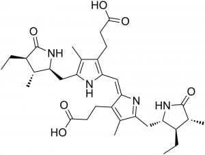
A dear friend who studied at Harvard University once told me that when at College Football matches against fellow Ivy League institution Brown University, the chant that rang out from the bleachers was ‘What’s the colour of sh*t? Brown! Brown! Brown!’ Why is excrement brown? It is largely down to the organic pigment stercobilin. Stercobilin is ultimately derived from haemoglobin, which makes red blood cells red. Red blood cells degenerate after ~ 120 days, producing heme. Heme is then transported to the liver where it is attacked by enzymes, which strip out the iron and convert it into greenish-coloured biliverdin. This is secreted into bile which passes into the gallbladder. Here it converts to bilirubin, which is yellow. Bilirubin is responsible for the yellow colouration of some gall stones. Bilirubin is secreted into the large intestine where bacteria break it down forming, ultimately brown compounds stercobilin and related compounds stercobilinogen and urobilin. These are the pigments which make excrement brown.

Stercobilin

Stercobilin molecule

Now, we are all aware of how the colour of our excrement can be a proxy for health, diet, Guinness consumption etc., and let’s be honest, we all notice it. The failure of bilirubin to be excreted from the gall bladder can result in a number of medical conditions. People who have an especial interest in the excrement of others are new parents. Dr Griffin’s opening line of his recent paper in Color Research and Application reads ‘Many parents are surprised and fascinated by the stool colours of their firstborn.’ There’s a line to get your attention. I don’t have kids, but two of my close friends have had children in the last couple of months and I probed them on this. Gary told me he would not go so far as to use the word ‘fascinated’ (but you could tell he was), and Rachel demonstrated a high degree of newly learned literacy on the colour and significance of baby faeces. Lewis was absolutely right.

The colour of baby stools is important. A congenital liver disease called biliary atresia can occur in newborns, it may result in a neonatal liver transplant and is potentially fatal but it is treatable if detected early (see Bakshi al., 2012). It occurs when the bile duct is blocked, preventing bilirubin from entering the gut and ultimately preventing babies from fully digesting milk. Consequently, infants afflicted by this condition produce ‘clay’- or ‘putty’-coloured stools.

There is a well-recognised transition in the colour of (healthy) baby excrement. Newborns first pass almost black, tarry faeces, called the meconium (if you haven’t had a kid, and you don’t know what this looks like, don’t google images. Trust me). This is waste present in the baby’s bowel at birth, and is mainly amniotic fluid, bile and mucus. This is what comes out in the day or so after birth. Progressively the faeces turn from an olive green to a mustard or, if you are of an artistic temperament, yellow ochre. Normal, brown stools are passed at around 6 months of age. However, poorly digested milk can produce pale, putty-coloured stools, an indicator of potential biliary artesia. Therefore it is really important that doctors and parents can readily identify stool colour as ‘healthy’ or ‘suspect’. Lewis and colleagues’ work with medical staff has showed in a trial, that one third of stools were not correctly identified (Bakshi et al, 2012). These are children who could have gone on to be seriously poorly. How can this hit rate be improved?

Lewis’s team measured the colour of 148 stools from healthy babies. The things we do for research. The first step was to observe and measure the range of stool colours under tungsten light using a spectroradiometer. This device can quantify the colour observed in refelected light. Griffin et al. (2015) then simplified the colour of infant stools into three components ‘Dark’, ‘Pale’ and ‘Yellow’ (D, P, Y), they tentatively identified these colours with pigments; D being meconium and unreacted bilirubin; P as partially digested milk fats and Y as being our friends stercobilinogen, stercobilin and urobilin. The colour of stools could now be plotted as mixtures of these three end-members and the colours observed recorded as Munsell coordinates (below). These colours may be regarded as the range exhibited in the stools of healthy babies.

chart

The whole point of this study was to begin to design a simple process whereby doctors or parents could assess a baby’s health from a non-technical observation of the baby’s stools and without the need of a lifetime’s research in computational colour analysis. In Japan and Taiwan, simple stool-colour charts are used to help identify unhealthy babies and have been found to be very effective. The UK Children’s Liver Disease Foundation (CLDF)  produce a similar card and a handy stool-colour bookmark, in the hope that these will be used routinely; at present they are not, and yet this is a simple and intuitive visual test that requires little training. The CLDF have also recently produced a Yellow Alert app for health visitors

Stool Chart Bookmark-1

Lewis’s research is still a work in progress with only the stools of healthy babies studied at present. However it shows how important colour and colour perception are in diagnosing potentially fatal diseases, and this colour is most welcome on The Pigment Timeline.

As a coda, you may be surprised (or horrified) to learn that a number of artists have looked to stercobilin and related pigments to create works of art, and there are references to it occurring in some of the most obscure historical artists’ palettes. After all, it’s cheap and easy to obtain. Several artists have (allegedly) used their own and others’ excrement in their art work; famously (and controversially) Andres Serrano and Piero Manzoni. More recently Chris Ofili hit the papers for using elephant dung as a pigment. And then there’s this.

Manzoni produced 90 cans of his own excrement (in a numbered edition, obviously), produced and tinned in 1961. His statement here was about intimacy to the artist, something real, tangible and confidential; ‘if collectors want something intimate, really personal to the artist, there’s the artist’s own shit, that is really his’ he wrote to his friend and fellow artist Ben Vautier in December 1961 (Battini & Palazzoli, 1991). It is not said what Vautier’s response was or whether he forked out for a tin. However there is one in Tate Britain (below, left). This work and similarly Serrano’s ‘Piss Christ’ depicting a photograph of a crucifix suspended in a jar of the artist’s urine are extremely controversial not only in their subject matter but also in the fact that NO ONE IS REALLY SURE IF FAECES AND URINE IS WHAT WAS REALLY USED. It is left to our imagination to conjure up the worst or the best case scenario with these artworks.

I have never been minded or, indeed, asked to analyse a work of art containing stercobilin and related compounds as a pigment. Please note, that I am *NOT* looking for donations to my pigment reference collection just yet. However, bilirubin has been used and gets a mention in The Pigment Compendium under ‘Gallstone’. Bilirubin-based yellow and brown pigments were created historically from gallstones and gall bladders; there are references from the 3rd Century AD Greece to grinding fish galls with chalk and vinegar to produce faux orpiment. The ‘Gaule of Eeles’ was used similarly during the Medieval period … and then it was all ox gallstones and gall bladders in the 16th Century. Anyway I digress. Bilirubin looks quite pretty under the microscope. I’m grateful for the University of Cornell’s School of Veterinary Medicine‘s online spotter’s guide to particles in urine for the image below.


bilirubin

I don’t have a picture of stercobilin. This may be a good thing.


Bakshi B., Sutcliffe A., Akindolie M., Vadamalayan B., John S., Arkley C., Griffin L. D. and Baker A. (2012). How reliably can paediatric professional identify pale stool from cholestatic newborns?, Archives of Diseases in Childhood, 97(5):385-387.

Battino, F. & Palazzoli, L., 1991, Piero Manzoni: Catalogue raisonné, catalogue no. 1053/4., Milan, 472-5.

Cornell University of Veterinary Medicine; http://www.eclinpath.com/urinalysis/crystals/bilirubin-2/

Eastaugh, N., Walsh, V., Chaplin, T., & Siddall, R., 2008, Pigment Compendium: A Dictionary and Optical Microscopy of Historic Pigments. (1st ed.). London: Butterworth-Heinemann., 958 pp.

Griffin L. D., Sutcliffe A., Bradbury K., Kumble S., Mylonas D. and Baker A. (2015). Colour and spectral reflectance of stools from normal neonatal babies., Color Research & Application, 40(6):585-591.

Griffin Lab http://imageanalysis.cs.ucl.ac.uk/index.php

Nazer, H. and Roy, P. K., 2016, Unconjugated Hyperbilirubinemia., Medscape., http://emedicine.medscape.com/article/178841-overview#showall

Piero Manzoni; Artist’s Shit, 1961, Tate Britain: http://www.tate.org.uk/art/artworks/manzoni-artists-shit-t07667

Sepia: The Grant Museum

By Ruth Siddall, on 29 July 2016

When the Pigment Timeline Project contacted him, former Grant Museum curator Mark Carnall nominated a list of pigments encountered in the Grant Museum (some of which may feature in later blogs). These include alizarin used to stain skeletons and orpiment used in arsenic soaps to preserve taxidermy specimens. However it is sepia brown that caught our attention. And we are not the first to be fascinated by this pigment.

“I was much interested, on several occasions, by watching the habits of an Octopus or cuttle-fish. Although common in the pools of water left by the retiring tide, these animals were not easily caught. They darted tail first, with the rapidity of an arrow, from one side of the pool to the other, at the same instant discolouring the water with a dark chestnut-brown ink.”—Charles Darwin, The Voyage of the Beagle (1839)

I expect taunting cephalopods whilst messing about in rock pools was as good as anything for passing the time on such a long sea voyage as Darwin endured on the Beagle. But somehow he managed to distract himself from this activity and focus his interests elsewhere. Nevertheless, the ‘chestnut-brown ink’ he noticed has long had a place in our societies. Everyone has heard of sepia. It’s a well known colour name, a translucent brown ink, which immediately evokes Victorian photographs for many people. But there is much more to this than just a colour name, indeed there is a story which goes back millions of years. The main modern source of sepia is the cuttlefish, Sepia officinalis, from which the ink sacs are extracted and are used for applications including medicines, as a kitchen ingredient and of course as an artists’ pigment. The latter two functions of this fluid have been combined by our colleague, printmaker Eleanor Morgan who used raw cuttlefish ink in her interpretation of the Japanese art of Gyotaku, producing prints of fish and other edible sea creatures. Once the print is made, you can eat the fish, ready basted in its sepia sauce.

IMG_3731

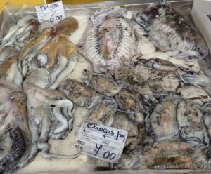
Coleoid cephalopods for sale at Tavira fish market in Portugal. Octopus on the left and cuttlefish or ‘chocos’ on the right.

IMG_2623

Dean Veall of UCL’s Grant Museum makes a Gyotaku print of an octopus using sepia ink at a workshop organised by Eleanor Morgan.

Ink is not restricted to cuttlefish. It is produced by all the coleoid cephalopods, i.e. squid, cuttlefish and octopus, who use it as a defence mechanism; a smoke-screen to confuse predators. Some deep water squids are even known to produce bioluminescent ink (Bush & Robison, 2007). The chemistry and biosynthesis of ink in cephalopods is complex and even to this day not well understood. It is a form of the common biological pigment melanin. Coleoid cephalopods produce the variety eumelanin which chemically and structurally is a complex polymer of 5,6-dihydroxyindole and 5,6-dihodroxyindole-2-carboxylic acid (Derby, 2014). Eumelanin is, as we all know, a dark brown, kind of ‘sepia’ colour … Melanins are also employed by cuttlefish and their relatives to change their skin colour by way of camouflage.

I visited the Grant Museum and met with Curator, Paolo Viscardi, to learn more about cephalopod ink in evolution. There is a large collection of cephalopods on display, preserved in glass jars, including several varieties of recent coleoids. However, without resorting to major dissection, the ink sacs were not visible. Nevertheless, these were rather beautiful objects.

IMG_9616

Whilst looking at the samples of preserved cuttlefish in the display cases, Paolo asked me (leadingly, it transpires) if I was aware that the ink sacs developed at the embryonic stage in cepaholopods? I was not. He turned around and pointed out a microscope slide in the Museum’s Micrarium, with a perfect embryo of a Loligo sp. squid, that just happened to be right there! Stained pink with alizarin, three black patches are clearly visible in the tiny specimen, two of these are its eyes and in the centre of its body, very clearly visible, is the ink sac and duct, less than a millimeter in length.

Loligo_embryo

Loligo sp. embryo – photo by Paolo Viscardi

The Grant Museum holds four of specimens of cephalopod fossils with excellent preservation of soft parts, including ink sacs. Surprisingly, sepia fossilises well. Glass et al. (2012) have studied fossilised ink sacs preserved in the Mid Jurassic Oxford Clay and Lower Jurassic Blue Lias Formations. They found that eumelanin was well preserved in these fossils and showed many similarities morphologically and chemically to that found in modern Sepia officinalis.

Paolo brought out the four fossilised cephalopods. One is on display in the Museum, the others we looked at in the stores. I have seen most places in UCL but this is the first time I have visited the Grant Museum’s dry stores. Whilst Paolo was locating the specimens, I gazed around at large cardboard boxes stacked on shelves, with marker pen labels like ‘disarticulated crocodile’ or ‘haddock x 27’.

The samples appeared and were splendid. They were obviously collected and prepared in the 19th Century and unfortunately coated in a good, thick layer of yellowing varnish, this has preserved them (though not a recommended conservation method today). Here they are:

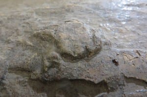
This specimen (R132) shows exceptional preservation of the ink sac and duct in the cuttlefish Geoteuthis brevipi. The ink is produced in the bulbous gland and ejected through the duct, which connects with the anus of the cephalopod. You can work the rest out.

IMG_9634

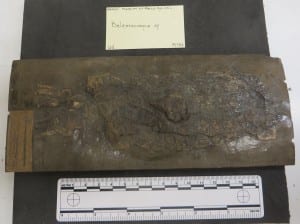
Belemnosepia sp. from the Oxford Clay at Christian Malford (R133). The ink sac is undamaged and appears as a bulbous protrusion on the surface.

IMG_9656

IMG_9662

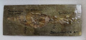
Belemnites sp. (R28) with parts named. The remains of the ink sac are small and poorly preserved.

IMG_9586

It is very likely that all of the three samples shown above were collected from a lagerstätte in the Oxford Clay near the village of Christian Malford in Wiltshire, which is justly famous for its well-preserved cephalopod fossils, including ammonites, belemnites and squids as well as fish and crustaceans. Indeed some of the samples analysed by Glass et al. (2012), came from this locality.

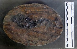
My favourite specimen in the Grant Museum came from Lyme Regis, a fragment of what would once have been a large cuttlefish with a huge ink sac, almost 12 cm long and also evidence of the cuttlebone (R110). The latter would probably have been aragonite, but the surface texture has preserved well and will be familiar to anyone who has ever owned a budgerigar. This was collected from ‘Lime Regis’ [sic], and is labelled Loligosepia Geoteuthis. Confusion may reign here, but these are two genus names and are synonymous, Loligosepia being the approved since 1966 (see Donovan & von Boletzky, 2014). However, like most of these things, most scientists ignore them and carry on naming things what they always used to name them. This could be the species Loligosepia bucklandi, originally discovered by #trowelblazer Mary Anning and named after protogeologist William Buckland.

IMG_9611

Sepia-based artists’ materials are prepared from ink sacs extracted from modern cuttlefish. Terry (1893) writes in his ‘practical book for practical men’; ‘When the creatures are captured, their glands are carefully extracted and sun-dried to solidify the contents. In this state ink bags are sent into commerce. The colourman subjects the sacs to boiling in a solution of soda or potash, whereby the colour is dissolved out of the receptacle, and being filtered clear of all the animal tissue, is next precipitated by the addition of acid, collected on a filter, washed and dried.’ Sepia is usually mixed with the standard water colour medium gum Arabic. It was probably introduced as an artists’ pigment in the early nineteenth century (Eastaugh et al., 2008) and is still sold today by specialist pigment dealers.

IMG_9561

A modern, dried ink sac from a cuttlefish ready to be prepared as an artist pigment.

Sepia, being dark brown, almost black, is not a rewarding pigment when viewed using polarising light microscopy and because of its complex organic chemistry it is not easy to identify in methods used routinely painting conservation scientists. Therefore it has not been identified in many works of art and is easily confused with other materials such as bistre and iron gall ink, however sepia ink is far more stable than these wood based inks (Reháková et al., 2015), if somewhat less vegetarian. Nevertheless it was probably frequently used for drawing, writing and as colour washes. It would be interesting to see how 160 million year old sepia would paint up …

Sepia pigment as a dispersion mount in plane polarised light; x 400 field of view is 1 mm (Eastaugh et al., 2008).


Find out more about The Grant Museum of Zoology


Coda: 11 October 2016

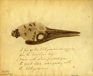
I have just been alerted to this marvellous blog post from OUMNH on the use of fossil sepia ink in the drawing of an Ichthyosaur skull by Elizabeth Philpott, 1833. So it has actually been used – and apparently very effectively as a pigment!

marybuckland_philpot_2


Coda: 24th October 2016

The fossil sepia as ink facts keep coming! This now from Henry Lee, Naturalist of the Brighton Aquarium in 1875 …

squidink-lee


Billings, S, 2016, Tales from the Jurassic Coast., Oxford Museum of Natural History Blog

Bush, S.L. & Robison, B.H., 2007, Ink utilization by mesopelagic squid., Marine Biology, 152, 485–494.

Derby, C. D., 2014, Cephalopod Ink: Production, Chemistry, Functions and Applications., Marine Drugs, 12, 2700-2730.

Donovan, D. T. & von Boletzky, S., 2014, Loligosepia (Cephalopoda: Coleoidea) from the Lower Jurassic of the Dorset coast, England., N. Jb. Geol. Paläont. Abh. 273/1, 45–63.

Eastaugh, N., Walsh, V., Chaplin, T., & Siddall, R., 2008, Pigment Compendium: A Dictionary and Optical Microscopy of Historic Pigments. (1st ed.). London: Butterworth-Heinemann., 343, 776-7.

Glass, K., Ito, S., Wilby, P. R., Sota T., Nakamura, A., Bowers, C. R., Vinther, J., Dutta, S., Summons, R., Briggs, D. E. G., Wakamatsu, K. & Simon, J. D., 2012, Direct chemical evidence for eumelanin pigment from the Jurassic period., PNAS, 109 (26), 10218–10223.

Lee. H., 1875, The Octopus or the ‘Devil-Fish’ of fiction and of fact., Chapman and Hall, London., 97-98.

Reháková, M., Ceppan, M., Vizárová, K., Peller, A., Stojkovičová, D., & Hricková, M., 2015, Study of stability of brown-gray inks on paper support., Heritage Science, 3 (8), 7 pp.

Terry, G., 1893, Pigments, paint & painting: a practical book for practical men. E. & F. N. Spon, London & New York.

Welcome to The Pigment Timeline Project

By Ruth Siddall, on 22 July 2016

Who are we?

The Pigment Timeline Project is a collaborative, cross disciplinary research project being undertaken by:

Jo VolleyArtist and Senior Lecturer at the Slade School of Fine Art. Co-director of the Materials Research Project.

Dr Ruth SiddallGeologist and conservation scientist, formerly of UCL Earth Sciences and currently part of the Office of the Vice Provost Education & Student Experience. Ruth is co-author of The Pigment Compendium.

Gary Woodley Artist and Lecture at the Slade School of Fine Art. Co-director of the Materials Research Project.

Malina BuschArtist and former Honorary Research Associate at Slade School of Fine Art, currently Lecturer at Morley College.

PT scheme5

What are we doing?

The aim of the Pigment Timeline Project is to investigate and establish connections between all UCL departments that involve pigment and colour in any aspect of their research.

The outcome of this project is to create a Pigment Timeline that will function as a virtual and ultimately physical passage through UCL. By identifying these areas and examining existing maps of UCL and plans of each department, a 3D computer model of single images and a simple animation will be created to reveal their association through colour, space and time. This will be a unique visual display of quantitative information and an innovative manifestation of the multidisciplinary and imaginative thinking that is part of UCL tradition.

In early 2015, we sent out an opinio survey to all UCL staff, asking them to tell us about how colour and pigments featured in their research. We are delighted to say that we received responses from staff in over 35 departments, research institutes and museums at UCL. Now, in the final year of this research project, everything is coming together.

Gary Woodley is translating the collated information into the maps and plans of the university, using FormZ software. In this way an interpreted model of UCL departments and buildings in 3D virtual space, will allow viewers to explore the colours and pigments used. You will be able to fly through this imagined UCL world of colour research.

The computer generated renderings, in their turn, will inform the production of several small detailed maquettes of the university pigment timeline as prototypes for further enquiry, display and funding applications. We will also produce a series of ink jet prints of 5 of the renderings and a number of silk screen prints.

PT scheme7

This proposal builds upon a well established interdepartmental research project into pigments between Jo Volley, Onya McCausland and Ruth Siddall who have worked together to develop a substantial pigment library. This includes generous donations from the Winsor & Newton Archives. Much of this collection is currently housed in 7 cases, 3 publicly hung in the north cloisters with 4 smaller cases in the Slade School. The cases are in the North Cloisters, adjacent to the Housman Room and along with Jo Volley’s painting, “A Pigment Timeline” have become a talking point within the UCL community.

PiTx

The pigment library itself has created much interest within and outside the Slade, attracting expertise and cross-disciplinary research at UCL, e.g. Earth Sciences, Chemistry, and History of Art. As a resource it offers students access to information that supports their understanding of materials and possibilities for practical application.

It is our hope that this project will establish new knowledge that relates to the ethos of the cross disciplinary environment of UCL. It will reveal pathways through its architecture and have possible implications for future structural changes.

It is a celebration of creative thinking and a thing of beauty.


What Next?

Alizarin Crimson, Mayan Blue, jellyfish bioluminescence, chlorphyll, indigo, Tyrian Purple, ultramarine, ochre, squid ink, Dragon’s Blood and err … the colour of faeces are just some of the intriguing and fascinating colours and pigments featuring in research at UCL. We will be identifying key colours to represent each department and, if you contributed to our survey, we will be contacting you in the near future to ask if you would be willing to be interviewed to talk in more detail about your research. If you’re willing you could feature on this blog!

Thank you for helping us make this happen!


The Pigment Timeline Project is funded by the UCL Centre of Humanities Interdisciplinary Research Projects.