‘A great gogle eye’: Some panopticon iconography
By Rudolf Ammann, on 17 March 2015
The PanoptiCam logotype is derived from a design the English jurist and philosopher Jeremy Bentham (1748 – 1832) created in the early seventeen-nineties to promote the panopticon.
Figure 1: Panopticon and Eye of Providence (Jeremy Bentham, 1791)
The panopticon is Bentham’s grand unfulfilled project. The penitentiary with prison cells arranged in a circle, open to inspection at all times from a central observation tower, was a cornerstone of Bentham’s legal reform agenda. It was intended to improve the inmates’ behaviour through the possibility of surveillance taking place at any given time. Great benefits to society were supposed to accrue from the use of such a ‘mill for grinding rogues honest’, but no panopticon was ever built.
This was not for lack of trying. Between 1791 and 1802, Bentham expended a great deal of fruitless effort to get his model prison built. When the government of the day was showing some interest in 1810–11, he resumed this effort, to no avail.
Bentham first started his campaign for the panopticon by writing a book that outlined his project: Panopticon; or the Inspection-House (1791). He also wanted a memorable visualization of the panopticon, and he drew a first rough sketch (Fig. 1) in a piece of private correspondence he penned the same year. In this message he intimates that only lack of time had prevented him from adding a frontispiece to the book that would have shown ‘a great gogle eye’ in a triangle – an Eye of Providence – hovering above the plan of the prison, inscribed with ‘Mercy’, ‘Justice’, and ‘Vigilance’ along the sides of the triangle.
In 1794 Bentham drew another sketch of this emblematic design:
Figure 2: Panopticon or the Inspection-House (Jeremy Bentham, 1794)
This second sketch (Fig. 2) adds a radiant gloriole to the design, an element associated with the Eye of Providence in conventional religious iconography.
By 1794, Bentham had managed to drum up some support for the panopticon; the prime minister, William Pitt, paid him £2,000 for preliminary work on the project. In the same year, Bentham asked Willey Reveley, the architect he had commissioned to draw up plans for the panopticon, to create the finished artwork:
Figure 3: ‘I have drawn the design as well as I can‘ (Willey Reveley, 1794)
Reveley produced a finished version of the design (Fig. 3) that interprets Bentham’s oval rendition of the panopticon as a perspectival projection and, deviating from Bentham’s sketch, embeds the divine goggle eye in the projection plane, thereby demoting the representation of the all-seeing deity into a representation of such representation, and into a representation of the divinely sanctioned, benign legal surveillance that would operate from the centre of the panopticon’s prison cells.
Reveley dispatched his drawing to Bentham with a recommendation to have it engraved. Bentham apparently did not follow this advice: no prints are known.
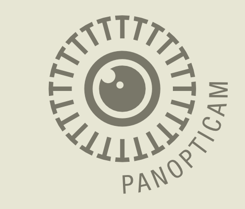
For the PanoptiCam project logo, we helped ourselves to key elements of Reveley’s work:

Figure 4: PanoptiCam logo
The PanoptiCam logo (Fig. 4) retains Reveley’s schematic drawing of the penitentiary cells, moving them from perspectival projection into the more conventional top view and replacing the Great Gogle Eye with a camera lens.
This final version of the logo is a simplification of an earlier development state in which we also retained a reference to the triangle:

Figure 5: PanoptiCam logo (early alternate take)
An instance of this earlier version (Fig. 5) is seen in the poster we put up in the UCL South Cloisters to notify people that they are being watched. The poster’s triangular shape is reminiscent of DIN 4844-2 / ISO 3864 hazard warnings.
Additionally – and somewhat satirically – another early state of the design retains the inscriptions around the three sides of the triangle:

Figure 6: PanoptiCam logo (early alternate take)
In this version (Fig. 6), the trinity of Mercy, Justice, Vigilance in the 18th century design (Fig. 3) is substituted with equivalents from a less elevated plane of abstraction.
The fact that Bentham and Reveley’s panopticon emblem can so readily be converted into a contemporary visual format is evidence of a peculiar quality: The design looks back to the visual genre of the emblem, which during its heyday in the 17th century invoked religious iconography in densely symbolic compositions that sought to express deep verities to live by. However, Bentham and Reveley’s piece also appropriates this iconography towards mundane ends, and so it already bears a signature rhetorical paw print of our own days: the use of iconographically dense representations to convey the presumed essence of a mundane undertaking, such as a business or a project.
Bentham and Reveley’s piece (Fig. 3) invited the modernization we undertook because it already is a logo.
— ❡ —
 Close
Close

