MAPS Summer Research Internship – Visualising COVID-19 inequalities in the UK
By Peter Marron, on 8 January 2024
Last year, undergraduate students at UCL took part in the Mathematical & Physical Sciences Undergraduate Research Internship scheme. As part of their project of visualising COVID-19 inequalities in the UK, they’ve written blog posts on their experience and findings. You can read the blog post written by Arts and Science student, Rose Bourges below:
The aim of this MAPS Summer Research Internship was to visualize in a simple and clear way social inequalities during the covid-19 pandemic in the UK. In this blogpost, I will describe in more detail the steps and methodology undertaken in this research project, as well as the results.
Why were you interested in this research internship?
On a personal level, this project deeply interested me for two main reasons. First, it matched perfectly with my desire to work in epidemiological research. I chose to pursue my studies in UCL’s Bachelor of Arts and Sciences, and to take a range of modules in Biomedical Sciences, Coding and Population Health, which reflect my goal to study the link between social and health inequalities. This research internship was the opportunity to apply this knowledge and to discover the world of research. Secondly, a module in ‘Coding for Bioscience Research’ in 2nd year had perfectly equipped me with the tools for this data analysis and visualisation research internship. In this class, I had to simulate the impact of covid-19 outbreaks on the number of deaths, according to certain parameters such as lockdowns and vaccination rates. I really enjoyed the logical aspect of coding and my familiarity with the covid-19 data encouraged me to apply to this internship.
Which social inequality did you decide to focus on?
This project focuses more specifically on the impact of income on education during school closures. It was clear after my first meeting with Dr Lehmann that due to the limited amount of time, it would be preferable to focus on one type of social inequality. I started looking at the available literature and decided that I wanted to focus on education, and more specifically on learning inequalities. There are two main reasons for this choice. First, during the covid lockdowns, I had personally witnessed how online classes had influenced my capacity to learn. My neuroscience classes also taught me about the neural basis of learning, and the importance of repetition over time. Undeniably, the lockdown was creating a pause in our school years. I was really intrigued to understand how social inequalities such as income could impact this covid learning gap, as evidence showed that the quality of learning differed greatly from one social background to another. Secondly, the fact that data was publicly available on the topic also led me to focus on learning inequalities during the first wave of the covid-19 lockdown.
Was there any previous research available?
Looking at the research that had already been done on social inequalities during covid-19 was the first step of this research internship, to be aware of the conclusions that had already been formulated and of any gaps in the literature.
One major publication was the Marmot Review. In 2010, the Marmot Review exposed the principle of social gradient of health, explaining the graded relationship between social inequalities and health inequalities. The latest version published in 2020 showed how the Covid-19 pandemic had revealed and amplified existing social inequalities, such as ethnicity, gender, and income. The latter particularly influenced the quality and quantity of learning students had during school closures.
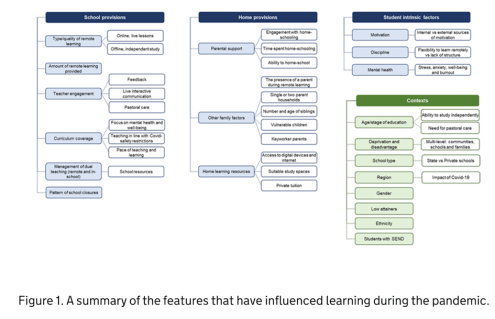
Most of the previous research available on learning inequalities comes from official sources. The UK government acknowledges that while learning had decreased overall for everyone during the pandemic, it was not spread out evenly. A brief from the Parliament, shown below, outlines all the possible factors for this phenomenon, which are regrouped in different categories – school provisions, home provisions, student intrinsic factors – all of this according to the context, such as the parent’s income. For example, students in state schools, which generally come from lower income families, are less likely to receive teaching hours. At home, they probably don’t have the adequate laptop to work on. On top of that, their parents are more likely to be key workers, meaning that they are less at home, and have less time to help their child with schoolwork. Finally, the child has more chances of spending his lockdown with a lack of private space, which can affect his mental health and his ability to work and learn. Consequently, Kelly et al estimated that in April 2020, children from higher income families spent an extra hour and a half on schoolwork. Agostinelli et al (2022) also showed in the United States how school closures could ‘increase socio-economic segregation’, when schools should be acting as a social equaliser. Along with the lack of technology and support from parents, they estimated that this triple impact of closing schools led children’s grades to decrease by four points in lower income families, while children in higher income families did not see any change in their grades.

In the UK, most of the official statistics base themselves on research from the Institute for Social & Economic Research. Using the Understanding Society Covid-19 dataset, it explores the links between home learning and socio-economic status. More importantly, it explains how social class, ethnicity, the level of the parents’ education and the impact it has on children’s learning are all intertwined.
With this research in mind and knowing that the average level of income varies widely from one region to another in the UK, I started thinking that I could build interactive maps comparing income with learning provisions during school closures.
Which data did you use?
Based on these previous findings, the next step was to find the data. This was the most time-consuming process, and I encountered many challenges. As a student, I often did not have the required licences to access some datasets, as many of the data was confidential. I learned to remain open-minded during the whole process and acknowledge that I would probably have to adjust the visualisations according to the available data. Lastly, a lot of time was spent reading user guides to understand how the data was formatted, and to decide which variables to keep in very large datasets.
All my data comes from the Understanding Society dataset, the data which has been used from the Institute for Social & Economic Research. Thus, it is an official and credible source. Thanks to unique PIDPs (person identifiers), I was able to merge together data on income, education and geographical location, which was its main advantage. Most of the questionnaires were tailored directly to school closures in the UK during covid-19. However, the data lacks objectivity and in geographical precision.
More information on the data, and on the code used to create the maps, can be found in the annex.
What are the final visualisations?
Now that I have outlined some details in the code, I will present the final maps which compare income with the number of weekly hours spent on schoolwork, on online and offline lessons, of help received on homework, and with the number of technological devices per child.
All of these results present an average across each of the regions.
Average income per child per month

This first map shows the average level of income in each region, per child. In other words, the household earning was divided by the number of children. This allows us to consider families with a single parent or many children, the assumption here being that the income “allocated” to each child would be different. The classical North/South divide is present here. The Southeast and London have the highest incomes, which are of £2300 to £2400 per month, while Yorkshire & Humber has the lowest average income of £1800.
This map can be seen as the “independent variable”, which will be used to compare to the “dependent variables”.
Number of weekly hours spent on schoolwork


Interactive version available on GitHub
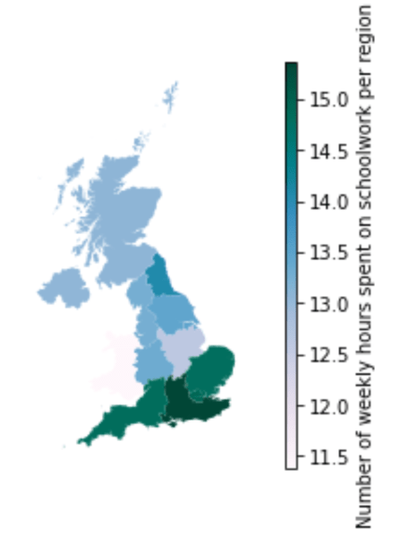
This map represents how many hours per week each student spent on schoolwork, during the first school closures in April 2020. This was subjectively measured by the parents, and it can designate personal work time as well as online lessons, permitting us to get a general overview.
Although there is not an exact linear relationship between income and the time spent on schoolwork, there are some notable differences across regions. At first view, the North/South income divide is striking here. In the South East, one of the regions with the highest income (£2300 per child per month), the average time spent on schoolwork was 15 hours per week. In comparison, in Yorkshire & the Humber, one of the regions with the lowest income (below £1800 per child per month), the time spent on schoolwork was on average 13.5 hours per week.
Number of weekly hours of offline and online lessons


These maps measure more precisely the time spent on schoolwork by comparing the weekly hours of online and offline lessons. An offline lesson is work that will be given by the school, done asynchronously. The assumption here is that a student will be more engaged in his schoolwork if he has more contact hours with the teachers and the rest of his class, rather than when the student is working on their own.
Concerning the number of offline lessons, the North/South divide is once again very present here, as the richer regions of the South had an average of 12.5 hours of offline learning per week, while the poorer regions of the North oscillated between 10 and 11.5 hours a week of offline learning.
Meanwhile, the number of online lessons do not show such a clear difference between the Northern and Southern regions. However, the richest region (London) had around 5.5 hours of online learning each week, while the poorest region (Yorkshire & Humber) had one of the lowest numbers of teaching hours, which was 3.5 hours a week.
In general, the fact that the maximum number of hours of online teaching was of 5.5 hours a week, cumulated with a maximum of 12.5 hours of offline teaching per week, is worrying when compared to the usual timetables, that contain around 25 to 30 hours for a high school student, with additional work at home. Although some children might be more concentrated during online lessons as there is not the usual distraction of other classmates, this difference remains concerning for the appearance of a learning gap for all children.
Number of technological devices per child

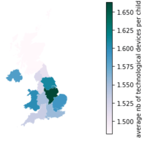
Next, this map shows how many technological devices each child had access to in the household. Once again, I divided the number of technological devices in the household by the number of children, assuming that a child will be less productive in his work if he must share a computer with his siblings. This is especially important during school closures and lockdowns, where all the teaching is taking place online. A child will be very disadvantaged if he cannot have access to the learning material.
The results are rather surprising as it is not the regions with the highest incomes that had the highest number of technological devices per child, and it’s even an opposite trend that can be observed. Therefore, there are no key takeaways concerning social inequalities in this map.
Number of weekly hours of help on schoolwork

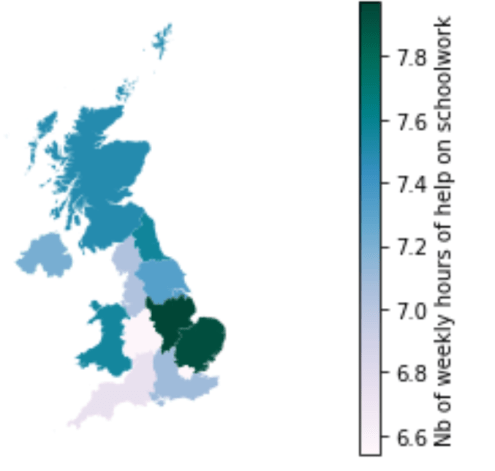
Finally, this last map displays how many hours per week a child in each household received in schoolwork from his parents or his siblings. This can be especially important to motivate children and to ensure their comprehension of the learning material. The assumption here is that households earning less money are more likely to have parents that are key workers, and who are therefore less at home.
The results here are surprising when compared to the other maps, as the North/South trend is almost reversed. As such, London is the region where children received the less schoolwork help, around 6.6 hours per week, while the East of England had around 8 hours of help per week. Therefore, our assumption above has not been verified.
Are there any limitations to these maps?
These maps have some clear limitations which are important to acknowledge to analyse the results correctly.
First, there is an obvious lack of objective data concerning educational attainment. For example, the time spent on schoolwork does not necessarily represent the quality of the learning. While some households might only count productive working time, others might factor in the breaks as well. Regarding “offline” work, some might interpret this only as assignments to hand in while others may think this also includes personal work. Overall, having access to objective data would have increased the reliability of this research.
Secondly, it must be noted that the different regions/countries across the UK might have implemented different policies concerning school closures. The maps often display Wales and Scotland in purple, especially regarding time spent on schoolwork, although these are not the poorest regions. Lockdowns were implemented in different ways across the United Kingdom and these maps could also be reflecting this diversity.
Furthermore, these maps do not reflect social inequalities within one region. For example, London has very different incomes according to the boroughs, and this is not shown on the maps due to the lack of specific geographical data. Across the regions, some data about social variables such as age and gender are also missing. A student preparing his A-levels should be spending considerably more time on his work than someone entering elementary school, and the maps do not show how school closures have impacted the different age groups. This is also the case for gender. Previous research has shown that women’s mental health had been more affected by lockdowns, and that they were expected to do more housework than usual. This may have also been the case for older female students, therefore impacting their schoolwork.
Finally, ethnic groups have been hit very differently by the covid-19 lockdowns. Some research indicates that a considerable learning gap has appeared in children from Pakistani and Bangladeshi backgrounds. Overall, social inequalities have risen in BAME backgrounds during covid-19, which is not shown in the maps. This was partly because the maps were representing numerical data rather than categorical data. It can be noted however that ethnicity and income are closely correlated.
Could your findings lead to further research?
This research was very time-limited, with few sources of data. Therefore, I will be indicating some possible guidelines for further research. The first possibility could be to cover the limitations outlined above concerning other social categories, such as ethnicity, rather than just focusing on income. Moreover, the next guidelines for further research described below focus more on measuring the actual learning gap.
Although these results are only representative of a short period of time, which is the start of the first lockdown, some available statistics could allow us to model the long-term impact. The UK government (gov.uk, 2020) estimates that 1 hour of teaching time per week leads to 0.1SD of test scores. This means that over the weeks, as the gap increases between the number of teaching hours between lower and higher income backgrounds, so do the grades. Some projections in the UK estimate that the educational attainment gap, which had been gradually closing since 2011, could widen again between 11% and 75%. If time had permitted, the time spent on schoolwork could therefore have been linked to educational attainment, with worse and best-case scenarios.
In the long run, this could affect a student’s potential to get into university, and thus possibly affect their income as well. In the United States, Agonistelli et al (2022) predicted that school closures could decrease the future income of children from lower income families by 25%. To realise this calculation in the UK, we would however need exact data on the number of teaching hours and not the amount of time spent on schoolwork.
Another possibility would be to compare the effects of remote learning according to income across subjects. For example, many studies focusing on OECD countries have shown that after the summer, children from lower income families start school again in September with a ‘learning loss’, especially in reading. While ‘literacy teaching also takes place at home’ (Marcotte, 2007), mathematics depends mostly on the amount of teaching time. This means that during school closures, reading skills could mostly be affected by the socio-economic background of the child, while mathematical skills could depend more on the quantity of teaching provided by the school.
Finally, school closures in different socio-economic backgrounds also had an indirect impact on educational attainment not only through teaching related measures but also child poverty and mental wellbeing. Many stopped receiving free school meals, and children in lower income families also lived in more precarious situations, affecting their mental well-being and therefore school achievement. In fact, the UK government has summarised all the features possibly influencing learning during the pandemic. If all the available data existed, it could be relevant to create interactive visualisations with some of these variables as well
Conclusion
In conclusion, these maps enable us to show in a simple and clear way social inequalities during school closures in the UK. Overall, regions with lower household income also witness less time spent on schoolwork, and less delivery of online and offline lessons, creating a learning gap between children from lower and higher income backgrounds. While the results have not been dealt with in a statistical way, this visual aid helps us convey the correct message and push towards further research.
Annex
Data description
It is the UK’s Household Longitudinal study, which began in 2009 and explores through waves a representative sample of the UK population, organized in themes. Thanks to unique PIDPs (person identifiers), I was able to merge together data on income, education and geographical location, which was its main advantage. Here are the two datasets used:
- UKHLS Covid-19 Web Survey data, April 2020 (ca_indresp_w): this dataset contained information on household income as well as questionnaires on home schooling during school closures.
- UKLHS Waves 1-18 data (k_indresp): this dataset contained information on the geographical location of the respondents, divided in the Governmental Office Region.
These datasets contain several limitations. First, the geographical data is not very precise, but without any licence I could not access any data more specific than the UK’s twelve regions. Secondly, most of the data is subjective. All the official data on educational attainment did not exist after the start of the covid-19 pandemic. Therefore, I had to rely on web and telephone surveys completed by parents, answering questions such as the amount of time spent on schoolwork and the number of technological devices in the household. However, these questionnaires were also an advantage because they were tailored specifically to covid-19 school closures. Therefore, it contained questions on online lessons for example, which would not have existed in the usual education questionnaires.
Data visualisation in Python – Methodology
- Merging datasets
- Putting in the same dataframe the data on income and education with the data containing Governmental Office Region thanks to the PIDPs
- Cleaning data
- Getting rid of missing values
- Selecting only columns I’m interested in to get a smaller and more comprehensible dataset
- Using the pivot function to have a single row per child in each household instead of columns
- Adding new columns
- Performing calculations to have “income per month per child” rather than “income per household over x amount of time”
- Performing calculations to have weekly amount of time spent on work (instead of daily), for more visually significant results
- Summary statistics
- Comparing the means and distributions of all the variables, to detect potential outliers
- Visualized this with the seaborn library
- Static data visualisations
- Importing the new dataset containing the tiles for the map
- Merging this new dataset with the previous one
- Calculating the mean of each variable for each region
- Creating one static map for the income per month per child
- Creating several static maps for all the schoolwork variables
- Interactive data visualisation
- Using the folium library and importing the British grid map
- Converting the data to GeoJSON format
- Calculating the centroid of each point
Written by: Rose Bourges, Arts and Science BASc
 Close
Close


