Explore GEO’s new interactive data dashboard
By ucypore, on 24 November 2017
My role in the Global Engagement Office (GEO) involves mapping UCL’s collaborations around the world, to help us tell our global story better. But as you can imagine at a university of UCL’s size, this is no mean feat!
Thanks to the work of the many academics collaborating internationally who have shared details of their work with GEO, we’ve been able to compile an interactive dashboard showcasing some of this activity.
You can take a look around the dashboard, created in Tableau public, here.
The motivation behind this new resource is to show the collaborations that GEO is aware of UCL having in certain countries. It is arranged by UCL faculty.
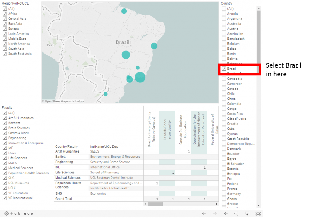
For example, let’s say we want to use the dashboard to find out what collaborations UCL has in Brazil.
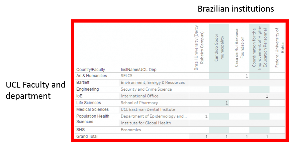
We just select ‘Brazil’ on the right hand side, then we can see in the matrix below the map the faculties and departments that collaborate in Brazil, while in the rows we’ll see the Brazilian institutions that we collaborate with, as shown in the image here:
 We can see that GEO is aware of UCL’s School of European Languages, Culture and Society (SELCS) in the Faculty of Arts & Humanities having a collaboration with the “Casa de Rui Barbosa Foundation.”
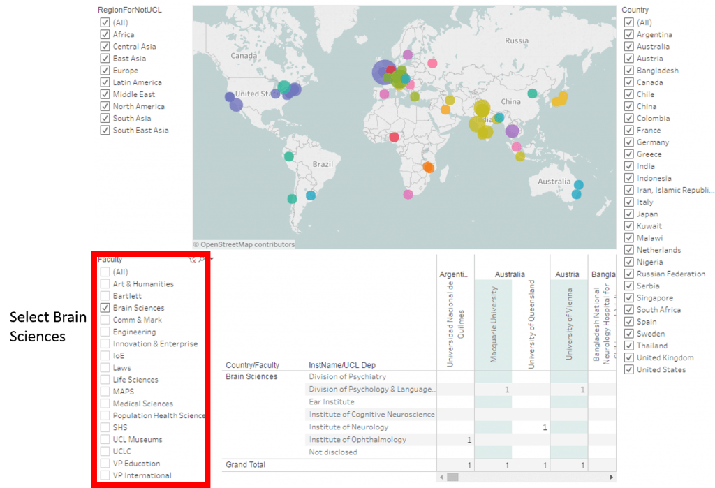
Another way the dynamic dashboard can be used is by navigating by Faculty. For example, let’s have look into Brain Sciences. If we select the faculty on the left hand side, we can can see the location of their collaborations:

We’re keen to keep this dashboard as up to date as possible, so if you are a UCL academic collaborating with colleagues overseas and you can’t find your work listed here, please contact me and we can add this in.
 Close
Close


