X Close

The Pigment Timeline Project

Home

Menu

Archive for the '#PigmentTimelineProject' Category

A Colour A Day: Week 22

By Ruth Siddall, on 23 August 2020

A Colour A Day Week 22. 17th-23rd August

Jo Volley writes…In JL Carr’s novel A Month in the Country the protagonist Tom Birkin returning from the First World War is redeployed as a wall painting conservator. He spends the summer uncovering a large medieval wall painting in a country church and along with it rediscovers a sense of faith in the future. As the painting’s image is revealed and through the unknown artist’s use and choice of colours, Tom begins to appreciate and understand the man.

‘I was working up the 3 brothers (see Luke 16), blissfully heedless of the judgement to come…The second magnate’s cloak was a splendid garment – red outside and green lining. A very good red, the best in fact, no expense spared, sinoper haematite that is, not to be confused with what some fatheads call sinoper which, as often as not, is red earth, the stuff they used to bring in by the shipload from Pontus Euxinus (and don’t ask me where that was). That’s the red which darkens almost as soon as you turn your back on it: it survives and that’s all that can be said for it. In fact, on damp walls, it’s all that does survive. Well, back to this chap’s cloak. It was resin-based and that doesn’t ooze out, by the gallon; they found a scallop-shell with caked deposit amongst the rubble in the Gifford Chantry at Boyton.’

‘Mr Birkin…Mr Birkin…is it an oil painting or a water colour or what is it for goodness sake?’ ’It’s all sorts of things, Mrs Keach. Item – blew bysse at 4s 4d. the pound, item – one sack of verdigris at 12d. a pound, item – red ochre, 3 pounds a penny, item – 3 pecks of wheat flour…. I suppose you could lump it all as tempera. And let’s not forget the wall itself – down in the sinful south, plastered with chalk bound with parish offerings of skimmed milk; up here, slaked limestone putty damped just enough to stiffen. That’s about what it is. …Spaynishe white,  Baghdad indigo, Cornish malachite…

But for me, the exciting thing was more than this. Here I was, face to face with a nameless painter reaching from the dark to show me what he could do, saying to me as clear as my words, ‘If any part of me survives from time’s corruption, let it be this. For this was the sort of man I was.’

Each pigment is bound in gum Arabic on W&N watercolour paper and reads from left to right:

Malachite
Verdigris
Chalk
Haematite
Red ochre
Chalk
Indigo
Blue bice

A Colour A Day: Week 21

By Ruth Siddall, on 16 August 2020

A Colour A Day Week 21. 10th-16th August

Jo Volley writes….

Extracts from Matisse on Art Jack D Flam 1973. On the occasion of an exhibition at the Gallery Maeght, December 1949 the title of which was Black is a Colour. Henri Matisse’s remarks were recorded by M. Maeght.

Before, when I didn’t know what to put down, I put down black. Black is a force: I depend on black to simplify the construction. Now I have given up all blacks*The use of black as a colour in the same way as the other colours – yellow, blue or red – is not a new thing. The Orientals made use of black as a colour, notably the Japanese in their prints. Closer to us, I recall a painting by Manet in which the velvet jacket of a young man with a straw hat is painted in a blunt and lucid black. In the portrait of Zacharie Astruc by Manet, a new velvet jacket is also expressed by a blunt luminous black. Doesn’t my painting of the Marocains use a grand black which is as luminous as the other colours in the painting? Like all evolution, that of black in painting has been made in jumps. But since the Impressionists it seems to have made continuous progress, taking a more and more important part in colour orchestration, comparable to that of the double-bass as a solo instrument. 

*Matisse does not mean he has given up the use of black, but that he no longer used it merely for linear construction as in his earlier works. Actually, at this time Matisse was making a use of black as a colour instead of an element of linear construction.

From left to right

  1. Jet – W&N Designers gouache
  2. Perylene – W&N Designers gouache
  3. Lamp – W&N Designers gouache
  4. Blue Black – W&N Calligraphy ink
  5. Mars – W&N Designers gouache
  6. Ivory – W&N Designers gouache
  7. Noir Intense – Lefranc Bourgeois Linel gouache

A Colour A Day: Week 20

By Ruth Siddall, on 9 August 2020

A Colour A Day – Week 20. 3rd – 9th August

Jo Volley writes…
This week’s colours are more earths, gifted by Steven Patterson, Chief Executive Officer, Derivan, Australian artist materials manufacturer, from their Matisse Structure Origins Range. To accompany them please listen to Mahler’s Das Lied von der Erde;

The earth breathes, in full rest and sleep.
All longing now becomes a dream.

Each colour is painted out in 3 layers on W&N watercolour paper and read from left to right:

1. Armenian Gugark Cherry
2. Morrocan Yellow Oxide
3. Armenian Lori Red Light
4. Armenian Tavush Trans Green
5. Armenian Lori Violet Light
6. Armenian Kotayk Ochre
7. Armenian Bole

A Colour A Day: Week 19

By Ruth Siddall, on 2 August 2020

A Colour A Day – Week 19.  27th July-2nd August

Jo Volley writes…..

This week we celebrate the last seven FA Cup finals using the predominant colour worn by the winning team on the day. The FA Cup is the world’s oldest football competition, the first games played in the autumn of 1871, the same year as the Slade School was established. Arsenal have won the cup a record 14 times. 🏆

Each colour can be found in the Liquitex Soft Body Acrylic range and is on W&N watercolour paper.


A Colour A Day: Week 18

By Ruth Siddall, on 26 July 2020

A Colour A Day Week 18: 20th-26th July

Jo Volley writes…..

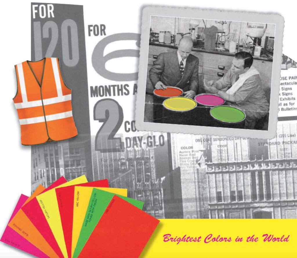
Fluorescent color is seen 75 percent sooner than conventional color! Flourescent color is three times brighter than regular color! Your eyes go back to fluorescent colour for a second look 59 percent of the time! DayGlo promotional material, 1930s

The American Chemical Society designated the development of DayGlo Flourescent Pigments by the Switzer brothers as a National Historic Chemical Landmark in a ceremony in Cleveland, Ohio, on September, 8, 2012.

7 Kremer fluorescent pigments bound in gum arabic.

Red Brick
Green
Golden Yellow
Violet
Light Yellow
Blue
Magenta Red


A Colour A Day: Week 17

By Ruth Siddall, on 19 July 2020

A Colour A Day.  Week 17: 13-19 July

Jo Volley writes…

Over the last week I have had the privilege to work with 7 colours produced and sent to me by Ruth Siddall.  To receive these little packets of pigments through the post and work them into paint has been a pure delight.    

Ruth says of them. “These colours are all based on lake pigments made from American plants and an insect, the cochineal beetle. Three are wood dyes (logwood, brazilwood and osage orange), Aztec marigold was made from dried flowers, the avocado lake was made from a dye extracted from the stones of the fruit. Annatto (or achiote, achiotl) is a spice made from seeds. The latter was used as a ink in historical Mexican painting, and also as food colouring and a cosmetic.”    

All are bound in gum arabic on W&N watercolour paper and read from left to right.

Osage Orange, Maclura pomifera
Annatto, Bixa orellana
Cochineal, Dactylopius coccus
Logwood, Haematoxylum campechianum
Brazilwood, Caesalpina echinata
Aztec Marigold, Tagetes erecta
Avocado, Persea americana

A Colour A Day: Week 15

By Ruth Siddall, on 5 July 2020

A Colour A Day: Week, 15. 29th June – 5th July

Jo Volley writes…….

In spring 2017, Nisar Hossain, Dean of the Fine Art Faculty, University of Dhaka, Bangladesh, Artist and specialist on Contemporary Painting and Folk Painting of Bangladesh, led a contemporary installation  workshop at the Slade based on traditional Folk Art of Bangladesh.  He also gave  a public lecture at the Whitechapel Gallery The heritage of ritualistic folk painting and the traditional painter communities of Bangladesh as part of the Inspire exchange project between the Slade School of Fine Art and the University of Dhaka Faculty of Fine Art, Bangladesh funded by the British Council.

Links to various workshops throughout the Inspire project

Here are 7 of the colours Nisar generously donated to the Material Research Project pigment library, written in Bangla, as he gave me. Each are bound in gum Arabic on W&N watercolour paper and read from left to right.

  1. Hāra pathar
  2. Haritāl
  3. Sindura
  4. Bhusha kali
  5. Hingula
  6. Elamati
  7. Nīl


A Colour A Day: Week 14

By Ruth Siddall, on 28 June 2020

A Colour A Day week 14; 22nd-28th June

Jo Volley writes …
I am currently working on a timeline of Van Gogh’s colours for the Van Gogh House in London. In a letter to Theo dated 8th April 1888, Arles, he writes;

‘My Dear Theo, Am obliged to write to you as I’m sending you an order for colours which, if you place with Tasset & Lhote, rue Fontaine, you’ll do well – since they know me – to tell them that I expect a discount at least equivalent to the cost of the carriage…‘ He continues with a list of instructions for colours, canvas and carriage then writes…


A Colour A Day: Week 13

By Ruth Siddall, on 21 June 2020

A Colour A Day Week 13; 15th – 21st June
Jo Volley writes….
This week’s feature of 7 greys also  includes the poem Penumbra  by artist and poet, Sharon Morris,  from her collection False Spring, Enitharmon Press, 2007.  Sharon is a Professor at the Slade School of Fine Art.
 

Penumbra

Your shadow has fallen on me
like the fig tree
in its profusion

and I am left
chasing your image
as the sun drops

into occlusion, you
running with that cusp of light
against disappearance,

my tears
wanting to make your face haptic
from its shroud.


Colours read from left to right and are painted out onto W&N watercolour paper:

 
  1. Galena
  2. Bone grey (JV/12)
  3. Graphite
  4. Neutral grey
  5. Payne’s grey
  6. Ash grey (JV/20)
  7. Melser Grau
 

A Colour A Day: Week 12

By Ruth Siddall, on 14 June 2020

A COLOUR A DAY – Week 12; 8th-14th June

Jo Volley writes….

This week’s colours are 7 earths, gifted by Steven Patterson, Chief Executive Officer, Derivan, an Australian artist materials manufacturer, from their Matisse Structure range. Four being from the Yirrkala set of natural  Australia pigments whose names are as much a joy to the ear as their colour to the eye. Each colour is painted out in 3 layers on W&N watercolour paper.

They read from left to right:

  1. Gurrngan
  2. Miku
  3. Ganggul
  4. Watharr
  5. Australian Sienna
  6. Yellow Oxide
  7. Raw Umber