X Close

The Pigment Timeline Project

Home

Menu

Archive for the '#Colour' Category

A Colour A Day: Week 37

By Ruth Siddall, on 6 December 2020

A Colour A Day: Week 37. 30th November – 6th December
Jo Volley writes…
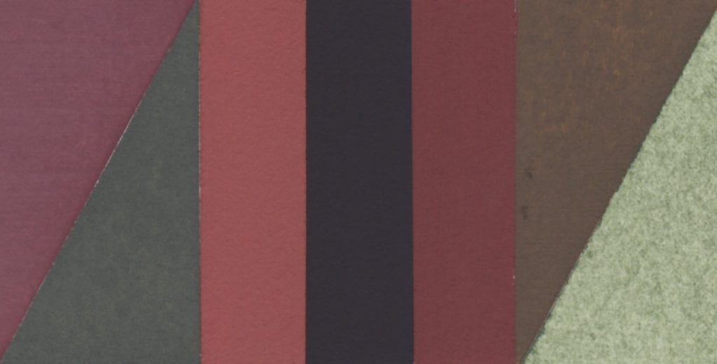
This week we have 7 more colours gifted by Steven Patterson, Chief Executive Officer, Derivan, Australian artist materials manufacturer, from their Matisse range of acrylics.


Answer to an Inquiry.

My formats are square, but the grids never are absolutely
square; they are rectangles, a little bit off square, making a
sort of contradiction, a dissonance, though I didn’t set out to do
it that way. When I cover the square surface with rectangles, it
lightens the weight of the square, destroys its power.

Agnes Martin, Writings 1992


Colours are painted out onto W&N watercolour paper and read from left to right:

Australian Red Voilet
Transparent Red Oxide
Deep Rose Madder
Mars Violet
Transparent Venetian Red
Lori Red – Light
Permanent Maroon

A Colour A Day: Week 35

By Ruth Siddall, on 22 November 2020

A Colour A Day: Week 35. 16th – 22nd November

Jo Volley writes …

‘We had a remarkable sunset one day last November. I was walking in a meadow, the source of a small brook, when the sun at last, just before setting, after a cold gray day, reached a clear stratum in the horizon, and the softest, brightest morning sunlight fell on the dry grass and on the stems of the trees in the opposite horizon and on the leaves of the shrub oaks on the hillside, while our shadows stretched long over the meadow east-ward, as if we were the only motes in its beam. It was such a light as we could not have imagined a moment before, and the air also was so warm and serene that nothing was wanting to make a paradise of that meadow. When we reflected that this was not a solitary phenomenon, never to happen again, but that it would happen forever and ever, an infinite number of evenings, and cheer and reassure the latest child that walked there, it was more glorious still.’

Extract from ‘Walking’ by Henry David Thoreau, 1862
(for J.S)

Pigments manufactured by Ruth Siddall, bound in gum Arabic on W&N watercolour paper, and read from left to right:

Weld & Calcium Carbonate Lake
Annatto Lake
Safflower Carthamidin Lake
Eosin Lake #1 & Annatto Lake 50:50 mix
Eosin Chalk Lake
Geranium Lake
Eosin Lake #1

A Colour A Day: Week 34

By Ruth Siddall, on 15 November 2020

A Colour A Day: Week 34. 9th-15th November

Jo Volley writes…

This week’s colours are named after or made for artists and very much inspired by Caroline de Lannoy’s Colour Tale which I first saw at the Tate in 2000 and again last year at the Colour & Poetry: A Symposium performed by the Slade Colour Choristers. Caroline de Lannoy says of the work.

‘Much of my interest has been in the way in which language impinges on our perception, both in its everyday contexts and in works of art. The world has millions of colours. Why do we only name a few? The human eye can see about a thousand levels of light – dark, a hundred levels of yellow-blue, a hundred levels of red-green. This means that the human eye can distinguish about ten million different colours. But human language categorizes these into a small set of words. Throughout the years I have collected 1153 colour names. These colour names, are both abstract and referential. Some colour terms are metaphorical extensions of what are originally object names; some derive from the world of nature, some come from paint materials and others from my own interpretation. ‘Colour Tale’ deals with the relationships between communication and perception, between the spoken words and the visual. It illustrates the ambiguous implications for perceptual research of findings dealing with linguistic and visual classification. Carefully measured and adjusted the written elements or declarative statements comment on aspects of communication, vision, and any specific sites. The colour names are composed as a body of theoretical discourse, and as a ‘visual’ poem, to create a mental image or a fantasy picture, and to develop thinking spaces. Free for the imagination the colours become as intangible as ghosts in the air. The passage of the words sparks off continually the ability to remember fundamental experiences and it invites the audience to take part, by assigning images to the words, thus translating the auditory impressions into visual ones. The rich structure of association around these words call up images and stimulate the emotion and the imagination of the hearers, conveying different ideas to different persons – for a word is a signifier and has many possible signified. This is a prime case of audience participation. The listener is free to make his-or her individual interpretation, to construct his-or her own fantasy picture, and to ‘see’ his-or her personal colour perception since the subject matter is out of sight.’

Please listen to Colour Tale performed here by Eddie Izzard

Colours read from left to right:

van Dyck brown – Lefranc & Bourgeois gouache
Veronese green – Lefranc & Bourgeois gouache
Titan red – mixture
Klein blue
Stuart Semple orange
Prout’s brown ink – Roberson
Corot green – Lefranc & Bourgeois gouache


A Colour A Day: Week 30

By Ruth Siddall, on 18 October 2020

A Colour A Day: Week 30. 12th-18th October.

Jo Volley writes…

In October 2015, whilst on research leave, I travelled around Provence visiting pigment quarries, mines and factories to look at pigment manufacturing methods and processes. In this marvellous red landscape, I have never felt such a strong emotional relationship between the landscape and painting.  The trip was also something of a pilgrimage to visit the bibliotheque in Aix en Provence to view a remarkable manuscript made by the C17 Dutch artist A. Boogert who in 1692 completed an educational manual of how to mix every colour available to him. Each pigment is bound in gum Arabic and applied to paper with instruction as to their properties, proportions and potential. It is an extraordinary document of the pigments available at that time and of an artist’s dedication to learning. It was a humbling experience to hold in one’s hands this rare and beautiful manuscript, and to feel a connection with Boogert’s endeavours. The timeless and common manufacture of binding colour and making paint. The sheer pleasure of it… and its desire to communicate. It has also been the inspiration for this project.

Each red earth is bound in gum Arabic on W&N watercolour paper.

Collected: Sentier des Ocres, Roussillon.
Purchased: Sentier des Ocres, Roussillon.
Collected: Les Mines des Bruoux, Gargas.
Collected: Mathieu Ocre Usine, Roussillon.
Purchased: Les Mines des Bruoux, Gargas.
Purchased: Mathieu Ocre Usine, Roussillon.


A Colour A Day: Week 29

By Ruth Siddall, on 11 October 2020

A Colour A Day: Week 29. 5th -11th October

Jo Volley writes…

In the early 1800’s the mineralogist Abraham Werner published the Nomenclature of Colours to identify minerals by key characteristics. It was later amended by Patrick Syme, C19 Scottish flower painter, having been introduced to it by Robert Jameson who had studied for a year under Werner before becoming a professor of Natural History at Edinburgh University. Jameson had matched Werner’s descriptions with the actual minerals, Syme then used these as his starting point for the colour names, descriptions and actual colour charts introducing references to animals and vegetables. Darwin took a copy on the HMS Beagle voyage (1831-1836) and its terminology, ‘lent both precision and lyricism to Darwin’s writings, whether he was detailing the changeable ‘hyacinth red and chestnut brown’ of the cuttlefish, ‘the primrose yellow’ of species of sea hare, or the ‘light auricular purple’ and provided his naturalist contemporaries with clear point of reference, and enabled all his readers to clearly envision the creatures and settings of lands that most, in a pre-photography age, would never see.’

Extracts from Publisher’s notes Werner’s Nomenclature of Colours, Natural History Museum


A Colour A Day: Week 28

By Ruth Siddall, on 4 October 2020

A Colour A Day; 28th  September – 4th October

Jo Volley writes…

This week’s colours are seven Russian earth pigments gifted by Ruth Siddall who says of them. ‘These seven pigments are supplied by Moscow-based company Colibri Premium Pigments. Many of the earth and mineral pigments they supply are sourced in Russia. This is a selection of their ochres, which include iron ochres (red and yellow ochre) and aluminium-rich earths known as bauxite (deposits much overlooked as ochres). Siderite is iron carbonate. Also included here are two very ‘Russian’ pigments made from minerals mainly known only from deposits in Russia. Shungite is a black, carbon-rich earth pigment. It is found in very ancient, 2 billion year old rocks in Russian Karelia, in the region of Lake Onega. It is named after the town of Shunga. It formed as biogenic deposits, probably from algae preserved in anoxic conditions and then subsequently metamorphosed. Volkonskoite is a green-coloured, chrome-bearing smectite clay mineral. It is sourced from the Okhansk region of the Urals. Tuff is a volcanic ash deposit, in this case coloured purple by iron oxides.

Ruth suggests listening to Sibelius’s Karelian Suite whilst viewing the colours.

All pigments are bound in gum Arabic on W&N watercolour paper and read from left to right:

Tuff Purple
Siderite
Mumia Bauxite
Shungite
Sankirnaya Ochre
Volkonskoite

A Colour A Day: Week 27

By Ruth Siddall, on 27 September 2020

A Colour A Day: Week 27; 21st-27th September

Jo Volley writes…

This week’s colours are inspired by Anni Albers’ 1926 wall hanging Black White Yellow exhibited at the Tate show in 2018. In her book, On Weaving, she states; ‘Continuing in our attitude of attentive passiveness, we will also be guided in our choice of color, though here only in part. For our response to color is spontaneous, passionate, and personal, and only in some respects subject to reasoning. We may choose a color hue – that is, its character as red or blue, for instance – quite autocratically. However, in regard to color value – that is, its degree of lightness or darkness – and also in regard to color intensity – that is, its vividness – we can be led by considerations other than exclusively by our feeling. As an example: our museum walls will demand light and have a color attitude that is non-aggressive, no matter what the color hue and whether there is over-all color or a play of colors.

First column top to bottom:
Davy’s Grey – W&N Watercolour
Turner’s Yellow – Liquitex Soft Body Acrylic
Gris Lichen – Lefranc Bourgeois Designers gouache
Primary Yellow – W&N Designers gouache
Davy’s Grey – W&N Watercolour
Turner’s Yellow – Liquitex Soft Body Acrylic

Second column top to bottom:
Velvet Black – Lefranc Bourgeois Designers gouache
White
Velvet Black – Lefranc Bourgeois Designers gouache

Third column top to bottom:
Primary Yellow – W&N Designers gouache
Gris Lichen – Lefranc Bourgeois Designers gouache
Turner’s Yellow – Liquitex Soft Body Acrylic
Davy’s Grey – W&N Watercolour
Primary Yellow – W&N Designers gouache
Gris Lichen – Lefranc Bourgeois Designers gouache

Fourth column top to bottom:
White
Velvet Black – Lefranc Bourgeois Designers gouache
White

Fifth column top to bottom:
Spectrum Yellow – W&N Designers gouache


A Colour A Day: Week 26

By Ruth Siddall, on 20 September 2020

A Colour A Day: Week 26. 14th-20th September

Jo Volley writes…

This weeks colours are 7 lake pigments manufactured by Ruth Siddall.


ON THE CHARACTER OF A RED CALLED LAC
CHAPTER XLIII

A colour known as lac is red, and it is an artificial colour. And I have various receipts for it; but I advise you, for the sake of your works, to get the colour ready made for your money. But take care to recognise the good kind, because there are several types of it. Some lake is made from the shearings of cloth and it is very attractive to the eye. Beware of this type, for it always retains some fatness in it, because of the alum, and does not last at all, either with temperas or without temperas, and quickly loses its colour. Take care to avoid this; but get the lac which is made from gum, and it is dry, lean, granular, and looks almost black, and contains a sanguine colour. This kind cannot be other than good and perfect. Take this, and work it upon your slab; grind it with clear water. And it is good on panel; and it is also used on the wall with a tempera; but the air is its undoing. There are those who grind it with urine; but it becomes unpleasant, for it promptly goes bad.

Cennino Cennini, Il Libro dell’Arte


All pigments are bound in gum Arabic on W&N watercolour paper and read from left to right:

Iris green lake – ‘Lily green’
Logwood lake
Logwood ‘chalk’ lake
Cutch #1
Cutch #2
Butterfly Pea Flower lake
Lac lake – Kerria lacca

A Colour A Day: Week 25

By Ruth Siddall, on 13 September 2020

A Colour A Day: Week 25. 7th-13th September

Jo Volley writes…

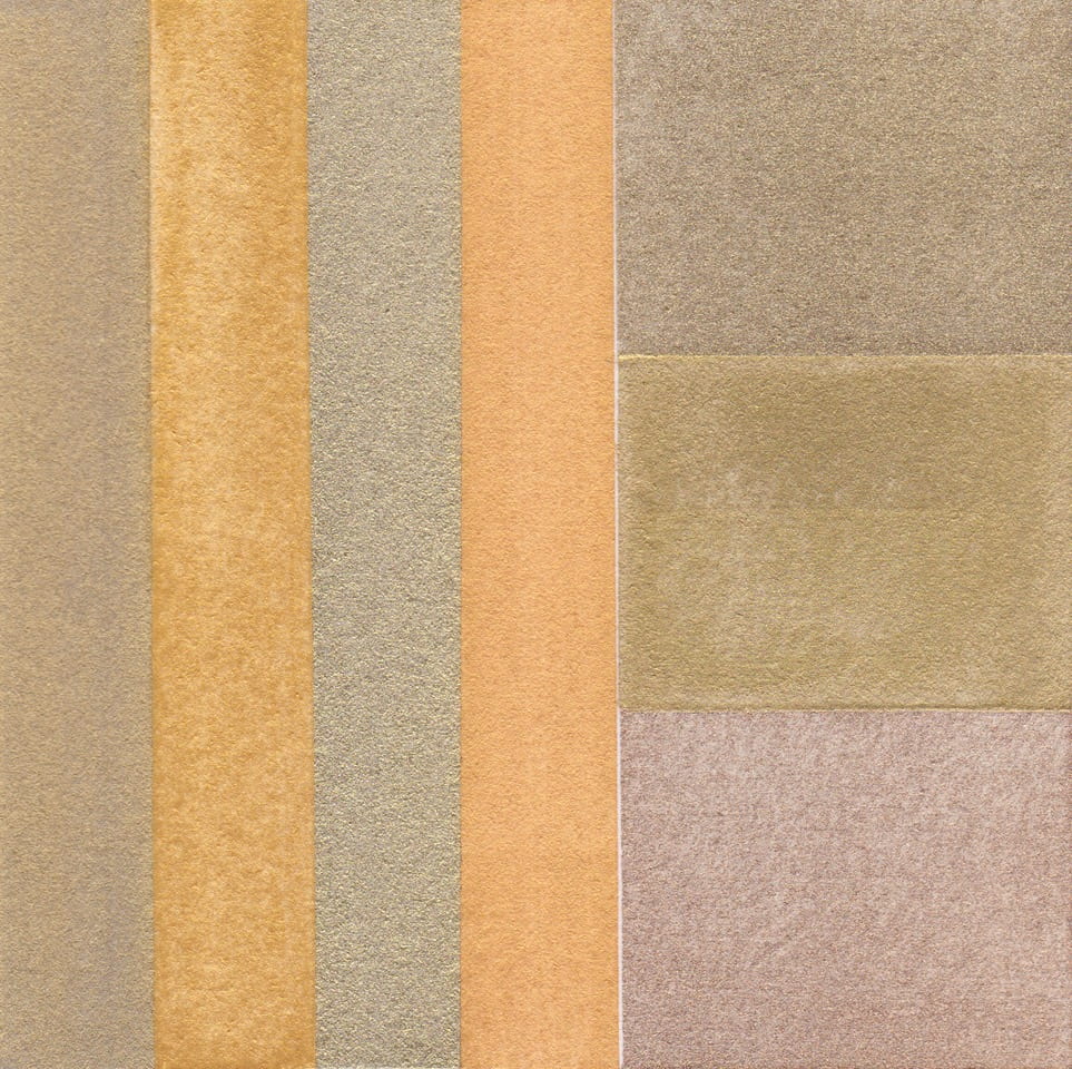
A method for making shell gold

Grind either skewings or leaf gold with a small amount of clear honey into a paste using a muller and slab. Work the muller slowly in a figure of eight until you have the mixture spread out thinly on the slab, gather up and begin grinding again. Continue this process for approx. 15 minutes or until you have broken down the gold into fine particles. Place the mixture into a glass and fill with hot water to flush out the honey.

When the gold has settled to the bottom of the glass decant the water.
Repeat approx. 5 or 6 times until all the honey is removed. De-ionised or distilled water is recommended for the last 2 stages. Allow the gold pigment to dry. Bind with gum Arabic and store the gold paint in a shell.

All pigments are bound in gum Arabic on W&N watercolour paper.

First column left to right: Four gold pigments gifted by the artist, Lisa Milroy, collected on her travels in China.

Second column top to bottom:
Schmincke pale gold
Jo Volley’s shell gold
Schmincke rich pale gold

A Colour A Day: Week 24

By Ruth Siddall, on 6 September 2020

A Colour A Day: Week 24. 31st August – 6th September

Jo Volley writes…

This week we pay homage to the maillot jaune of the Tour de France with seven historic yellow pigments and celebrate Adam Yates, English cyclist, wearing it for the first time. The maillot jaune was adopted in 1919 by Henri Desgrange, director of the tour, to distinguish the leader of the race more easily within the peloton. Desgrange was also editor of the sports paper L’Auto which funded the tour and printed on yellow paper. To quote Jens Voigt, who wore the maillot jaune for a day during the 2001 tour, ‘Yellow is a beautiful colour, no?
All pigments are bound in gum Arabic on W&N watercolour paper and read from left to right:

Gamboge

Lead tin yellow

Orpiment

Alizarin yellow

Naples yellow

Indian yellow

Aureolin

In memory of Tommy Simpson, the first British cyclist to wear the yellow jersey.
30 November 1937, Haswell – 30 July 1967, Mount Ventoux.