 Close
Close

Google Flu Trends is dead – long live Google Trends?
By rmjlmcd, on 23 January 2018
In this post Fabian Sailer discusses using Google Trends and the current flu season
Google Flu Trends (GFT) was a project which aimed to predict flu outbreaks based on web searches of google users. The project was launched in 2008 but abandoned in 2015. Why did this happen? Mainly because the predictions were not accurate enough; disease models based on surveillance data, e.g. of the Centre for Disease Control (CDC), have shown higher accuracy. GFT also did not predict the non-seasonal 2009 H1N1 pandemic, and from 2011 until 2013 the flu prevalence predicted by GFT was wrong in 100 out of 108 weeks. Approaches to estimate flu epidemics of another independent research team based on google trends showed a better accuracy then GFT.
There was enough reason to cancel this project, many also say it was cancelled because it was able to predict the past better than the future. The promising results of Yang et al. motivated me to have a look at trends.google.com, a web page which allows users to analyse the popularity of search terms over time.
I was interested in the current flu season which is why I started to look at the term “flu”.

Graph 1: Popularity of the term “flu”
This figure (Graph 1) shows that “flu” searches on Google started to increase at the beginning of September 2017, which is also the beginning of the vaccination period. The terms “vaccine” and “flu vaccine” have been searched more frequently in this period as well. In December the number of searches rose faster and peaked on the 09.01.2018. I compared the shape of this graph with the surveillance data provided by Public Health England (PHE) in their weekly national influenza report. PHE documents that the flu season picked up speed in December and peaked in the first week of January.
Due to this similarity between the PHE data and the graph obtained from google trends I decided to have a little play around with trends.google.com.
As a next step, I wanted to know whether I could also recognize the “flu” pattern from the first figure for searches for flu symptoms. Therefore, I took the first 5 symptoms listed on nhs.uk/conditions/flu.
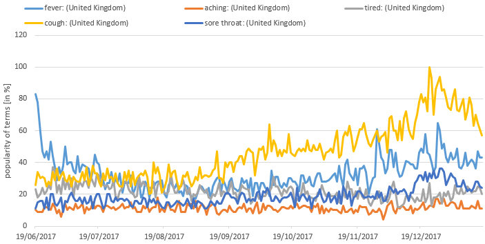
Graph 2: Popularity of terms relating to flu symptoms
Generally this chart (Graph 2) does not indicate a clear trend as observed in the flu chart. But the searches for some symptoms (“fever”, “cough”, and “sore throat”) seem to rise in line with the general “flu” trend. On the other hand, other more unspecific symptoms like “aching” and “tired” did not show this trend at all.

Graph 3: Popularity of generic terms relating to health
Looking at other generic terms (Graph 3 – “sick”, “ill”, and “healthy”) I could not observe the “flu” trend. On a side note, I could also see that during Christmas people are searching less frequently for “healthy”. But presumably the New Year’s resolutions overcompensate this drop-off with searches for “healthy” peaking in the first week of January.
I wanted to know whether these observed “flu” trend connects to current news.
It was reported that the National Health Service (NHS) is currently working at a 100% capacity. This maximum workload is partially due to the flu season. Therefore, I wanted to see whether the “flu” pattern can be observed in search terms looking for the NHS or health care in general as well.
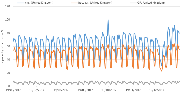
Graph 4: Popularity of search terms relating to health care in general
Interestingly, there is a completely different pattern in this data. First of all, the three curves displayed here do not start rising between October and December. But all of them show a weekly repeated pattern. Most searches for “nhs”, “gp”, or “hospital” happen on Mondays/Tuesdays. Over the week there is a slight slope until Friday before the number of searches drop to their lowest value of the week on Saturday/Sunday (Graph 4).
There might be lots of reasons for this pattern. My first theory was that employees might need to get a doctor’s certificate on these days to call in sick for work.

Graph 5: Popularity of terms relating to medical certificates
But this pattern cannot be observed within the search terms for sick notes (Graph 5).
A similar weekly pattern can be observed if we examine the searches for other working places like a “bank”. Even the searches for “flu” and the symptoms for the flu seem to follow this weekly repetition to a certain extent. But none of these patterns is as distinct as the one for “nhs” and “hospital”. I was not able to find the one reason for this pattern, and I guess it is a combination of factors which result in this unique shape.
As all of this data is freely available I invite you to have a play with google trends and see which interesting bits and pieces you might discover.
One Response to “Google Flu Trends is dead – long live Google Trends?”
- 1
Dear Lorraine,
Thank you for this amazing post! Fascinating that there is a clear pattern for the term “NHS” but not for “sick notes”. I’m not sure if this could be an explanation, but maybe people don’t know the opening hours of their local NHS and therefore google it and when they go, they get a sick note there and no longer need to google that term?