Confusion in the (social mobility) ranks? Interpreting international comparisons
By Blog Editor, IOE Digital, on 4 February 2013
Last Friday the Sutton Trust published a very interesting report questioning the validity of global educational rankings. Having written extensively on this subject myself I can only welcome this report as making an important contribution to policymakers’ understanding of international comparisons of educational attainment. Yet the report also brought to mind the robustness of cross-national comparisons of another area of great policy interest – social mobility.
Readers have probably heard that social mobility is low in the UK by international standards. A number of sensationalist stories have led with headlines such as “Britain has worst social mobility in western world“ and that “UK has worse social mobility record than other developed countries“.
Leading policymakers have made similar statements. To quote England’s Secretary of State for Education Michael Gove: “Those who are born poor are more likely to stay poor and those who inherit privilege are more likely to pass on privilege in England than in any comparable country”.
But is this really the case? Are we sure social mobility is indeed lower in this country than our international competitors? Or is it the case that, just like global league tables of educational achievement, there remains great uncertainty (and misunderstanding) surrounding cross-national comparisons of social mobility?
The answer can actually be found by exploring a little further academic research that has been published on the Sutton Trust website. Figure 1 is taken from a Social Mobility Report published on 21 September 2012.
Figure 1: International comparisons of social mobility – Sutton Trust report 21st September 2012

Saving the technical details for another time, the longer the bars in this graph, the less socially mobile a country is. Here we see a familiar story; Britain ties with Italy as being the least socially mobile.
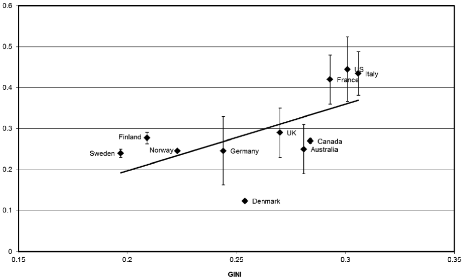
Figure 2, however, tells a different story. This is taken from another report published by the Sutton Trust just three days later.
Figure 2: International comparisons of social mobility – Sutton Trust report 24th September 2012

This graph plots a measure of income inequality (horizontal axis) against an economic measure of social mobility (vertical axis). Thus the closer a country is to the top of the graph, the lower its level of social mobility. Now, it appears that the UK may actually be more socially mobile than France, Italy and the US, and very similar to countries like Australia, Canada and Germany. Perhaps even more surprisingly, the UK is also similar to Sweden, Finland and Norway. Indeed, the only country that we can have any real confidence that the UK is significantly different to is Denmark.
Why is there such a contrast between these two sets of results? The trouble is, cross-national studies of social mobility have to rely upon data that are not really cross-nationally comparable. Rather, data of varying quality have been used in each of the different countries. Individuals are interviewed at different ages, using different questionnaires and survey procedures. Indeed, even different statistical analysis methods are used. No wonder, then, that social mobility in the UK can look very different, depending upon which dataset and method of analysis are used.
So although global rankings of educational attainment can be misleading, so can those of social mobility. In fact, problems with international comparisons of social mobility are often significantly worse. Yet this does not seem to stop journalists and policymakers making bold claims that “Britain has some of the lowest social mobility in the developed world“. Things are rarely so black or white in the social sciences – and social mobility is no exception. This uncertainty should be recognised when journalists and government officials report on social mobility rankings in the future. Otherwise, I fear for the credibility of this extremely important social issue.
5 Responses to “Confusion in the (social mobility) ranks? Interpreting international comparisons”
- 1
- 2
-
3
Denis Mongon wrote on 5 February 2013:
Fascinating and a helpful warning to avoid the trap of exaggerating when there is enough to do to improve educational success and social mobility.
-
4
Caroline wrote on 11 February 2013:
Hi,
This article does not make sense; the two measures being compared here are not comparable. The first is a measure of generational earnings elasticity – which is an indicator of social mobility and the second is the gini co-efficient which is a measure of income inequality.
Income inequality and social mobility are different things.
No social scientist has ever claimed that the gini coefficient is a measure of social mobility and resultantly I think this article is misleading!
Thanks -
5
John Jerrim wrote on 11 February 2013:
Sorry – perhaps this was not clear (the label of the vertical-axis of Figure 2 appears to be chopped off). The vertical axis presents the intergenerational income elasticity – the same measure of social mobility that is presented in Figure 1. So it is possible to compare ‘apples with apples’ across Figure 1 and Figure 2.
 Close
Close


Thank you very much for posting this as it underlines the general point made by Smithers and others that international rankings are currently used mainly for political purposes, and as we know from exchanges across the dispatch box in Parliament, one side will always find completely opposing evidence to the other. Is this healthy for debate on education issues? Well it’s classic legal practice and a good judge no doubt can sift the good from the bad, but once the media get hold of it as you rightly point out, then it can turn into wildfire stories that only serve to accentuate the extreme positions (about which not doubt those who hold them are very happy!).