 Close
Close

How have earnings and household incomes changed in the current Great Recession?
By Blog Editor, IOE Digital, on 22 January 2013
The economic downturn that began in 2008 – “The Great Recession” – produced the largest post-war fall in UK output to date. The contraction in 2008-9 was as big as in the Great Depression of the 1930s – a 7% fall. But the recovery has been much slower, the economy now bumping along for the last two years, oscillating around the same level.
How have households fared since the crisis began? The earnings of employees are the largest component of total household income. The graph below draws on recently published results from the government’s annual survey of earnings and hours (ASHE), held in April each year. It reveals how gross weekly earnings for full-time workers have changed during the Great Recession.
The graph shows the changes to “average”, “high”, and “low” earnings, measured by the median (the middle of the distribution), the top decile (10% of employees have earnings above this level), and the bottom decile (only 10% of employees earn less than this). The figures are adjusted for price changes and are shown in index form with values in 2008 set equal to 100. (The adjustment uses the RPI – annual changes in real earnings are smaller when using the CPI.)
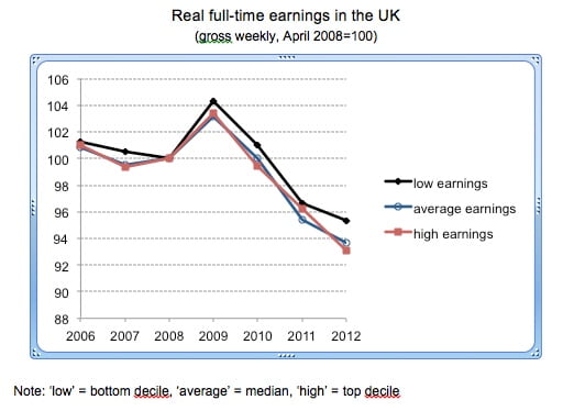
Real earnings actually rose in 2009 – at the bottom of the distribution, in the middle, and at the top – helped in part by a fall in prices (by over 1% in the year to April). But earnings then fell in the following three years, and in April 2012 were some 6-7% lower in real terms than they had been four years earlier. Nominal earnings continued to rise slightly after 2009 but the return of positive price inflation drove down the real figures (retail prices rose by over 5% in each of the years to April 2010 and April 2011).
Besides these changes in levels, the graph implies much stability in earnings inequality for most of the period. The three data series largely move together so that the ratios of high to low earnings, high to average, and average to low earnings change little. For example, the ratio of high to low earnings was 3.63 in 2008 and 3.55 in 2012. In both years, the high earner got just over three and a half times the amount received by the low earner. (In 2012, high earnings with my definitions were exactly £1,000 a week, low earnings £282, and average earnings £506.)
There is no simple story of a large rise in overall inequality of earnings during the Great Recession – of the top running away from the middle, or the bottom falling away from the rest – or, on the other hand, of a substantial compression in differentials. (NB There are people earning outside of my “high-low” range – 20% of all employees, given the definitions – and the graph says nothing about what has happened to earnings at these extremes.)
Of course, a focus on gross earnings of full-time employees does not give the full picture of how the incomes of the UK population have changed. It ignores other paid work, self-employment, investment income, pensions, state benefits, and direct taxes. It excludes about 70% of the population – we need to consider those working part-time, those without work, children, and the elderly. And we need also to consider households rather than looking just at individuals by themselves. Households perform an important insurance role against individual income loss.
This is what colleagues and I do in a book published this month, The Great Recession and the Distribution of Household Incomes. We analyse changes in total household incomes from all sources for 21 rich countries, with a special focus on Germany, Ireland, Italy, Sweden, and the USA, in addition to the UK. The results are also summarised in this paper (pdf).
Across 2007 to 2009 – the crisis years – real net incomes of households typically rose by a small amount in the countries we study (by 2% in the UK), repeating the pattern shown for earnings for the UK alone in the graph. The main explanation was the support given by governments through lower taxes, and in particular, higher spending on state benefits. There was also little obvious change in income inequality over 2007–9 in our 21 countries, with one or two exceptions. The absence of sharp changes in the distribution of household incomes across the crisis years is one of the striking features of the Great Recession.
The changes after 2009 are harder to track. Results from household surveys appear with a lag and not all countries collect the necessary data each year. In the UK, the latest figures refer to the 2010-11 tax year. They show average net household incomes only 2% lower than in 2007-8. But further falls can be expected, including in 2011-12 on the evidence of the changes in earnings in 2012 in my graph – the impact of the Great Recession on household incomes will be with us for a long while yet. Notably, inequality in household incomes declined sharply in 2010-11 – a different picture to that for earnings – since high incomes fell more in percentage terms than low incomes.
Interest in households’ living standards should not stop at their net incomes. One of the caveats in our book is that such a focus misses the impact of changes to indirect taxes and to public services. Rises in the former and cuts in the latter are all part of the “fiscal consolidation” to improve governments’ balances following their efforts to support incomes during the crisis years. The relatively modest changes to the distribution of income between 2007 and 2009 provide little reassurance about the medium and long-term effects of prolonged stagnation accompanied by sustained high unemployment.
Sources for graph: Annual Survey of Hours and Earnings, Office for National Statistics website. Gross weekly pay in April of each year, employees on adult rates whose pay for the survey pay-period was not affected by absence. Earnings are adjusted for changes in prices using the RPI All Items (monthly) (Table 20 from CPI and RPI Reference Tables, October 2012).

