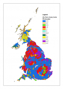
What would the country look like under proportional representation?
By Oliver W Duke-Williams, on 11 May 2015
 The 2015 UK General Election was most notable for producing a result – a Conservative majority – that few had predicted. Perhaps the second most discussed aspect has been the difference between the amount of votes gained by smaller parties, and the number of seats that they won. Between them Ukip and the Green Party won about 5million votes, but just 2 seats.
It’s possible to use published voting results to redraw the country as if proportional respresention was in play, with each party being awarded a number of seats based on the proportion of the overall vote that they gained.
There are many variants of PR and other voting systems that offer an alternative to the UK’s ‘First Past the Post’ model, both in determining the number of seats, and in appointing candidates to those seats. The most significant qualification to considering ‘what would the result look like as PR?’ however comes before the allocation method: under PR it is obvious that some people – perhaps a large number – would not vote in the same way that they do under the current system.
Here, a very simple model allocation is used. A target number of seats was calculated for each party. The parties are considered in order of the total number of votes cast, thus the Conservatives gain the first seat (apart from the Speaker, who is appointed before anything else). This seat is given to the Conservative candidate who gained the largest vote share within their constituency election. The next seat goes to the Labour candidate with the largest vote share, and so on. If the candidate for any party with the largest share was in a seat that has already been allocated via this method, then the candidate with the next highest share (in an unallocated seat) is used.After all applicable parties have been awarded one seat, then the allocation returns to the first party, and selects their second seat in the same way, continuing as before. When parties reach a total number of MPs that matches their proportion of the total national vote, then they drop out of the allocation system.
This model has flaws and isn’t proposed as an ideal approach, but has the merit – for the purpose of this post – of being fairly easy to implement.
The results are shown in the maps below; there is a traditional map, and a cartogram, in which the size of each constituency is modified to reflect the size of the population. An interactive version of the map is available here: http://www.ucl.ac.uk/~uczcodu/ge2015pr/ukpr.html [NB This is currently resource heavy, and needs better generalisation of the boundary data…]
Under this seat allocation, several notable features are apparent: a Green heartland in London, and a wide scattering of Ukip seats. The SNP domination of Scotland is less comprehensive, and the LibDem meltdown less pronounced.
A particular weakness can be seen in allocation of seats in Northern Ireland: the national vote based determination of a target number of seats means that not all seats in NI are filled by the local parties; the remainder have been filled by the Conservatives as the largest party, but with candidates who have won a very low number of votes. This is reflected in part in the interactive map where I have varied the opacity of each constituency so that the lower the vote share of the ‘winning’ MP, the more transparent the shading.
 Close
Close


