X Close

Science blog

Home

News, anecdotes and pictures from across science and engineering at UCL

Menu

How to predict travel chaos

By Oli Usher, on 1 June 2015

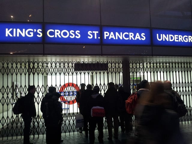
It’s a scenario London commuters are all too familiar with: a muffled announcement, ‘signal failure’ or ‘passenger action’; a station closed and thousands of passengers’ journeys interrupted.

Closed.

Closed. Photo: Oatsy40 (CC-BY)

London’s transport network is extensive, but fragile.

Everyday disruptions to the service have knock-on effects across the system.

Some are easy to predict – a closure at Mornington Crescent will mean more people exiting at Camden Town, on the same line and only a few minutes’ walk away.

Mornington Crescent

Mornington Crescent: quiet, only on one line, and located near to another station. Photo: Diamond Geezer (CC-BY-NC-ND)

Others are far more complex – how would a closure at a busy hub like Euston affect traffic across the network?

Two innovations of the past few decades mean that travel chaos is far more predictable than it was. One is the wealth of data captured by the Oyster Card system, which has been recording passengers touching in and out of the Underground since 2003. The other is the advance in computing power which makes statistical analysis of millions of journeys easy.

Ricardo Silva

Ricardo Silva

One statistician who has looked at Oyster data to chart the impacts of disruption on the underground is UCL’s Ricardo Silva. He has recently built a statistical model that predicts the knock-on effects of unplanned station and track closures across London’s urban rail network.

His work could help transport operators react more effectively to disruption. It can potentially be used to identify where bus services need to be beefed up, as well as identify bad decisions passengers make when reacting to disruption, which can help station staff make more useful announcements about alternative routes.

At the heart of Silva’s model is a database of every journey taken on the Tube, Overground and DLR using Oyster Cards, over 70 randomly chosen weekdays in 2012 and 2013 – covering tens of millions of passenger journeys.

Oyster Card. Photo © TfL Press Office, all rights reserved

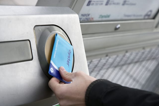
The Oyster Card system is used for over a billion journeys per year on the Tube alone – generating a wealth of data in the process. Photo © TfL Press Office, all rights reserved

Transport for London (TfL) strip out all personal information, such as the passenger’s name or Oyster Card serial number before supplying the data, and give each passenger a randomly allocated ID number. This means that Silva can track individual journeys across the network – including which stations the passengers travel between, and at what time – without invading their privacy.

Alongside the passenger data, he has TfL’s log of all incidents on those days, so he can tease out the difference between passenger behaviour when the network is running smoothly, and when it is being disrupted by a partial closure.

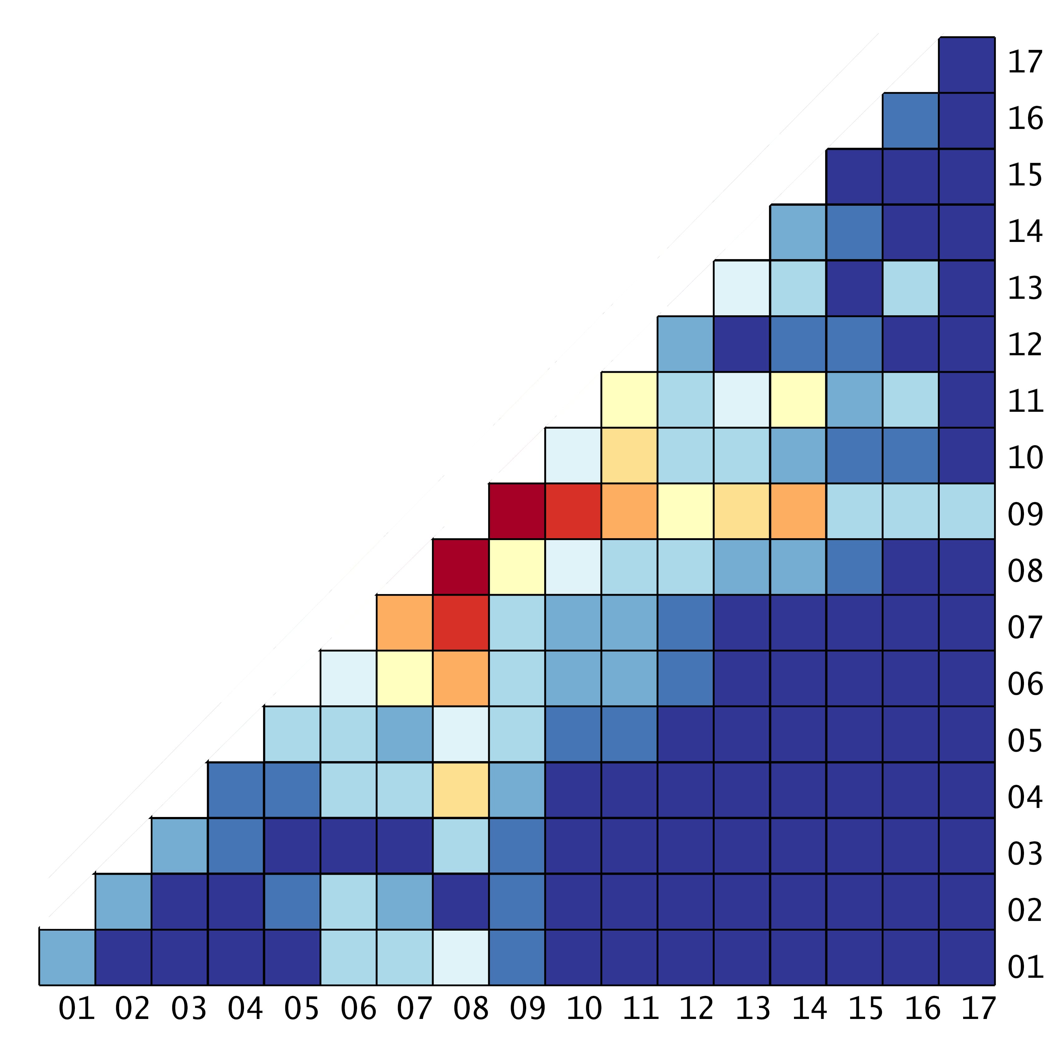
London’s urban rail network has 374 stations, which means there are almost 140,000 possible paths a passenger can take as they navigate their way across the capital. (There are a handful of pairs of stations, Silva says, that nobody travelled between in any of the 70 days he studied.)

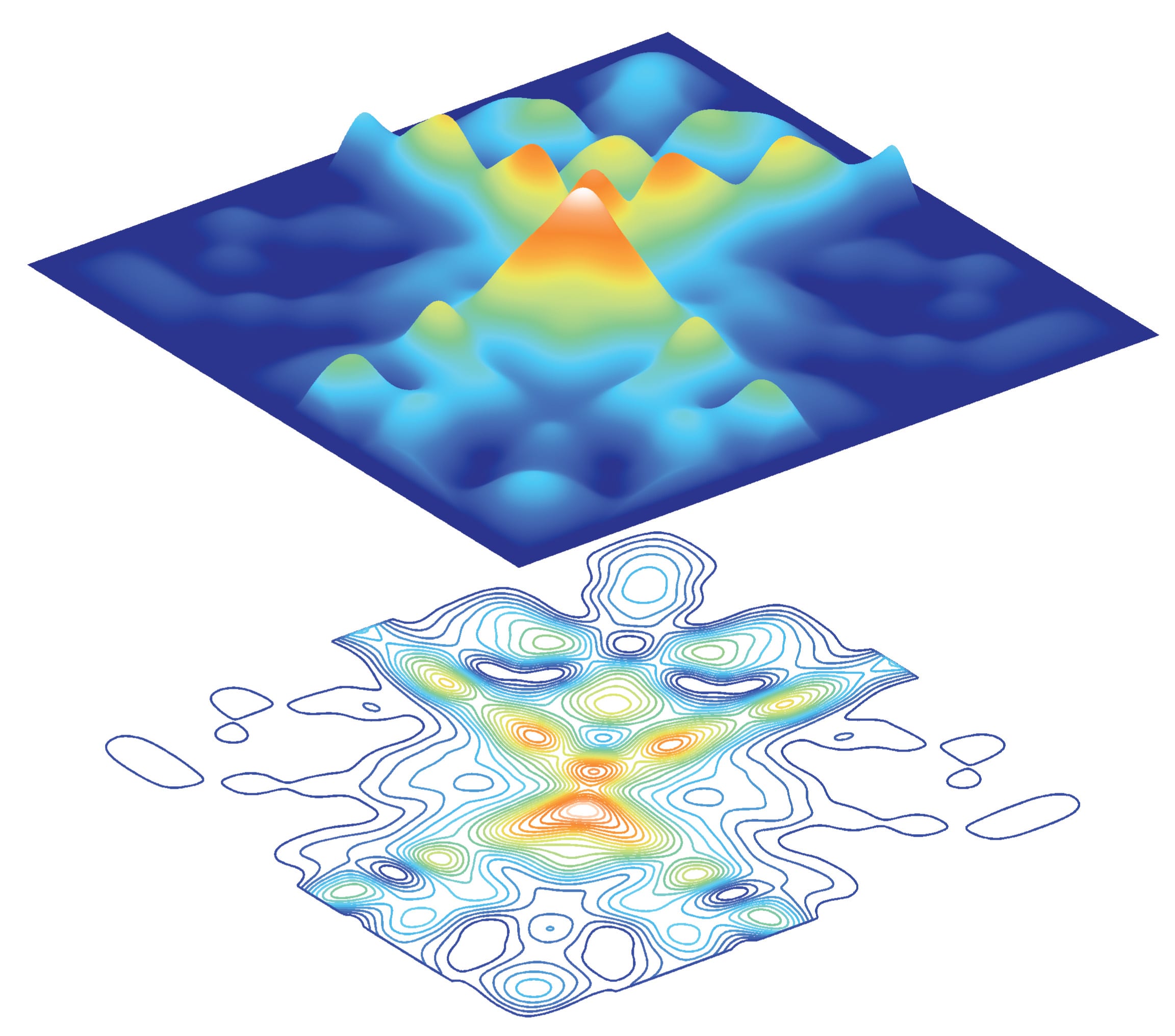
Silva’s model predicts minute by minute how many journeys are being made between each pair of stations, how many passengers will enter and leave the system at each station, and how many will be inside the system at any given time.

In its most basic form, the model is simply a description of where passengers are entering and leaving the system at any given time; a reflection of how the network is when it’s working normally. But unlike the real network, he can experiment, closing stations or lines and seeing how the virtual passengers adapt to the disruption.

In principle, the model can give staff immediate feedback about what passengers are likely to be doing at that point, when an unplanned service disruption takes place. However, implementing real time feedback will require further work as the existing technical facilities are not ready for that yet.

Silva’s model takes a lot of computing power – it takes a few days to run a simulation on an ordinary desktop computer – but it is not unmanageable. Extending the model to take account of passenger flows through the transport network, or to run the simulation quicker would require supercomputer facilities such as UCL’s Legion Cluster.

UCL's Legion Cluster. Photo: Tony Slade, © UCL Creative Media Services (all rights reserved)

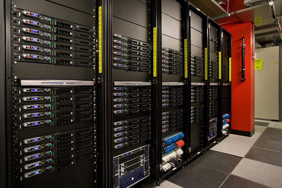
UCL’s Legion Cluster supercomputing facility. Photo: Tony Slade, © UCL Creative Media Services (all rights reserved)

The model doesn’t only apply to London – it is applicable to any transport network where passengers’ entry and exit points are tracked, meaning it could be useful for transport authorities around the world.

Related links

Visualising political polarisation

By Oli Usher, on 29 October 2014

Network diagrams are visualisations of the links between different things. Points mark out the things (for instance, children in a class) and lines are the connections between them (for instance, whether they are friends). For small sets of data, these are an arresting way of immediately understanding relationships between things.

For instance in this (imaginary) diagram, even the quickest of glances shows that Maryam has many friends and Peter has very few:

Simple network diagram

While they work well for small datasets, like a class with a few tens of children, these diagrams quickly become unreadable as you add more points.

But what if there were a way to avoid showing every point, while still somehow conveying the overall message? Many of the individual data points will be very similar or even identical (for instance Peter, Sarah and Philippe in the diagram above). If you could somehow average these out and come up with a handful of idealised versions of the children in the class, you could drastically reduce the clutter – and in the case of particularly complex ones, simplify a chart and make it readable.

This is something UCL statisticians Patrick Wolfe and Sofia Olhede have worked on in a new paper, published recently in the Proceedings of the National Academy of Sciences. The thrust of the paper is highly technical and not for the faint-hearted:

science

But one example of how their technique simplifies the presentation of data is much more comprehensible.

A decade ago, a statistical study of over 1200 political blogs in the run-up to the 2004 US election went viral thanks to a startling visualisation of the hyperlink between blogs:

diagram

Network diagram of US political blogs in 2004 (Credit: Lada Adamic, all rights reserved)

Blogs supporting President Bush’s Republican Party (red dots) overwhelmingly linked to other Republican blogs (red lines). On the left, blogs supporting the Democrats and their candidate John Kerry (blue dots) showed a similar pattern of mutual linking (blue lines).

Hyperlinks crossing the political divide – in orange – were relatively few and far between.

The chart starkly displays the lack of communication of a polarised political discourse. But if you’re looking for any finer detail, it is a mess. There are over a thousand dots and several thousand lines. The detail is impossible to see.

Olhede and Wolfe’s analysis condense down 1224 blogs into just 17 buckets of 72 blogs each, clustered together based on similar linking behaviour.

This diagram looks complicated at first sight, but it is in fact quite simple.

Each line and each column represents one of the 17 buckets of blogs, with lines and columns 1 to 8 representing the eight buckets of liberal blogs, while 9 through 17 are the nine buckets of conservative blogs.

Match up the co-ordinates, and the colour of the square shows how often these blogs link to each other, with dark blue being no links and bright red being extremely frequent linking.

So for instance, to see how frequently the blogs in the sixth bucket link to those of the eighth, you just need to look at  the sixth block in the eighth column. (The square is orange, representing frequent linking between them – as indeed you might expect of two liberal blogs.)

This simplified diagram, called a ‘network histogram’, reveals the same dramatic segregation of the blogosphere as the network diagram does – notice the sea of blue in the bottom right part of the diagram, where you might expect to see links between Republican and Democratic blogs – in a chart with just 153 points of data, rather than several thousand.

It also shows other features such as relative popularity within each political grouping (which is virtually impossible to see in any detail in the original visualisation) as well as how much blogs within each of the 17 bins link to themselves (i.e. the blogs most similar to them). Perhaps surprisingly, many of them don’t – with the most isolated blogs not linking to blogs similar to themselves, but just linking to the most popular, most mainstream ones on their side of the political spectrum.

The network histogram also reveals the nature and frequency of the (rare) links across the political divide – for instance, the most popular cross-partisan linking occurs between bucket 9 of conservative blogs and bucket 8 of liberal blogs – though even this is only frequent enough to show up in pale yellow.

Make the histogram a square (by mirroring it), and the data can be represented in different ways – for instance, with different heights representing varying intensities of linking (top) or map-like contours (bottom).

Links


Simplifying complex data

By Oli Usher, on 27 October 2014

One challenge in science is how to represent vast datasets in a way that the human eye and brain can understand. UCL statisticians Sofia Olhede and Patrick Wolfe have worked on methods of simplifying data on relationships between things in a way which captures all the important features, but is not so unwieldy that the patterns are lost.

blogs contour

The top pair of images on this page show data on how frequently blogs supporting different parties link to each other – showing frequent linking between fellow US Republican Party blogs and US Democratic Party blogs (top and bottom quadrants of the picture) but very little crossing the political divide (left and right quadrants). Peaks (in red and yellow) show groups of blogs that link to each other frequently, blue areas show combinations of blogs that rarely never link to each other. The lower image is a 2D map of exactly the same data.

The next image shows a mathematical approximation of the shape of the distribution of linking in that data – showing how the underlying pattern of blogs linking to each other is actually rather simple.

blogs idealized


A detailed article on the science behind these images – and what they tell us – will be published here on the UCL Science blog on Wednesday.

Picture credits: Patrick Wolfe, Sofia Olhede (UCL Statistical Science).

Data from Adamic and Glance

Links

High resolution images